13 Above Kitchen Cabinet Ideas That Look Intentional and Lived-In
That narrow strip above your kitchen cabinets often becomes a dusty no-man's-land. But with a little thought, it can be one of the coziest spots in your home.
The key is treating it like a shelf, not a storage dump—think curated, not cluttered.
Whether you rent or own, these 13 ideas will help you style that awkward gap into something that feels finished and personal.
1. Trailing Pothos or Ivy for Soft Greenery
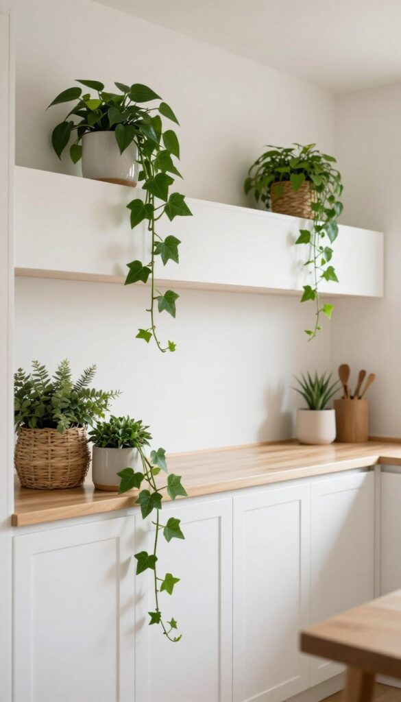
That awkward gap above your upper cabinets doesn't have to collect dust or random odds and ends. Instead, let a few cascading plants drape over the edge, turning an empty ledge into a living vignette. Pothos and ivy are perfect for this spot because they thrive in low light and forgive occasional neglect, so you don't need a green thumb to pull it off.
The soft green trails break up all those hard cabinet lines and instantly make the kitchen feel more relaxed and lived-in.
Start with two or three medium-sized pots placed at different points along the cabinet run, spacing them so the vines have room to spread. Choose simple ceramic or woven baskets as planters to keep the look cohesive and avoid visual clutter. As the vines grow, they'll naturally weave together, creating a lush curtain that softens the transition between cabinets and ceiling.
This works especially well in kitchens with white or neutral cabinetry, where the green pops without competing.
Best Plant Choices
Pothos (golden, marble queen, or neon) and English ivy are the top contenders. Both are low-maintenance, tolerate low light, and grow quickly enough to fill the space within a few months. If your kitchen gets more sunlight, try a string of pearls or a philodendron for variety.
Planter Style Tip
Stick with matte finishes like terracotta, matte black ceramic, or natural woven baskets. Glossy or overly ornate pots can distract from the plants. Keep the planters uniform in color or material to maintain a clean, intentional look.
Watering And Maintenance
Since reaching above cabinets can be a hassle, choose self-watering pots or add a layer of pebbles at the bottom to reduce watering frequency. Check soil moisture every two weeks, and trim any leggy vines to encourage fuller growth. Dust the leaves occasionally so they stay glossy and healthy.
2. Woven Baskets in Varied Sizes
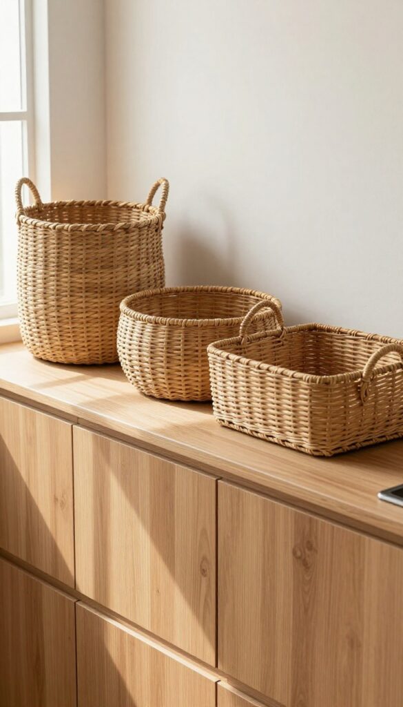
The space above your cabinets doesn't have to be a dusty no-man's-land. With a few woven baskets in different sizes, it becomes a warm, textural display that hides clutter and feels intentional. Natural fibers like seagrass or rattan add softness against hard cabinet lines, and the slight offset placement keeps things from looking too staged.
It's the kind of look that says lived-in without trying too hard.
Group two or three natural fiber baskets to hide odds and ends while adding texture. Keep them slightly offset for a relaxed look. This approach works especially well in kitchens with warm wood tones or neutral color schemes, as the baskets echo those earthy hues.
For a cohesive feel, stick to baskets in the same color family—think light tan, warm brown, or washed white—but vary the shapes (tall, round, rectangular) to create visual interest. Avoid cramming them too close together; a little breathing room makes the arrangement feel curated rather than cluttered.
Best Materials
Seagrass, rattan, and water hyacinth are top choices because they're lightweight, durable, and have a natural texture that softens the hard lines of cabinets. Avoid plastic-looking synthetics if you're going for that warm, organic feel. If your kitchen has a more modern edge, try baskets with a tighter weave or a darker stain to bridge the gap between rustic and contemporary.
Storage Tip
- Use baskets to store items you don't need daily, like holiday platters, extra linens, or seldom-used small appliances. Drop a cloth napkin or a piece of felt inside to prevent rattling. For a cleaner look, choose baskets with lids or a deep enough shape to hide contents completely.
- Labeling isn't necessary since the baskets themselves are the decor, but if you want to stay organized, tuck a small tag inside each one.
Styling Trick
Place the largest basket slightly off-center, then nestle a medium and small one beside it at different heights. If your cabinet gap is shallow, opt for oval or rectangular baskets that sit flush against the wall. Add a single trailing plant or a small stack of cookbooks on the opposite side to balance the composition without making it symmetrical.
3. Vintage Breadboards and Cutting Boards
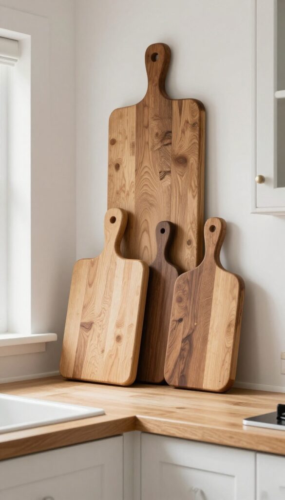
Wooden cutting boards and breadboards have a warmth that few other decor pieces can match. Leaning a few against the wall above your cabinets instantly softens the hard lines of the kitchen and adds a lived-in, collected feel. The mix of wood tones, grains, and shapes creates an effortless rustic vignette that feels intentional without trying too hard.
A cluster of vintage-style breadboards and cutting boards leaned against the wall above your cabinets brings natural texture and a cozy, handmade feel to the kitchen. The varied sizes and wood tones—from pale maple to rich walnut—create visual interest without clutter. This idea works especially well in kitchens with white or neutral cabinets, where the wood adds a warm contrast.
To keep the look curated, choose boards with similar patinas or stick to a tonal range. You can also incorporate a small wooden rolling pin or a vintage pastry board for extra character. The key is to let the wood speak for itself, so avoid overcrowding the space with other decor.
Best Wood Tones
Stick with warm, medium to dark woods like walnut, cherry, or reclaimed oak. These tones stand out against light cabinets and don't get lost. If your kitchen has warm wood floors, choose boards in a slightly lighter shade to create contrast without clashing.
Layout Tip
Lean the largest board at the back, slightly off-center, and layer smaller ones in front at different angles. This staggered arrangement feels more natural than lining them up in a row. Leave a few inches of space between boards so each one reads as a separate piece.
Finishing Touch
Add a small sprig of dried eucalyptus or a single dried orange slice tucked behind the front board. This tiny detail introduces a subtle organic element that complements the wood without overwhelming it.
4. Stacked Cookbooks with a Bookend
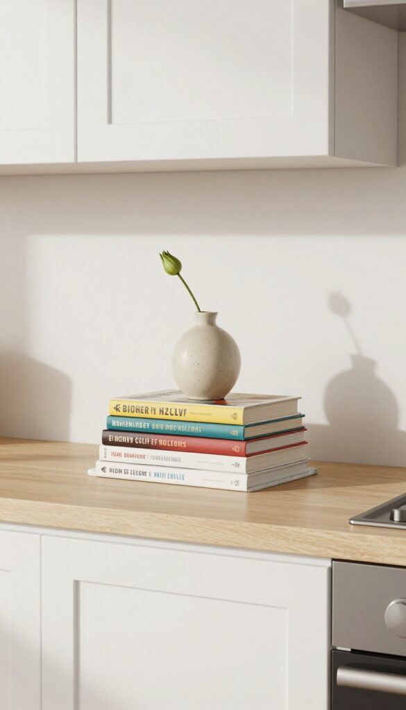
If you have a collection of cookbooks gathering dust on a lower shelf, moving them above the cabinets gives them new life. Stacking them horizontally with a bookend keeps the look tidy and intentional rather than cluttered. It’s a simple way to add warmth and personality to the kitchen without committing to a full vignette.
This idea works because it’s both practical and decorative. The horizontal stack breaks up vertical lines above the cabinets, making the space feel more grounded. Plus, you can swap out the top object seasonally—a ceramic pumpkin in fall, a small vase in spring—to keep the look fresh.
Choose cookbooks with colorful spines or cloth covers for extra visual interest.
Best Colors
Stick to a cohesive color palette that complements your kitchen. Neutral cookbook covers in cream, gray, or navy work well with most schemes. If your kitchen is all white, a pop of red or mustard yellow from a book spine adds a friendly contrast.
Styling Tip
Use a bookend that feels substantial enough to hold the stack steady but not so tall that it dominates. A marble or wood bookend adds texture. Place the stack near the edge of the cabinet so it’s visible but not in the way when you open doors.
Finishing Touch
Top the stack with a small ceramic object like a bud vase, a salt pig, or a mini bust. Keep it under 6 inches tall so it doesn’t look overwhelming. The object should feel like a natural extension of the books, not a random trinket.
5. Ceramic Pitchers and Stoneware Jugs
There’s something quietly satisfying about a row of ceramic pitchers lined up above your cabinets. Their soft, rounded shapes break up all the straight lines and hard edges, and the earthy tones add a warmth that feels handmade and intentional. It’s a look that says your kitchen has soul, not just style.
Gather a few cream-colored or earthy pitchers in different sizes and arrange them in a loose row. The variation in height and silhouette keeps the display from feeling too uniform. Stick to a neutral palette—off-white, terracotta, sage—so the collection feels cohesive but not matchy.
This works especially well in kitchens with open shelving or glass-front uppers, where the pitchers can echo the textures of dinnerware below.
Best Colors And Finishes
- Stick with matte, unglazed finishes for a truly rustic feel. Cream, oatmeal, dusty sage, and warm terracotta all play nicely together. If your kitchen leans modern, you can mix in one glossy white pitcher for a subtle contrast.
- Avoid bright colors or busy patterns—the goal is a calm, collected look.
Arrangement Tip
Line them up from shortest to tallest, or group two tall ones on one end and a cluster of short ones on the other. Leave a few inches of space between each so they don’t feel crowded. If you have a narrow gap above the cabinets, just two or three pitchers can make a bigger impact than a crowded row.
Finishing Touch
Tuck a small sprig of dried eucalyptus or lavender into one of the pitchers. It adds a soft organic element and a whisper of fragrance. Swap it out seasonally—a few stems of wheat in fall, or a single branch of cherry blossoms in spring.
6. A Row of Glass Apothecary Jars
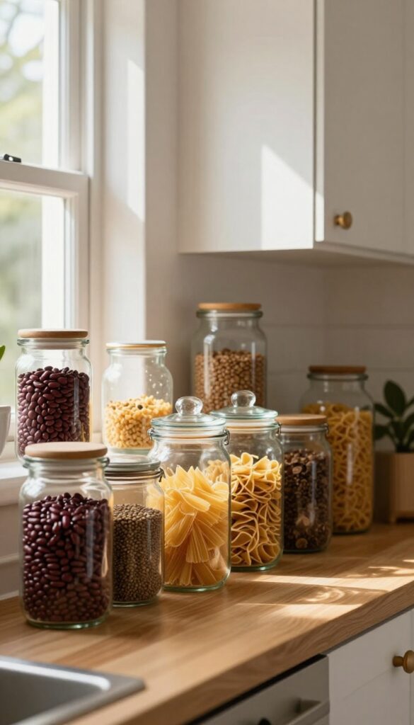
Glass apothecary jars bring a charming, old-world feel to the space above your cabinets. Their transparent sides let you play with color and texture, while the varied heights create a rhythm that feels curated, not cluttered. For a warm and lived-in look, fill them with everyday ingredients like dried pasta or beans, or go whimsical with fairy lights that glow softly at night.
Clear glass jars catch light beautifully, making the area above your cabinets feel airy and open rather than heavy. The key is to choose jars with interesting shapes—think tall, narrow bottles paired with round, bell-shaped ones. Fill them with items that complement your kitchen's color palette: earthy brown lentils, bright red kidney beans, or golden pasta shapes.
For a cozy evening vibe, string battery-operated fairy lights inside a few jars, letting the glow spill out through the glass.
Best Fillers For A Warm Look
- Dried goods are a natural fit because they're inexpensive and come in beautiful colors. Layering different textures—like smooth black beans next to ridged pasta—adds visual interest. You can also use cork, pinecones, or small ornaments for seasonal updates.
- Just keep the fillers dry and sealed if you're in a humid climate.
Arrangement And Height Variation
- Group three to five jars together, varying heights to create a staggered silhouette. Place the tallest jar slightly off-center, then flank it with shorter ones. Leave a few inches of space between each so they don't feel crowded.
- This asymmetry feels natural and collected, not overly staged.
Lighting And Finishing Touch
For maximum impact, install a low-profile LED strip light on top of the cabinets, aimed upward. The light will bounce off the ceiling and illuminate the jars from above, making the glass glow. If your kitchen has warm undertones, use warm white bulbs to keep the mood cozy.
7. Framed Art or Small Prints Leaning
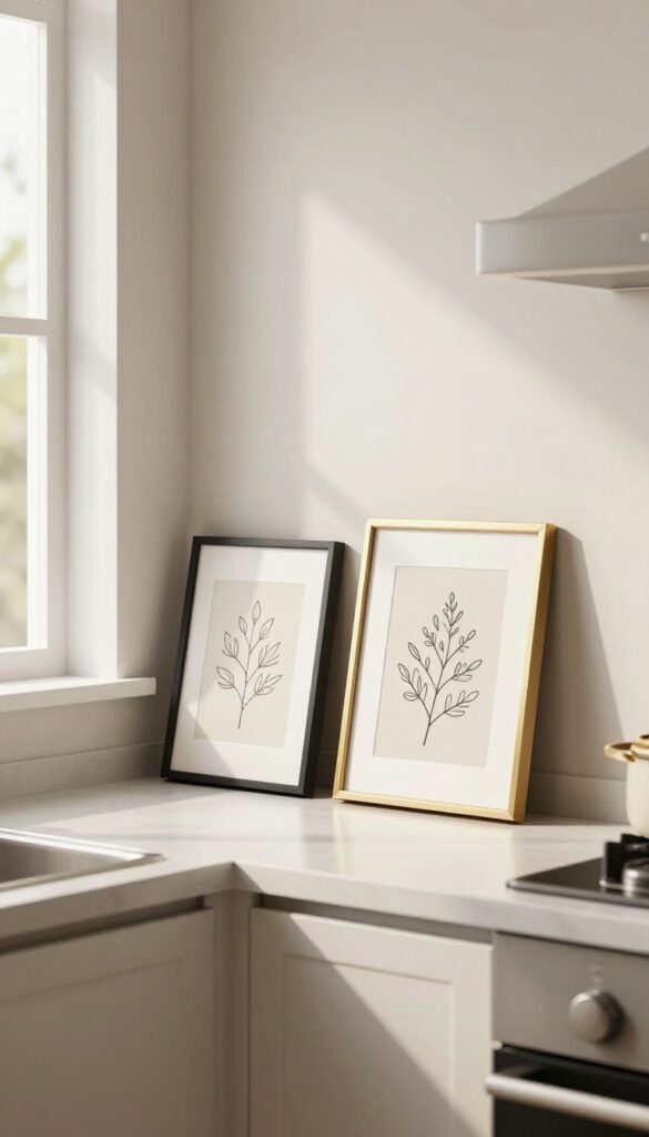
Lining the backsplash behind your stove or countertop with a few small framed prints is an easy way to bring personality to that awkward gap. It softens the transition between the cabinet tops and the wall without adding clutter. The leaning look feels intentional but relaxed, like you just set them there because you liked the view.
Choose simple subjects like botanicals, line drawings, or abstract washes in muted tones. Stick to one or two frames per section so the arrangement stays airy. Mix frame finishes—black, brass, or natural wood—for a collected-over-time feel.
The key is keeping the scale modest: 5×7 or 8×10 works best so nothing overwhelms the space. This idea works especially well in kitchens with open countertops or a window above the sink, where the art becomes a subtle focal point.
Best Frames For The Look
Thin-profile frames in black, brass, or light wood keep the display from feeling heavy. Avoid bulky ornate frames that compete with the backsplash. A mix of finishes adds warmth and keeps the arrangement from looking too uniform.
Placement Tip
Lean the prints at a slight angle against the backsplash, not flat against the wall. This creates depth and a casual gallery feel. If you have a long stretch of counter, group two prints together rather than spacing them far apart.
Subject Ideas
Botanical prints, simple line art, or abstract watercolors in soft greens, blush, or charcoal work well. Avoid busy patterns or dark images that might feel heavy above eye level. Stick to subjects that complement your kitchen’s color palette.
8. A Single Long Greenery Garland
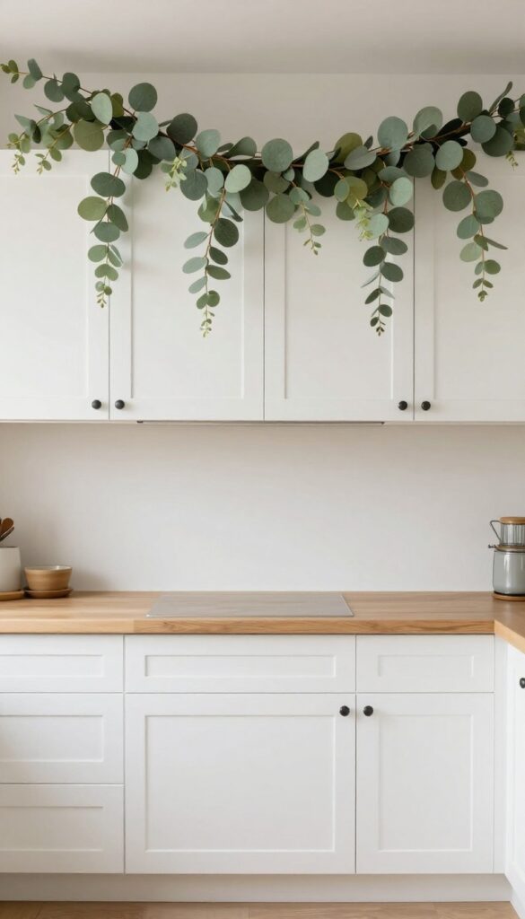
A single long garland running across the top of your cabinets is one of the easiest ways to add warmth and a finished look. It creates a continuous, soft line that draws the eye horizontally, making the kitchen feel wider and more intentional. Best of all, it doesn't block access to the cabinets, so you can still store items up there without hassle.
Drape a faux eucalyptus or olive garland across the top of your upper cabinets. The greenery adds a natural, organic touch that softens the hard lines of cabinetry. Because it's a single, unbroken piece, it feels cohesive and calming rather than cluttered.
This works especially well in kitchens with white or neutral cabinets, where the green stands out without overwhelming the space. For a warm, lived-in feel, choose a garland with subtle variations in leaf color and texture, and let it hang slightly over the edges for a relaxed, effortless look.
Best Materials
Faux eucalyptus, olive, or ivy garlands are ideal because they hold their shape and don't require watering. Look for high-quality silk or plastic versions that mimic real leaves—avoid anything too shiny or plastic-looking. A garland with a flexible wire stem makes it easy to shape and drape exactly how you want.
Placement Tip
Center the garland so it spans the full width of the cabinet run, letting it dip slightly in the middle for a natural curve. If your cabinets have gaps between sections, you can use small clear command hooks to hold the garland in place without damaging the paint.
Seasonal Swap
Keep the garland as a year-round base, then layer in seasonal accents like tiny pumpkins in fall or white berries in winter. This keeps the look fresh without starting from scratch each season.
9. Mixing Metals with Copper or Brass Pieces
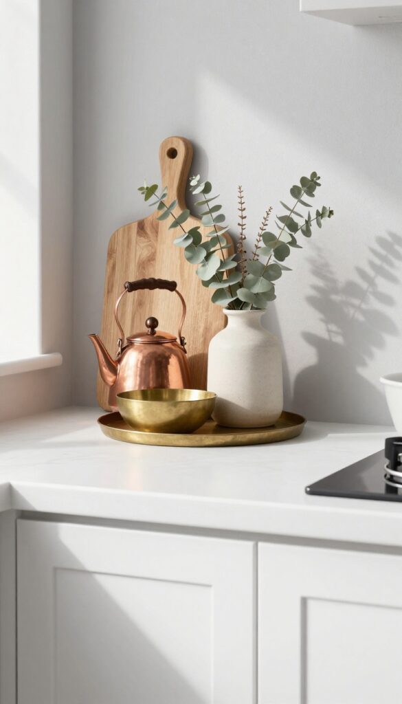
A kitchen filled with neutral tones can feel serene, but sometimes it needs a little spark. That's where copper and brass come in. Placing a warm metallic piece among your everyday dishes and jars adds a subtle glow that makes the whole space feel more intentional and lived-in.
You don't need a full set of copper pots to make this work. Start with one or two pieces—a brass bowl, a copper kettle, or a set of brass candlestick holders. Set them on a small tray or directly on the cabinet top, mixing them with ceramic vases, wooden cutting boards, or woven baskets.
The contrast between matte and shiny surfaces creates depth without clutter. Stick to warm metals (copper, brass, gold) rather than mixing with silver or chrome to keep the look cohesive. This idea works especially well in kitchens with white, cream, or light gray cabinets, where the metallic tones can really pop.
Best Colors To Pair
Copper and brass shine brightest against soft neutrals like warm white, beige, or light taupe. They also look stunning next to deep greens, navy blues, or charcoal for a more dramatic contrast. Avoid pairing them with cool grays or stark whites, which can make the metals feel out of place.
Texture Mix Tip
To keep the look balanced, pair shiny metals with matte or textured items. Think a rough ceramic bowl next to a smooth brass vase, or a linen runner under a copper pot. The mix prevents the area from feeling too glossy or cold.
Small-space Fix
If your above-cabinet space is shallow, choose one standout piece—like a single copper teapot or a brass candlestick—and place it off-center. Group it with a small stack of books or a tiny plant to create a vignette without overcrowding.
10. Open Cane Baskets for Light Texture
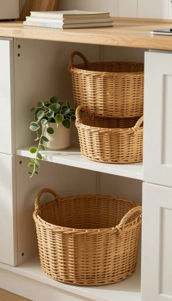
If your kitchen leans warm and lived-in, cane or rattan baskets are a natural fit for that awkward space above the cabinets. Their open weave keeps things airy, so they don't weigh down the room visually. Plus, they're practical: you can stash seldom-used serving dishes or extra linens without creating a cluttered look.
Cane baskets bring a soft, organic texture that contrasts nicely with sleek countertops or modern appliances. The key is choosing baskets with an open weave so light passes through, preventing the top of your cabinets from feeling heavy. Stick to a mix of sizes and shapes for visual interest, and keep the color palette neutral—natural cane, warm brown, or whitewashed rattan.
This idea works especially well in kitchens with white or light-colored cabinets, where the baskets add warmth without overwhelming the space.
Best Colors And Finishes
Stick with natural cane tones—honey, tan, or bleached. Avoid dark stains that can make the area feel top-heavy. If your kitchen has warm wood floors, match the basket undertones to keep the flow cohesive.
Storage Tip
Use these baskets for items you rarely reach for: holiday platters, extra bakeware, or bulk pantry overflow. Line them with a cloth napkin if you want to hide contents completely, but the open weave already does a good job of softening what's inside.
Shelf Styling Tip
Group three baskets of varying sizes together, angling one slightly for a casual feel. Tuck a small trailing plant or a stack of cookbooks next to them to break up the basket cluster and add more texture.
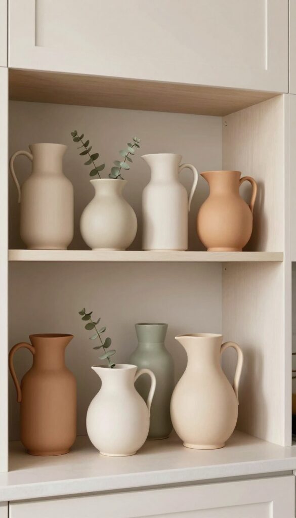
11. A Collection of White Ironstone or Milk Glass
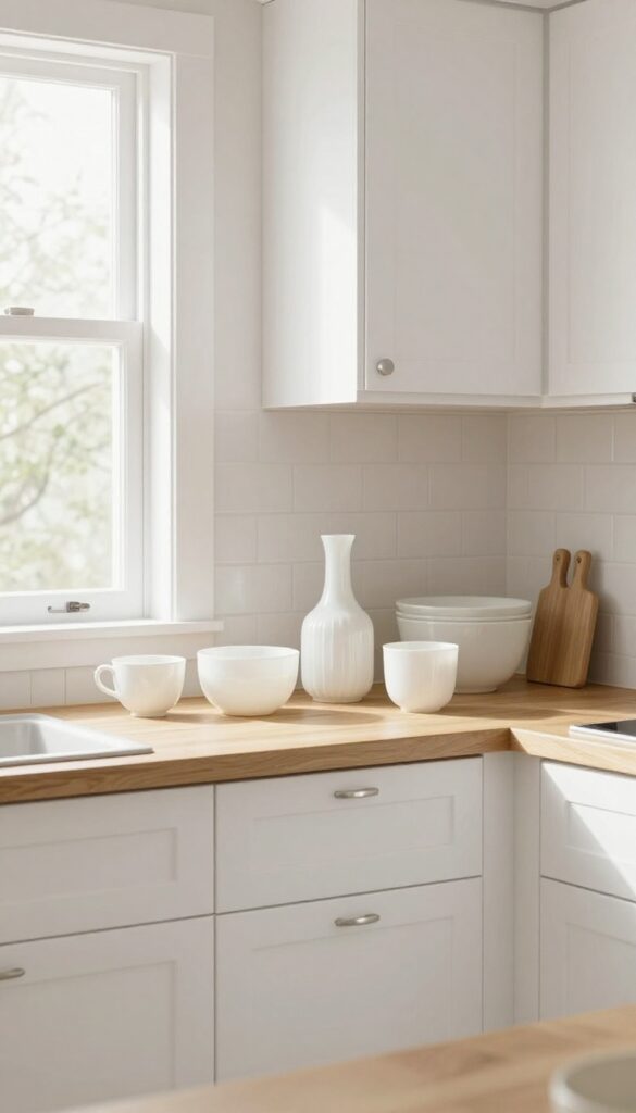
There's a quiet charm to lining up white ironstone or milk glass above your cabinets. The soft, creamy tones catch the light and add a layer of texture without introducing visual clutter. It's a look that feels both intentional and effortless, especially when you group pieces in varying heights and shapes.
The monochrome palette ties everything together, making even a mismatched assortment feel like a curated collection.
White ironstone and milk glass share a warm, vintage quality that suits a lived-in kitchen. They're not stark or cold—instead, they bring a softness that balances harder surfaces like tile and stainless steel. Start with a few pitchers, then add bowls, vases, or even small covered dishes.
The key is to keep the color consistent so the eye reads the grouping as one cohesive display rather than random clutter. This works especially well in kitchens with white or light cabinetry, where the collection pops without feeling heavy. If your cabinets are darker, the white pieces will stand out beautifully, creating a striking contrast.
To keep the look from feeling too precious, mix in a few pieces with subtle imperfections—a tiny chip or a faint crack adds character. Arrange them in clusters of three to five, varying heights by placing smaller items on top of sturdy books or small wooden risers. The goal is a relaxed, collected-over-time feel that looks like you've been gathering these pieces for years.
Best Shapes To Look For
Pitchers and creamers are natural stars because their handles and spouts add visual interest. Bowls and tureens work well for lower layers, while tall vases or candlesticks can break up the horizontal line. Look for pieces with gentle curves, ribbed details, or scalloped edges—they add texture without breaking the monochrome rule.
Where To Source On A Budget
Thrift stores, flea markets, and estate sales are gold mines for affordable ironstone and milk glass. You don't need a complete matching set—mixing different eras and patterns actually adds depth. Online marketplaces like Facebook Marketplace or eBay often have lots sold in bulk, which is a great way to build a collection quickly without spending a lot.
Styling Tip: Layering Heights
To keep the display from looking flat, use small wooden blocks, overturned bowls, or stack of vintage books to elevate some pieces. Place taller items toward the back or center, and let shorter pieces cluster around them. This creates a dynamic silhouette that draws the eye across the whole space above your cabinets.
12. Hanging a Small Wreath or Macrame
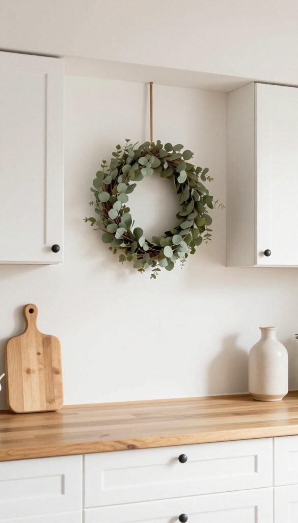
Above-cabinet space often gets treated as a dumping ground for rarely-used appliances or dusty bins. But with a small wreath or macrame piece, you can turn that awkward gap into a charming focal point. The key is choosing something lightweight and visually airy so it doesn't feel heavy or cluttered.
A simple wreath adds a touch of nature, while macrame brings in texture and a soft boho vibe.
Hanging a small wreath or macrame piece above your cabinets draws the eye upward and makes the whole kitchen feel taller and more curated. It's an easy, low-commitment way to add personality without taking up any counter or cabinet space. Plus, you can swap it out seasonally or whenever you want a refresh.
For a warm, lived-in look, stick with natural materials like dried eucalyptus, rattan, or cotton rope. Keep the scale small — something around 12 to 16 inches wide works best so it doesn't overwhelm the area or collect too much dust.
Best Materials For A Natural Feel
Dried flowers, grapevine, or preserved boxwood wreaths bring in organic texture and earthy tones. For macrame, unbleached cotton cord in a simple knot pattern keeps it light and airy. Avoid anything too dense or synthetic, as it can look out of place against warm wood or neutral cabinetry.
Placement And Height Tip
Hang the piece so it sits just below the cabinet top but above eye level — about 2 to 4 inches down from the ceiling or cabinet crown. Use a small command hook or a thin nail hidden behind the wreath. If your cabinets don't go to the ceiling, center the piece in the gap for a balanced look.
Seasonal Swap Idea
Keep a spring wreath of lavender and eucalyptus, then switch to a dried orange slice and cinnamon stick version for fall. For winter, a simple pine cone or evergreen wreath feels cozy. Macrame pieces work year-round and can be dressed up with a small dried flower tucked into the knots.
13. Seasonal Touches Like Mini Pumpkins or Pinecones
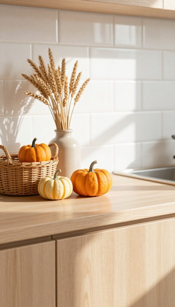
There’s something refreshing about a space that changes with the seasons, and the area above your kitchen cabinets is the perfect spot to play along. Instead of letting that ledge collect dust, turn it into a tiny stage for seasonal finds. Mini pumpkins in autumn, pinecones in winter, or seashells in summer—these little swaps keep the kitchen feeling intentional without a big commitment.
Seasonal decor above cabinets works because it’s low-effort and high-impact. You don’t need to overhaul the whole room—just swap a few objects every few months. The key is to keep the arrangement simple and cohesive so it doesn’t look cluttered.
Stick to a small collection of natural elements, maybe paired with a neutral base like a wooden bowl or a ceramic vase. This approach fits perfectly with a warm, lived-in aesthetic, adding a touch of nature that feels curated, not chaotic.
Best Materials
- Natural textures are your best friend here. Think dried branches, woven baskets, clay pots, or linen ribbons. These materials add warmth and depth without competing with your kitchen’s existing finishes.
- Avoid plastic or overly shiny items—they can look cheap and out of place. Instead, opt for real or high-quality faux botanicals that mimic nature’s imperfections.
Color Flow
- Seasonal decor should echo the colors already in your kitchen. If your cabinets are white or light wood, go for muted autumn oranges, soft greens, or sandy beiges. For darker kitchens, brighter pops like lemon yellow or deep burgundy can add contrast.
- The goal is to complement, not clash. A simple rule: stick to two or three colors per season and repeat them in small doses.
Small-space Fix
- Even if your above-cabinet gap is narrow, you can still make seasonal swaps work. Use slim, low-profile items like a line of small pumpkins or a single garland of pinecones. Avoid bulky pieces that overwhelm the space.
- A row of tiny terra-cotta pots with seasonal greenery (like rosemary in winter or basil in summer) adds life without taking up much room.
FAQ
Is it safe to put things above kitchen cabinets?
Yes, as long as you avoid heavy or flammable items near the stove. Stick to lightweight decor and secure anything that could tip.
How do I clean above kitchen cabinets with decor?
Dust regularly with a microfiber duster or a vacuum attachment. Rotate items occasionally to clean underneath.
What if my cabinets don't go all the way to the ceiling?
That's the perfect spot for decor! Use the space to display items that draw the eye up and make the kitchen feel taller.
Should I decorate above cabinets in a rental?
Absolutely. Use removable adhesive hooks or lean items instead of drilling. Stick to lightweight, renter-friendly pieces.
How do I keep the look from feeling cluttered?
Edit ruthlessly. Stick to one or two colors, vary heights, and leave some empty space. A little breathing room makes everything look intentional.
Conclusion
Decorating above your kitchen cabinets doesn't have to be complicated. With a few thoughtful pieces, you can turn that forgotten ledge into a warm, personal display that makes your kitchen feel complete.
Start small, edit often, and let your space evolve naturally.