13 Canister Ideas That Make Kitchen Shelves Look Effortlessly Organized
Open shelving in the kitchen looks great, but keeping it tidy takes a little thought. Canisters are one of the easiest ways to add both function and style—they hold your everyday staples while creating a clean, cohesive look. The trick is choosing the right shapes, materials, and arrangements so your shelves feel curated, not cluttered.
Modern kitchen design leans into simplicity and purpose. That means clear lines, neutral tones, and items that earn their spot. Canisters fit right in, whether you prefer sleek metal, warm wood, or minimalist ceramic.
They bring texture and rhythm to your shelves without overwhelming the space. Ready to give your kitchen shelves a refresh?
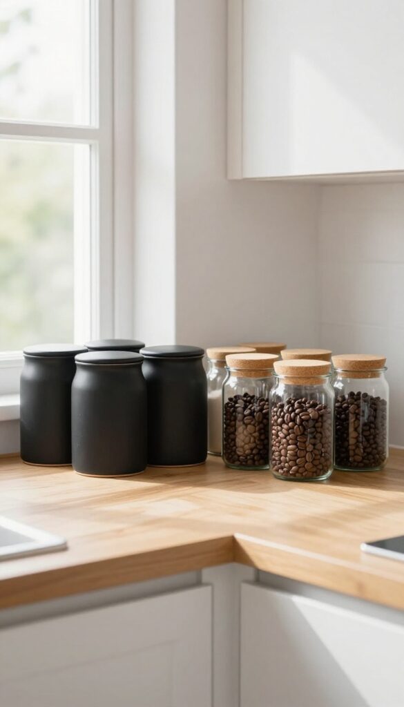
1. Stick to a Monochrome Palette for Instant Calm
Open kitchen shelves can easily turn into a cluttered mess if you're not careful with what you put on them. One of the simplest ways to keep things looking tidy and intentional is to commit to a single color for your canisters. When every jar, tin, or container shares the same hue, your eye glides over the shelf without getting stuck on mismatched labels or busy patterns.
The result is a clean, almost spa-like atmosphere that makes your kitchen feel more spacious and organized.
A monochrome palette works because it reduces visual noise. Instead of competing colors, your shelves become a calm backdrop for the real stars: the ingredients inside. Matte white canisters feel airy and fresh, soft gray adds a touch of sophistication, and black brings drama and contrast against lighter walls.
The key is to choose one finish—matte, glossy, or textured—and stick with it across all your containers. This uniformity creates a cohesive look that feels curated, not chaotic. Plus, it makes it easier to swap out contents without worrying about clashing colors.
For the best effect, pair your monochrome canisters with simple, clear labels (or no labels at all) and group them together on a single shelf or in a dedicated section of your shelving. The visual weight of the same color repeated in a row is incredibly satisfying and instantly makes your kitchen look more put-together.
Best Colors To Start With
- White is the most forgiving and brightens up any shelf, especially in smaller kitchens. Soft gray offers a neutral that feels warmer than white but still understated. For a bold statement, go with black canisters—they work beautifully on white or light wood shelves and create a striking, modern contrast.
- You can also try muted earth tones like beige or taupe for a softer, organic feel that still stays within the monochrome family.
Shelf Styling Tip
Place your monochrome canisters in a neat row or a tight cluster, leaving a few inches of breathing room between them. Add one or two natural elements like a wooden cutting board or a small plant to break up the uniformity without adding color. This keeps the shelf from feeling too sterile while maintaining that calm, cohesive vibe.
Finishing Touch
Choose canisters with matching lids—whether they're bamboo, stainless steel, or the same color as the body. Consistent lid style reinforces the monochrome look and makes the shelf feel like a single, intentional design element rather than a random collection of jars.
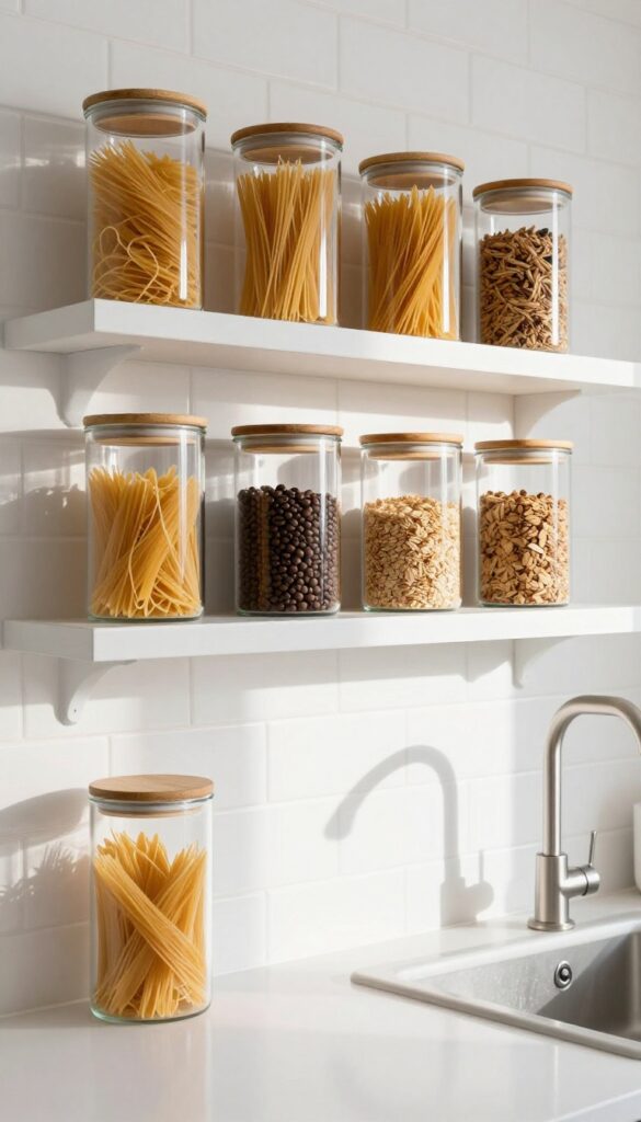
2. Mix Glass and Metal for an Industrial Touch
Clear glass canisters with brushed brass or stainless steel lids bring a sleek, modern vibe to open shelving. The transparency shows off your ingredients—pasta, flour, coffee beans—while the metal adds a subtle industrial edge. Grouping them in odd numbers creates a balanced, curated look that feels intentional, not cluttered.
This look works best when you choose canisters in a uniform shape but vary the sizes slightly. The repetition of glass and metal creates rhythm, while the different heights add visual interest. Place them on a shelf with enough breathing room—don't crowd them.
A shelf that's too packed loses the clean, airy feel that makes this style so appealing.
Best Materials To Look For
Stick with thick, clear glass—thin glass can feel cheap and chips easily. For lids, brushed brass offers a warm contrast against cool stainless steel appliances, while stainless steel keeps things more minimalist. Avoid plastic lids; they yellow over time and ruin the clean look.
Shelf Styling Tip
Arrange canisters in a line from tallest to shortest, or cluster three together on one side of the shelf. Leave the other side open for a small plant or a stack of cookbooks. This asymmetry keeps the display dynamic without feeling messy.
Where It Works Best
This combo shines on open kitchen shelves near a window where natural light can hit the glass. It also works well on a floating shelf in a pantry or above a coffee station. Avoid placing them in direct sunlight for long periods—some ingredients like spices or oils can degrade.
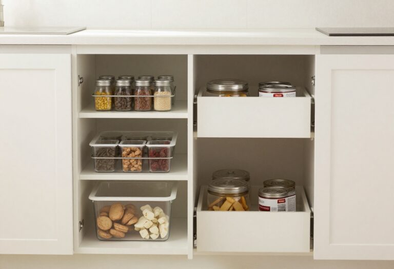
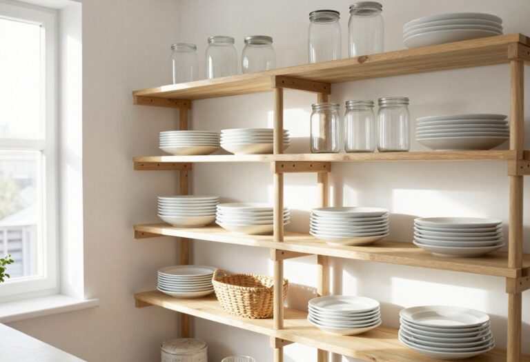
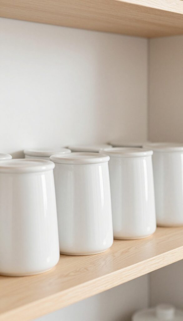
3. Use Uniform Canisters for a Streamlined Look
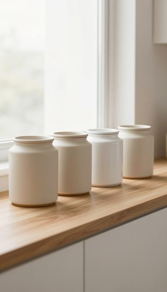
There's a reason matching canisters are a staple in modern kitchens: they turn a row of everyday staples into a single, calm display. When every container shares the same size, shape, and material, the shelf reads as one cohesive unit rather than a collection of random jars. This approach is especially effective in small kitchens where visual noise can make the space feel cramped.
Plus, the repetition creates a rhythm that feels intentional and curated, not cluttered.
Uniform canisters work best on open shelves where you can see them all at once. The key is to choose a style that complements your kitchen's finish—think matte ceramic for a soft touch, clear glass for an airy feel, or brushed metal for an industrial edge. Keep the labels simple: a small chalkboard sticker or a handwritten tag keeps things personal without breaking the visual flow.
This setup isn't just about looks; it also makes grabbing flour or sugar a no-brain motion. And because everything matches, you can swap contents seasonally without disrupting the overall aesthetic.
Best Materials For A Clean Look
Matte ceramic and frosted glass are top contenders because they hide fingerprints and soften light. If you prefer a warmer vibe, ribbed glass or matte stoneware adds gentle texture without breaking the uniformity. Avoid high-gloss finishes in busy patterns—they can compete with the clean line you're aiming for.
Labeling That Adds, Not Distracts
- Chalkboard labels or simple white adhesive tags keep the look minimal. Place the label in the same spot on every jar—centered or top-left—so the eye glides across the row. For a modern twist, use a label maker with a clean sans-serif font.
- Just make sure the labels are easy to remove when you change contents.
Shelf Styling Tip
Line the canisters up in a straight row, leaving a few inches of breathing room between each. If your shelf is deep, stagger them slightly for dimension, but keep the front edges aligned. Add a single trailing plant or a small wooden cutting board at one end to soften the geometry without breaking the streamlined effect.
4. Layer Canisters with Wooden Accents for Warmth
Ceramic or glass canisters on open shelves can feel a bit stark if they’re left on their own. Adding a wooden cutting board or a small tray underneath instantly changes the look. The natural grain of the wood breaks up the uniformity and brings in warmth without cluttering the shelf.
This trick works especially well in kitchens with white or neutral cabinets, where a touch of wood keeps the space from feeling too clinical.
Start by choosing canisters in a consistent material and shape—think matte ceramic jars with bamboo lids or clear glass with metal tops. Place them on a rectangular wooden board that’s slightly longer than the canister grouping. The board acts as a visual anchor, creating a mini-landing zone that feels intentional.
For the best effect, stick to a neutral palette: beige, cream, and light oak. Avoid high-contrast colors that might compete with the wood’s natural tone. This setup works on floating shelves, baker’s racks, or even on a countertop if shelf space is limited.
Best Materials To Mix
Pair smooth ceramic or ribbed glass canisters with a solid wood board in oak, acacia, or bamboo. The contrast between the glossy or matte finish of the canisters and the matte, textured wood creates visual interest. Avoid mixing too many wood tones—stick to one or two similar shades so the look stays cohesive.
Shelf Styling Tip
Group three canisters of varying heights on the board, with the tallest at the back or center. Leave a few inches of board visible on each side to frame the arrangement. If the shelf feels bare, add a small wooden scoop or a sprig of dried eucalyptus next to the canisters for a soft, organic touch.
5. Go Tall and Slim for Narrow Shelves
When shelf depth is limited, standard canisters often stick out too far or look awkwardly squat. Tall, slim containers solve this by drawing the eye upward, making the most of vertical real estate without crowding the counter. They create a streamlined silhouette that feels intentional and modern, especially when lined up in a neat row.
This approach works beautifully on narrow shelves above a sink or beside a range hood, where every inch counts.
Tall canisters are a smart solution for tight spaces because they use height instead of depth. Their slender profile keeps them from protruding into walkways or blocking other items on the shelf. For a cohesive look, choose canisters with similar heights but varying widths—like a set of graduated cylinders.
This creates rhythm without monotony. Clear glass versions let you see contents at a glance, while matte ceramic or metal options add texture. Arrange them in a single row, spaced evenly, and top with matching lids for a polished finish.
The visual effect is clean, orderly, and surprisingly spacious.
Best Materials For A Modern Feel
- For a modern kitchen, opt for materials that feel sleek and substantial. Brushed stainless steel or matte black metal canisters have a cool, industrial edge that pairs well with concrete or quartz countertops. Frosted glass with bamboo lids softens the look while keeping it contemporary.
- Avoid overly ornate patterns or glossy finishes that can feel busy on narrow shelves. Stick to one material family—all metal or all glass—to maintain a unified appearance.
Shelf Styling Tip
- To keep the arrangement from feeling too rigid, add a small plant or a slim cookbook at one end of the row. This breaks the line of canisters without disrupting the vertical flow. Alternatively, place a single trailing vine in a narrow pot between two canisters for a touch of softness.
- The key is to keep accessories minimal and proportional to the shelf depth.
Where This Works Best
This idea shines on shelves that are 4 to 6 inches deep—too shallow for standard canisters but perfect for tall, narrow ones. Try it on a shelf above a kitchen window, on a floating shelf beside the stove, or on a narrow ledge in a pantry. It also works well in a bathroom for storing cotton swabs or bath salts, maintaining the same clean, vertical look.
6. Cluster Canisters by Function on One Shelf
Grouping canisters by purpose turns a simple shelf into a smart command center. When baking essentials like flour, sugar, and baking soda sit together on one shelf, and coffee and tea supplies claim another, you create a visual rhythm that feels both intentional and effortless. This isn't just about looking neat—it's about making your kitchen work for you.
You'll always know exactly where to reach, and the clean lines of matching canisters add a sense of order that makes the whole room feel calmer.
Dedicating one shelf to baking essentials and another to coffee and tea items creates a functional grouping that makes sense visually and practically. This approach keeps your countertops clutter-free and your workflow smooth. Use matching canisters for each group to reinforce the visual separation—clear glass for coffee beans and tea bags, ceramic or stainless steel for flour and sugar.
The result is a kitchen that feels organized without looking sterile.
Best Containers For Each Group
- For baking essentials, choose airtight canisters with wide mouths so you can scoop easily. Ceramic or matte black containers look modern and hide messes. For coffee and tea, clear glass jars with cork lids let you see the contents at a glance and add a warm, earthy texture.
- Keep the shapes consistent within each group—round jars for baking, square for coffee—to strengthen the visual distinction.
Shelf Layout Tip
- Place the most-used canisters at the front of the shelf and less-frequent items behind them. On the baking shelf, put flour and sugar front and center, with baking soda and powder behind. On the coffee shelf, lead with your everyday coffee beans, then tuck tea bags and specialty blends behind.
- This small adjustment saves time and keeps the shelf looking full but not crowded.
Finishing Touch
Add a small tray or wooden riser under the coffee group to elevate it slightly. This creates a subtle visual break between the two zones and adds a layer of texture. A tiny plant or a salt cellar on the same shelf can anchor the arrangement, but keep it minimal—the goal is clarity, not clutter.
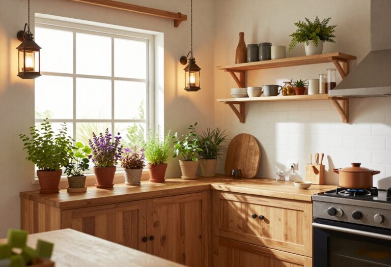
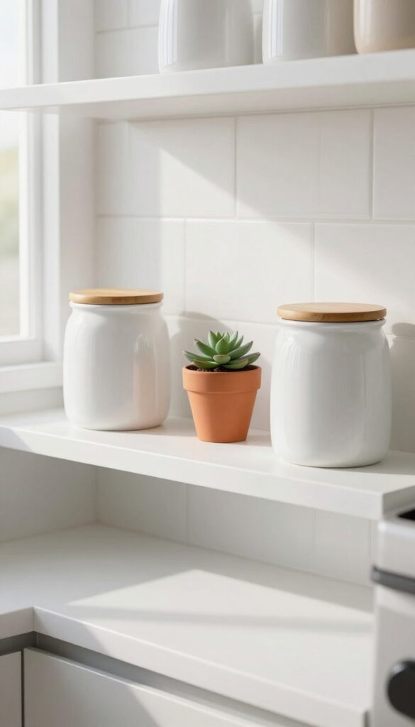
7. Add a Touch of Greenery Beside Your Canisters
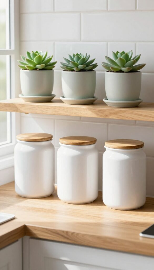
A row of canisters looks tidy, but it can also feel a little flat. Dropping a small plant next to them changes the whole energy. The green softens the hard edges of the containers and adds a natural, living element that makes the shelf feel curated rather than just organized.
It’s an easy way to bring warmth into a clean, modern kitchen without cluttering the space.
Pick a low-maintenance plant that thrives on neglect—succulents, small ivy, or even a tiny snake plant work perfectly. Place it on a shallow saucer or in a simple ceramic pot that echoes the finish of your canisters. The contrast between the matte green leaves and the glossy or matte canisters creates visual interest.
Keep the plant trimmed so it doesn’t overwhelm the canisters; the goal is a balanced composition where each piece has room to breathe. This works especially well on open shelves near a window or under cabinet lighting that highlights the foliage.
Best Plant Choices
- Stick with plants that don’t need constant watering or bright direct light. Succulents like echeveria or haworthia stay compact and come in soft greens that blend with neutral kitchens. Small ivy varieties trail gently over the edge of the shelf, adding movement without taking up horizontal space.
- Avoid anything that grows tall or wide quickly—you want the plant to remain a subtle accent, not a takeover.
Pot And Saucer Pairing
- Choose a pot that complements your canister set without matching exactly. If your canisters are white ceramic, a matte terracotta pot or a pale sage planter adds a soft color contrast. Always use a saucer to catch water and protect the shelf.
- For a cleaner look, place the pot on a small wooden coaster or a stone trivet that ties into the shelf’s overall material palette.
Placement And Lighting Tip
- Set the plant on the end of the shelf or between two canisters for a balanced asymmetry. Make sure it gets indirect light—south- or east-facing windows are ideal. If your shelf lacks natural light, a small grow light bulb in a nearby fixture can keep the plant happy without adding clutter.
- The light also casts a soft shadow that makes the canisters pop.
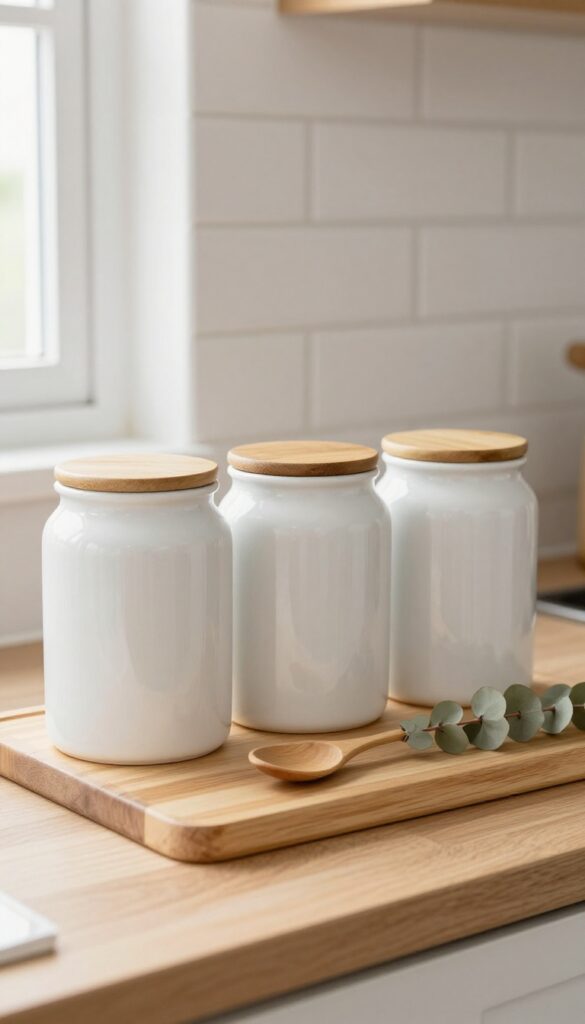
8. Use Canisters with Wooden Lids for a Natural Vibe
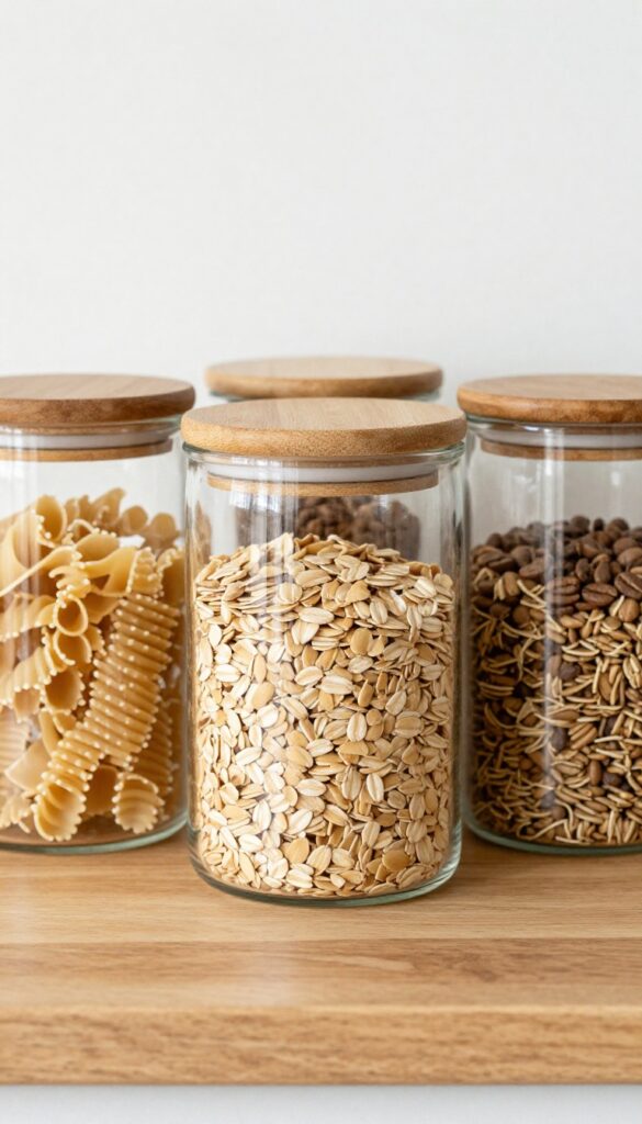
Glass jars with bamboo or acacia wood lids bring a warm, organic feel to your kitchen shelves. The clear glass lets you see the contents at a glance, while the natural wood grain adds texture and earthiness. This combination works especially well in kitchens with wooden countertops or open shelving, where the contrast between sleek glass and raw wood creates a simple yet striking focal point.
Wooden lids soften the industrial look of plain glass canisters, making them feel more like decor than storage. They fit right into modern farmhouse, Scandinavian, or minimalist kitchens. The warmth of the wood balances cool tones in the room, like stainless steel appliances or white cabinetry.
To keep the look cohesive, choose lids in the same wood finish as your cutting boards or shelving.
Best Materials
Bamboo is lightweight and affordable, while acacia offers a richer grain and darker hue. Both are durable and resist moisture when sealed properly. Avoid unfinished wood near the stovetop, as steam can warp the lids over time.
Shelf Styling Tip
Group canisters of varying heights on a shelf to create visual rhythm. Fill them with dry goods like pasta, oats, or coffee beans in complementary colors. Leave a little space between each jar so the wood lids stand out against the wall.
Finishing Touch
Add a small label tag tied with twine to each lid for a rustic touch. Use a consistent font style to keep the display neat. This small detail ties the natural vibe together without overwhelming the clean look.
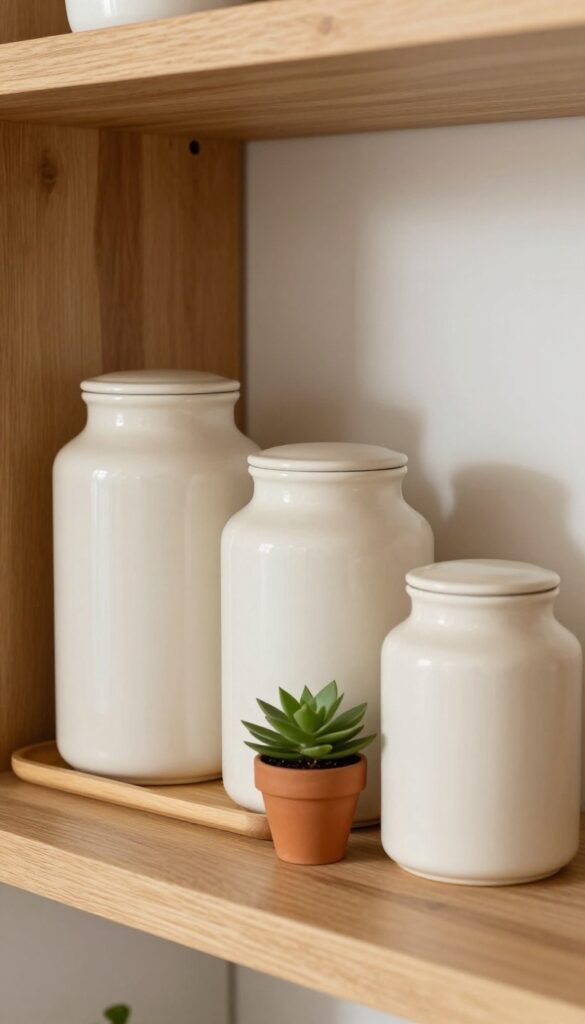
9. Create a Symmetrical Display with Matching Sets
There’s something quietly satisfying about a shelf that feels perfectly balanced. When you place two identical canisters on either end of a shelf, with a smaller object in the middle, the whole arrangement instantly looks intentional. Symmetry brings a sense of calm and order to a kitchen—especially when the rest of the space might feel busy.
This trick works beautifully on open shelving, above a coffee station, or even on a floating shelf in a breakfast nook. It’s a low-effort way to make your canisters feel like part of a curated vignette, not just storage.
Matching canisters do the heavy lifting here. Choose a set that shares the same shape, material, and finish—think ceramic with a matte glaze, glass with bamboo lids, or sleek metal with a brushed texture. Place one on the left end of the shelf and one on the right.
In the center, add a smaller item that contrasts in height or material: a tiny succulent in a terracotta pot, a small wooden spice jar, or a single candle. The centerpiece should be noticeably smaller than the canisters so the symmetry remains the star. This layout works best on shelves that are at least 24 inches wide, giving each canister breathing room.
For a cleaner look, keep the canisters’ contents simple—flour, sugar, or coffee beans—and label them if the containers are opaque. The overall effect is polished without feeling stiff, and it’s easy to swap out the centerpiece seasonally.
Best Materials For The Look
- Stick to materials that feel cohesive with your kitchen’s existing palette. White ceramic with a matte finish is a classic choice that works in modern, farmhouse, or transitional kitchens. If your kitchen leans industrial, try matte black metal canisters with a brushed texture.
- Glass canisters with bamboo lids add warmth and let you see the contents, which is handy for baking staples. Avoid mixing too many materials in one display—stick to two at most for a clean, uncluttered feel.
Shelf Styling Tip
- Keep the rest of the shelf minimal so the symmetry stands out. If the shelf is part of a larger open shelving unit, let the symmetrical canister set be the focal point on one shelf, and balance it with a different arrangement on the shelf below. For example, a row of cookbooks on the lower shelf creates a nice visual anchor.
- Also, make sure the canisters are at eye level or slightly above—this draws the eye naturally and makes the symmetry feel intentional.
Finishing Touch
- Add a small touch of greenery or a natural element to soften the symmetry. A tiny potted herb, a single dried eucalyptus stem in a small vase, or a wooden spoon rest in the center can break up the hard lines without disrupting the balance. Just keep the centerpiece low and compact so it doesn’t compete with the canisters.
- This tiny detail makes the arrangement feel lived-in and approachable.
10. Incorporate Canisters with Built-In Scoops
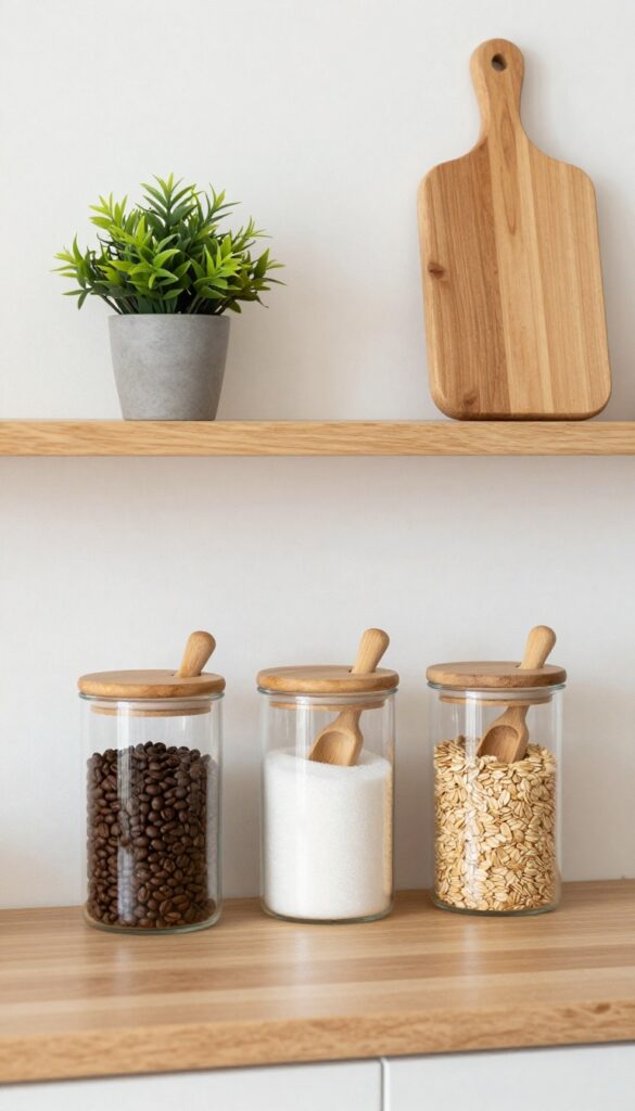
Some kitchen tools just make sense, and canisters with attached scoops are one of them. They keep your coffee, sugar, or oatmeal within easy reach while adding a tidy, intentional look to open shelves. The scoop becomes part of the design, not an afterthought.
Canisters with built-in scoops are a smart way to blend function and style. The scoop clips onto the lid or sits inside a groove, so it's always handy but never cluttering your counter. This works especially well for frequently used ingredients like coffee beans, granulated sugar, or rolled oats.
On open shelves, these canisters create a uniform, organized look—each jar has its own tool, so nothing gets lost. The visual rhythm of matching jars with matching scoops feels modern and clean, especially when you stick to a single material like clear glass or matte ceramic. For a cohesive display, choose scoops in a consistent finish—brass, stainless steel, or wood—that ties into your hardware or other accents.
Best Materials For The Look
- Clear glass canisters let you see the contents, which is both practical and visually appealing. Pair them with bamboo or stainless steel scoops for a natural or industrial touch. If you prefer a more uniform look, go with matte white ceramic jars and matching ceramic scoops—this creates a seamless, minimalist vibe.
- The key is to pick a material that complements your shelf's overall palette.
Shelf Styling Tip
- Arrange the canisters in a row on a lower shelf so they're easy to grab. Add a small plant or a wooden cutting board on the shelf above to break up the repetition. Keep the scoops facing the same direction for a neat, linear look.
- This small detail makes the display feel curated rather than cluttered.
Finishing Touch
Label each canister with a simple tag or a bit of chalkboard paint on the lid. This adds a personalized touch and helps everyone in the household find what they need. Plus, it reinforces the clean, organized aesthetic you're going for.
11. Play with Heights for Visual Rhythm
Grouping canisters of matching material but varying heights creates a rhythm that feels both intentional and alive. The staggered silhouette breaks up the monotony of a flat shelf line, drawing the eye across the display in a natural, pleasing way. This trick works especially well on open shelving or a kitchen island where you want a curated but not overly styled look.
Start by placing the tallest canister at the back or one end of the shelf, then step down in size as you move across. This creates a gentle slope or a zigzag pattern that adds depth and movement. Just make sure the tallest ones don’t block the view of smaller items behind them—angle them slightly or leave a gap.
The result is a display that feels dynamic without being chaotic, perfect for modern kitchens where clean lines meet lived-in warmth.
Best Materials
Stick to one material for the canisters to keep the look cohesive despite the height differences. Matte ceramic, brushed stainless steel, or frosted glass all work beautifully. The uniform finish lets the varying heights be the star, while the material adds a subtle texture contrast against your shelves.
Layout Tip
For a balanced composition, arrange canisters in odd numbers—three or five work best. Place the tallest in the center or at one end, then alternate heights outward. Leave a few inches between each canister so they breathe, and consider tucking a small plant or a wooden spoon holder at the lower end to anchor the arrangement.
Finishing Touch
Add a low, shallow tray underneath the tallest canister to catch any stray coffee grounds or tea dust. It also visually grounds the tall piece, making the height difference feel intentional rather than accidental. A slim wooden or marble tray in a neutral tone keeps the look clean and modern.
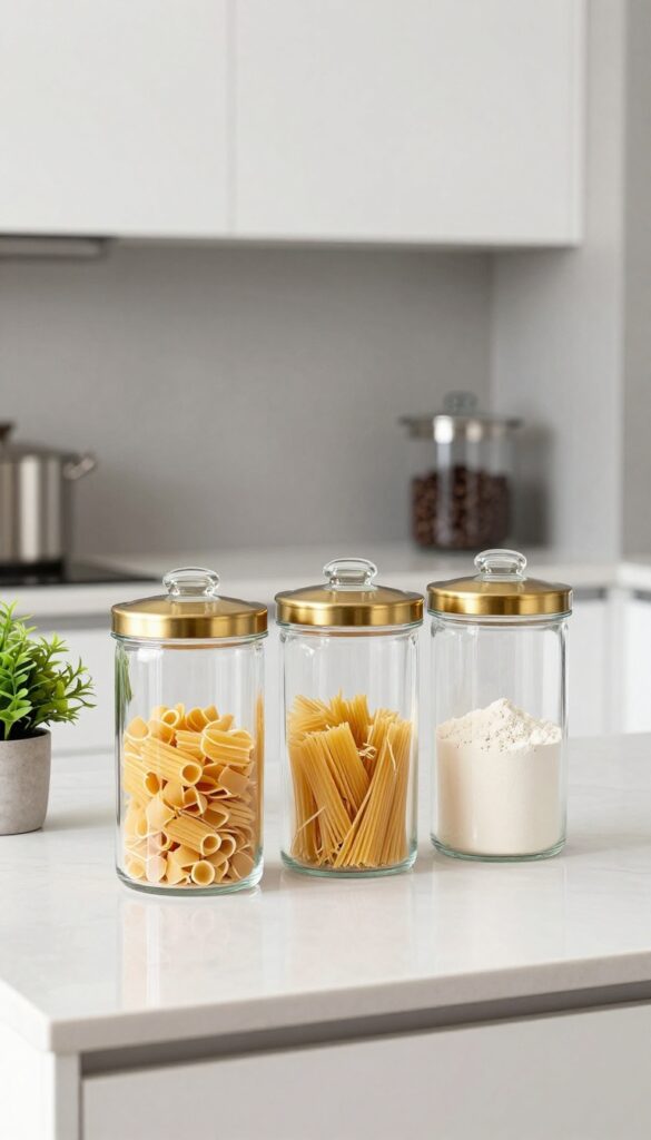
12. Use Clear Canisters with Colorful Contents
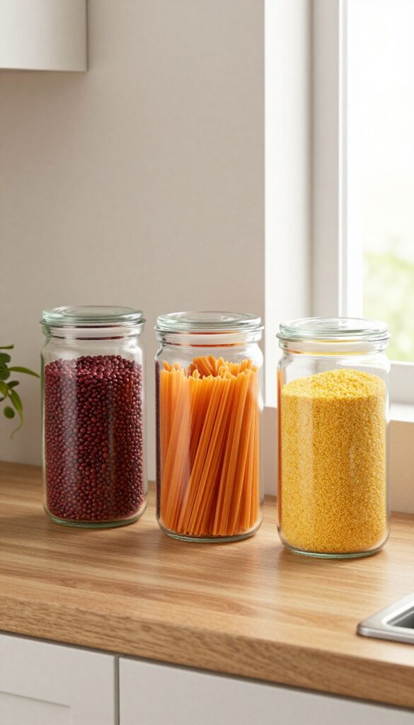
Glass canisters aren't just for hiding dry goods. When you fill them with vibrantly colored ingredients, they become a display in their own right. The transparent walls turn everyday staples into a visual feature, adding both function and personality to your shelves.
The key is restraint—choose a focused color story so the display feels intentional, not chaotic.
Fill glass canisters with brightly colored pasta, lentils, or candy. The natural hues become part of the decor. This works best when you stick to a limited color palette—like red and orange, or green and yellow—to avoid a chaotic look.
The result is a clean, modern display that feels curated and lively at the same time.
Best Color Palettes
For a modern look, pair warm tones like red lentils and orange pasta together. If you prefer a cooler vibe, go with green split peas and yellow cornmeal. Avoid mixing more than two or three colors on one shelf to keep the arrangement visually calm.
Container Choice
Opt for clear glass canisters with airtight lids—they keep contents fresh while showing off the colors. Uniform shapes (like all cylinders) create a neat, cohesive line, while mixing a few different heights adds subtle rhythm without breaking the clean aesthetic.
Shelf Styling Tip
Place the canisters on a wooden or marble shelf to ground the bright colors with a neutral backdrop. Leave a little breathing room between each jar so the colors don't blur together. A small trailing plant or a single ceramic object can break up the row without distracting.
13. Label Canisters with Modern Typography
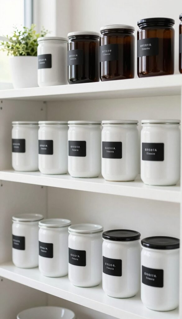
Typography can transform a simple row of canisters into a deliberate design statement. Clean sans-serif labels bring a crisp, contemporary feel that cuts through kitchen clutter without adding visual noise. Whether you use a label maker, vinyl cutter, or handwritten tags, the key is consistency in font size and placement.
This small detail makes your shelves look curated rather than chaotic, and it helps everyone in the household grab the right ingredient without guessing.
Modern typography turns everyday storage into a visual system that feels both intentional and effortless. By choosing a single font and sticking to a uniform label size, you create a rhythm that the eye follows naturally. The contrast between a matte black label on a white canister or a white label on a dark glass jar adds depth without overwhelming the shelf.
This approach works especially well on open shelving where every detail is on display. The labels do more than identify contents—they anchor the whole composition, making the shelf feel complete.
Best Materials
- Adhesive vinyl labels offer a clean, professional look that withstands kitchen moisture. For a softer touch, try chalk labels on matte glass or ceramic canisters. Avoid glossy labels on glossy containers—the glare makes them hard to read.
- Stick to opaque or frosted backgrounds for the best contrast.
Layout Tip
Align all labels at the same height, about two-thirds of the way down the canister. This creates a strong horizontal line that ties the group together. If your canisters vary in size, use the same label height on the tallest jar and scale down proportionally on smaller ones.
Finishing Touch
Add a subtle drop shadow or a thin border to the label design for extra definition. This tiny detail makes the typography pop without feeling busy. Keep the font weight medium—not too thin to disappear, not too bold to dominate.
FAQ
What type of canisters work best for open kitchen shelves?
Glass canisters with airtight lids are a top choice because they show contents clearly and keep food fresh. For a modern look, opt for uniform shapes and neutral colors like white, clear, or matte black.
How do I keep canisters from looking cluttered on shelves?
Stick to a consistent color palette and limit the number of canisters per shelf to three or five. Use trays or risers to group them, and leave some empty space around each item for breathing room.
Can I mix different canister styles on the same shelf?
Yes, but keep a unifying element like color, material, or shape. For example, mix glass and ceramic canisters if they’re all white. Too many different styles can feel chaotic.
Should I label my canisters?
Labels add a clean, organized look and are helpful for family members. Use a consistent labeling system—like chalkboard stickers or a label maker—to keep it cohesive.
How do I arrange canisters on a narrow shelf?
Choose tall, slim canisters and line them up in a single row. Avoid bulky shapes that take up too much depth. Grouping them by height also helps maintain a tidy appearance.
Conclusion
Bringing canisters into your kitchen shelf styling is one of those small changes that makes a big visual impact. Whether you lean toward monochrome minimalism or warm natural textures, there’s a combination that will make your shelves feel both organized and inviting.
The key is to choose pieces you love and arrange them with intention—leaving a little breathing room so each canister stands out. Remember, your kitchen shelves should reflect your daily habits and personal style.