13 Kitchen Counter and Backsplash Ideas That Feel Cozy and Layered
Your kitchen counter and backsplash work together more than you might think. They set the tone for the whole room, and when they match well, everything just clicks.
But matching doesn't mean identical—it means finding a balance that feels intentional and warm. Whether you're remodeling or just refreshing, these 13 ideas lean into cozy, layered textures and colors that make your kitchen feel inviting.
Think soft contrasts, natural materials, and finishes that age beautifully. Ready to find your perfect pair?
1. Butcher Block Counter with Subway Tile Backsplash
Warm wood counters paired with classic white subway tile create a timeless, cozy kitchen. The wood adds natural grain and warmth, while the tile keeps it light and clean. Add open shelving and brass hardware for extra charm.
The combination of butcher block and subway tile is a go-to for kitchens that feel both inviting and practical. Butcher block brings a soft, organic texture that balances the crisp lines of the tile. It’s a look that works in modern farmhouses, mid-century homes, and even urban apartments.
The key is letting the wood be the star—choose a warm oak or walnut finish, and keep the tile layout simple with a classic brick pattern. This pairing is especially effective in galley kitchens or L-shaped layouts where the counter becomes a natural focal point. To keep the space from feeling too rustic, add modern touches like sleek brass faucets and matte black hardware.
The result is a kitchen that feels layered but not cluttered, with a cozy, lived-in vibe that invites you to linger.
Best Colors
- Stick with warm neutrals to let the wood and tile shine. White subway tile is the obvious choice, but consider a warm off-white or soft cream for a cozier feel. For the butcher block, honey oak or walnut adds richness without being too dark.
- If you want a pop of color, try a sage green or navy blue on the lower cabinets—it pairs beautifully with the wood tones.
Texture Mix
- The contrast between smooth tile and grainy wood is what makes this combo special. Add a third texture with a brushed brass or matte black faucet. For the backsplash, consider a handcrafted subway tile with slight irregularities for extra depth.
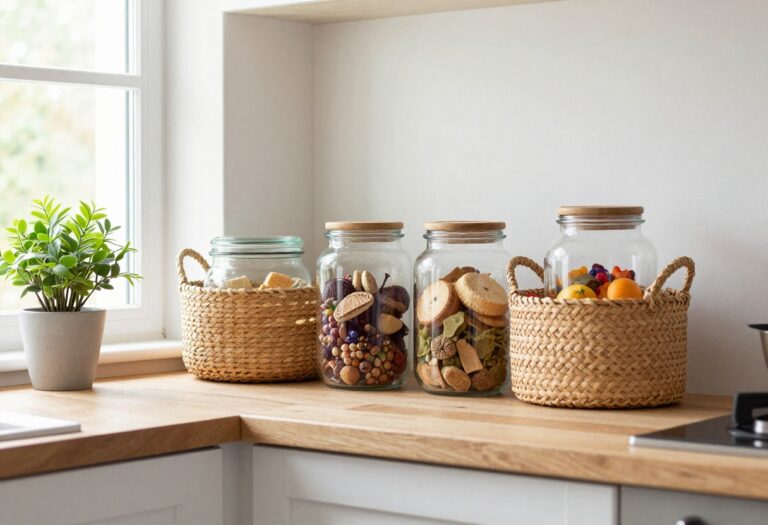
- Open shelving in the same wood as the counter ties the look together.
Finishing Touch
- Don’t forget the hardware. Brass or copper knobs and pulls warm up the white tile and echo the wood’s golden undertones. A simple wooden cutting board propped against the backsplash reinforces the material story.
- For lighting, go with a pendant in a soft metal finish to complete the cozy, layered feel.
2. Dark Soapstone Counter with Handmade Zellige Tile
There’s something quietly magnetic about pairing a deep, matte soapstone countertop with glossy, irregular zellige tile. The dark stone anchors the whole kitchen, giving it weight and a sense of permanence, while the handcrafted tile adds a layer of texture and light play that keeps the space from feeling too heavy. The result is a kitchen that feels both grounded and full of character—like it was pieced together over time with intention.
Soapstone is naturally soft to the touch and develops a beautiful patina as it ages, making it a favorite for those who want a countertop that feels lived-in from day one. Its dark, almost charcoal hue creates a dramatic backdrop that makes lighter elements—like the zellige tile—pop. The tile itself is handmade in Morocco, so each piece has slight variations in color, size, and glossiness.
When installed, the subtle shifts in tone and the small, irregular edges catch the light differently, creating a surface that feels alive and ever-changing. This combination works especially well in kitchens where you want a balance between rustic and refined. The soapstone brings a quiet, earthy elegance, and the zellige adds just enough sparkle and artisanal flair without going overboard.
It’s a pairing that feels collected, not decorated.
Best Colors And Finishes
- Stick with a soapstone in the darkest charcoal or nearly black range—veining is fine but keep it subtle. For the zellige, choose a tile with warm undertones like creamy white, soft terracotta, or pale sage. The contrast between the matte stone and the glossy, slightly uneven tile is what makes this combo work.
- Avoid high-gloss soapstone or overly uniform tile, as that kills the handcrafted vibe.
Texture And Light Play
- The magic here is in the tactile contrast. Soapstone feels smooth and almost silky, while zellige has a slight rippled surface and tiny pits. When light hits the backsplash, the glossy spots reflect and the matte areas absorb, creating a subtle shimmer.
- For the best effect, install under-cabinet lighting that washes the tile from above—this emphasizes the irregularities and makes the wall feel dimensional.
Styling And Finishing Touches
- Keep the rest of the kitchen simple to let the counter and backsplash shine. Use open shelving in warm wood tones to echo the handmade feel, and add a few ceramic pieces or a wooden cutting board on the counter. A matte black faucet and brushed brass hardware can tie the dark stone and the warm tile together.
- Avoid busy patterns or bold colors elsewhere—this duo is already a statement.
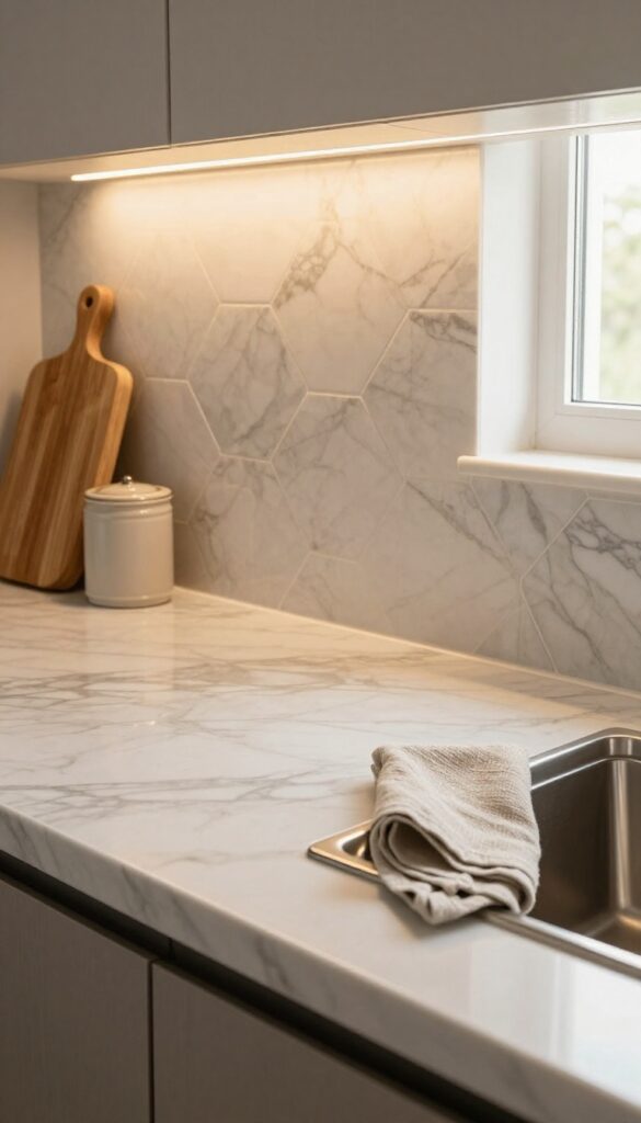
3. Warm White Marble Counter with Herringbone Pattern Tile
There’s something quietly stunning about pairing a classic marble countertop with a backsplash that has a little rhythm. This combo uses Carrara marble with soft gray veining—nothing too dramatic, just gentle streaks that keep the surface feeling light and airy. Against it, a herringbone-laid ceramic tile in a warm off-white adds texture and movement without competing for attention.
The result is a kitchen that feels polished but not precious, elegant but still welcoming. It’s the kind of look that works in both old houses and new builds, and it doesn’t scream for attention—it just feels right.
The magic here is in the balance. The marble brings a cool, smooth sophistication, while the herringbone pattern introduces a handmade, tactile quality. The warm off-white tile (think creamy, not stark) softens the marble’s formality and ties the whole scheme together.
This pairing is particularly effective in kitchens with natural light, where the subtle veining and tile pattern catch the sun in different ways throughout the day. It’s a timeless foundation that lets you layer in warmer elements—brass fixtures, wooden stools, woven textures—without the space feeling busy.
Best Colors
- Stick with a soft, warm white for the tile grout—bright white can feel too harsh next to the marble’s gray veins. For the counter, choose Carrara or a similar marble with light gray veining on a white or very pale cream background. Avoid stark white or high-contrast veining; the goal is a gentle, cohesive palette.
- Accent colors like sage green, dusty blue, or warm brass work beautifully as pops.
Texture Mix
- The herringbone tile adds a subtle texture that breaks up the marble’s smooth surface. To keep the look layered, introduce a third texture through your backsplash material—a matte, slightly uneven ceramic tile works best. Avoid glossy tiles, which can compete with the marble’s polish.
- The contrast between the sleek counter and the patterned, matte backsplash is what makes this combo feel so intentional.
Finishing Touch
Add warmth with a wooden cutting board or a small potted herb plant on the counter. A brass faucet or cabinet hardware ties into the creamy tile tones and softens the cool marble. Keep the counter relatively clear to let the backsplash shine—this is a look that benefits from a little breathing room.
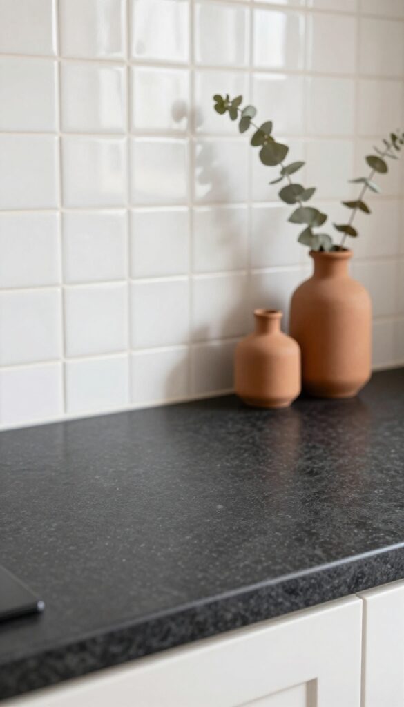
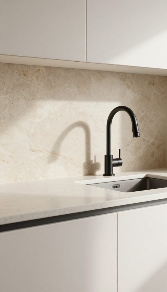
4. Black Granite Counter with Sage Green Tile Backsplash
Black granite counters bring a grounded, almost architectural feel to a kitchen, but they can read a bit heavy on their own. Pairing them with sage green tile changes the whole energy—the green softens the dark stone and adds a natural, earthy pop that feels both calming and intentional. This combo works especially well in kitchens that get plenty of natural light, where the green can really glow without making the space feel dim.
The contrast between deep black and muted sage creates a layered look that's cozy without being dark. Black granite is durable and forgiving, hiding crumbs and spills better than lighter stones, while the green tile adds visual texture and a hint of color that keeps the kitchen from feeling sterile. Whether you go with classic subway tile for a clean line or zellige for a handcrafted feel, the green will bring warmth and personality to the room.
Best Tile Shapes And Finishes
Subway tiles in a matte or satin finish keep the look timeless and easy to clean. If you want more texture, zellige tiles add subtle irregularities that catch the light and make the green feel richer. Avoid high-gloss finishes here—they can clash with the granite's natural polish and make the space feel too shiny.
Cabinet Pairing Tip
White or light wood cabinets keep the kitchen airy and let the black and green stand out. For a cozier vibe, try warm oak or butcher block accents on an island. Dark cabinets can work if you add plenty of under-cabinet lighting and a light-colored floor to balance the weight.
Finishing Touch
Add brushed brass or matte black hardware and faucets to tie the two tones together. A few open shelves with white dishes or small potted herbs will soften the look even more and give the kitchen a lived-in, layered feel.
5. Reclaimed Wood Counter with Patterned Cement Tile
There’s something about pairing weathered wood with punchy tile that feels both grounded and playful. A reclaimed wood countertop brings warmth and a sense of history, while patterned cement tiles add a dose of personality without overwhelming the space. The key is letting these two materials take center stage—keep cabinets, walls, and hardware simple and neutral.
This combo works especially well in kitchens that want to feel cozy but not cluttered, with a layered, lived-in look that gets better with age.
Rustic reclaimed wood counters pair beautifully with colorful, patterned cement tiles. The wood's worn texture balances the tile's bold geometry. Keep the rest of the kitchen neutral to let this duo shine.
Best Colors
- Stick with warm, earthy tones for the wood—think weathered gray, honey brown, or deep walnut. For the cement tile, choose a pattern that picks up one of those wood tones in its design. A classic black-and-white geometric tile feels crisp, while a terracotta or blue pattern adds more color.
- Avoid matching the wood and tile exactly; contrast is what makes this pairing pop.
Texture Mix
- The beauty here is in the contrast between rough and smooth. The wood should feel tactile—visible grain, knots, and slight imperfections are part of the charm. Cement tiles have a matte, slightly gritty finish that complements the wood without competing.
- Add a few smooth elements like a glazed ceramic vase or a stainless steel faucet to break up the texture and keep the eye moving.
Finishing Touch
To protect the wood counter without losing its character, seal it with a food-safe matte finish. For the cement tile, use a penetrating sealer to guard against stains and moisture. A simple open shelf above the backsplash with a few neutral dishes or a small plant keeps the look airy and avoids distracting from the main materials.
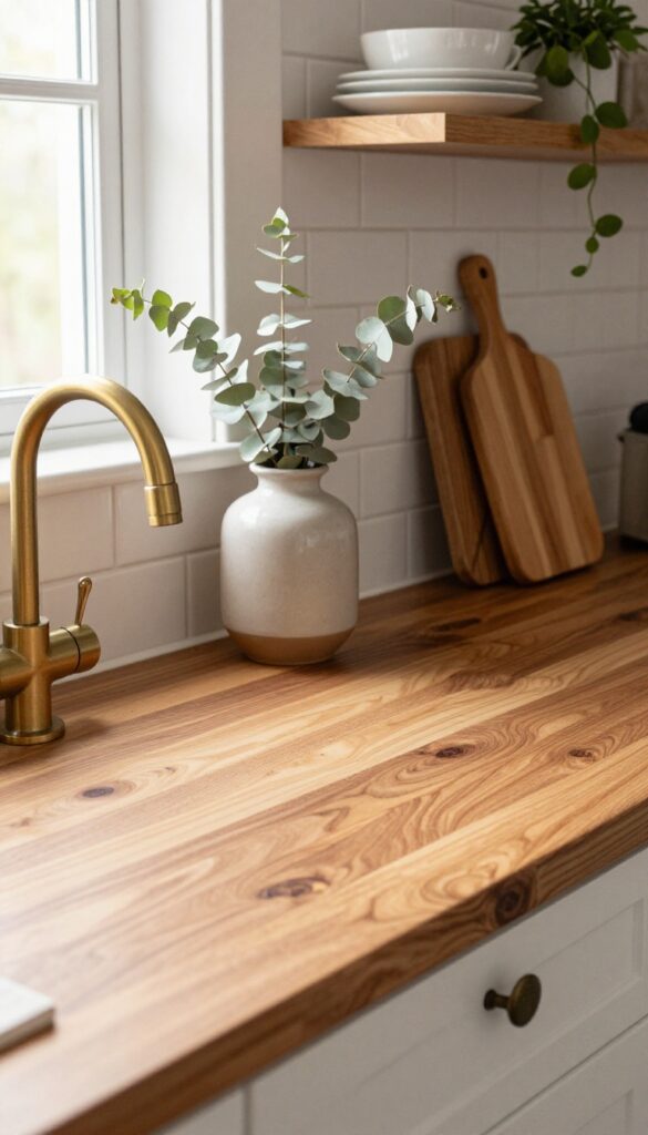
6. Quartz Counter with Thin Brick Backsplash
Smooth, polished quartz in white or light gray pairs beautifully with thin brick tiles in warm, sandy tones. The contrast is subtle but effective—the brick brings texture and a touch of industrial coziness, while the quartz keeps things sleek and easy to maintain. It’s a smart way to add character without committing to a full rustic look.
This combination works especially well in kitchens that want a modern foundation with a bit of warmth. The brick backsplash becomes a focal point behind the stove or sink, drawing the eye without overwhelming the space. Keep the grout lines thin and in a matching sand color to let the brick texture shine.
Pair with warm wood open shelving or a butcher block island to reinforce the cozy, layered feel.
Best Colors
Stick with white or very light gray quartz to keep the space bright. For the brick, choose sandy beige, warm taupe, or a soft blush tone—these add warmth without going dark. Avoid red-toned bricks if you want to maintain a clean, modern vibe.
Texture Mix
The smooth quartz and rough brick create a pleasing tactile contrast. To enhance the layered feel, add a matte black faucet and brushed brass cabinet hardware. A woven runner or a few ceramic canisters on the counter will reinforce the cozy, lived-in aesthetic.
Finishing Touch
Install under-cabinet lighting to highlight the brick texture in the evening. The shadows cast by the uneven brick surface add depth and make the kitchen feel warm and inviting. A simple fruit bowl or a small herb plant on the counter completes the look.
7. Concrete Counter with Mosaic Glass Tile
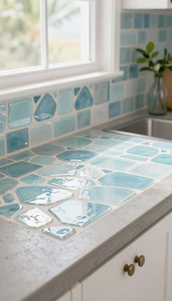
Polished concrete counters bring an industrial edge that feels grounded and modern, but they can lean a little cold on their own. Pairing them with a mosaic glass backsplash in seafoam or pale blue softens that hardness with a coastal, luminous touch. The glass catches light from windows and under-cabinet fixtures, casting a subtle shimmer across the workspace.
It’s a layered look that feels both cozy and curated—like a kitchen that belongs in a beach house, even if you’re miles from the shore.
This combination works especially well in open-plan kitchens where you want the countertops to feel substantial without overwhelming the room. The concrete’s raw texture anchors the space, while the glass tiles add movement and a hint of color. To keep the look cohesive, choose tiles with irregular, handcrafted shapes—they reflect light differently and avoid a too-perfect, sterile feel.
The result is a kitchen that feels lived-in, warm, and quietly sophisticated.
Best Colors
Stick with pale, watery tones for the glass tiles—seafoam, pale blue, or soft aqua work beautifully against warm gray or charcoal concrete. If you prefer a brighter look, creamy white tiles with hints of celadon keep the palette airy. Avoid dark or heavily patterned glass, as it can compete with the concrete’s natural veining.
Texture Mix
The contrast between smooth, matte concrete and glossy, faceted glass is what makes this pairing sing. For extra depth, use a tumbled or iridescent glass tile that catches light at different angles. A honed concrete finish (not high-gloss) keeps the counter from feeling slippery or too reflective, letting the backsplash take center stage.
Finishing Touch
Warm wood open shelving above the backsplash adds a cozy, organic layer—try floating shelves in oak or walnut. A few ceramic jars, a trailing plant, and a matte black faucet complete the look without cluttering the visual line. The wood echoes the warmth of the concrete and softens the glass’s sparkle.
8. Stainless Steel Counter with Hexagon Marble Tile
If you love the practicality of stainless steel but worry it might feel too cold or industrial, pairing it with hexagon marble mosaic tiles is the perfect fix. The metal surface is a dream for bakers and anyone who appreciates easy cleanup, while the marble backsplash adds softness, warmth, and a touch of luxury. Under-cabinet lighting with a warm bulb temperature helps bridge the two materials, making the whole setup feel cozy rather than clinical.
This combination works especially well in kitchens that get a lot of use. Stainless steel counters are heat-resistant, hygienic, and develop a nice patina over time, while hexagon marble tiles bring in subtle veining and a handmade feel. The contrast between the sleek, reflective metal and the matte, textured stone creates visual interest without being busy.
To keep the look layered and inviting, add warm wood cutting boards, a few ceramic canisters, and soft linen dish towels.
Best Colors And Finishes
Stainless steel naturally pairs with cool grays and whites, but to keep the space from feeling sterile, choose marble tiles with warm beige or taupe veining. A brushed or satin finish on the steel will reduce glare and feel more approachable than a mirror-polished surface. For the grout, go with a soft gray or off-white to let the hexagon pattern shine without being too stark.
Lighting Tip
Warm under-cabinet lighting is essential here. LED strips with a color temperature around 3000K will cast a golden glow across the steel and marble, softening the metal's coolness and highlighting the marble's natural variation. Avoid cool white or daylight bulbs, which can make the space feel like a commercial kitchen.
Styling Detail
Balance the hard surfaces with organic touches. A small wooden cutting board, a potted herb plant, or a ceramic utensil holder in a warm earth tone will add texture and prevent the kitchen from feeling too sleek. Keep the countertop mostly clear to show off the marble backsplash, but let a few everyday items double as decor.
9. Terrazzo Counter with Matching Terrazzo Backsplash
Terrazzo has made a major comeback, and for good reason. It's playful without being childish, and it adds texture and visual interest without overwhelming the space. When you use it on both the counter and backsplash, the effect is seamless and surprisingly calming.
The repetition of the same pattern creates a layered look that feels intentional and cozy, especially when you choose a warm base like cream or blush with subtle darker flecks.
Going all-in on terrazzo creates a cohesive, wrap-around effect that makes your kitchen feel both modern and inviting. The key is choosing a base color that feels warm and soft, so the flecks add personality without making the room feel busy. This look works best in kitchens with plenty of natural light, where the terrazzo can catch the light and show off its depth.
Pair it with simple, flat-front cabinetry in a complementary neutral to keep the focus on the stone. Open shelving with a few ceramic pieces in matching tones helps tie the whole thing together.
Best Colors For A Cozy Feel
- Stick with warm, creamy bases like ivory, blush, or pale peach. The flecks should include a mix of darker tones like charcoal, terracotta, or navy, but keep them small and evenly distributed. Avoid high-contrast combinations like white with black flecks, which can feel cold.
- Instead, aim for a palette that feels like a soft, speckled sunset.
Texture And Finish
- A honed or matte finish works best for a cozy, lived-in look. It softens the reflective quality of the stone and makes the surface feel more tactile. Polished terrazzo can be slippery and too shiny for a relaxed vibe.
- For extra warmth, add a matte sealer and pair the terrazzo with brushed brass or unlacquered brass fixtures.
Styling Tip: Keep It Simple
- Let the terrazzo be the star. Keep countertops clear except for a few essentials like a wooden cutting board or a ceramic fruit bowl. Choose cabinet hardware in a soft metal like brass or bronze, and add a woven runner or natural fiber bar stools to bring in more texture.
- A small potted plant with green leaves adds a fresh pop of color that complements the flecks.
10. Wood Slab Counter with Hand-Painted Tile Backsplash
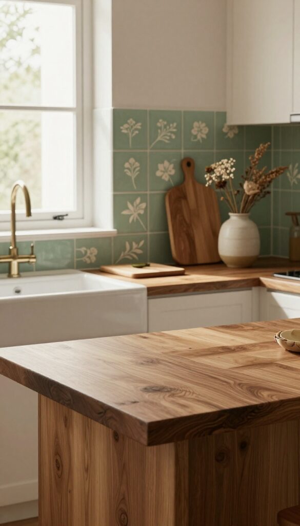
A live-edge wood slab counter brings the outdoors in with its raw, organic silhouette, while hand-painted tiles—think delicate florals or playful geometrics—add a layer of artistry and color. The trick is to choose tiles that echo a hue from the wood’s undertones, like a soft sage green that picks up the gray in reclaimed oak. This pairing feels cozy and collected, as if the kitchen grew naturally around a beloved heirloom.
The warmth of a wood slab counter softens the hard edges of a kitchen, making the space feel more like a lived-in gathering spot than a sterile workspace. Hand-painted tiles, meanwhile, introduce a bespoke quality that mass-produced backsplashes can’t match. Together, they create a look that’s both grounded and whimsical—perfect for a kitchen that doubles as a creative hub.
To keep the balance, let the wood be the star and use the tile as an accent, perhaps only behind the stove or sink.
Best Wood Species
Walnut and cherry offer rich, warm tones that pair beautifully with earthy tile colors like terracotta or mustard. For a lighter, more Scandinavian feel, go with ash or white oak—they let brighter tile patterns pop without competing. Always seal the wood properly with a food-safe finish to protect against moisture and stains.
Tile Pattern Tips
If your wood has dramatic grain, stick with simpler tile motifs like small-scale florals or repeating diamonds to avoid visual chaos. For a more uniform wood slab (like a smooth maple), you can go bold with large-scale geometric patterns or intricate Moroccan-inspired designs. Lay out the tiles on the floor first to see how the pattern flows before committing.
Cozy Detail
Add a low-hanging pendant light with a warm bulb above the counter to highlight the wood’s texture and the tile’s glaze. A few open shelves nearby with ceramic pitchers or wooden cutting boards reinforce the handcrafted feel without cluttering the space.
11. White Quartz Counter with Stacked Stone Backsplash
Crisp white quartz countertops instantly make a kitchen feel brighter and more spacious. Pair them with a stacked stone backsplash in warm beige or soft gray, and you get a look that’s both clean and rugged. The stone’s natural variations in tone and texture add depth without feeling busy, making this combo ideal for kitchens that want a subtle nod to the outdoors.
It’s a cozy, layered approach that keeps the space inviting rather than cold or overly modern.
This combination works beautifully in kitchens that get plenty of natural light, as the white quartz reflects it while the stone absorbs some, creating a balanced glow. The stacked stone adds a tactile element that contrasts with the smooth counter, giving the room visual interest without clutter. It’s a practical choice too—quartz is low-maintenance and durable, while stone backsplashes are easy to wipe down.
To keep the look cohesive, choose stone tiles with a similar undertone to your quartz, like warm beige if your quartz has creamy veins or cool gray if it’s more stark white.
Best Colors And Materials
Stick with quartz that has minimal veining—think pure white or a soft white with subtle gray or beige streaks. For the stone, opt for stacked slate or quartzite tiles in earthy tones like warm taupe, driftwood gray, or sand. Avoid high-contrast stones with dramatic color shifts; you want a gentle blend that feels natural.
Texture Mix Tip
Balance the rough stone with smooth surfaces elsewhere. Use a polished quartz countertop, sleek cabinet hardware, and a simple undermount sink. Add a matte black faucet for a grounding touch that ties the organic stone to the clean lines of the quartz.
Finishing Touch
Install under-cabinet lighting to highlight the stone’s texture and prevent the kitchen from feeling too heavy. Warm LED strips (2700K) will make the beige tones glow, while cool light (3000K) works better with gray stone. This small detail makes the backsplash a focal point without overwhelming the space.
12. Blue Pearl Granite with Creamy Subway Tile
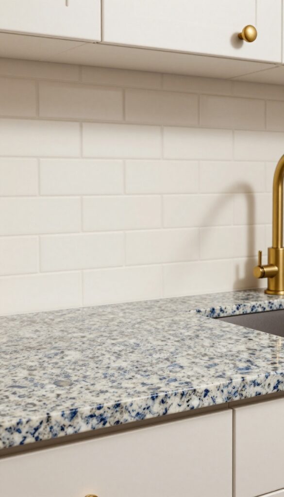
Blue Pearl granite brings a deep, moody elegance with its navy and silver flecks that catch the light from every angle. Paired with creamy, off-white subway tile, the contrast feels intentional and warm rather than stark. The result is a kitchen that feels grounded and layered, with just enough sparkle to keep things interesting.
Brass fixtures add the final touch, bridging the cool stone and soft tile with a golden glow that makes the whole space feel inviting.
This combination works especially well in kitchens that get plenty of natural light, as the granite's shimmer really comes alive during the day. The creamy subway tile keeps the look from feeling too dark or formal, making it suitable for both modern and transitional homes. For a cozy, layered effect, consider a matte finish on the tile to soften reflections and let the granite be the star.
Best Colors
- Stick with warm off-whites for the subway tile—think ivory, cream, or warm alabaster. These tones prevent the blue granite from feeling cold. For walls, a soft greige or pale beige keeps the palette cohesive.
- Accent with brass or unlacquered brass for hardware and fixtures to enhance the warmth.
Texture Mix
The polished surface of Blue Pearl granite contrasts beautifully with the matte or slightly textured finish of handmade subway tile. This tactile variety adds depth without clutter. If your tile is glossy, try a honed granite finish for a more subdued, cozy feel.
Finishing Touch
Add a brass faucet and cabinet pulls to tie the cool stone and warm tile together. A brass or gold-toned pendant light above the sink or island will echo the metallic flecks in the granite and complete the layered look.
13. Lava Stone Counter with Textured Plaster Backsplash
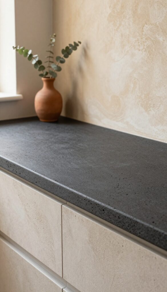
If you want a kitchen that feels grounded and full of character, lava stone counters paired with a hand-troweled plaster backsplash deliver in spades. The dark, matte surface of lava stone has a natural porosity that catches light softly, while the warm clay-toned plaster adds an organic, almost sculptural texture. Together, they create a rustic Mediterranean vibe that’s both cozy and layered—perfect for anyone who loves earthy materials and a lived-in feel.
This combination works best in kitchens with good natural light, because the dark counter can absorb brightness and make the space feel intimate rather than cave-like. The plaster backsplash, with its subtle swirls and uneven finish, brings a handcrafted warmth that balances the stone’s raw edge. To keep the look cohesive, choose warm clay or terracotta tones for the plaster—think sandy beige, burnt sienna, or muted ochre.
The contrast between the dark counter and the lighter wall creates depth without needing busy patterns or bold colors. It’s a pairing that feels timeless but still fresh, like something you’d find in a sun-drenched farmhouse in Tuscany.
Best Colors And Finishes
- Stick with earthy, muted tones to let the textures shine. Lava stone typically comes in charcoal, deep gray, or black, so choose a plaster color that warms it up—like a soft clay, warm beige, or dusty rose. Avoid high-gloss finishes; matte or satin sheens keep the look natural and prevent the materials from competing.
- For a subtle pop, consider a plaster with fine sand or mica flecks that catch the light.
Texture Mix
- The magic here is all about contrast. Lava stone is rough and porous, while plaster can be smooth or lightly textured. To amplify the cozy feel, choose a hand-troweled plaster with visible swirls and slight unevenness.
- This creates a tactile surface that invites touch. Pair with natural wood open shelving or woven baskets to add even more layers of texture.
Finishing Touch
- Warm lighting is essential to highlight the texture. Install under-cabinet lights with a warm LED (2700K–3000K) to cast a soft glow across the plaster. Add a few matte brass or black fixtures—like a gooseneck faucet or pendant lights—to echo the earthy palette.
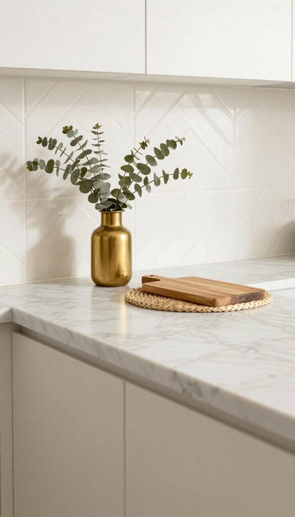
- Keep countertop accessories minimal: a wooden cutting board, a ceramic vase with dried eucalyptus, and a simple soap dispenser are all you need.
FAQ
What is the best backsplash for a butcher block counter?
White subway tile is a classic choice that keeps the look light and fresh. For more warmth, try a creamy zellige or a soft sage green tile.
Can I mix different counter and backsplash materials?
Absolutely. Mixing materials like wood and tile or stone and glass adds texture and personality. Just make sure they share a common color or finish to keep the look cohesive.
How do I choose a backsplash color that matches my counter?
Look at the undertones in your counter—warm, cool, or neutral—and pick a backsplash that complements them. For example, warm wood counters pair well with creamy or earthy tiles.
What backsplash works best with dark granite counters?
Light-colored tiles like white, cream, or sage green create contrast and prevent the kitchen from feeling too dark. Subway, herringbone, or zellige patterns add visual interest.
Are quartz counters a good choice for a cozy kitchen?
Yes, especially when paired with a textured backsplash like brick or stacked stone. Quartz is durable and easy to clean, while the backsplash adds the warmth and character you want.
Conclusion
Finding the right counter and backsplash combo is all about balance. You want materials that feel good together and create a space you actually enjoy spending time in. Whether you lean toward warm wood and tile or sleek stone with texture, the best pairings are the ones that make your kitchen feel like home.
Take your time, play with samples, and trust your instincts. A layered, cozy kitchen is totally within reach.