13 Kitchen Shelves Decor Ideas for Styled Open Storage
Open kitchen shelves are a chance to show off your favorite pieces while keeping everyday items within easy reach. The trick is balancing beauty with function so the space feels light, not cluttered.
A few thoughtful touches can turn plain shelves into a focal point that breathes. Whether you're starting from scratch or refreshing an existing setup, these 13 ideas will help you style your shelves with a clean, airy vibe.
Each one focuses on practical details that make open storage feel intentional and inviting.
1. Layer White Ceramics for a Clean Base
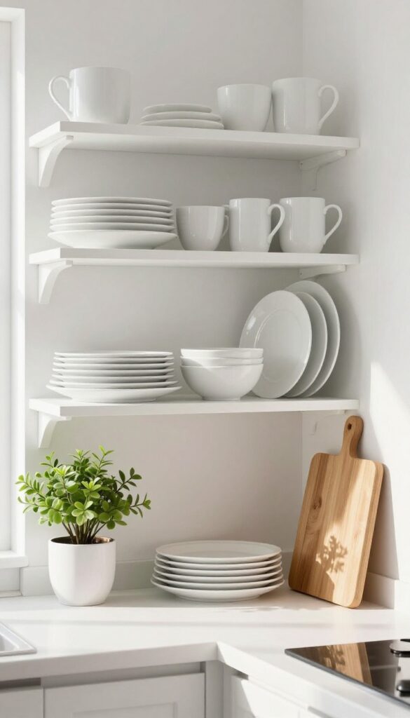
White ceramics are the unsung heroes of open shelving. They bring a crisp, clean look that instantly makes a kitchen feel more spacious and polished. The beauty lies in their simplicity—stacking plates, bowls, and mugs in neat piles or leaning them against the back wall creates a calm, uniform base.
The varied shapes and sizes add subtle visual interest without overwhelming the eye, making this approach perfect for light and airy kitchens.
Start by gathering your everyday white dinnerware—plates, bowls, mugs, and small serving pieces. Arrange them in tidy stacks, alternating sizes for a layered effect. Lean a few larger plates against the back wall to create depth, then place bowls and mugs in front.
Keep the arrangement balanced but not too symmetrical; a slight asymmetry feels more natural and lived-in. This technique works especially well on upper shelves where you want a clean, uncluttered look that draws the eye upward.
Best Materials
Stick with matte or glossy white ceramics—they reflect light and keep the space bright. Mix in a few pieces with subtle texture, like ribbed mugs or hand-thrown bowls, to add dimension without breaking the monochrome palette. Avoid busy patterns or colored accents, as they can disrupt the calm, airy vibe.
Layout Tip
Group similar items together—plates with plates, bowls with bowls—to create visual order. Use stackable items to save vertical space, and leave a few inches between groups to let the shelf breathe. For a finishing touch, add a single small plant or a wooden cutting board to introduce warmth and contrast.
Storage Note
This style works best for everyday dishes you use frequently. Keep heavier items on lower shelves for easy access, and reserve upper shelves for lighter pieces like mugs or small bowls. The uniform color also makes it easy to rotate seasonal pieces without clashing.
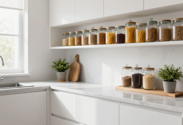
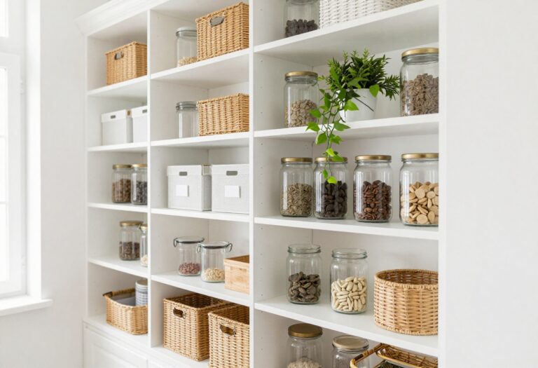
2. Mix Open Baskets with Glass Jars
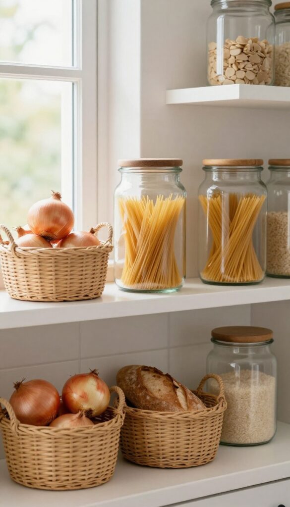
Texture is a quiet hero in kitchen styling, and this idea leans into it beautifully. By pairing woven baskets with clear glass jars, you create a shelf that feels layered and lived-in without looking busy. The baskets soften the look with their natural warmth, while the jars add a clean, reflective quality that keeps things light.
It's a combination that works especially well in kitchens that lean airy and bright, where every element should feel intentional but not fussy.
This approach turns everyday storage into a visual feature. Use a large basket for onions or garlic, a medium one for bread, and smaller jars for pasta, rice, or snacks. The key is to keep the jars neatly filled and the baskets not overflowing—balance is everything.
Place the baskets on lower shelves or at the ends for visual weight, and group jars in the center or on upper shelves to draw the eye upward. The contrast between matte, organic textures and smooth, transparent surfaces prevents the shelf from feeling one-note.
Best Materials
- Stick with natural fibers for baskets—seagrass, rattan, or water hyacinth add warmth without looking too rustic. For jars, choose clear glass with simple metal or bamboo lids to keep the look clean. Avoid colored glass or overly decorative jars, as they can compete with the baskets.
- The goal is a neutral, cohesive palette that lets the contents speak.
Layout Tip
- Vary the heights and shapes to create rhythm. A tall jar next to a low, wide basket feels more dynamic than matching sizes. Group items in odd numbers—three jars and two baskets, for instance—to avoid a symmetrical, staged look.
- Leave a little breathing room between pieces so the shelf doesn't feel crammed.
Finishing Touch
Add a small trailing plant like pothos or a sprig of eucalyptus in a slim jar to introduce a soft, organic line that breaks up the straight edges. This tiny detail ties the natural and glass elements together and adds a fresh, lived-in feel.
3. Add a Small Herb Garden on the Top Shelf
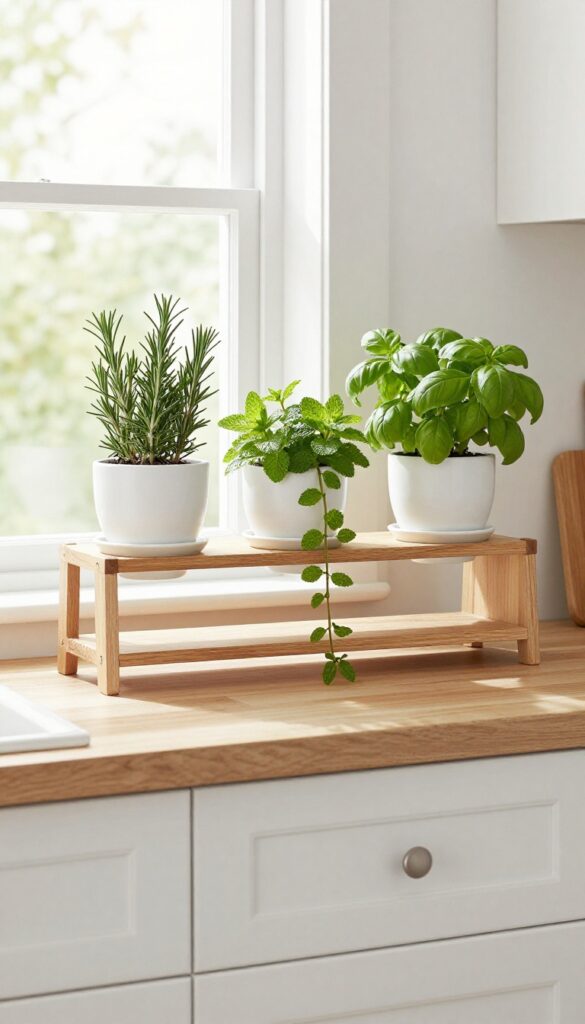
That top shelf often becomes a dusty landing zone for rarely used platters. Instead, turn it into a living, breathing element that brings the outdoors in. A row of small potted herbs softens the hard lines of cabinetry and fills the kitchen with a gentle, fresh scent every time you walk by.
Place three or four small potted herbs like basil, mint, or rosemary on the highest shelf. The trailing green softens the hard lines and brings a fresh scent into the kitchen. This setup works best on a shelf that gets indirect light from a nearby window.
Choose uniform pots in a neutral tone—think matte white, warm terracotta, or soft sage—to keep the look cohesive and airy. The herbs are both decorative and practical: snip a few leaves while cooking for an instant flavor boost.
Best Pots
Stick with simple, unglazed terracotta pots or matte ceramic in soft earth tones. Avoid glossy finishes or busy patterns that compete with the greenery. Saucers are a must to catch water drips and protect the shelf surface.
Plant Styling Tip
Mix upright herbs like rosemary with trailing ones like mint or thyme. This creates visual variety without looking chaotic. Place taller pots at the back and let trailing stems spill over the front edge for a soft, organic feel.
Care Note
Water sparingly—most herbs prefer the soil to dry out between waterings. A small watering can kept nearby makes maintenance easy. Rotate pots occasionally so each plant gets even light.
4. Lean Art or a Small Framed Print
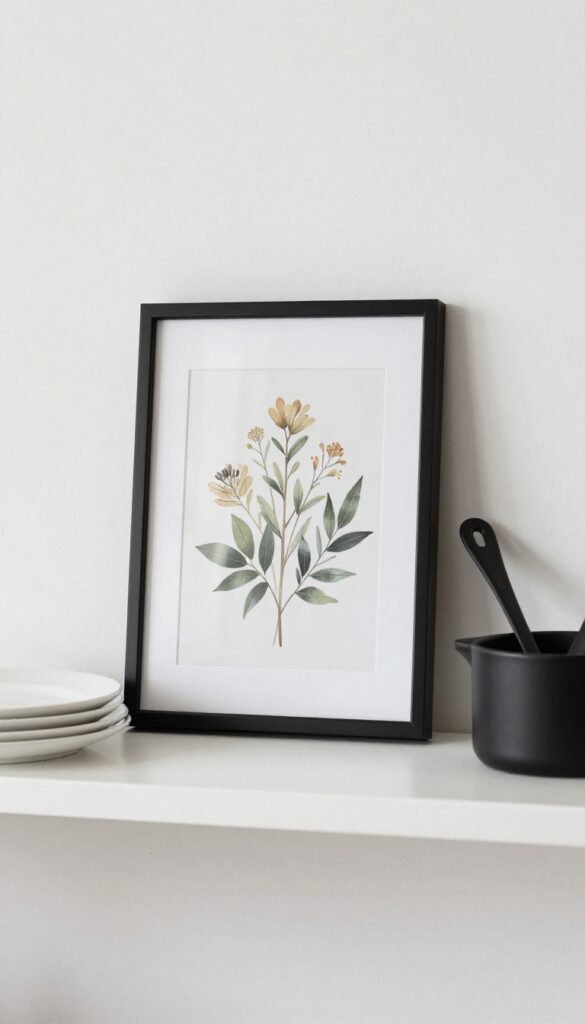
Open shelves can start to feel a little one-note if every single item is a dish or a jar. Adding a small framed piece of art changes the rhythm and gives the eye a place to rest. A botanical print, a simple line drawing, or even a vintage postcard propped against the back wall softens the utilitarian look of stacked plates and bowls.
It makes the shelf feel more like a curated display and less like storage.
The trick is to keep the scale small and the subject simple. A 5×7 or 8×10 frame works best—anything larger can overwhelm the shelf and crowd out functional pieces. Choose art with a light background and minimal detail to maintain that airy, uncluttered feel.
Black or natural wood frames blend seamlessly with most kitchen styles, while a brass or gold frame adds a subtle touch of warmth. Prop the frame slightly angled against the back wall, or lean it against a stack of cookbooks for a casual, lived-in look.
Best Placement
Position the art on a shelf that’s at eye level or slightly above, so it’s easy to see without craning your neck. A shelf near the coffee station or tea corner is a natural spot, since it breaks up the row of mugs and canisters. Avoid placing art directly above the stove or sink, where steam and grease might damage the frame or paper over time.
Style Pairing
- Pair the framed print with items that echo its colors or mood. A black-and-white line drawing looks crisp next to white ceramic dishes and a matte black utensil crock. A soft botanical watercolor pairs nicely with wooden cutting boards and a small potted herb.
- The goal is to create a visual conversation between the art and the objects around it, not to make the art feel isolated.
Finishing Touch
For extra depth, layer the frame in front of a larger piece like a woven placemat or a marble pastry board. This adds texture without clutter. If you swap art seasonally, stick to the same frame size so the layout stays consistent—just rotate the print itself for an easy refresh.
5. Group Similar Items in Threes
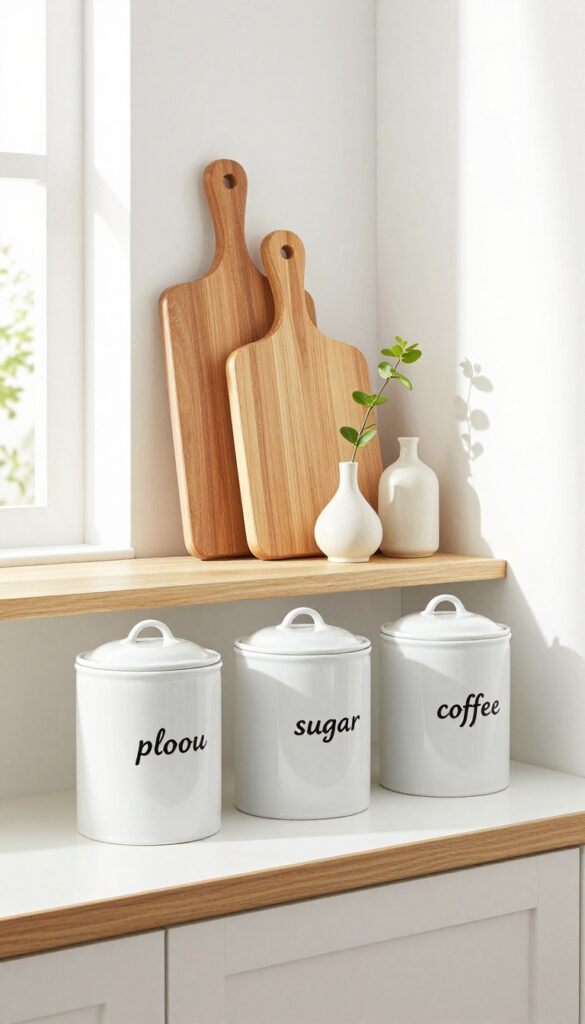
There’s something about the number three that just works in decor. When you cluster matching canisters, wooden cutting boards, or small vases together in odd numbers, the arrangement feels more natural and balanced. It’s a styling trick that interior designers swear by because it mimics the way we see the world—imperfect and organic.
On open kitchen shelves, this approach adds a sense of calm without looking too staged or sparse.
Grouping items in threes creates visual rhythm and prevents shelves from feeling cluttered or chaotic. Start with a set of three identical canisters for pantry staples like flour, sugar, and coffee. Or line up three wooden cutting boards of varying sizes, leaning the largest against the back wall.
For a softer look, place three small ceramic vases with single stems—each slightly different in height. The key is to keep the items similar in color or material so the grouping feels intentional, not random. This works especially well on a shelf above a coffee station or near a window where natural light highlights the repetition.
Best Materials
Stick with natural textures like wood, ceramic, or stone for a light and airy feel. White or cream ceramic canisters keep things bright, while light oak cutting boards add warmth. Avoid dark or heavy materials like black metal or thick stone, which can weigh down the grouping.
Shelf Styling Tip
Vary the heights within your trio to create visual interest. Place the tallest item at the back or center, then stagger the others slightly forward. If your items are all the same size, use a small riser or a stack of books to lift one up.
Small-space Fix
In a tiny kitchen, limit yourself to just one trio per shelf. Too many groups of three can feel busy. Choose a focal shelf—like the one above the sink or coffee maker—and let the rest of the shelves stay minimal with just a few everyday dishes.
6. Use a Single Statement Pitcher as a Focal Point
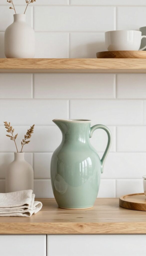
Sometimes a shelf just needs one hero piece. A single oversized pitcher—think ceramic in a soft glaze or glass with a sculptural handle—can anchor an entire display. It gives the eye a place to land, breaking up the visual noise of stacked bowls and jars.
This is especially effective on a middle shelf, where it sits at eye level and naturally draws attention. The trick is to keep everything around it minimal so the pitcher truly stands out.
Place one large ceramic or glass pitcher on a middle shelf. Its bold shape draws the eye and gives the whole shelf a moment of rest among smaller items. The pitcher doesn't have to be functional—it can simply be a sculptural piece.
Choose a color that complements your kitchen palette, like a soft sage green or creamy white. Around it, group a few smaller items in similar tones, such as a stack of linen napkins or a small wooden board. The contrast in scale makes the pitcher feel intentional, not random.
This works best on a shelf with at least 12 inches of height clearance so the pitcher isn't cramped.
Best Colors
- Stick to muted, earthy tones that feel light and airy. Soft blush, pale blue, or warm cream keep the look fresh. Avoid dark or glossy finishes that can feel heavy.
- A matte or satin glaze reflects light softly and blends seamlessly with a light kitchen.
Layout Tip
Center the pitcher on the shelf, then flank it with two or three smaller objects like a small vase, a stack of plates, or a simple candle. Keep the arrangement asymmetrical for a relaxed, styled look. Leave some empty space around the pitcher to let it breathe.
Finishing Touch
Add a single dried stem or a few sprigs of eucalyptus inside the pitcher. This softens the silhouette and adds a subtle organic texture. Choose something that won't need watering, so the display stays low-maintenance.
7. Stack Neutral Linens Neatly
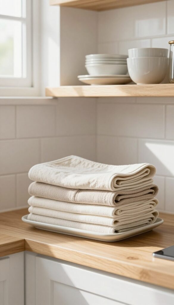
A tidy stack of soft linens on an open shelf brings instant warmth and a relaxed, lived-in feel to your kitchen. Unlike bare dishes or glassware, fabric adds texture and softens the clean lines of your shelving. This idea works especially well on lower shelves where you can easily grab a towel or napkin while cooking, keeping your space both beautiful and functional.
Folding cloth napkins, tea towels, or placemats into a neat stack is one of the simplest ways to style open storage without overthinking it. The key is sticking to neutral tones—cream, linen, soft gray, or pale beige—so the pile feels cohesive and calming rather than busy. Place the stack on a lower shelf where it’s within arm’s reach, and let the fabric’s natural folds add subtle visual interest.
This trick works in any kitchen, from modern farmhouse to minimalist, because the softness balances harder materials like wood, metal, or tile.
Best Colors And Fabrics
- Stick to solid neutrals or very subtle stripes in natural fabrics like linen, cotton, or hemp. These materials drape nicely and resist wrinkles better than synthetics. Avoid bright patterns or dark colors, which can make the stack look heavy or cluttered.
- A mix of two or three similar tones—for example, cream and oatmeal—adds depth without losing the airy feel.
Shelf Styling Tip
Place the linen stack on a small wooden or ceramic tray to define the area and keep it from sliding around. Layer a single folded towel on top at a slight angle for a casual, approachable look. Leave a few inches of space around the stack so it doesn’t feel crammed, and pair it with a simple jar or small plant on the same shelf for balance.
Storage And Maintenance
Rotate the linens regularly so you always have clean ones on hand, and wash them in a gentle cycle to keep the fabric soft. If you use the towels daily, keep the stack shallow—three to five towels max—so you’re not constantly disrupting the display. For extra style points, fold each piece the same way and align the edges neatly before stacking.
8. Incorporate a Small Wooden Cutting Board
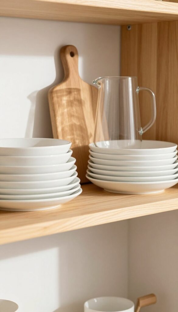
A slim wooden cutting board leaning against the back of a shelf adds instant warmth without taking up much space. The natural grain and honey tones break up all the white plates and glassware, creating a cozy, lived-in look. It's one of those small touches that makes open shelving feel curated instead of staged.
A wooden cutting board is more than a kitchen tool—it's a styling element that brings texture and organic contrast. Choose a board with a simple shape and visible wood grain for the best effect. Prop it upright against the back wall or lay it flat as a base for a small jar or vase.
Either way, it softens the hard edges of ceramics and adds a rustic note that keeps the shelf from feeling too sterile.
Best Wood Tones
Light woods like bamboo, maple, or beech keep the look airy and fresh. Darker woods like walnut or cherry add drama but should be used sparingly if your kitchen leans light. A medium oak tone works with almost any color palette.
Placement Ideas
Lean the board against the back wall behind a stack of bowls or next to a pitcher. If your shelf is deep enough, lay it flat and place a small salt cellar or a single candle on top. Avoid overcrowding—one board per shelf is enough.
Practical Styling Tip
Use the cutting board as a mini serving station for cheese or bread during parties, then return it to the shelf when not in use. It's both decorative and functional, which is the whole point of open shelving.
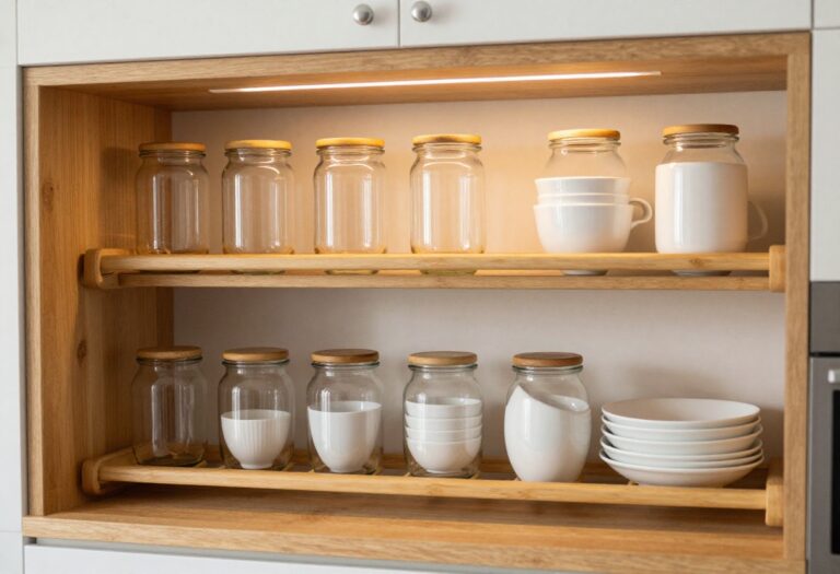
9. Display a Collection of Clear Glassware
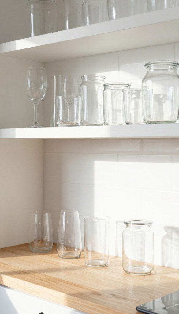
Clear glassware is one of those styling tricks that works like magic on open shelves. Because glass is transparent, it doesn't add visual weight the way ceramic or colored pieces do. Instead, it catches the light and creates little sparkles throughout the day, making your shelves feel bright and airy.
This is especially effective in kitchens that lean light and neutral, where you want the shelves to feel open rather than packed.
Gather a small collection of clear glasses, tumblers, or apothecary jars and arrange them in a cluster on one shelf. You can use all matching pieces for a uniform look, or mix different shapes and heights for more visual interest. The key is to keep the grouping tight so it reads as a deliberate display rather than random storage.
Place them near a window or under a light source to maximize the reflective quality. This arrangement works beautifully above a coffee station, near a sink, or on a shelf dedicated to barware.
Best Shapes To Mix
For the most dynamic display, combine at least three different silhouettes: a tall flute, a short tumbler, and a rounded jar. The variety in height and width creates a rhythm that feels curated. Avoid using too many identical pieces unless you have a full matching set, which can look a bit flat.
Where To Place Them
Position the glassware on a shelf that gets natural light for part of the day. Morning or afternoon sun streaming through the glass adds a soft glow to the whole kitchen. If your shelves are in a darker corner, add a small LED puck light above the shelf to create the same sparkling effect.
Finishing Touch
To keep the look clean, make sure every glass is spotless before you arrange it. Even a tiny water spot or smudge becomes more noticeable on clear glass. A quick polish with a microfiber cloth right before styling makes a big difference in how polished the shelf feels.
10. Add a Tiny Vase with a Single Bloom
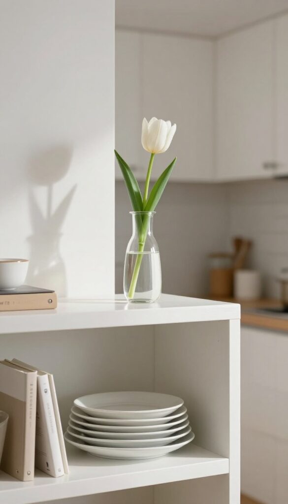
Sometimes the smallest detail makes the biggest difference. A single stem in a petite vase can soften the hard lines of kitchen shelves and add a living, breathing element to an otherwise static display. It’s the kind of understated touch that feels intentional without trying too hard.
A tiny bud vase with one fresh flower or a dried stem is an easy, low-maintenance way to bring color and life into your kitchen. Place it on a shelf where it can catch the light—maybe next to a stack of plates or a cookbook. The contrast between the delicate stem and the sturdy kitchenware creates a lovely visual balance.
For a light and airy feel, choose a clear glass vase and a single white bloom like a tulip or a daisy. If you prefer something more textural, a dried lavender stem adds a subtle scent and a rustic touch. The key is to keep it simple: one vase, one stem, no clutter.
Best Placement
Position the vase near the edge of the shelf so the stem can lean out slightly, breaking up the straight lines. Avoid placing it behind larger items where it might get lost—let it have its own little spotlight.
Vase Options
Look for small vases with narrow necks, like test tubes or mini bud vases. Clear glass keeps the look light, while ceramic or matte finishes add a subtle texture. Thrift stores are great for finding unique, tiny vases on a budget.
Seasonal Swap
Change the stem with the seasons: a cherry blossom branch in spring, a sprig of eucalyptus in summer, a dried wheat stalk in fall, or a pine sprig in winter. This keeps the display feeling fresh and connected to the time of year.
11. Use a Tiered Stand for Spices or Oils
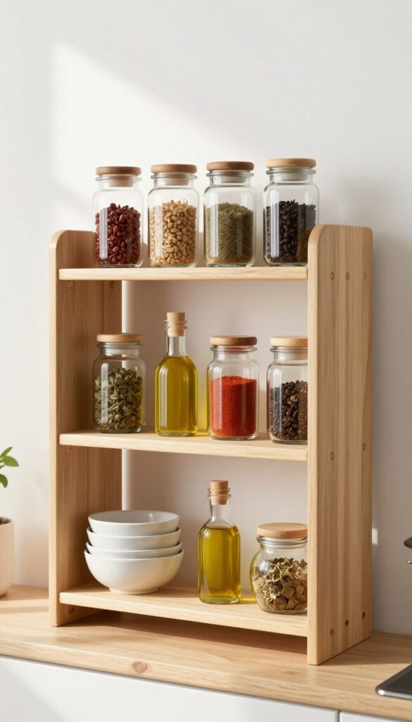
A tiered stand is one of those small additions that instantly makes a shelf feel more curated. It lifts everyday items like spice jars or oil bottles off the flat surface, creating height variation and a sense of purpose. In a light and airy kitchen, a wooden or metal stand adds warmth without clutter, and the staggered levels make everything easy to see and grab.
Instead of lining up bottles in a row, a tiered stand gives each item its own little stage. The visual lift breaks up the horizontal line of the shelf, drawing the eye upward and making the whole display feel intentional. It’s especially handy for small shelves where you want to maximize space without stacking things on top of each other.
Plus, the angled tiers mean you can spot the cumin or oregano at a glance—no more rummaging behind taller bottles.
Best Materials
- For a light and airy look, go with a natural wood stand in a pale oak or bamboo finish. It keeps the feel warm but not heavy. If your kitchen leans more modern, a slim metal stand in brushed brass or matte black adds a subtle contrast that still feels clean.
- Avoid dark, chunky wood or overly ornate designs—they can weigh down the shelf visually.
Layout Tip
- Place the tiered stand toward the back of the shelf so the front edge stays open and uncluttered. Group similar items together—spices on one tier, oils on another—and leave a little breathing room between each bottle. If the stand has three levels, use the top for your most-used spices and the bottom for larger bottles.
- This keeps the shelf looking balanced and easy to navigate.
Finishing Touch
Add a small plant or a slim cookbook next to the stand to anchor the arrangement. A trailing pothos or a single sprig of eucalyptus in a tiny vase softens the edges and brings in a fresh, organic element. Just keep it minimal—the tiered stand is the star here, so everything else should play a supporting role.
12. Keep a Few Cookbooks Horizontally Stacked
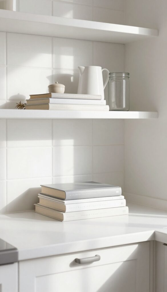
Open shelves can sometimes feel a bit one-note when everything is standing upright. Stacking two or three slim cookbooks flat on a lower shelf instantly breaks up the vertical rhythm and adds a cozy, lived-in layer. It’s a small move that makes the whole display feel more intentional and less like a store display.
This trick works especially well on a shelf that’s already holding taller items like pitchers or canisters. The horizontal stack creates a visual anchor and gives the eye a place to rest. Stick to cookbooks with clean, neutral covers—think soft whites, warm grays, or muted pastels—to keep the look light and airy.
If your books have bright jackets, simply remove them or turn them spine-in for a more uniform palette. Place the stack near the center or slightly off-center, then top it with a small object like a ceramic salt cellar or a single dried sprig for a finished feel.
Best Books To Use
Choose cookbooks with simple, modern covers in soft tones. Avoid busy patterns or dark colors that can weigh down the shelf. Thin, paperback volumes work better than thick hardcovers because they keep the stack low and unobtrusive.
Shelf Placement Tip
Position the stack on a lower or middle shelf rather than the top one. This keeps the visual weight grounded and makes the books easy to grab when you’re cooking. Leave a few inches of space on either side so the stack doesn’t feel cramped.
Finishing Touch
Add a tiny plant or a small ceramic object on top of the stack to draw the eye and soften the hard lines. A trailing succulent or a simple white vase works beautifully without overwhelming the composition.
13. Finish with a Small Decorative Object
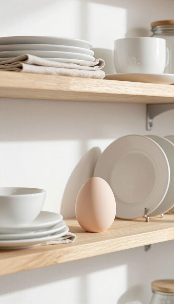
After arranging your dishes, jars, and linens, the shelf might still feel a little unfinished. That’s where a single small decorative object comes in. Think of it as the period at the end of a sentence—it signals that the styling is deliberate, not accidental.
A ceramic egg, a tiny sculpture, or a smooth stone can anchor the composition and give the eye a resting place. This final touch keeps the shelf from looking like random storage and turns it into a curated display.
Adding one small decorative piece is the easiest way to elevate an open shelf from functional to finished. The key is restraint: just one object per shelf or per grouping. It could be a matte ceramic egg in a soft blush tone, a miniature vase with a single dried flower, or a polished river stone.
The object should contrast slightly in texture or color with the items around it, so it stands out without shouting. Place it slightly off-center, not dead in the middle, to create visual interest. This trick works on any shelf, whether it’s holding white dinnerware or colorful cookbooks.
It’s the detail that makes guests think you spent hours styling, when really it took two seconds.
Best Materials For The Finishing Object
- Natural materials like stone, ceramic, or unglazed terracotta work beautifully because they add organic texture. A small marble sphere or a matte black ceramic cube can anchor a shelf of warm wood tones. Avoid shiny plastic or anything too trendy—you want the object to feel timeless and intentional.
- If your kitchen leans modern, try a geometric concrete form. For a farmhouse vibe, a single wooden egg or a tiny woven basket does the trick.
Where To Place It
- Place the decorative object near the front edge of the shelf, slightly to one side, so it creates depth. If you have a row of plates or jars, set the object at the end of the row to act as a visual stop. On a shelf with a stack of cookbooks, rest the object on top of the books or next to them.
- The goal is to break up the line of functional items with a moment of pure decoration.
Size And Scale Tip
- Keep the object small—about the size of your fist or smaller. Anything larger competes with the dishes or jars and makes the shelf feel cluttered. The object should feel like a whisper, not a shout.
- If you’re unsure, start with something neutral like a white ceramic egg and swap it out seasonally for a tiny pumpkin or a pinecone.
FAQ
How often should I rotate items on my kitchen shelves?
Aim for a seasonal refresh every few months. Swap out linens, switch herb varieties, or change the art print to keep the look feeling current without a full overhaul.
What if my shelves are very narrow?
Stick to slim items like small jars, stacked napkins, or a single leaning print. Avoid bulky baskets or oversized pitchers that will crowd the space.
How do I keep dust off open shelves?
Dust shelves weekly with a microfiber cloth. Wash glass jars and ceramics every couple of weeks, and give linens a quick shake or wash as needed.
Can I mix metals on the same shelf?
Yes, but keep it intentional. Stick to two metals, like brass and matte black, and repeat them in small doses so the mix feels cohesive rather than chaotic.
Should I fill every inch of shelf space?
No, leave some breathing room. Empty spots make the shelf feel light and airy, and they give the eye a place to rest between groupings.
Conclusion
Styling kitchen shelves doesn't require a big budget or a total redesign. Small changes like adding a herb pot, stacking linens, or grouping glassware can make open storage feel polished and personal. The key is to keep things light, both in color and in quantity, so your shelves stay functional and fresh.
Pick a few ideas that fit your kitchen's vibe and start arranging. Over time, you'll find a rhythm that makes your shelves feel like a natural extension of your home.