15 Kitchen Paint Ideas Walls Colour Schemes Can Use
A fresh coat of paint can do wonders for a kitchen. It’s one of the quickest, most affordable ways to change the whole feel of the room without a full renovation. Whether you’re drawn to calm neutrals or want to try something bolder, the right color sets the tone for everything else.
Weekend projects are all about making a noticeable impact with manageable effort. Painting your kitchen walls (or even just an accent wall) fits that bill perfectly.
You don’t need to be a pro to get great results, just a little planning and the right shade. We’ve rounded up 15 kitchen paint ideas that balance style and practicality.
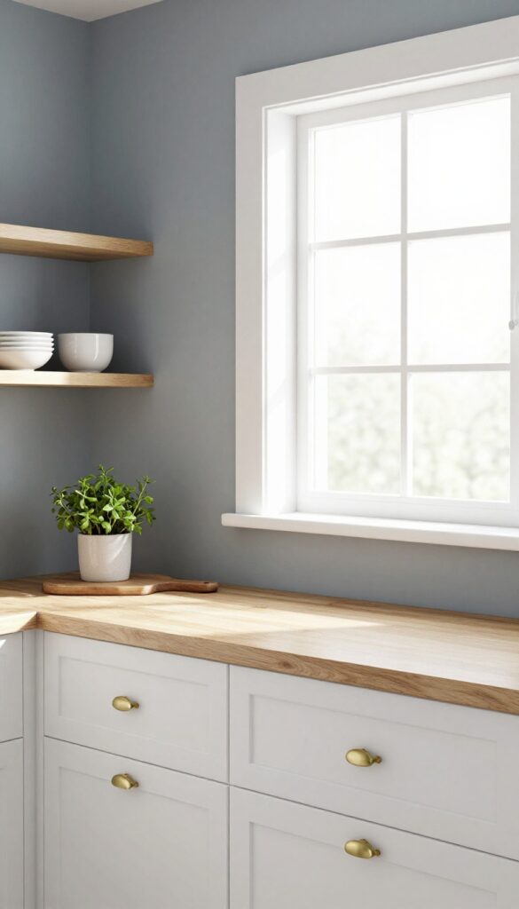
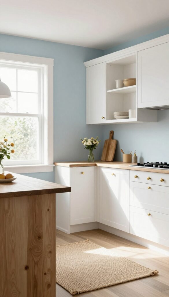
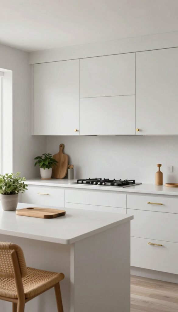
1. Soft White with Warm Undertones
A creamy white that feels cozy, not stark. Pairs well with natural wood and brass fixtures for a timeless look. This shade works in both modern and traditional kitchens, making it a versatile choice for a weekend refresh.
Soft white with warm undertones brings a gentle, inviting glow to your kitchen. Unlike cool whites that can feel clinical, this shade adds a layer of comfort. It reflects light beautifully, making the space feel larger and brighter without being harsh.
The warmth comes from hints of cream, beige, or yellow, which complement natural materials like wood and stone. It's an excellent backdrop for brass or gold fixtures, adding a touch of elegance. For a practical weekend project, you can paint the walls yourself and instantly transform the room.
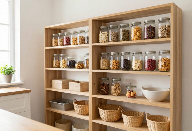
Pair with open shelving in natural wood and woven textures for a relaxed, stylish look.
Best Colors To Pair
This white works beautifully with soft greiges, pale blues, and muted greens. For a bolder contrast, try navy blue or charcoal. Keep the palette light and airy to maintain the cozy feel.
Materials That Shine
Natural wood, brass, and marble are perfect companions. Wood adds warmth, brass brings a subtle gleam, and marble introduces a touch of luxury. Avoid glossy finishes that can feel cold; matte or satin sheens are ideal.
Lighting Tip
Warm white bulbs (2700K-3000K) enhance the creamy tones. Use pendant lights with brass or wood accents to tie the look together. Under-cabinet lighting in the same warm hue prevents shadows and keeps the space inviting.
2. Sage Green for a Calming Vibe
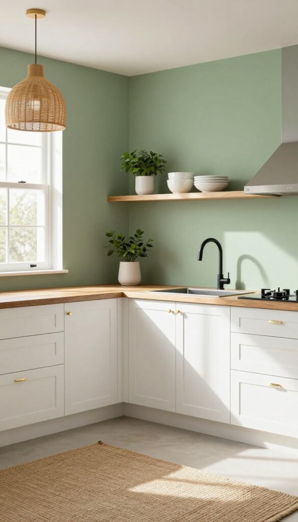
If your kitchen feels a little chaotic, sage green is the color equivalent of a deep breath. It’s earthy without being dull, and it pairs effortlessly with white cabinets and natural wood accents. This shade brings the outdoors in, making your cooking space feel like a serene retreat rather than just a work zone.
Plus, it’s forgiving—dust and smudges don’t show as easily as on stark white walls.
Sage green works especially well in kitchens with good natural light, where it shifts from soft gray-green to a warmer herbal tone throughout the day. It’s a weekend-friendly project because you can paint just one wall or the whole room without worrying about matching complicated undertones. For a cohesive look, carry the color onto open shelving or a kitchen island base.
The key is keeping other elements simple: white countertops, brass or black hardware, and plenty of plants to echo the green.
Best Color Pairings
- Sage green loves crisp white, warm cream, and soft beige. For a bolder contrast, try deep navy or charcoal on lower cabinets. Avoid pairing it with cool grays—they can make the green look muddy.
- Instead, lean into warm neutrals like oak or walnut wood tones.
Finishing Touch
Add texture with linen curtains, a jute rug, or woven pendant lights. These natural materials reinforce the calming vibe and keep the room from feeling flat. A few ceramic jars or a wooden cutting board on the counter complete the look without trying too hard.
3. Navy Blue Lower Cabinets, White Uppers
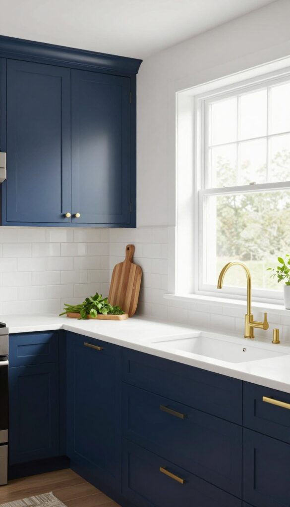
Two-tone cabinetry is having a moment, and this particular combo is a classic for a reason. Navy blue on the bottom anchors the kitchen, making it feel grounded and intentional, while white uppers keep the space open and bright. It’s a look that works in both modern and traditional kitchens, and it’s surprisingly weekend-friendly if you’re up for a painting project.
If your kitchen feels a little flat or top-heavy, switching to darker lowers can change the whole energy. The navy adds depth and a subtle richness that reads almost like a neutral, so it won’t overwhelm the room. White uppers reflect light and keep the ceiling from feeling low, which is especially helpful in galley kitchens or spaces without tons of natural light.
The contrast also creates a natural focal point at eye level, drawing attention to your countertops and backsplash. For a cohesive look, carry the navy into an island or a open shelving unit, but keep the upper cabinets light to maintain that airy balance.
Best Colors
Stick with a true navy that has a slight gray undertone—think Hale Navy by Benjamin Moore or Naval by Sherwin-Williams. Avoid shades that pull too purple or too green, as they can clash with warm wood tones or brass hardware. For the uppers, a crisp white like Chantilly Lace or Simply White keeps the contrast clean without looking stark.
Hardware Pairing
Brass or brushed gold knobs and pulls are the natural match for navy lowers—they warm up the cool blue and add a touch of elegance. If you prefer a more modern vibe, matte black or oil-rubbed bronze works too, especially with a satin nickel faucet. Just keep the same finish throughout for a polished look.
Budget-Friendly Swap
Painting existing cabinets is totally doable over a weekend. Use a high-quality bonding primer and a cabinet-specific paint with a semi-gloss or satin finish for durability. If you’re not ready to commit to all lowers, try painting just the island or a single base cabinet for a similar effect.
4. Butter Yellow for a Sunny Morning Feel
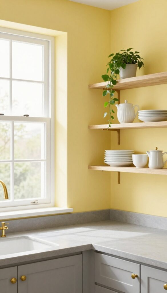
Butter yellow is one of those shades that instantly lifts your mood without screaming for attention. It’s warm, soft, and feels like a gentle hug every time you walk into the kitchen. Unlike bolder yellows that can feel overwhelming, this muted tone brings a cheerful glow that works beautifully with natural light.
It’s especially inviting in kitchens that face east or north, where the morning sun can play off the walls and make the whole space feel brighter.
Butter yellow pairs effortlessly with gray countertops and brass hardware, creating a look that feels both polished and approachable. The gray grounds the warmth, while brass adds a subtle touch of elegance. This combination is perfect for weekend refreshers—just a coat of paint and a few swapped-out handles can transform the room without a full renovation.
It’s a practical choice that still feels special, and it works in both modern and traditional kitchens.
Best Color Pairings
Stick with soft, neutral tones to let the butter yellow shine. Warm whites, light grays, and even pale blues make excellent companions. For a bolder contrast, try deep navy or charcoal on an island or lower cabinets—it adds depth without clashing.
Finishing Touch
- Brass hardware is the secret weapon here. Go for unlacquered brass or brushed gold on cabinet pulls and faucets. The warm metal echoes the yellow and keeps the look cohesive.
- Add a few open shelves with white dishes and a trailing plant to complete the sunny vibe.
5. Charcoal Gray for Modern Drama
Charcoal gray is having a moment in kitchens, and for good reason. This deep, moody shade adds instant sophistication without feeling cold or industrial. It works especially well in open-concept spaces where you want the kitchen to feel grounded and intentional.
The key to pulling it off is contrast—pair it with crisp white or light wood countertops, and make sure your lighting plan is generous. Natural light helps the gray read as rich rather than heavy, so if your kitchen lacks windows, supplement with layered fixtures.
Best Color Pairings
Stick with warm whites (like Swiss Coffee or Alabaster) for cabinets or trim to keep the space from feeling flat. Brass or brushed gold hardware adds a touch of warmth that pops against the dark backdrop. If you want a two-tone look, try charcoal on lower cabinets and a soft white or pale sage on uppers.
Lighting Tip
Because charcoal absorbs light, you need more than one source. Install under-cabinet task lighting, a pendant over the sink or island, and maybe a few recessed cans. Dimmers let you adjust the mood—brighter for cooking, softer for dining.
Finishing Touch
Open shelving in a light wood tone breaks up the darkness and adds texture. Display a few ceramic pieces or cookbooks in neutral colors to keep the look curated, not cluttered.
6. Blush Pink Accent Wall
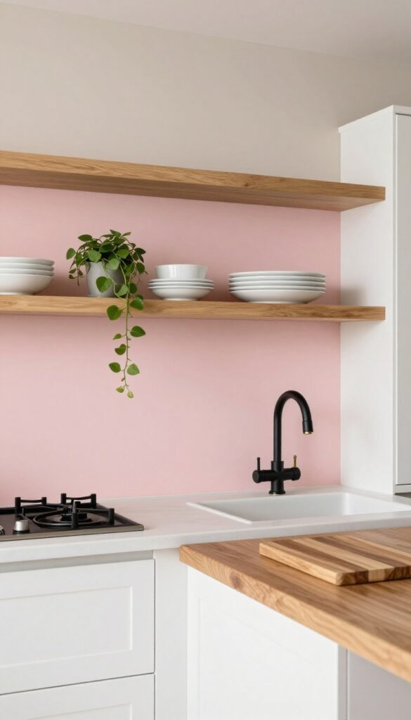
A soft blush pink accent wall is one of those kitchen updates that feels both fresh and timeless. It brings a gentle warmth that makes the space feel more inviting without overwhelming the senses. Paired with crisp white cabinets and natural wood accents, this color creates a balanced, grown-up look that still feels playful.
Blush pink works especially well in kitchens that get plenty of natural light, as the soft hue glows without feeling too sweet. Keep the surrounding walls, countertops, and cabinetry in neutral tones like white, beige, or light gray to let the pink stand out as a deliberate accent. This approach keeps the room feeling airy and prevents the color from dominating the space.
For a weekend refresh, painting just one wall—ideally the one behind the stove or sink—can transform the entire kitchen without a major commitment.
Best Colors To Pair
Blush pink pairs beautifully with warm woods like oak or walnut, as well as with matte black or brass fixtures. For a cohesive palette, consider soft whites (like Benjamin Moore's White Dove) for cabinets and a warm greige for adjacent walls. Avoid cool grays, which can clash with pink's warmth.
Finishing Touch
Bring the accent wall to life with a few open shelves in the same pink tone or a contrasting light wood. Style them with white ceramics, a trailing plant, and a few cookbooks to add texture and personality. This small styling detail makes the wall feel intentional rather than just painted.
7. Classic Blue-Gray for Versatility
A muted blue-gray is one of those rare paint colors that feels both calming and sophisticated without trying too hard. It sits beautifully between cool and warm tones, so it never feels cold or sterile. Whether your cabinets are white, wood, or even black, this shade creates a quiet, collected backdrop that lets everything else breathe.
This color works like a neutral but with more personality. It’s dark enough to hide everyday smudges but light enough to keep the kitchen feeling open. The blue undertone adds a subtle freshness, while the gray keeps it grounded and modern.
If you’re doing a weekend refresh, this is a low-risk, high-reward choice that instantly upgrades the room’s mood.
Best Cabinet Pairings
- White cabinets look crisp and classic against blue-gray. Warm wood tones, like oak or walnut, bring out the gray side and make the space feel cozy. For a bolder look, pair with matte black cabinets for a moody, modern vibe.
- The key is to keep the undertones consistent—cool whites and warm woods both work, just stick with one direction.
Finishing Touch
- Add warmth with brass or gold hardware and light fixtures. The metallic glow contrasts nicely with the cool wall color. A few open shelves with white dishes or greenery will keep the look from feeling too heavy.
- If your kitchen gets good natural light, the blue-gray will shift throughout the day, looking softer in the morning and richer in the afternoon.
8. Terracotta for Warmth and Character
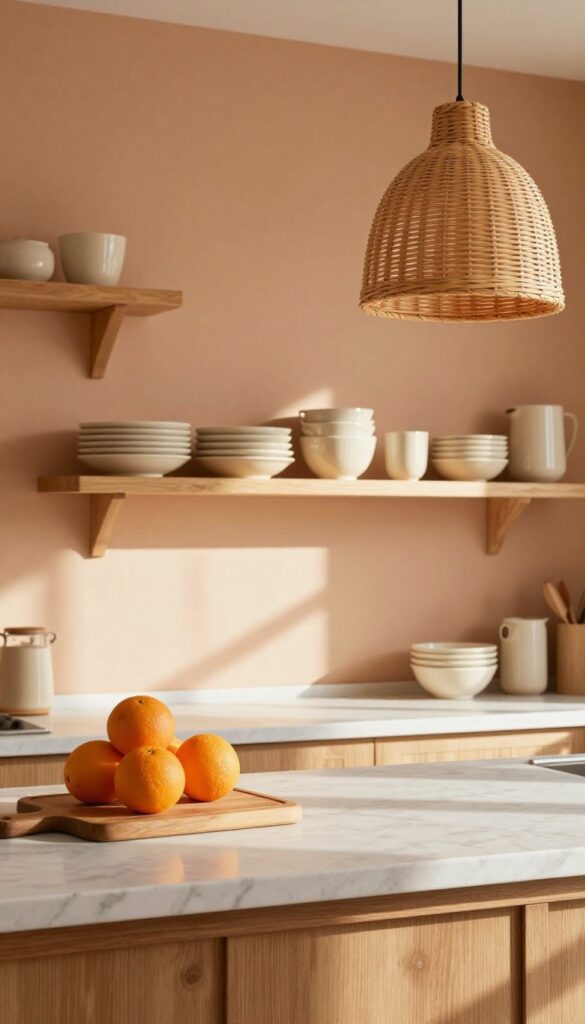
Terracotta isn’t just for flower pots anymore. This earthy, sunbaked hue brings a cozy, Mediterranean warmth that instantly makes a kitchen feel more inviting. It pairs beautifully with natural wood tones and creamy whites, creating a grounded, lived-in look that’s both stylish and approachable.
Whether you go for a full wall or just an accent area, terracotta adds character without trying too hard.
Terracotta is a versatile choice that works in many kitchen styles, from rustic farmhouse to modern minimal. Its warm undertones make the space feel instantly cozier, especially in kitchens that get lots of natural light. You can use it on a single wall, as a backsplash, or even on cabinets for a bolder statement.
Pair it with warm woods, rattan, and cream textiles to enhance the earthy vibe. For a weekend refresh, painting just one wall or the area behind open shelving can transform the room without a major commitment.
Best Colors To Pair
- Terracotta loves warm neutrals like cream, beige, and soft white. It also plays well with muted greens like sage or olive, and deep blues like navy for contrast. Avoid cool grays or stark whites, as they can make the terracotta look muddy.
- Stick to warm, earthy companions to keep the palette cohesive.
Where to Use It
The most impactful spot is an accent wall behind the stove or sink. You can also paint the inside of open shelving or a kitchen island for a surprise pop. If you’re renting or want a temporary look, try terracotta peel-and-stick tile for a backsplash that’s easy to remove later.
Finishing Touch
Add texture with matte paint or a slight limewash finish for an authentic, aged feel. Then bring in warm wood cutting boards, woven baskets, and cream pottery to complete the look. A few trailing plants like pothos or ivy soften the edges and add life.
9. Olive Green for a Rich, Organic Look
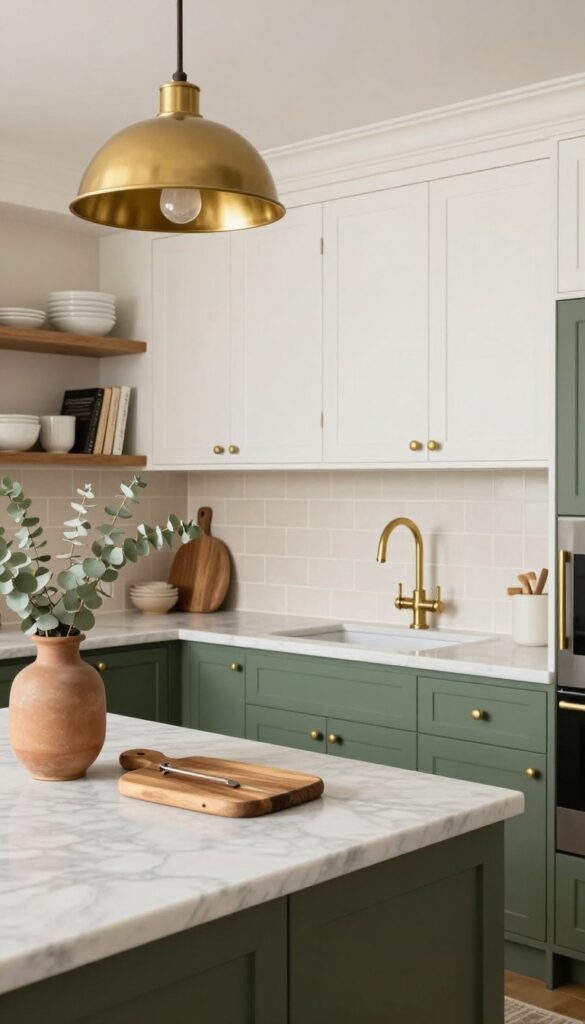
Olive green sits right in that sweet spot where earthy meets elegant. Deeper than sage but not as dark as forest green, it brings a grounded richness that feels both timeless and current. In a kitchen, this shade works like a neutral with attitude—it pairs beautifully with brass, dark wood, and natural stone, creating a space that feels collected rather than decorated.
Best of all, it's a weekend-friendly update that instantly upgrades your cabinets or an accent wall without requiring a full renovation.
Olive green is a versatile choice that can be used on cabinets, an island, or even just a single wall. Its depth adds warmth and sophistication, making the kitchen feel more intimate and inviting. Pair it with warm metals like brass or copper for a touch of luxury, and balance it with light countertops or open shelving to keep the space from feeling too heavy.
This color works especially well in kitchens with natural light, where it shifts from a muted khaki in the morning to a deeper, more dramatic tone in the evening.
Best Color Combos
Olive green pairs beautifully with creamy whites, warm beiges, and soft terracottas for a cohesive, organic palette. For a bolder look, try it with deep navy or charcoal on lower cabinets. Brass hardware and light wood accents complete the scheme.
Where to Use It
Paint your lower cabinets olive green and keep uppers white for a balanced two-tone effect. Or use it on a kitchen island to create a focal point. If you're not ready to commit, try an olive green backsplash or a single accent wall behind open shelving.
Finishing Touch
Add texture with natural materials like a butcher block countertop, woven bar stools, or a jute runner. A few trailing plants on open shelves reinforce the organic feel and soften the richness of the green.
10. White with a Black Accent Wall
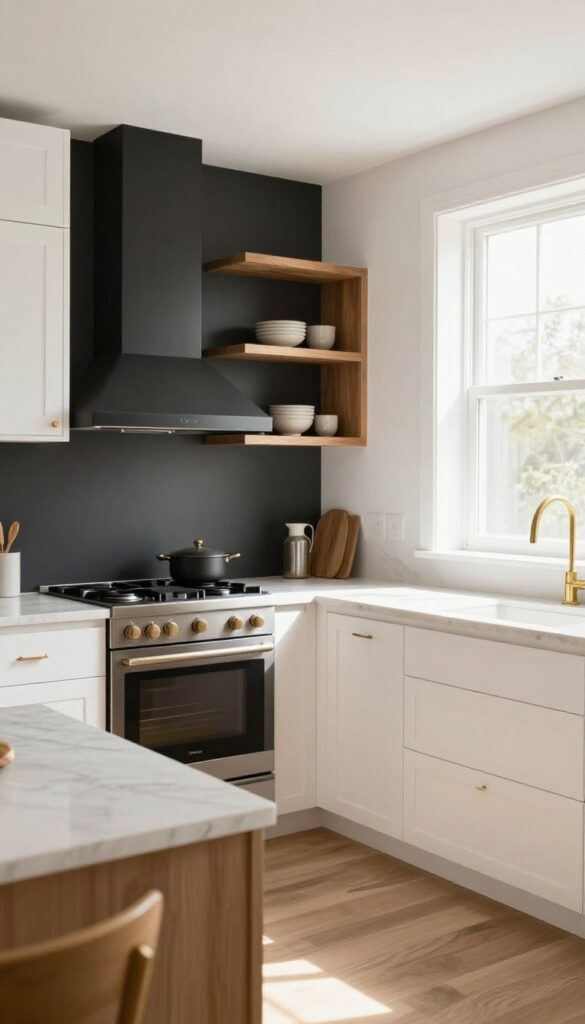
A crisp white kitchen gets an instant dose of drama with a single black accent wall. It’s one of those high-contrast looks that feels both bold and totally doable—no need to repaint the whole room. Place it behind the stove or sink to create a natural focal point that anchors the space without overwhelming it.
The best part? This trick works in almost any kitchen, from tiny galley layouts to open-plan spaces, and it’s perfect for a weekend refresh.
The key is keeping the surrounding walls white (or a very light off-white) so the black wall really pops. Matte black paint hides splatters better than gloss and adds a soft, modern edge. Pair it with warm wood accents, brass hardware, or marble countertops to keep the look from feeling too stark.
For a cohesive finish, carry the black into small details like cabinet handles, light fixtures, or bar stools. This idea is especially effective in kitchens with good natural light—the white bounces light around while the black adds depth.
Best Paint Finish
- Go with a matte or eggshell finish for the black wall. It reduces glare and makes the color feel rich and velvety, not harsh. In a kitchen, matte is surprisingly practical—it hides fingerprints and minor splashes better than satin or semigloss.
- If you’re worried about wipeability, a matte paint with a washable formula works perfectly.
Where To Place It
The wall behind the stove is a natural choice because it frames the cooking zone and makes a statement without competing with cabinets. Alternatively, try the wall behind the sink—it turns a utilitarian area into a design moment. Avoid busy patterns or multiple accent walls; one solid black wall is plenty.
Finishing Touch
- Add open shelving on the black wall with white or light wood shelves. The contrast makes dishes and plants pop. Keep the styling minimal—a few ceramic pieces, a small plant, or a stack of white plates.
- This keeps the look airy and prevents the black from feeling heavy.
11. Pale Blue for a Breath of Fresh Air
Light blue is one of those colors that instantly makes a kitchen feel cleaner and more open. It’s not as cold as white, but still keeps things airy and bright. In a small kitchen, pale blue walls can trick the eye into seeing more space, which is exactly what you want when square footage is tight.
This shade works especially well in kitchens that get good natural light, but even in darker spaces, a soft blue can feel fresh rather than gloomy. Pair it with white trim and open shelving to keep the look light and uncluttered. For a weekend refresh, this is a low-commitment color that still packs a visual punch.
Best Color Combos
Pale blue pairs beautifully with crisp white, warm wood tones, and brushed brass or nickel hardware. Avoid going too gray or cool-toned—stick to a blue with a hint of warmth so the kitchen still feels inviting.
Small-space Fix
If your kitchen is on the smaller side, use pale blue on the walls and keep cabinets white. This creates a sense of depth without overwhelming the room. Add a few open shelves in the same blue tone for a cohesive look.
Finishing Touch
Bring in natural textures like a woven rug, wooden cutting boards, or linen curtains. These soften the coolness of the blue and make the space feel lived-in, not sterile.
12. Warm Beige for a Cozy Neutral
Beige gets a bad rap, but hear us out. A warm, taupe-like beige is nothing like the flat, builder-grade version you're picturing. It brings depth and coziness without darkening the room, making it a perfect weekend refresh for any kitchen.
This shade pairs beautifully with natural wood tones and soft whites, creating a space that feels both grounded and airy.
Warm beige is the unsung hero of neutral kitchens. It reads as sophisticated and inviting, especially when you choose a shade with subtle undertones of gray or brown. Unlike stark white or cool gray, this color wraps the room in a gentle warmth that makes mornings feel slower and evenings cozier.
It's forgiving of crumbs and splatters, too—a practical win for busy cooks. To keep it from feeling flat, pair it with matte black hardware, warm brass fixtures, or open shelving with ceramic dishes. The result is a kitchen that feels curated, not sterile.
Best Colors To Pair
Stick with warm whites like Swiss Coffee or Navajo White for trim and cabinets. Add depth with charcoal or olive green accents in textiles or bar stools. Wood tones—especially oak or walnut—bring out the beige's warmth without clashing.
Texture Mix Tip
Since beige can read flat on large walls, layer in texture through linen curtains, a jute rug, or woven pendant lights. A matte finish on the walls also helps absorb light softly, while glossy tiles or marble countertops add a subtle contrast.
Budget-Friendly Swap
If a full repaint feels overwhelming, try beige on just one accent wall or the island. You can also swap out your backsplash for warm-toned zellige tiles to achieve a similar effect without touching the walls.
13. Mint Green for Retro Charm
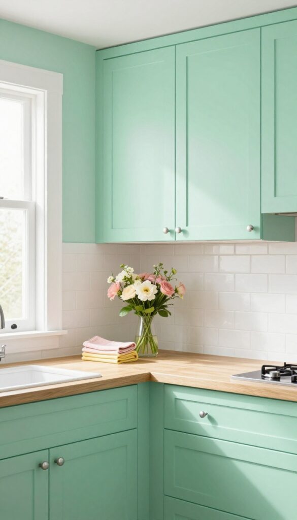
Mint green is making a comeback, and it’s easy to see why. This soft, nostalgic shade adds a playful yet sophisticated touch to any kitchen, especially when paired with chrome fixtures and pastel accents. It’s a color that feels fresh without being overwhelming, perfect for a weekend refresh that won’t require a full renovation.
Whether you go for an accent wall or full cabinets, mint green brings a cheerful mid-century vibe that works in both modern and traditional spaces.
Mint green is a versatile color that can transform your kitchen into a retro-inspired haven. It pairs beautifully with white subway tile, butcher block countertops, and chrome hardware for an authentic mid-century look. For a more subtle approach, try mint green on lower cabinets or an island, leaving upper cabinets white to keep the space feeling open.
This color also works well with pastel accessories like pink or yellow dish towels, adding a playful pop without overwhelming the room. The key is balance: let mint green be the star, but keep other elements simple to avoid a dated look.
Best Color Combinations
- Mint green loves company. Pair it with crisp white for a clean, airy feel, or go bold with navy blue for a striking contrast. For a softer palette, combine mint with pale pink or butter yellow.
- Chrome fixtures and brushed nickel hardware enhance the retro charm, while warm wood tones add a natural balance. Avoid pairing mint with too many cool tones; a touch of warmth keeps the space inviting.
Budget-friendly Refresh
- You don’t need to repaint the whole kitchen to try this trend. Start with a single accent wall or the back of open shelving. Mint green peel-and-stick wallpaper is another easy option for a temporary change.
- If you’re feeling bolder, paint just the island or a set of cabinets. This approach gives you the retro look without committing to a full color scheme, and it’s easy to update later.
Finishing Touches
- Complete the look with retro-inspired accessories. Think chrome toasters, pastel canisters, and vintage-style tea towels. Add a few mid-century modern bar stools or a pendant light with a milk glass shade.
- Plants like spider plants or pothos in white pots add life without clashing. Keep countertops clutter-free to let the mint green shine.
14. Deep Plum for Unexpected Luxury
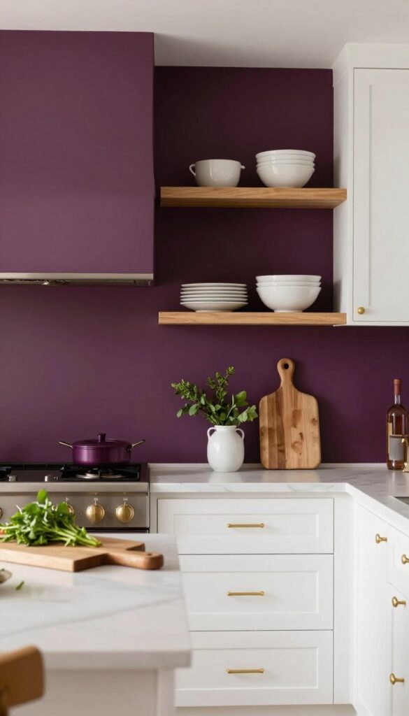
Plum isn’t the first color you think of for a kitchen, but that’s exactly what makes it so striking. This deep, wine-inspired shade brings warmth and richness without feeling heavy or dark. It works especially well in kitchens that get plenty of natural light, where the plum can shift from a deep berry to a soft aubergine depending on the time of day.
The key is using it sparingly — a single wall or the lower cabinets — so it reads as a deliberate accent, not an overwhelming choice. If you’re after something that feels both bold and refined, plum delivers without shouting.
Plum pairs beautifully with warm metals like brass or copper, and it creates a stunning contrast against white or cream cabinetry. For a weekend-friendly refresh, consider painting just the island or the backsplash wall. The color adds depth and a sense of luxury that feels more custom than a typical neutral.
Keep the rest of the kitchen light and airy to let the plum stand out. Add a few wooden cutting boards or open shelves with ceramic dishes to soften the look. This is a great way to test a dramatic color without committing to a full kitchen makeover.
Best Color Pairings
Plum loves creamy whites, pale grays, and warm beiges. For a bolder look, pair it with mustard yellow or soft blush. Keep hardware in brass or matte black to tie the richness together.
Where To Apply It
The lower cabinets are a perfect spot — they ground the room and make the color feel intentional. A single wall behind the stove or a kitchen island also works well. Avoid painting upper cabinets plum, as it can make the space feel top-heavy.
Finishing Touch
Add open shelving with light-colored dishes or glass jars to break up the plum and keep the kitchen feeling open. A small plant or fresh herbs on the counter add a natural, lively contrast.
15. Two-Tone Neutral: Greige and White
Greige is having a moment, and for good reason. It blends the warmth of beige with the coolness of gray, creating a neutral that feels balanced and never flat. Pairing greige walls with crisp white trim and cabinets gives your kitchen a subtle, sophisticated look that works with almost any style—from modern farmhouse to contemporary.
It’s an easy weekend project that instantly upgrades the whole room without overwhelming it.
This color combo is all about contrast without drama. The greige walls add depth and warmth, while the white trim and cabinets keep things bright and airy. It’s a practical choice for real homes because it hides dirt better than pure white and feels more inviting than stark gray.
Plus, it’s a perfect backdrop for pops of color in accessories or natural wood accents.
Best Colors
Look for greige shades with a balanced undertone—not too yellow or too blue. Popular options include Sherwin-Williams Agreeable Gray or Benjamin Moore Revere Pewter. White trim should be a true white with a hint of warmth, like Chantilly Lace or Simply White, to keep the look cohesive.
Texture Mix
To keep the space from feeling flat, add texture through matte walls, semi-gloss trim, and natural materials like wood countertops or woven barstools. A matte finish on walls softens the greige, while glossy white cabinets reflect light and add visual interest.
Finishing Touch
Bring in warmth with brass or black hardware and a few green plants. The greige and white palette lets these accents stand out without clashing, so you can easily update the look later with new decor.
FAQ
What is the best paint finish for kitchen walls?
Eggshell or satin finishes are ideal. They offer a slight sheen that’s easy to clean and holds up well against grease and moisture.
How much paint do I need for a kitchen?
For an average kitchen (about 150 sq ft of wall space), one gallon usually covers two coats. Measure your walls to be sure.
Can I paint over dark kitchen walls without priming?
It’s best to prime first, especially if going from dark to light. A good primer ensures even coverage and true color.
Should I paint my kitchen cabinets the same color as the walls?
Not necessarily. Contrast often looks better. Try a different shade or keep cabinets white while painting walls a color.
How long does it take to paint a kitchen?
A weekend is usually enough for one room. Prep and first coat on Saturday, second coat on Sunday.
Conclusion
Updating your kitchen with a fresh paint color is one of the most rewarding weekend projects you can tackle. It’s budget-friendly, relatively quick, and makes a huge visual impact. Whether you go for a soft neutral or a bold accent, the key is choosing a shade that makes you happy every time you walk in.
We hope these 15 ideas gave you some inspiration for your own space. Remember, paint is forgiving—if you try a color and don’t love it, you can always change it. Happy painting!