10 Light Blue Living Room Ideas That Keep the Mood Calm
A calm living room doesn't need to feel boring. Light blue does the heavy lifting here, cooling a space without draining the warmth out of it.
The shade works harder than most people expect. It softens harsh afternoon glare, plays well with wood and linen, and makes even a small room feel a little more open.
These ten ideas cover the whole range, from full walls to small accents you can swap in a weekend. Pick one, or stack a few, and watch the mood settle down.
1. Paint the Walls a Soft Sky Blue
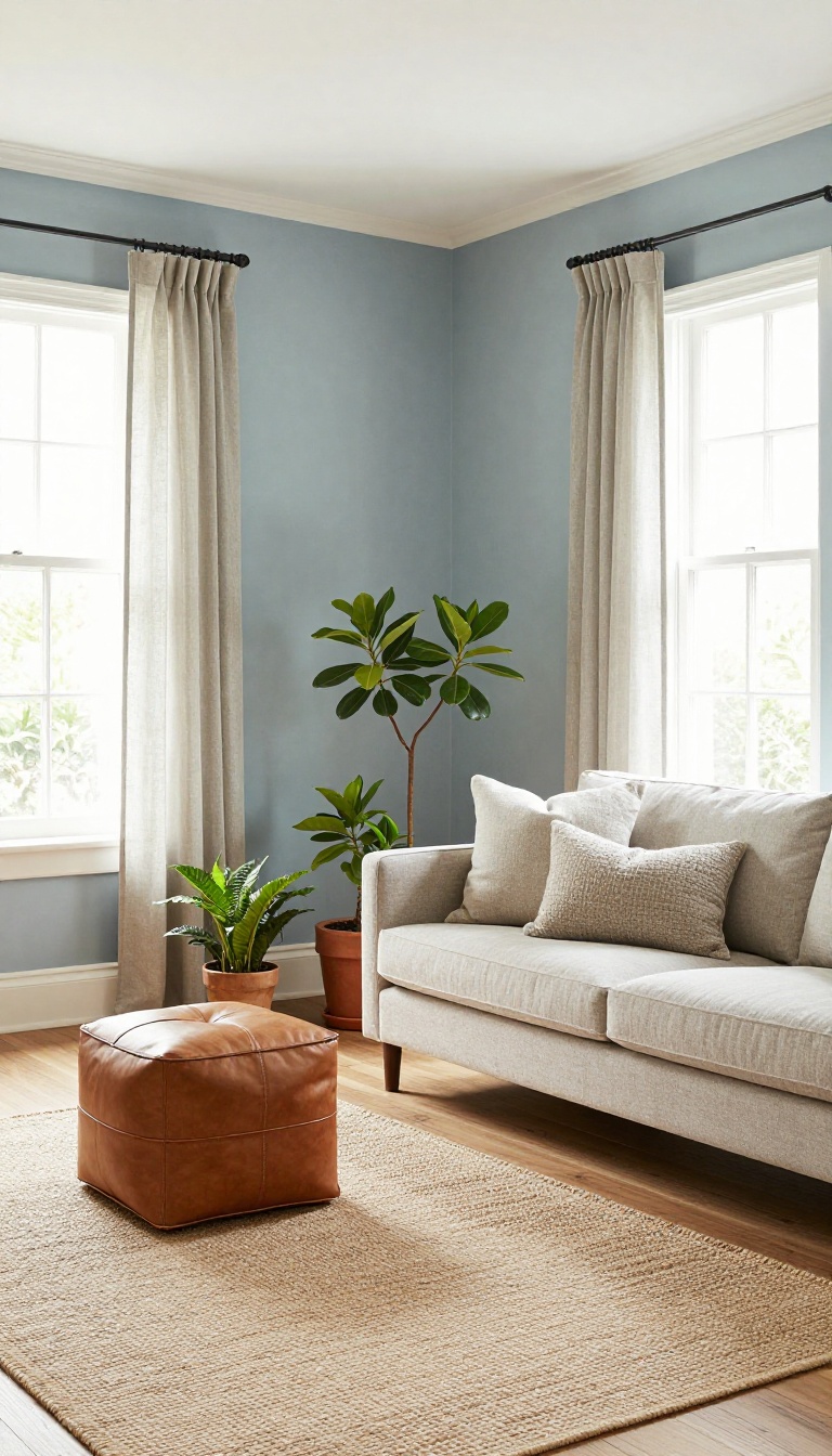
A soft sky blue on all four walls is the simplest way to set a calm tone in a living room. The trick is picking a shade with a little gray or green mixed in, so it reads as gentle rather than icy. Pair it with warm white trim and natural wood floors, and the room stays balanced instead of cold.
Start by grabbing a few paint chips in the light blue family. You want something that looks like a hazy morning sky, not a swimming pool. Hold the chips against your floor and trim in daylight, since artificial light can make blues look completely different.
Once you find a shade that feels soft and slightly muted, commit to it. The whole room will feel instantly more relaxed.
Why Undertones Matter
Blues with a hint of gray feel sophisticated and calm, while blues with green undertones feel a bit more organic and earthy. Pure, bright blues can turn chilly fast, especially in north-facing rooms. If your space gets little natural light, lean toward a gray-blue to keep things cozy.
South-facing rooms can handle a slightly cooler blue without feeling cold.
Trim And Floor Pairings
Warm white trim is your best friend here. It creates a soft contrast that keeps the walls from looking washed out. Natural wood floors add warmth and texture, which balances the coolness of the blue.
If you have dark floors, a lighter blue wall will brighten the room without making it feel sterile.
Finishing Touches
Add a few warm textures like a woven jute rug, linen curtains, or a leather ottoman. These materials soak up the coolness and make the room feel lived-in. A couple of brass or wood accents will also help.
Keep the palette simple so the blue remains the star.
2. Use Light Blue as an Accent Wall
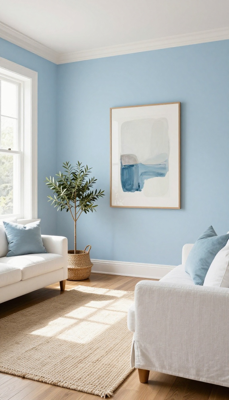
Painting every wall in a light blue can feel like a big commitment, especially if you love your current neutral base. An accent wall gives you the calm of light blue without repainting the entire room. It also creates a natural focal point.
The eye lands on that one wall, and the rest of the room gets to breathe.
You don't need a professional to pull this off. Pick the wall that already draws attention—usually the one behind the sofa or the one you face when you walk in. That's where light blue will do the most work.
A single painted wall can shift the whole mood of a living room. It adds depth, softens harsh light, and gives you a built-in backdrop for art or a mirror. Best of all, it's a weekend project, not a renovation.
Pick The Right Wall
The wall behind your sofa is the classic choice because it anchors the seating area. If your sofa sits against a wall with a window, consider the opposite wall instead so the blue doesn't compete with glare. In an open-plan space, choose the wall that visually separates the living zone from the dining or kitchen area.
Choose A Shade That Fits The Light
Light blue looks different depending on how much natural light the wall gets. North-facing rooms tend to make blues look cooler, so lean toward shades with a hint of gray or green. South-facing rooms can handle brighter, clearer blues without feeling icy.
Grab a few paint samples and tape them up for a full day before you commit.
Style Around The Accent
Once the wall is blue, keep the rest of the room simple. White or cream trim makes the color pop, and warm wood tones keep it from feeling cold. Add a large piece of art or a round mirror to break up the flat color.
If you want more depth, layer in a textured throw or a woven basket near the wall.
3. Choose a Light Blue Sofa as the Centerpiece
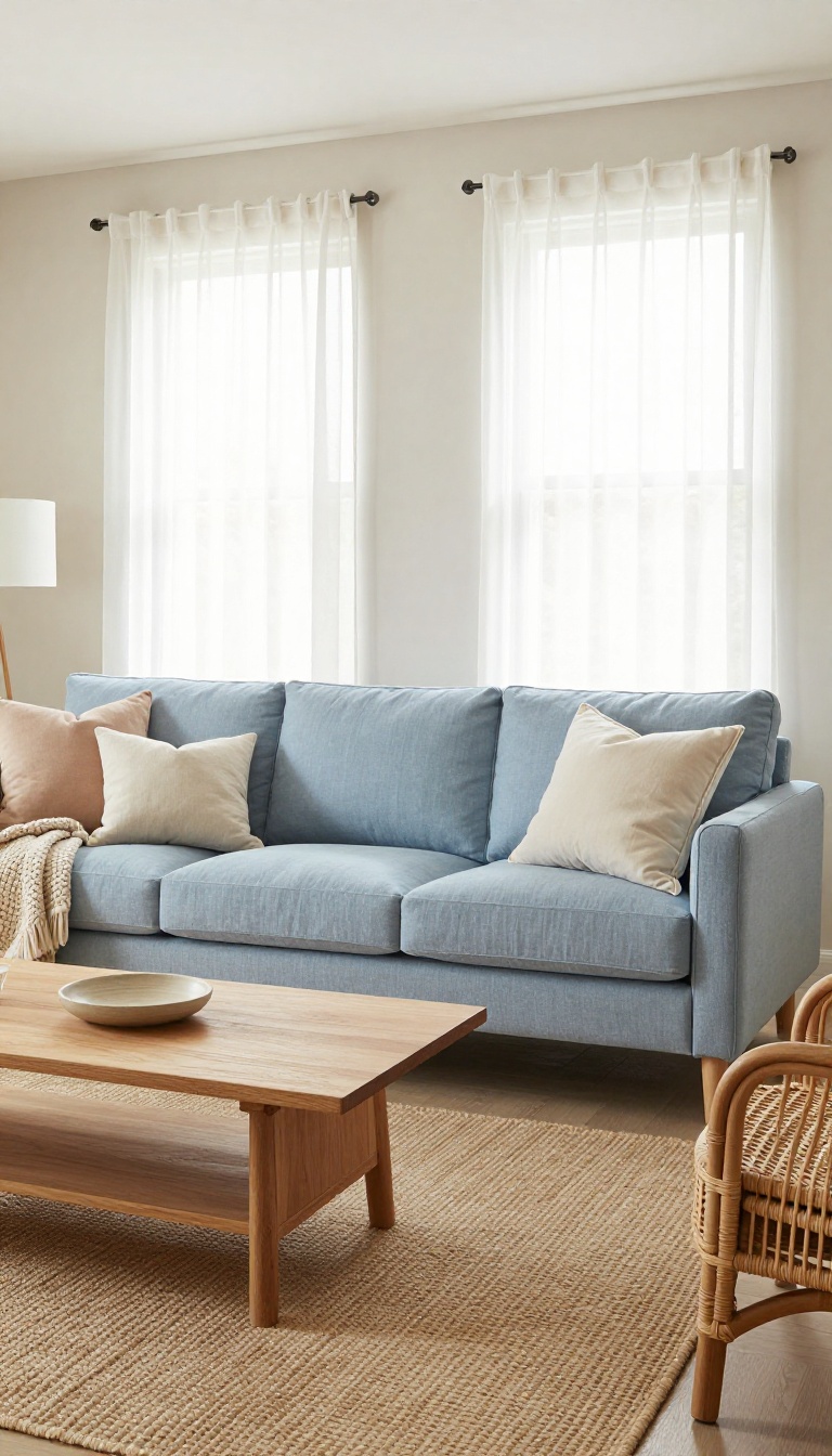
A light blue sofa does more than fill an empty corner. It becomes the anchor that pulls the whole room into a calmer rhythm. But a big block of pale blue can also go flat if you leave it alone.
The trick is balancing softness with texture and a few grounding neutrals. Get that mix right, and the couch feels intentional instead of washed out.
Start by picking the right shade. Light blue covers a wide range, from icy powder to soft denim. A slightly grayed blue tends to hold up better in a living room than a bright pastel because it reads as calm rather than candy-colored.
Fabric matters just as much as color. Linen and cotton blends keep the look relaxed and breathable. Velvet in a light blue adds depth and catches the light in a way that flat weaves can't.
Once the sofa is in place, treat it like the room's center of gravity. Everything else should support it, not compete with it.
Balance The Blue With Warm Neutrals
A light blue couch on its own can feel chilly. Add warm neutrals like oatmeal, sand, or soft cream to bring back coziness. Throw pillows in those tones break up the blue and give your eye a place to rest.
A natural wood coffee table or rattan side chair does the same thing. The goal is contrast without clutter. Two or three warm pieces are usually enough.
Layer In Texture So It Doesn't Fall Flat
Smooth blue fabric needs something rough nearby. A chunky knit throw, a woven jute rug, or a nubby linen cushion adds the tactile contrast that keeps the room interesting. Mixing textures also makes the blue look richer.
When light hits a woven rug and a soft sofa in the same space, the color shifts and feels less one-note. Stick to two or three textures max. More than that and the calm starts to fray.
Keep The Surrounding Palette Quiet
The sofa is the star, so let the walls and floor stay understated. White, warm gray, or a barely-there beige keeps the blue from fighting for attention. If you want a second color, choose something muted like sage, blush, or soft clay.
Bright pops will pull the room in a different direction. Less noise around the sofa means the calm tone actually lands.
4. Layer Light Blue with Warm Neutrals
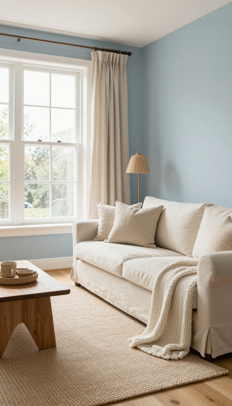
Light blue on its own can drift toward chilly, especially in rooms with lots of gray light or cool-toned flooring. The fix isn't to abandon the color—it's to give it something warm to lean against. Beige, cream, and soft tan do exactly that, turning a cool blue room into one that feels balanced and lived-in.
Think of warm neutrals as the blanket your light blue walls get to curl up in. They don't compete for attention; they just take the edge off. You can bring them in through big pieces like a sofa or rug, or through smaller touches like lampshades, curtains, and wood tones.
The goal is a room that feels calm but not clinical.
Start With The Biggest Warm Surface
Your floor or your largest piece of furniture sets the temperature of the room. A cream bouclé sofa, a sand-colored jute rug, or even light oak floors give the blue something soft to sit against. If you already have cool gray floors, a large warm-toned area rug can do the same job without any renovation.
Mix Textures, Not Just Colors
Warm neutrals read warmer when they have texture. Linen curtains, a chunky knit throw, a woven basket, or a nubby upholstery fabric all add depth that flat paint can't. Pair these with your light blue walls or a light blue accent chair and the room starts to feel layered instead of flat.
Keep The Balance Intentional
Aim for roughly two parts warm neutral to one part light blue. That ratio keeps the blue as the star while the neutrals do the comforting. If the room still feels cold, add a warm wood tone—like a walnut side table or a rattan pendant—and a lamp with a soft white bulb.
5. Add Light Blue Window Treatments
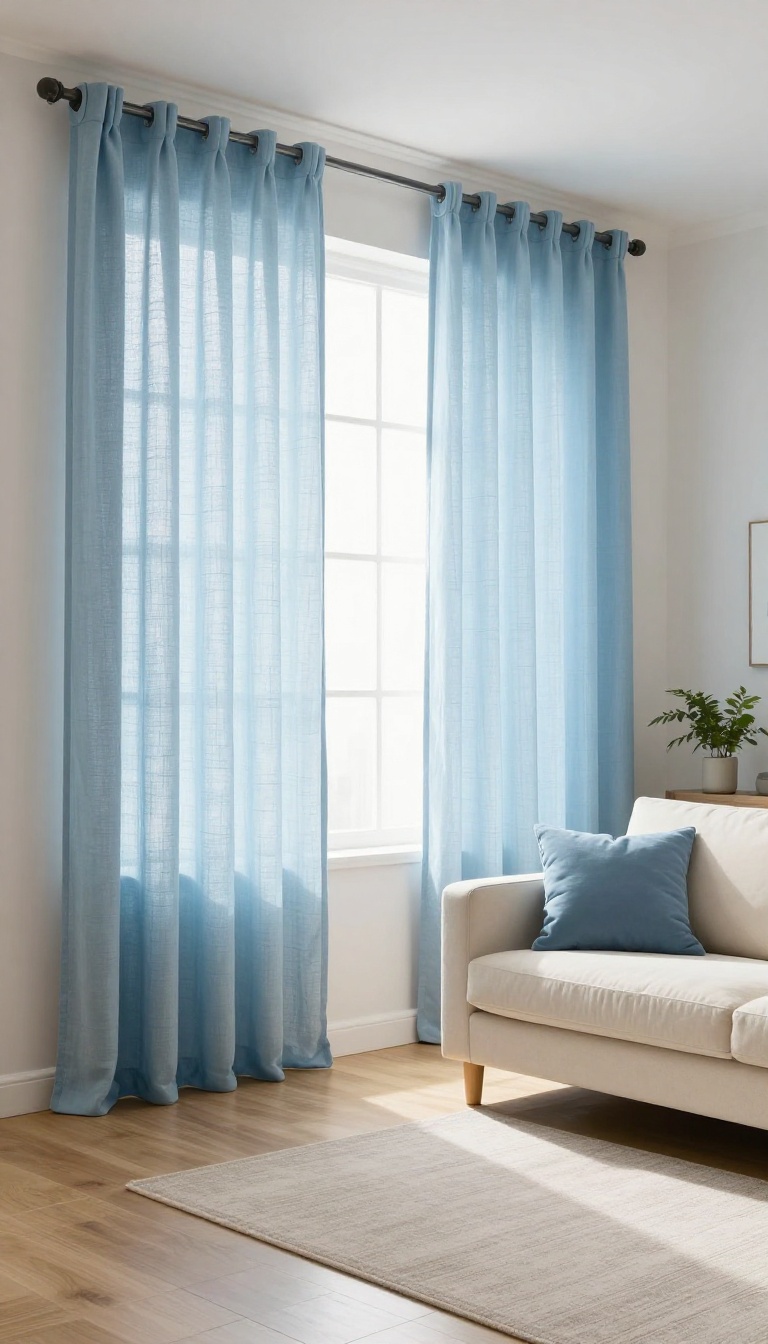
Windows are often the last thing you decorate, but they do a lot of quiet work in a calm room. Light blue curtains or shades filter the light before it hits your furniture, so the whole space feels softer. They also repeat the blue you already have, which makes the palette look intentional instead of accidental.
The trick is keeping the fabric light enough to let daylight through. Heavy, opaque drapes in a pale blue can turn a bright room gray, which is the opposite of what you want. Sheer or semi-sheer panels in a soft sky or powder blue give you privacy and glow at the same time.
You don't need custom anything to get this right. Ready-made linen or cotton blends in light blue are everywhere, and they hang nicely without a designer price tag. Just check the length before you buy, because curtains that puddle on the floor fight the clean, calm look you're after.
Pick The Right Fabric Weight
Sheer linen and voile are the safest bets for a calm living room. They diffuse direct sun into a soft wash of light and keep the blue from looking flat. If you need more coverage, layer a light blue sheer with a white or cream blackout panel behind it.
That way you control the brightness without losing the color.
Match The Blue To Your Accents
Your curtains don't have to match your sofa or rug exactly. In fact, they shouldn't. Choose a blue that's one or two shades lighter or darker than your main accent so the room feels layered, not matched.
A pale blue curtain against a medium blue pillow reads as thoughtful instead of theme-y.
Hang Them High And Wide
Mount the rod close to the ceiling and extend it a few inches past the window frame on each side. This makes the window look bigger and lets more light in when the curtains are open. It's a small change that makes the whole room feel taller and calmer.
6. Incorporate Light Blue Through Rugs and Textiles
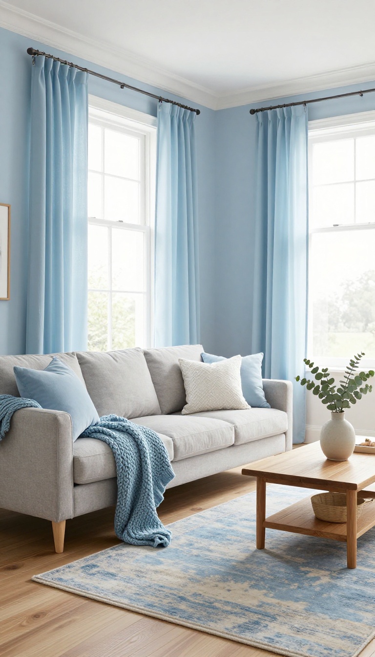
Walls and furniture get most of the attention, but the floor and the fabrics are where a light blue room actually starts to feel lived in. A rug anchors the color underfoot, and throws, pillows, and curtains carry it up onto the seating. This is the easiest way to test a light blue palette without repainting anything.
Textiles also soften a room in a way paint can't. They add texture, absorb sound, and give the eye somewhere to rest. If your walls are already light blue, this layer keeps the space from turning flat and one-note.
Start with one piece you love, then build outward. A rug sets the tone, and everything else follows from there.
Start With An Area Rug
An area rug is the fastest way to pull light blue into a room that's still mostly neutral. Choose a shade that's a step or two deeper than your walls so it reads as intentional rather than washed out. A soft sky blue works well against warm wood floors, while a gray-blue holds its own on cool tile or concrete.
Size matters more than pattern here. A rug that's too small makes the seating area feel disconnected, so aim for one that reaches under the front legs of your sofa and chairs. In an open floor plan, use the rug to define the conversation zone and let the bare floor handle the traffic paths.
If you want the calmest possible result, go with a low-contrast pattern like a faded vintage wash or a subtle tonal stripe. It adds visual interest without shouting.
Mix Patterns And Textures
One light blue textile can look lonely. Two or three, layered together, start to feel collected. Pair a smooth flatweave rug with a chunky knit throw, or set a crisp linen pillow next to a velvet one in a deeper blue.
The trick is to vary scale. A large geometric rug can handle a small dotted pillow, but two busy patterns of the same size will fight each other. Keep one pattern big and the others quiet.
Texture does the same job as color here. Wool, cotton, jute, and chenille all catch light differently, so a single blue can look like three shades across a sofa.
Layer In Throws And Pillows
Throws and pillows are the cheapest way to shift a room's mood, and they're easy to rotate with the seasons. A light blue throw draped over a neutral armchair adds color without committing to a new piece of furniture. Try one solid blue throw and two pillows in a mix of blue and cream.
That combination keeps things calm but stops the room from looking like a showroom set. If you already have a blue sofa, use textiles to break up the block of color. A cream throw and a patterned pillow will keep it from feeling like a single blue mass.
Don't Forget Curtains
Curtains are the largest textile in most living rooms, so they carry a lot of weight. A light blue curtain panel softens the window and frames the view without blocking much light. Sheer fabrics in pale blue keep the room airy, while a heavier linen blend adds warmth and privacy.
Hang them high and wide so the fabric skims the floor and the window feels bigger. If you want the color to stay subtle, choose a curtain that's only slightly bluer than the wall. The effect is quiet, but it ties the whole room together.
7. Mix Light Blue with Natural Materials
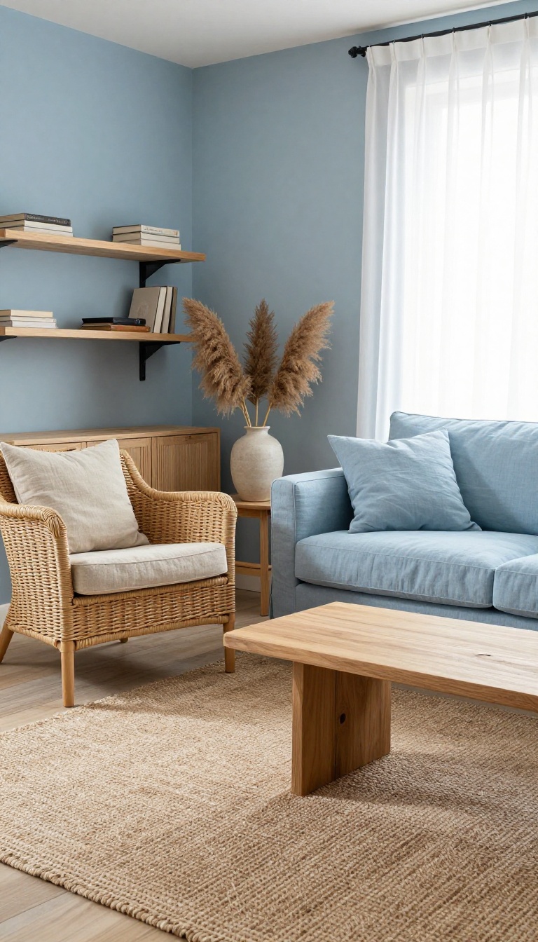
Light blue and natural materials are a match made in calm-living heaven. Wood, rattan, jute, and linen bring organic texture that softens the coolness of blue and keeps the palette from feeling too perfect. The result is a room that feels collected, not decorated, and comfortable enough to actually relax in.
Think of light blue as the sky and natural materials as the ground. One lifts the mood, the other keeps it grounded. When you pair them, you get a space that feels airy but still warm, polished but still touchable.
The trick is to layer different textures so the blue doesn't sit flat against a single surface. A woven rattan chair, a chunky jute rug, a linen slipcover, a raw wood table—each one adds a little irregularity that makes the room feel human. And because these materials come in so many natural tones, they work with almost any shade of light blue, from pale sky to soft denim.
Start With A Woven Foundation
A jute or sisal rug is the easiest way to bring natural texture into a light blue room. It adds a subtle, nubby surface that contrasts nicely with smooth walls or a tailored sofa. Look for a rug with a loose weave or visible fibers—it doesn't need to be perfectly uniform.
If jute feels too scratchy underfoot, layer a smaller cotton or linen rug on top for softness. The mix of textures is what makes it work.
Add Wood In Warm Tones
Wood furniture in honey, oak, or walnut tones warms up light blue instantly. A raw-edge coffee table, a simple wooden bench, or even a set of open shelves can do the job. Avoid heavily stained or orange-toned woods if you want to keep the mood calm—medium and light woods feel more in sync with a soft blue palette.
If you already have dark wood pieces, balance them with lighter woven accents so the room doesn't get too heavy.
Weave In Rattan And Cane
Rattan, cane, and wicker bring a breezy, organic feel that pairs beautifully with light blue. A cane-backed chair, a rattan pendant light, or a woven basket for throws adds texture without bulk. These materials also introduce subtle shadows and patterns that keep the room from looking too flat.
You can mix rattan with wood and jute freely—just keep the shapes simple so the overall look stays calm.
Soften With Linen And Cotton
Linen and cotton are the fabrics that make light blue feel livable. Slipcovers, curtains, and throw pillows in these materials have a natural slub and softness that keeps the room from feeling stiff. Choose unbleached, oatmeal, or pale gray linens to bridge the blue and the wood tones.
And don't worry about wrinkles—they're part of the charm. A slightly rumpled linen sofa or curtain reads as relaxed, not messy.
8. Use Light Blue in Small Doses with Art and Decor
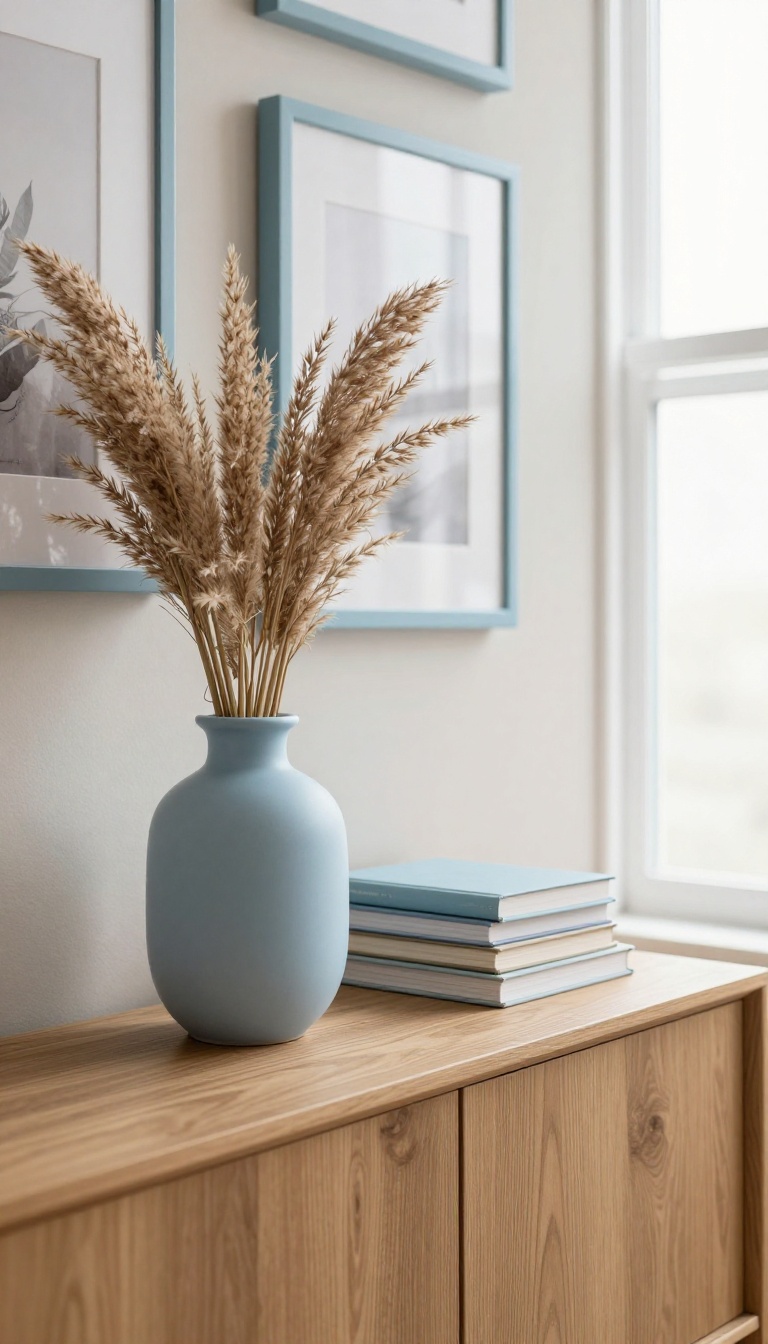
Not everyone wants to repaint a whole room or swap out a sofa. The good news is that light blue works just as well in tiny amounts, and those small touches can shift the mood without a big commitment. Think of it like adding a pinch of salt to a dish.
A single light blue vase, a framed print, or a stack of books can cool down a warm corner and make the whole space feel more collected. The trick is to place these accents where your eye naturally lands, so they read as intentional rather than random. Start with one or two pieces and build from there.
Small doses of light blue are perfect for renters, commitment-phobes, and anyone who likes to change things up often. You can test the color in your actual light before going bigger, and if it doesn't feel right, you can move it to another room or return it. These accents also let you mix in other colors and textures without a fight.
A light blue ceramic lamp next to a warm wood side table looks balanced, not matchy. The same goes for a soft blue throw draped over a neutral chair. The key is to treat these pieces as punctuation, not the whole sentence.
A little goes a long way, and a few well-placed items can make a room feel finished without feeling themed.
Pick Pieces That Pull Their Weight
A light blue vase on a console table does double duty: it adds color and holds fresh or dried stems. Look for matte finishes or handmade textures so the blue feels earthy, not plastic. Picture frames are another easy win.
A set of three light blue frames on a gallery wall ties mismatched art together and gives the arrangement a quiet through-line. Books work too, especially if you style them by color. A short stack of pale blue spines on a coffee table or shelf adds a soft focal point that you can rearrange whenever you want.
Place Accents Where They Matter
Put your light blue pieces where you already look: the coffee table, the mantel, the entryway console. Those spots get the most eyeball time, so even one item makes an impact. Avoid scattering tiny blue objects everywhere.
Instead, group two or three together on a tray or shelf so they read as one deliberate moment. If you have a dark corner that feels heavy, a light blue lamp or candle holder can lighten it without adding a big piece of furniture.
Mix With Warm And Neutral Tones
Light blue pops against warm whites, creams, and natural wood. Pair a blue vase with a jute rug or a rattan basket to keep the vibe relaxed. Metals matter too.
Brushed brass or aged bronze warms up the coolness of light blue, while silver or chrome can make it feel icier. Don't be afraid to add a third color in small amounts, like a hint of terracotta or mustard. It keeps the palette from feeling one-note.
9. Create a Light Blue Gallery Wall
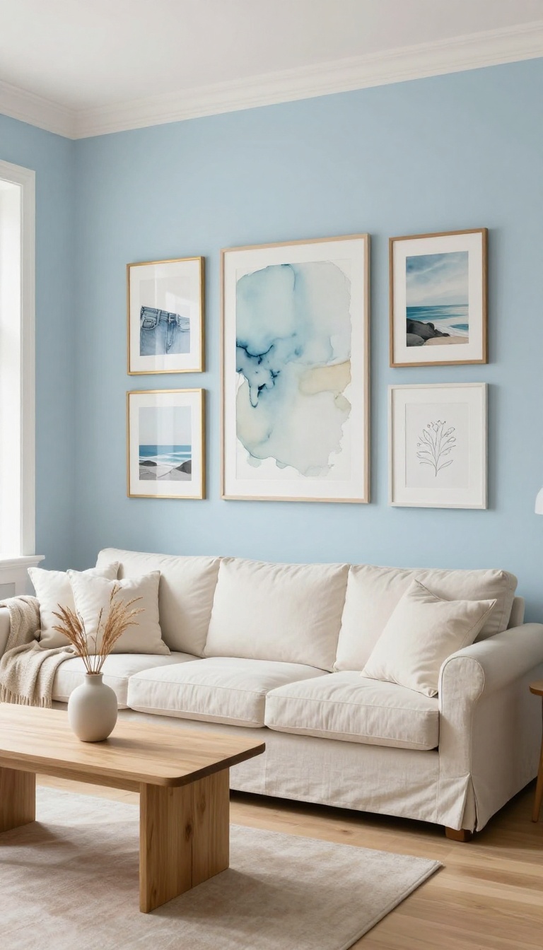
A gallery wall gives your eye somewhere to land, and when the art leans light blue, that landing spot feels like a deep breath. Instead of one big piece doing all the talking, you get a cluster of smaller moments that build a mood together. The trick is keeping it collected, not chaotic.
Mix sizes, mix frames, and let the blue tones repeat just enough to feel intentional.
You do not need a curated collection from a fancy gallery. You need a few pieces that share a color story and a wall that can handle a little visual noise without feeling loud. Light blue is forgiving here because it reads as soft even when the shapes and styles clash.
A watercolor sky, a faded denim print, a coastal photo, and an abstract wash of pale blue can all hang together if you keep the palette loose. The goal is a focal point that calms the room, not one that competes with it.
Pick A Palette, Not A Theme
Choose three to five light blue shades and let everything else stay neutral. Think powder blue, icy aqua, and a muted slate, then add white, cream, or pale wood tones in the frames or matting. You are not matching colors exactly.
You are repeating them at different intensities so the wall feels layered instead of store-bought.
Mix Sizes And Frames On Purpose
Start with one larger anchor piece, then build outward with smaller ones. A big abstract print surrounded by small sketches and a couple of square photos creates a rhythm that feels collected over time. Frames can vary too.
Thin brass, raw oak, and simple white all work together as long as you repeat at least one material twice. Thrift stores and online print shops make this affordable, so you can swap pieces as your taste shifts.
Hang It So The Room Still Breathes
Keep the arrangement about two to three inches apart so the pieces read as one unit. Center the whole group at eye level, usually around 57 to 60 inches from the floor, so it feels connected to the furniture below. Leave at least a foot of empty wall on either side.
A gallery wall needs quiet space around it to keep the calm mood intact.
10. Balance Light Blue with Metallic or Black Accents
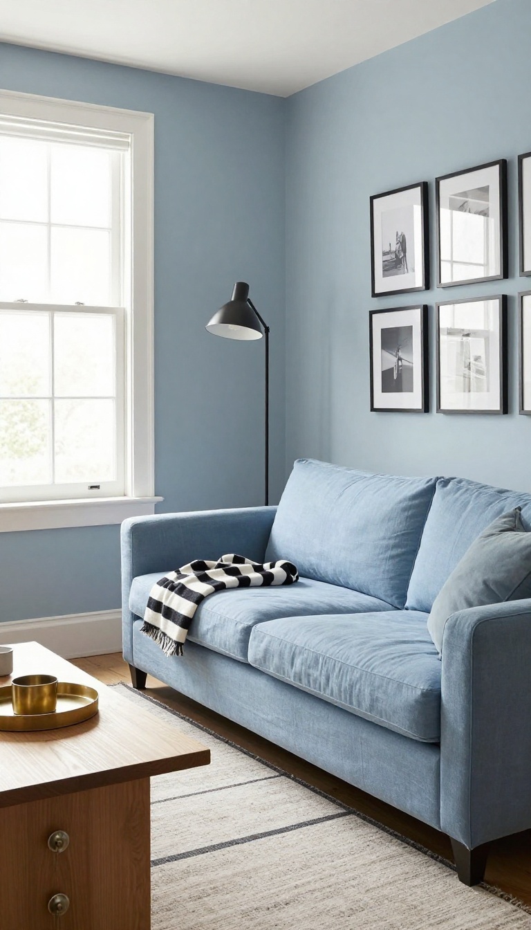
Light blue can sometimes read too soft, almost like it's fading into the background. Adding a hit of metal or a touch of black gives it a backbone, so the room feels intentional instead of washed out. You don't need much—just enough to catch the eye and add a little edge.
Think of it as contrast that doesn't fight. Brass warms things up, silver keeps it cool and crisp, and black grounds the whole scheme. Pick one direction and sprinkle it around, or mix them if you're feeling bold.
Either way, the calm stays, but now it has a bit of polish.
Light blue and metallics are a natural pair, especially in finishes that have a little age to them. Brushed brass and antiqued silver feel softer than chrome or polished nickel, which can look too shiny in a relaxed space. You can bring them in through lamp bases, drawer pulls, or a simple picture frame.
Even a small tray on the coffee table can do the trick. Black works differently. It doesn't add shine; it adds weight.
A black metal floor lamp, a slim console table, or a few black picture frames will make the light blue pop without making the room feel dark. The key is to keep black accents thin and spread out, not clustered in one heavy blob. You can also use black in textiles—a throw with a black stripe, or a rug with a black border.
That way the contrast feels soft and touchable, not harsh. And if you're worried about commitment, start with something small like a black candle holder or a brass switch plate. You can always add more once you see how it feels.
Where To Add Shine
Metallic accents catch light and make a light blue room feel more dynamic. Try a brass floor lamp next to a reading chair, or a silver bowl on the coffee table. Even cabinet hardware in a warm metal can make a big difference.
Just keep the finish consistent so it looks deliberate.
How To Use Black Without Overdoing It
Black should feel like a punctuation mark, not a paragraph. A black picture frame, a thin black curtain rod, or a black side table will do the job. Avoid large black furniture unless you want a high-contrast look.
The goal is balance, not drama.
Mixing Metals And Black
You can absolutely use both. Pair a brass lamp with a black shade, or use black metal legs on a table with a brass top. The trick is to repeat each finish at least twice so the room feels cohesive.
A little repetition goes a long way.
FAQ
What shades of light blue work best in a living room?
Shades with gray or green undertones, like powder blue or pale aqua, tend to feel calm and sophisticated. Avoid overly bright or neon blues if you want a relaxing mood.
Can light blue make a room feel cold?
It can if you use it alone. Balance it with warm neutrals, natural wood, and textured fabrics to keep the space cozy.
How do I choose a light blue paint color?
Test a few samples on your walls and look at them at different times of day. Lighting changes how blue reads, so what looks soft in the store might look icy at home.
What colors pair well with light blue in a living room?
Warm whites, beige, tan, soft gray, and even blush pink work well. For contrast, navy, charcoal, or black can add depth.
Is light blue still trendy for living rooms?
Yes, light blue is a classic color that never really goes out of style. It's versatile and easy to update with accessories.
Conclusion
Light blue works best when you let it breathe. Pick one idea from this list that fixes your biggest complaint, whether that is a wall that feels flat, a corner that stays dim, or a room that never quite relaxes. Try it for a week before buying anything else.
A few small swaps usually beat one big overhaul. Layer in texture, warm up the lighting, and stop once the room feels calm and easy to be in. Light blue does not need much help, just a little intention.