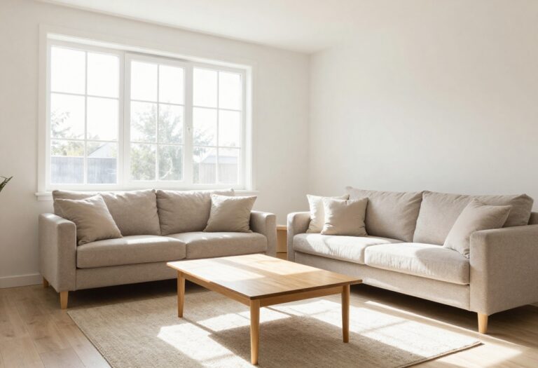
15 Living Room Curtains Ideas Built Around Color Schemes
You pick a curtain color, hang it up, and suddenly the whole living room reads differently. That's the strange power of window treatments: they frame the light, set the mood, and tie a color scheme together faster than almost anything else.
The tricky part is choosing a shade that actually works with your walls, furniture, and the way you use the room. The fifteen ideas ahead each start with a color scheme and build outward, from warm neutrals and soft whites to navy, sage, terracotta, and black.
Some keep things calm and airy, others go bold and dramatic. Every one includes practical notes on fabric, lining, and length so you can match the idea to your space without guessing.
1. Warm Neutral Linen Curtains for a Calm, Airy Room
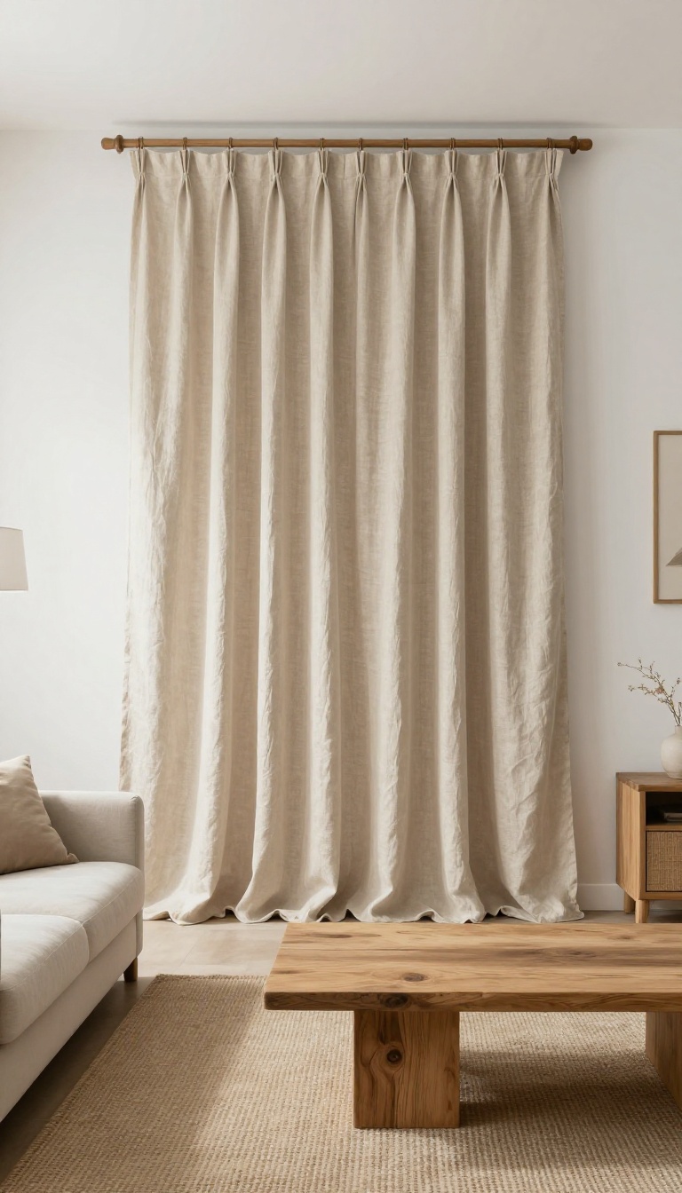
Oatmeal and flax linen curtains bring a soft, organic texture that settles a busy living room without making it feel heavy. They filter light beautifully, so the space stays bright but never harsh. If your room already has white walls and wood tones, this is the easiest way to keep that relaxed, natural feel going.
Linen also plays well with other neutrals. It won't fight a beige sofa, a jute rug, or a reclaimed wood coffee table. Instead, it ties them together with a quiet warmth that feels collected, not staged.
The key is sticking to undyed or lightly dyed linen in shades like oatmeal, flax, sand, or pale wheat. These colors have a subtle variation that reads as texture, not pattern. That keeps the window treatment interesting without adding visual weight.
Hang them from a simple rod in a warm metal or natural wood finish. Skip heavy valances or ornate tiebacks. The whole point is ease, so let the fabric fall in loose, gentle folds.
For lining, choose a lightweight cotton or a privacy liner in a similar tone. Blackout lining will kill the airy feel, so avoid it unless you truly need room darkening. If you want a bit more body, a cotton-linen blend works well and wrinkles less than pure linen.
Pick The Right Shade Of Neutral
Oatmeal leans slightly yellow, which adds warmth to north-facing rooms. Flax is a touch cooler and grayer, so it works better in rooms that already get a lot of golden afternoon light. Hold a swatch against your wall at different times of day before you commit.
Get The Length And Hang Right
For a calm, airy look, hang curtains from ceiling height or just below the crown molding. Let them kiss the floor or break by half an inch. A short curtain chops the room and makes it feel smaller, so always err on the longer side.
Style Without Clutter
Keep the rod hardware simple and the folds relaxed. Add a single tieback in a matching fabric if you want shape, but leave the rest alone. Pair with sheer white roller shades if you need extra privacy during the day.
2. Soft White Sheer Layers for Bright, Open Spaces
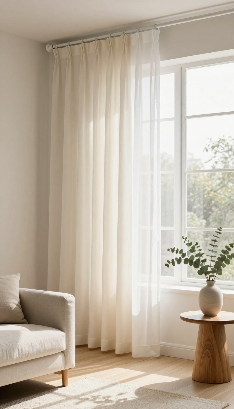
White curtains don't have to feel flat or boring. When you layer a lightweight sheer with a heavier solid panel, you get a setup that filters harsh daylight and still keeps the room feeling airy. This works especially well in smaller living rooms where dark, bulky curtains would shrink the space.
The trick is choosing the right white. Stark white can read cold, while warm whites and soft creams feel cozier without turning yellow. Pair that with a sheer that lets in a soft glow, and you've got a color scheme that stays clean and open all day.
The layered look solves a common problem: you want privacy and light control, but you don't want to block out the sun completely. Sheers handle the daytime softness, and the heavier panel gives you something to close at night. Together they create depth without adding visual weight.
Pick The Right Whites
Match your whites to your walls. If your walls are cool gray-white, go with a crisp white sheer and a slightly warmer panel to add subtle contrast. If your walls lean warm, choose cream or ivory sheers so the whole window feels cohesive instead of mismatched.
Fabric And Lining Choices
For the sheer layer, look for linen blends or polyester voile that drape softly and let light through. The heavier panel can be cotton, linen, or a lined faux-silk. Add a blackout lining if you want to block evening glare or streetlights, but keep the lining white so it doesn't darken the window from the inside.
Hanging And Length Tips
Hang both layers from the same rod or use a double rod for flexibility. Mount the rod close to the ceiling and extend it a few inches past the window frame to make the room feel taller and wider. Let the panels just kiss the floor or break slightly for a relaxed look that suits bright, open spaces.
3. Charcoal Gray Panels for a Modern, Grounded Look
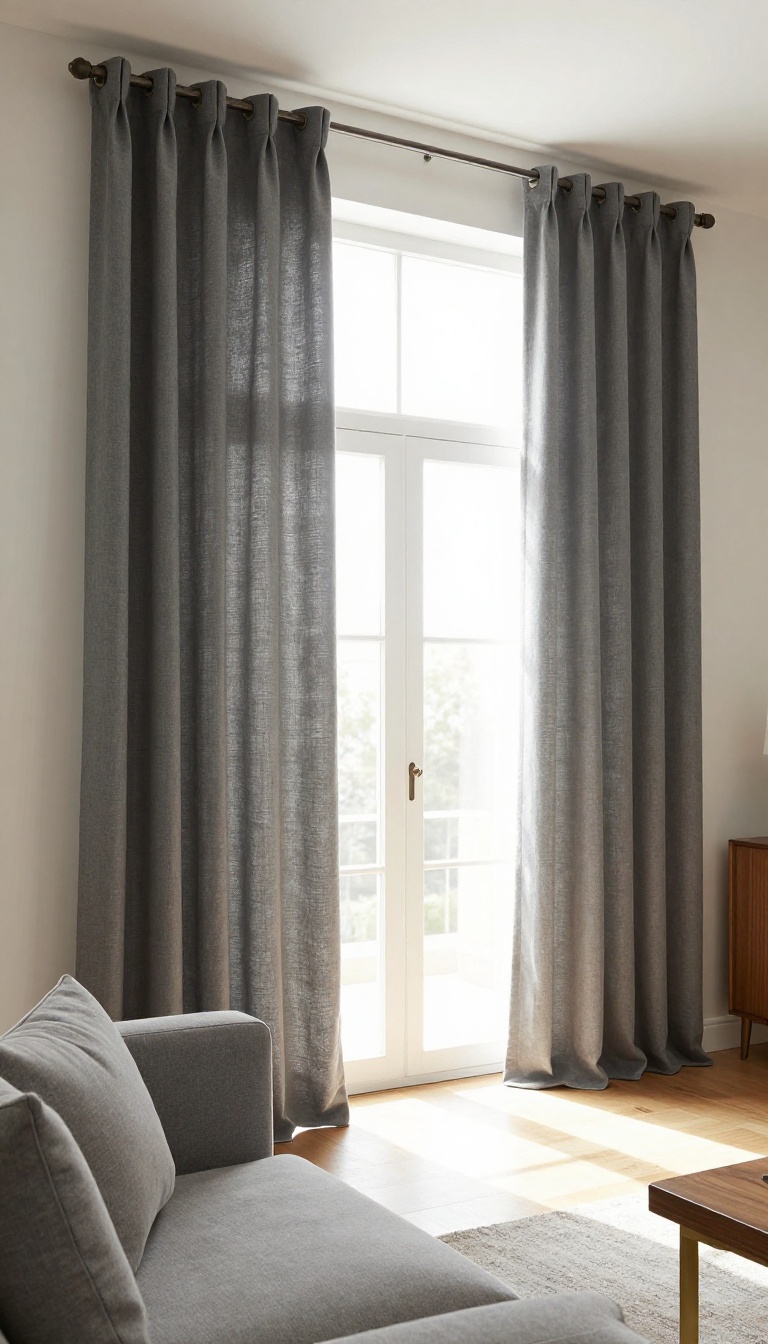
Charcoal gray curtains bring a quiet, modern weight to a living room. They frame windows with depth and contrast, but they don't have to feel dark or heavy. The trick is picking the right fabric and finish so the room stays warm and inviting.
Charcoal works because it's not quite black. It has enough softness to blend with gray sofas, wood tones, and brass accents, yet enough depth to make a window feel intentional. In a room with light walls, charcoal panels create a clean, grounded focal point.
In a darker space, they add richness without swallowing the light.
Why Charcoal Beats Basic Black
Black curtains can look stark and flat, especially in daylight. Charcoal has a hint of gray that softens the edge and plays better with natural light. It also pairs easily with warm woods, leather, and muted rugs, so the room feels layered instead of severe.
Pick A Linen Blend For Warmth
A linen blend gives charcoal a subtle texture that catches light and keeps it from looking cold. Pure synthetics can read shiny or stiff, which kills the cozy factor. Look for a medium-weight linen-cotton mix that hangs well and feels soft to the touch.
Hang Them High And Wide
Mount the rod close to the ceiling and extend it several inches past the window frame. This makes the window look larger and lets the charcoal panels read as architecture, not just fabric. For a tailored look, choose a simple rod with matching rings and skip the heavy valance.
Line Them For Better Performance
A blackout or thermal lining helps charcoal curtains block light and insulate the room. It also prevents the sun from fading the fabric over time. If you want a softer glow, choose a privacy lining instead, which keeps the color rich without making the room pitch dark.
4. Navy Blue Curtains That Make a Bold but Classic Statement
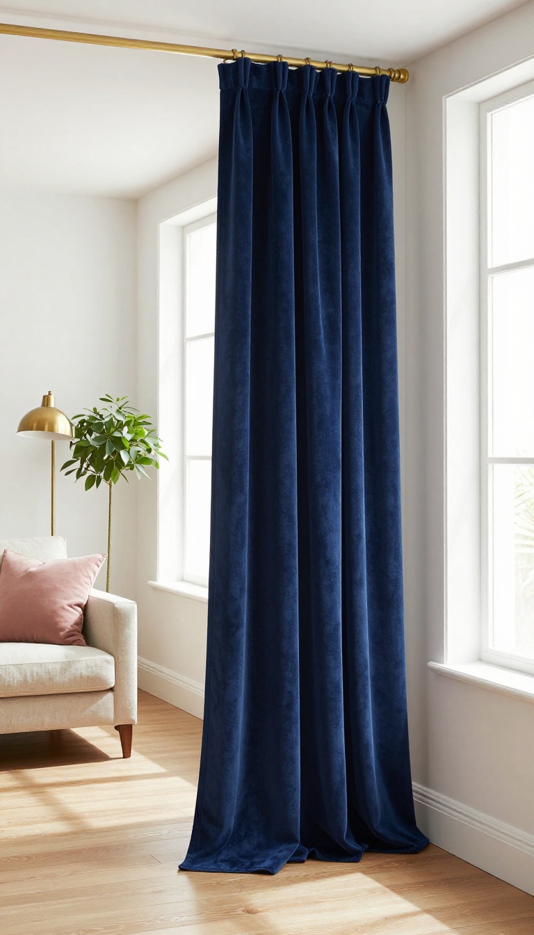
Navy blue curtains bring a deep, confident presence to a living room without screaming for attention. They read almost like a neutral, so they play nicely with warm woods, crisp whites, brass accents, and even soft pinks or greens. The trick is getting the finish right, because navy can look rich and tailored or flat and heavy depending on fabric, lining, and length.
Floor-length panels are the move here. They draw the eye upward, make ceilings feel taller, and give the room that pulled-together hotel look. Add a blackout lining and you get a polished drape plus real light control for movie nights or weekend naps.
Pair navy with a lighter wall color and let the curtains do the heavy lifting, or go tone-on-tone with a darker blue wall for a moody, layered effect.
Fabric And Finish
Velvet gives navy a luxe, light-absorbing depth that feels expensive. Linen blends keep it breezier and more casual, while a subtle sheen on cotton sateen adds a touch of glam. Whatever you choose, make sure the panels have enough weight to hang straight and hold their shape.
Hardware That Works
Brass or antique gold rods warm up navy and keep it from feeling cold. Matte black hardware makes the look sharper and more modern. Skip busy finials and go for simple, substantial brackets that can handle the weight of lined panels.
Accent Colors To Pair
Cream, camel, and warm white soften navy and keep the room inviting. For a bolder twist, add mustard yellow, blush pink, or emerald green in pillows and art. Navy also loves a touch of red or orange if you want a classic, preppy vibe.
5. Sage Green Curtains for a Fresh, Nature-Inspired Vibe
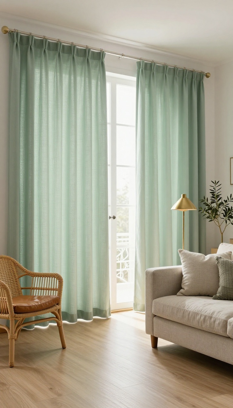
Sage green curtains bring a soft, earthy calm that feels like a deep breath. The muted, gray-green tone works with almost any light, shifting from cool and airy in the morning to warm and cozy at night. It's an easy way to pull nature indoors without going full jungle.
Sage green sits in that sweet spot between neutral and colorful. It's noticeable but never loud, which makes it a smart pick for living rooms that need a little life without a full commitment to bold hues. Pair it with natural textures and you get a space that feels grounded and relaxed.
One of the best things about sage is how well it plays with other materials. Rattan, leather, brass, and light wood all look better next to it. The color has enough gray in it to feel sophisticated, but enough green to keep things fresh.
For fabric, a cotton blend is your best bet. It hangs with a casual, lived-in look that suits the earthy vibe. Linen blends work too, though they wrinkle more.
If you want a crisper feel, a cotton-poly blend holds its shape better. Lining matters here. An unlined cotton lets light filter through and gives the room a soft glow.
If you need more privacy or want to block street light, add a privacy lining. Just avoid heavy blackout linings unless you're using the room for movies, since they can make sage look flat. Length is another easy win.
Floor-length panels that just kiss the floor keep things elegant. For a more relaxed feel, let them puddle slightly. Either way, hang the rod high and wide to make the room feel taller and brighter.
Why Sage Works In Almost Any Light
Sage green has a chameleon quality. In north-facing rooms, it reads cool and slightly blue, which can feel serene. In south-facing rooms, it warms up and looks more olive.
That flexibility means you don't have to worry as much about matching your existing wall color. It also plays well with both warm and cool color schemes. If your room leans warm with terracotta and wood tones, sage adds a nice contrast.
If your room is cool with grays and blues, sage bridges the gap without clashing.
Textures That Make Sage Feel Alive
Sage green loves natural materials. Rattan or wicker furniture, a leather sofa, and brass accents all bring out the earthy side of the color. Add a jute rug and a few woven baskets, and the room starts to feel like a greenhouse in the best way.
Don't forget plants. Real or faux, greenery reinforces the nature-inspired vibe. A large fiddle leaf fig or a trailing pothos near the window will make the curtains feel like part of a larger scene.
Styling Tips For A Polished Look
Keep the rest of the room relatively simple so the curtains can do their job. A neutral sofa, a couple of textured pillows, and a wooden coffee table are enough. If you want to add pattern, choose something subtle like a small-scale geometric or a faded floral.
For hardware, go with matte black, antique brass, or brushed nickel. These finishes feel modern and won't compete with the softness of the green. A simple rod with finials keeps the focus on the fabric.
6. Blush Pink Curtains That Add Warmth Without Going Sweet
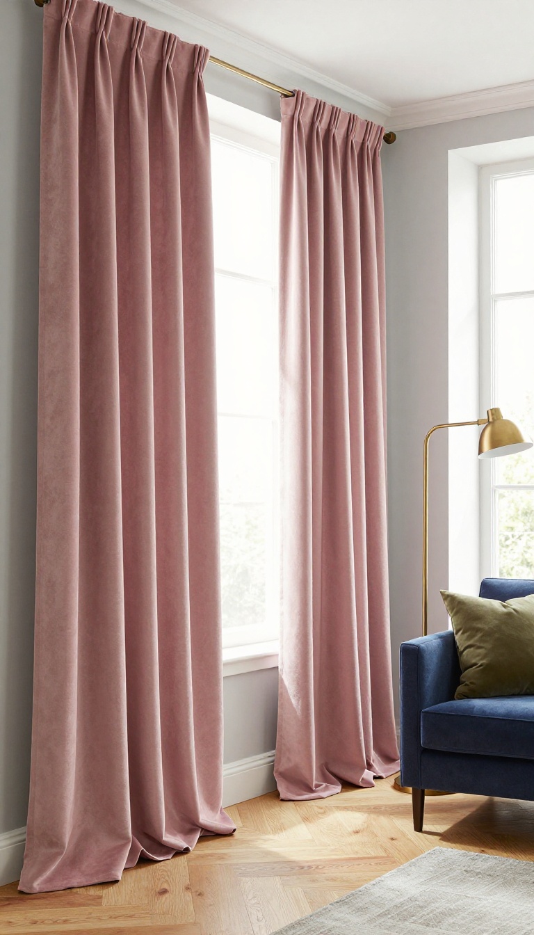
Blush pink has a reputation problem. Many people hear "pink curtains" and picture a nursery or a little girl's bedroom, not a grown-up living room. But the right shade of blush—muted, dusty, and soft—can warm up gray or white walls in a way that feels calm and surprisingly sophisticated.
The trick is all in the fabric and the styling. Get those right, and blush becomes a neutral you'll want to use again and again.
Blush pink works because it's basically a warm neutral with a hint of color. It picks up the rosy undertones in wood floors and softens cool gray walls without fighting them. In a room with white walls, it adds a gentle wash of warmth that keeps things from feeling sterile.
The key is to avoid anything too bright or bubblegum. Look for shades like dusty rose, pale mauve, or muted coral-pink. These read as grown-up and pair beautifully with navy, charcoal, olive, and brass.
Fabric choice matters just as much. Velvet gives you a rich, moody depth that feels luxurious, while linen keeps things breezy and casual. Either way, the color stays subtle instead of sweet.
Pick The Right Shade
Not all blush pinks are created equal. A cool-toned pink with gray undertones feels modern and elegant, while a warmer peachy pink brings cozier vibes. Hold swatches against your wall at different times of day to see how the light changes them.
If you're nervous, go one shade dustier than you think you want. It'll still read as pink, but in a whisper, not a shout.
Fabric Makes The Difference
Velvet is the secret weapon here. Its dense pile absorbs light and gives blush a deep, velvety richness that feels anything but childish. Linen is the other great option—its natural texture and slight sheen keep the pink from looking flat.
Avoid shiny synthetics or anything with a lot of sheen; they can push the color into prom-dress territory. A cotton-linen blend is a good middle ground if you want easy care and a soft look.
Styling Tips For A Grown-up Look
Pair blush curtains with darker, grounding colors. Navy, charcoal, or black furniture and accents will make the pink feel intentional and chic. Add brass or gold hardware for a touch of warmth.
Keep the rest of the room relatively neutral—think white walls, a gray sofa, and a few wood tones. If you want to layer in more color, olive green or deep teal work beautifully with blush. And don't forget the lining: a white or ivory lining keeps the color true and helps with privacy and light control.
7. Mustard Yellow Curtains for a Cheerful, Retro Touch
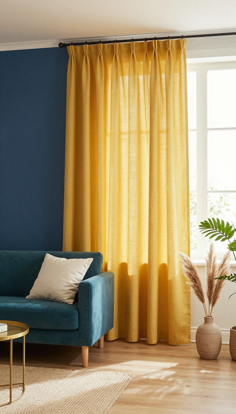
Mustard yellow is the friend who shows up to a quiet party and gets everyone talking. It brings instant warmth and a retro wink without turning your living room into a time capsule. The trick is pairing it with the right colors and a fabric that keeps the shade rich instead of loud.
Start by looking at what's already in the room. If your walls are white, gray, or beige, mustard yellow will pop in a good way. If you have teal or navy accents, even better—those cool tones balance the warmth so the room feels collected, not chaotic.
Fabric choice matters more than you'd think. A medium-weight cotton, linen blend, or velvet holds the color deeply. Thin, shiny fabrics can make mustard look neon, which is rarely the goal.
Pairing Mustard With Teal Or Navy
Teal and navy are mustard's best friends. The cool blues keep the yellow from feeling too sweet, and the yellow keeps the blues from feeling cold. Try curtains in mustard and a sofa or rug in teal.
Or go navy on the walls and let mustard curtains be the main event. If you want a softer version, use mustard as a secondary color—maybe just on the curtains while the rest of the room stays neutral with small teal pillows.
Choosing The Right Fabric Weight
Medium-weight fabrics are the sweet spot. They diffuse light just enough to make mustard look golden rather than glaring. Cotton canvas, linen blends, and lightweight velvet all work well.
Avoid heavy blackout linings unless you need them for sleep. They can make the color look flat. If you do need blackout, add a white or cream lining to keep the yellow lively from the inside.
Styling Tips For A Retro Feel
Lean into the retro vibe with simple shapes. Grommet tops or a clean rod-pocket style look modern-retro. Add a few mid-century touches—a tapered leg side table, a geometric throw pillow—but don't overdo it.
Keep the rest of the window treatment simple. No heavy valances or ornate tiebacks. Let the color do the talking.
8. Terracotta Curtains for a Warm, Earthy Living Room
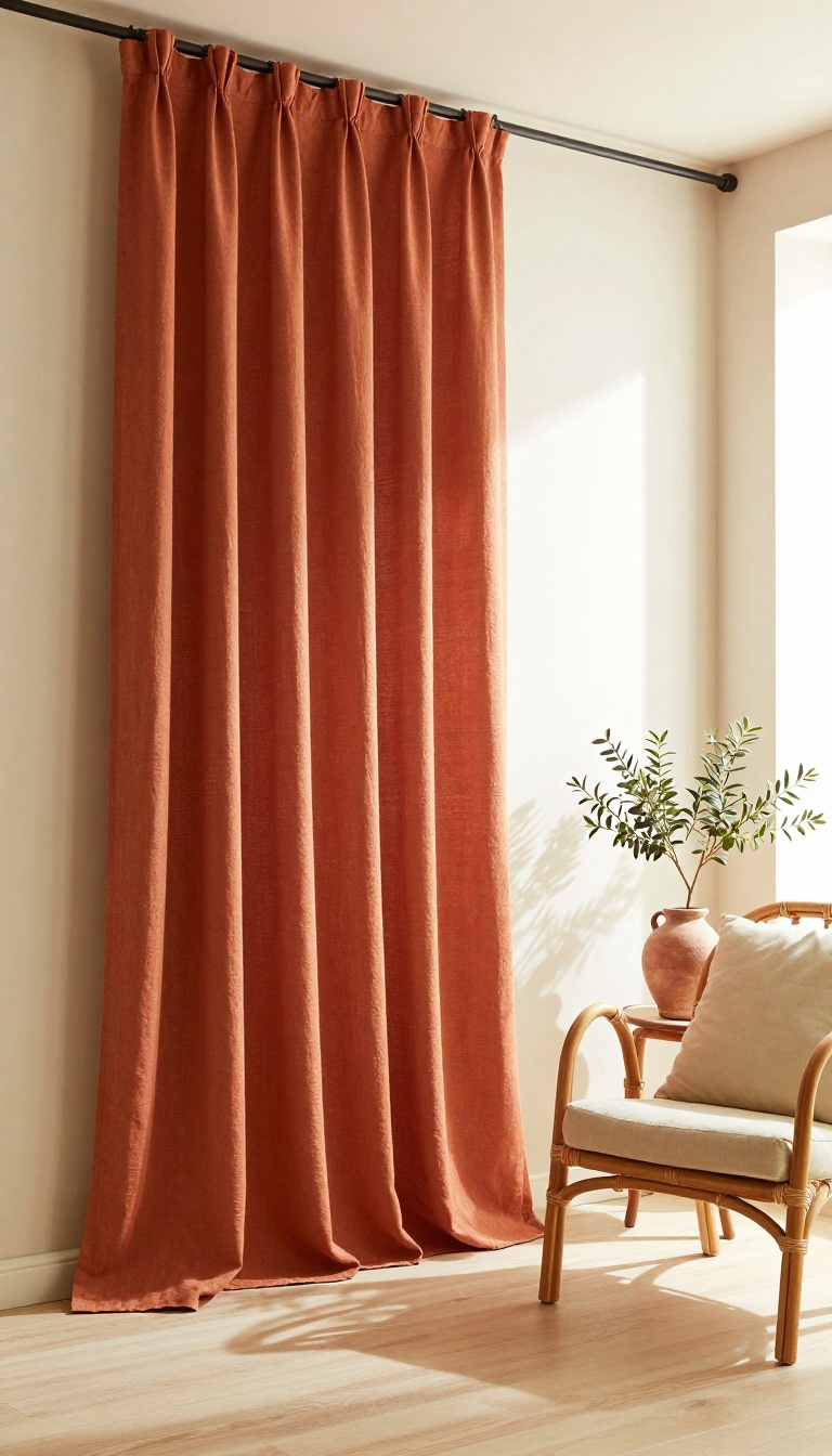
Terracotta curtains bring a sunbaked, Mediterranean feel to modern or bohemian spaces. The color sits somewhere between burnt orange and clay, so it adds warmth without turning loud. Pair them with cream walls and natural wood, and the whole room feels grounded and inviting.
Terracotta works because it echoes the colors of the earth, from desert sand to clay pots. In a living room, that translates to a cozy, lived-in vibe that still looks pulled together. The key is balancing the intensity of the hue with softer neutrals and plenty of texture.
Why Terracotta Works In Living Rooms
Terracotta is a warm, earthy tone that flatters almost any skin tone and wood finish. It reflects light in a way that feels golden rather than harsh, so it's forgiving in rooms with less natural light. And because it's a mid-tone, it plays well with both bold and muted palettes.
Fabric And Lining Choices
Linen and cotton blends drape beautifully and keep the look relaxed. If you want more structure, try a cotton-canvas or a lightweight velvet. For privacy or light control, add a thermal or blackout lining in a neutral color so the terracotta stays true.
Pairing Colors And Textures
Cream, ivory, and warm white walls let terracotta take center stage. Natural wood tones—oak, walnut, or rattan—add depth without competing. Add a few green plants or a muted sage throw to introduce a subtle contrast that feels organic.
Styling Tips For A Cohesive Look
Hang curtains high and wide to make ceilings feel taller and windows larger. Let them just kiss the floor for a tailored look, or go for a slight puddle if you want a bohemian touch. Keep hardware simple—matte black, brass, or bronze—so the fabric remains the star.
9. Black Curtains for Dramatic Contrast and Cozy Evenings
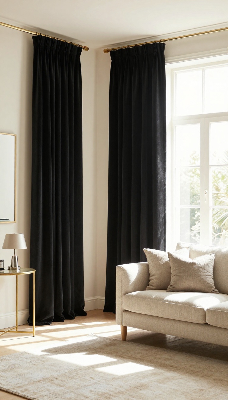
Black curtains don't whisper—they make a statement. They frame your windows like a bold picture frame, instantly adding depth and drama to the room. And when the sun goes down, they turn your living space into a cozy, light-blocking haven perfect for movie nights.
The key to pulling off black curtains is balance. Pair them with light-colored walls to keep the room from feeling like a cave. Add a few metallic accents—think brass curtain rods, gold picture frames, or silver table lamps—to catch the light and add a touch of glamour.
Why Black Works
Black absorbs light, so it creates a deep, rich backdrop that makes other colors pop. It also hides streetlights and early morning sun, which is a game-changer for late-night movie marathons or weekend sleep-ins. Plus, black is timeless—it never goes out of style.
Fabric And Lining
Choose a heavy fabric like velvet or a thick cotton blend to get the full light-blocking effect. If you want to block even more light, go for blackout lining. A matte finish feels more modern, while a slight sheen adds a hint of luxury.
Styling Tips
Hang curtains high and wide to make your windows look larger. Keep the rest of the room light and airy with pale walls, a light rug, and maybe a mirror to bounce light around. Metallic accents on hardware or accessories will keep the look from feeling too heavy.
10. Emerald Green Curtains for a Luxe, Jewel-Box Effect
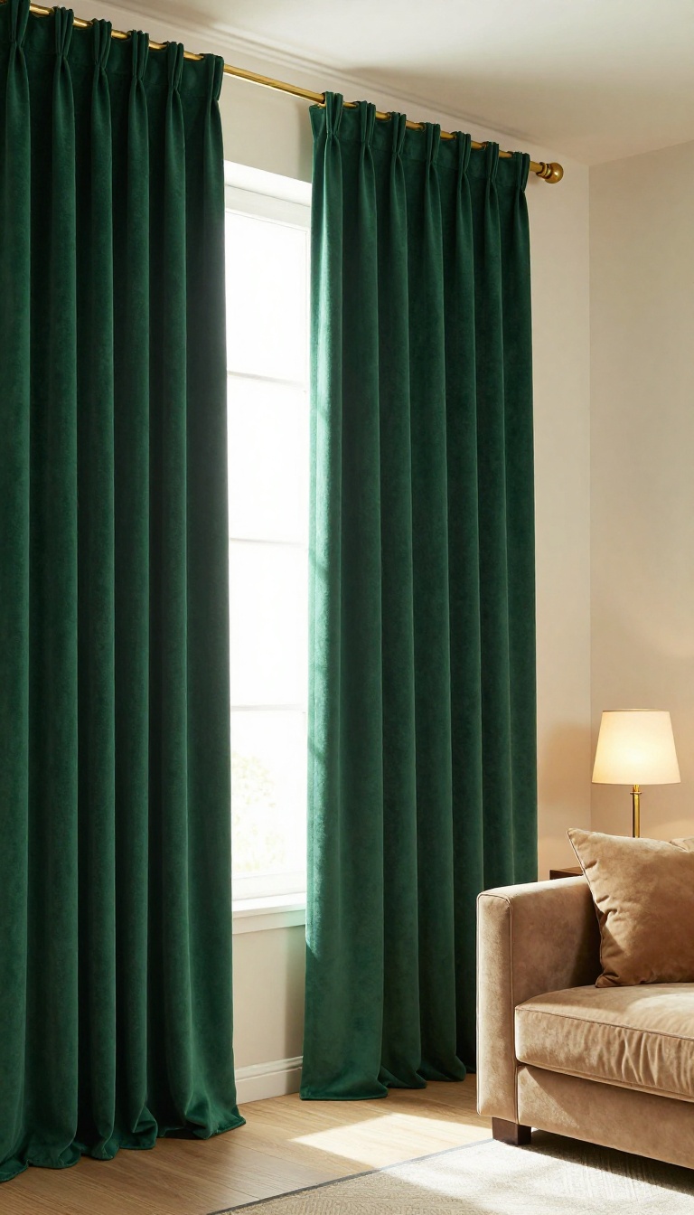
Emerald green doesn't do subtle. It walks into a room like it owns the place, and that's exactly why it works as a curtain color. The deep, saturated tone feels rich without being loud, especially when you let it stand alone against a quiet backdrop.
Think of it as the jewelry of your living room—one bold piece, everything else steps back.
Velvet is the fabric that makes emerald feel truly luxurious. The way it catches light gives the color depth, shifting from dark forest to bright jewel depending on the time of day. A simple linen or cotton blend can work too, but it reads more casual—still pretty, just less dramatic.
If you want that jewel-box effect, go velvet or a heavy satin.
What To Pair With Emerald
Keep walls neutral—warm white, cream, or a soft greige. Furniture in charcoal, camel, or light wood lets the curtains do the talking. Add a few brass or gold accents (lamp bases, curtain rods, picture frames) to bring out the warmth in the green.
Skip other bold colors unless you're going for a maximalist look.
Lining And Length Matter
Blackout lining keeps the color from fading and makes the room feel cozy at night. For a high-end look, hang curtains from ceiling to floor, or just kiss the floor. A slight puddle (an extra inch or two) adds drama but collects dust—so consider your cleaning routine.
When To Skip Emerald
Small rooms with low light can feel cave-like if you go too dark. If your living room is short on windows or natural light, try emerald in a lighter fabric like linen, or use it as a trim or tieback instead of full panels. Also, if you already have a lot of green in the room (plants, art, upholstery), emerald curtains might blend in rather than pop.
11. Burgundy Curtains for Rich, Autumn-Inspired Warmth
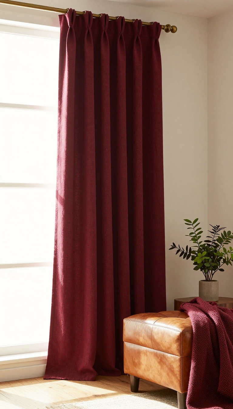
Burgundy curtains bring a deep, wine-toned warmth that makes a living room feel instantly cozy. They work best when the rest of the space leans into autumn colors and soft, golden light. This isn't a bright, attention-grabbing red.
It's a grounded, sophisticated shade that pairs naturally with wood, leather, and earthy textures. If you want a room that feels like a warm drink on a cold day, this is the color to build around.
Burgundy sits in that sweet spot between bold and livable. It adds richness without overwhelming a space, especially when you balance it with warm neutrals and natural materials. The key is to treat it as the anchor of the room's color story, not just a random pop of color.
Pair With Warm Wood And Leather
Burgundy and warm wood are a natural match. Think oak, walnut, or teak furniture with visible grain. Leather chairs or a tufted ottoman in caramel or cognac add another layer of autumn warmth.
Avoid cool-toned metals like chrome or brushed nickel near the windows. Instead, choose brass or antique bronze hardware for curtain rods and lamp bases. The goal is a cohesive, golden-hour glow even when the sun isn't out.
Choose The Right Fabric And Lining
Velvet is the obvious choice for burgundy, but it can feel heavy in smaller rooms. A linen-cotton blend in a matte burgundy finish offers similar depth with less weight. For a lighter look, try a semi-sheer burgundy that filters light instead of blocking it.
If you need privacy or insulation, go with a blackout lining. It keeps the rich color from fading and helps the room stay warm in winter. Just make sure the lining is white or ivory so the street-facing side stays neutral.
Layer Lighting For Maximum Coziness
Burgundy curtains absorb light, so the room can feel cave-like if you rely on a single overhead fixture. Add table lamps with warm bulbs (2700K) on side tables and a floor lamp near a reading chair. Dimmers are your friend here.
Candles or a fireplace add flicker and shadow that make the burgundy feel alive. If you don't have a fireplace, a small space heater with a faux flame effect can do the trick. The point is to create pools of warm light that the curtains can frame.
Balance With Neutrals And Texture
Burgundy can dominate if you let it. Balance it with a cream or oatmeal sofa, a jute rug, and a few textured throw pillows in rust or mustard. That keeps the autumn palette from feeling one-note.
Add a plant or two—something with deep green leaves like a rubber tree or ZZ plant. The green plays off the burgundy in a way that feels fresh, not Christmas-y. Keep the overall look grounded and lived-in.
12. Light Blue Curtains for a Soft, Coastal Feel
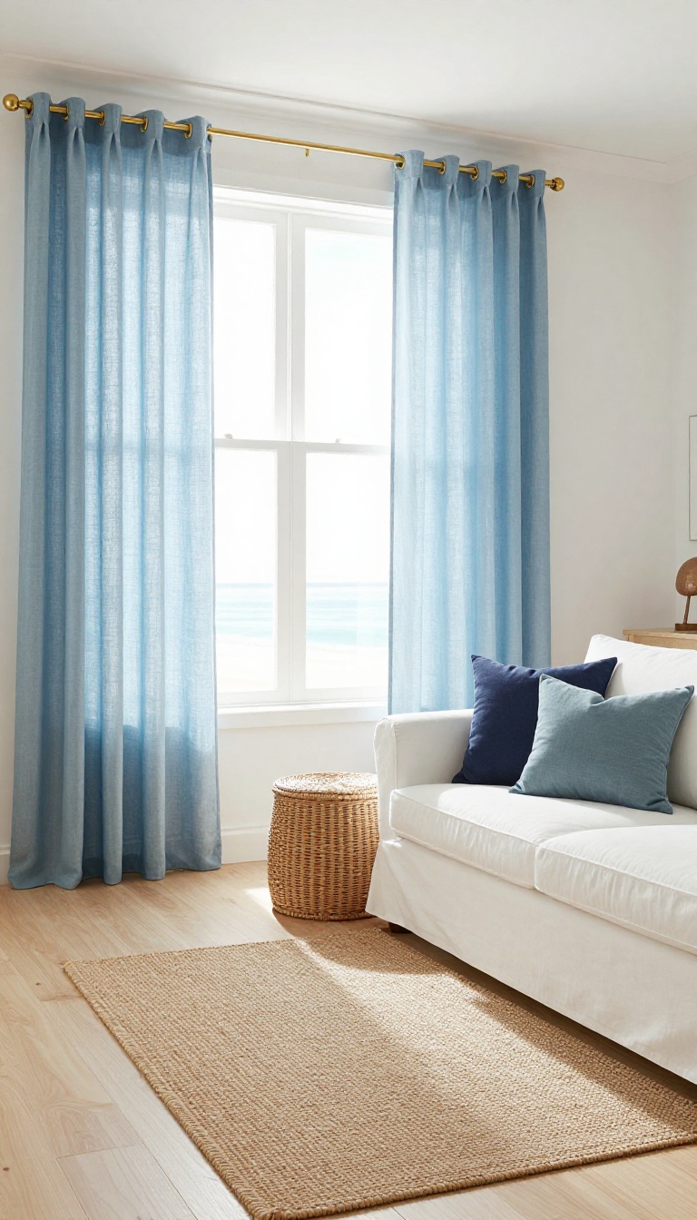
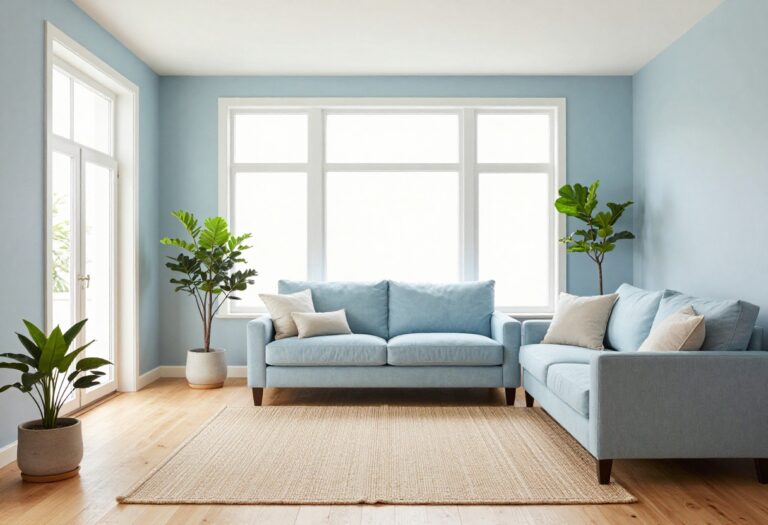
Light blue curtains pull the ocean indoors without hanging a single seashell. The color reads calm and open, like a clear morning sky, and it plays nicely with white walls, sandy neutrals, and weathered wood. Stick with linen or a light sheer if you want that breezy, beach-house look.
Heavier fabrics in the same shade start to feel formal, which fights the whole point.
Light blue works because it sits between cool and warm, so it never feels icy or flat. It softens bright afternoon sun and makes a small living room feel a little wider. Pair it with white trim and pale floors and the room practically exhales.
The shade matters more than people expect. A gray-blue leans moody and modern, while a clear sky blue stays cheerful and fresh. Hold a swatch against your wall in daylight before you commit.
Pick The Right Blue
Sky blue and powder blue keep things light and youthful. Dusty or gray-blues feel more grown-up and pair well with navy accents. If your walls are already blue, go a shade lighter or darker so the curtains read as a layer, not a repeat.
Fabric And Lining Choices
Linen and cotton blends hang with a soft, natural drape that suits the coastal mood. Sheer panels let light glow through and blur the view outside. Add a privacy lining if the room faces the street, but skip blackout unless you actually need to block the sun.
Heavy lining kills the airy feel.
What To Pair With It
White slipcovers, rattan, jute rugs, and pale wood all lean into the beachy vibe. Brass or matte black hardware adds a clean finishing touch. A few navy or seafoam pillows tie the curtains into the rest of the color scheme without going full nautical.
13. Lavender Curtains for a Gentle, Unexpected Pop of Color
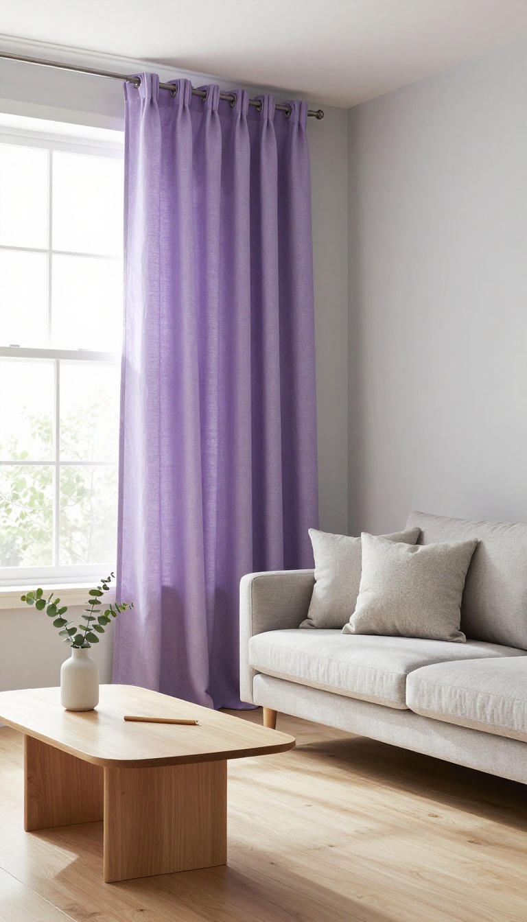
Lavender might not be the first color you think of for living room curtains, but that's exactly what makes it work. It's soft enough to blend with neutrals, yet distinct enough to keep a room from feeling flat. In a space full of beige, gray, and white, lavender reads as a gentle surprise—like a breath of fresh air that doesn't shout.
The key is keeping the fabric matte. Shiny lavender can veer into dated territory fast, but a cotton, linen, or velvet finish feels modern and understated. Pair it with cool-toned walls and simple furniture, and you've got a scheme that feels calm but not boring.
Lavender sits in that sweet spot between pastel and neutral. It's not as sweet as pink or as cold as blue, which makes it surprisingly easy to live with. In a living room with gray walls, lavender curtains add warmth without clashing.
Against white walls, they bring a soft wash of color that feels intentional but never overwhelming. The trick is to treat lavender as your main accent, not a background player. If your room is mostly neutral, these curtains become the focal point.
If you already have a lot of color, lavender can still work—just make sure it's the quietest shade in the mix. Fabric choice matters more here than with many other colors. A matte finish keeps lavender looking fresh and contemporary.
Velvet in a flat weave, linen blends, or heavy cotton all work well. Avoid anything with sheen, because shine plus pastel can look like a throwback to the '80s. Length and lining also affect the final look.
Floor-length panels with a simple rod pocket or hidden tabs keep things clean. If you want more privacy or light control, add a white or light gray lining—it won't change the color from the front, but it will make the curtains hang better and last longer.
Why Lavender Works With Neutrals
Gray and white are the easiest partners for lavender curtains. Gray brings out the cool undertones, while white keeps everything light and airy. If your sofa is beige or cream, lavender adds a subtle contrast that feels intentional.
Just avoid pairing it with warm yellows or oranges—they can make lavender look muddy.
Fabric And Finish Dos And Don'ts
Stick with matte fabrics like cotton, linen, or velvet with a flat pile. Shiny satin or silk can make lavender look dated and cheap. If you want a bit of texture, try a linen-cotton blend or a subtle slub weave.
These add depth without any glare.
Styling Tips For A Polished Look
Hang curtains high and wide to make the room feel taller. Add a simple metal or wood rod in a neutral finish—brass, black, or white all work. Keep the rest of the room uncluttered so the lavender can breathe.
A few gray or white throw pillows will tie everything together.
14. Patterned Curtains in a Two-Color Scheme for Visual Interest
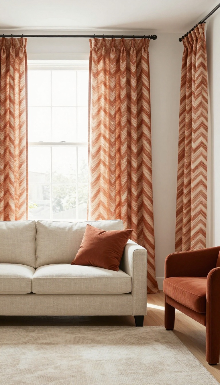
A pattern works best when it sticks to two colors. That's the whole trick: one pattern, two shades, zero chaos. Stripes, chevrons, or simple geometric repeats give the eye something to follow without turning the window into a competing focal point.
The two colors should already live somewhere in the room, usually on your sofa, rug, or a pair of accent chairs. That way the curtains don't introduce a new palette—they pull the existing one into sharper focus.
Two-color patterns solve a common problem. Solid curtains can feel flat, especially in a room with plain walls and neutral furniture. A pattern adds movement and texture, but a multicolor print often fights whatever else is going on.
Limiting yourself to two shades keeps the energy up and the palette tight. Start by picking the two colors from something you already own. A rug with cream and rust, a sofa in navy and white, or even a throw pillow with sage and charcoal.
Those two shades become your curtain colors, and the pattern becomes the bridge that connects the window to the rest of the room.
Choose A Pattern Scale That Matches The Room
Small rooms handle small patterns better. A tight stripe or a fine geometric repeat reads as texture from across the room and keeps the walls from feeling busy. Large-scale patterns need space to breathe, so they work best in open living rooms with high ceilings or wide windows.
Hold a fabric swatch up to the window before you commit. Step back ten feet and see how the pattern reads. If it turns into visual noise, go smaller.
If it disappears, go bigger.
Pull Both Colors From What's Already There
You don't need to match exactly. Close is fine. If your rug has a soft terracotta, a curtain in a slightly deeper rust still reads as the same family.
The goal is cohesion, not a perfect sample match. One color should dominate and the other should accent. A cream curtain with thin navy stripes feels calmer than a 50/50 split.
Let the background shade take up most of the fabric and the second color do the detailing.
Pick A Fabric That Holds The Pattern
Cotton and linen blends hold printed patterns well and drape nicely without looking stiff. If you want a crisper look, a cotton-poly blend keeps stripes sharp and resists wrinkles. For a softer, more relaxed feel, go with linen and accept a little natural texture.
Lining matters here. A privacy or blackout lining keeps the pattern from going sheer in bright sun and helps the colors stay true. Unlined patterned curtains can look washed out by mid-afternoon.
Hang Them High And Wide
Patterned curtains look best when they're hung close to the ceiling and extend a few inches past the window frame on each side. That extra width gives the pattern room to repeat fully and makes the window feel larger. Let the panels just kiss the floor or break slightly.
A puddle can work, but with a bold pattern it often looks like too much fabric doing too much. Keep the hem clean so the pattern stays the star.
15. Color-Blocked Curtains for a Playful, Custom Look
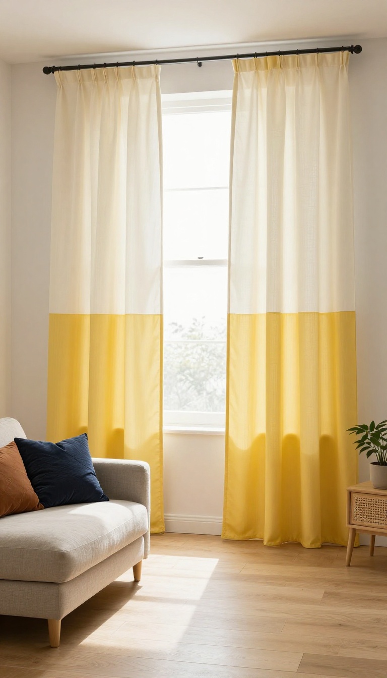
Color-blocked curtains take two bold hues and split them into one statement piece. The result feels custom and a little bit playful, like you hired a designer who wasn't afraid of color. You can split the panels horizontally or vertically, and each direction changes how your windows read.
It's a simple way to add personality without repainting the whole room.
Color-blocking works because it gives your eye two colors to play with instead of one. You're not just hanging fabric; you're creating a graphic moment that frames the window. The key is picking two shades that already exist somewhere in your living room, so the curtains feel intentional rather than random.
Horizontal Vs. Vertical Splits
A horizontal split puts one color on top and another on the bottom. That's a smart trick for low ceilings because the top color can match your wall and make the room feel taller. A vertical split runs the colors side by side, which adds width and works well on narrow windows.
Both are easy to DIY with fabric tape or a seamstress, and both let you use up leftover fabric from other projects.
Picking Two Colors That Play Nice
You don't need a color wheel degree to make this work. Start with one color you already love in the room, then pick a second that's either a lighter version of it or a complementary shade. For example, navy and mustard, or blush and rust.
Keep the saturation similar so one color doesn't bully the other. If you're nervous, use a neutral as one of the two and let the bold color do the talking.
Fabric And Lining Tips
Medium-weight fabrics like cotton canvas or linen blends hold a crisp split without sagging. If you want the colors to really pop, line them with white or ivory to block light and keep the hues true. For a softer look, skip the lining and let sunlight filter through, but be aware that the colors will read lighter during the day.
Either way, hem both sections to the same length so the block effect stays clean.
FAQ
How do I choose a curtain color for my living room?
Start with the colors already in your room, like your sofa or rug. Pick a curtain color that either matches one of them or contrasts gently. If you want a calm room, go neutral.
If you want energy, choose a bolder hue.
Should curtains match the walls or the furniture?
Either works, but the effect is different. Matching the walls makes the room feel larger and calmer. Matching the furniture ties the room together and adds emphasis.
You can also pick a third color that complements both.
What curtain color makes a living room look bigger?
Light neutrals like white, cream, and soft gray tend to make a room feel more open. Hang them high and wide to create the illusion of taller windows and more space.
Are dark curtains okay for a small living room?
Yes, if you balance them with light walls and plenty of natural light. Dark curtains add drama and can make a small room feel cozy rather than cramped. Just avoid heavy, bulky fabrics.
How do I pick a curtain fabric to go with my color scheme?
Match the fabric weight to the mood. Sheer and linen fabrics feel light and casual. Velvet and blackout fabrics feel rich and formal.
The color sets the tone, but the fabric sets the vibe.
Conclusion
Curtains are one of the easiest ways to shift the entire mood of a living room, and color does most of the heavy lifting. Start with a scheme that feels right for your space, then play with fabric and lining to fine-tune the light and texture.
You do not need to redecorate to make a change. A single new pair of panels in the right hue can make the whole room feel intentional and fresh.