11 Modern Kitchen Counter Decor Ideas With Clean Styling
Your kitchen counter is the heart of the action, but it doesn't have to look cluttered. With a few intentional touches, you can keep it functional while turning it into a stylish focal point. The key is balancing everyday items with decor that feels light and unforced.
Modern styling leans into simplicity—think clean lines, natural textures, and a restrained color palette. You don't need a full remodel to achieve that airy look. Small swaps and thoughtful arrangements can make your counter feel like a curated space.
Ready to refresh your kitchen counters? Here are 11 modern decor ideas that keep things clean, practical, and visually soothing.
1. A Single Statement Vase With Greenery
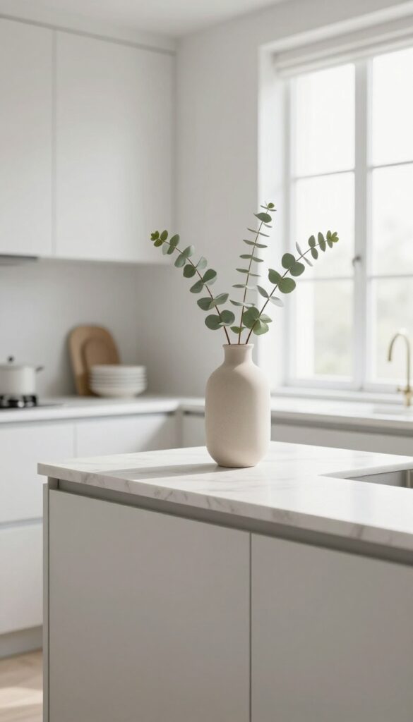
Sometimes the most impactful decor move is also the simplest. Instead of clustering multiple objects on your counter, try placing one tall vase with a few natural stems near the back. The vertical line draws the eye up, making the space feel taller and more open.
It's a light, airy look that adds life without adding clutter.
A single statement vase with greenery is the epitome of clean kitchen styling. Choose a ceramic or glass vase with a slender silhouette—think matte white, soft beige, or pale terracotta. Insert three to five stems of eucalyptus, olive branches, or dried pampas grass.
Keep the arrangement sparse so each stem has room to breathe. Position the vase near the back of the counter, slightly off-center, to create a natural focal point. This works beautifully on a kitchen island, near the window, or beside the sink.
The greenery adds organic texture and a soft pop of color, while the single object keeps the surface uncluttered. It's a styling trick that feels effortless but instantly elevates the whole room.
Best Colors And Finishes
Stick with neutral, earthy tones for the vase itself—cream, sand, sage green, or warm gray. Glossy finishes reflect light and feel more modern, while matte surfaces add a tactile, grounded quality. For the greenery, eucalyptus offers a muted blue-green that pairs well with almost any kitchen palette, while olive branches bring a silvery green that feels both rustic and refined.
Placement And Scale
- Proportion is key here. The vase should be tall enough to stand out—aim for 12 to 18 inches high—but not so tall that it overwhelms the counter. Place it at the back edge so it doesn't interfere with food prep.
- If your counter is near a window, the greenery will catch natural light and cast soft shadows, adding depth to the space.
Maintenance And Swap Tips
Fresh greenery lasts about two weeks if you change the water every few days. For a low-maintenance alternative, use high-quality faux stems—look for ones with realistic leaves and subtle color variation. Dried eucalyptus or preserved boxwood are also great options that stay beautiful for months without any upkeep.
2. A Slim Wooden Cutting Board as a Base
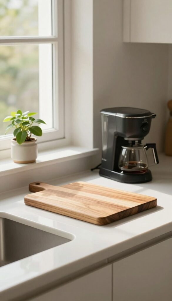
Counter space doesn't have to be cluttered to feel warm. A long, slim wooden cutting board placed near your coffee maker or oil bottle collection instantly anchors the area. It's a simple trick that adds a layer of texture and warmth without taking up much room.
Think of the cutting board as a tiny stage. Instead of placing items directly on cold countertops, set them on the wood. This defines a functional zone—like a coffee station or a cooking oil corner—and keeps things visually tidy.
The wood grain softens the look, while the slim shape works even on narrow counters. It's especially effective in kitchens with lots of stainless steel or stone, where a natural element can balance the cool surfaces.
Best Materials
Acacia or teak are ideal because they're durable and have rich, warm tones. Avoid bamboo if you want a more organic grain. The wood should be unfinished or oiled, not heavily lacquered, so it still feels natural.
Styling Tip
- Keep the board clear except for one or two items you use daily. For a coffee station, place your espresso machine on one end and a small plant or ceramic canister on the other. For oil bottles, group them in a neat row.
- This prevents the board from looking like a catch-all.
Where It Works Best
This idea shines on a kitchen peninsula, a narrow stretch of counter next to the sink, or even a bar cart. It's also great for renters who can't change countertops but want a quick warmth upgrade.
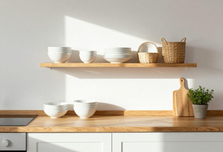
3. A Stack of Neutral Stoneware Bowls
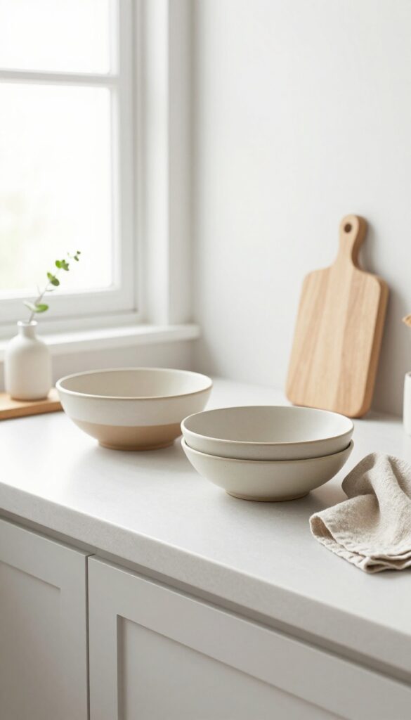
There's something quietly satisfying about a tidy stack of bowls sitting on the counter. It adds a sculptural element without trying too hard, and the neutral tones keep the look calm and cohesive. Plus, they're actually useful—grab one for a quick snack or toss in some fruit for an instant refresh.
A small stack of matte stoneware bowls in soft beige or gray brings a subtle texture to your kitchen counter. The key is keeping the stack low—two or three bowls at most—so it feels intentional rather than cluttered. Choose bowls with a slightly organic shape or a handmade feel to add warmth without breaking the clean lines of your kitchen.
Best Colors And Finishes
Stick with muted, earthy tones like oatmeal, warm taupe, or pale clay. Matte finishes work best here—they absorb light and feel soft to the touch, which fits the light and airy vibe. Avoid glossy or bright colors that might compete with the rest of your decor.
Styling Tip
Place the stack near the back of the counter, maybe next to a wooden cutting board or a small vase with a single stem. This creates a little vignette that feels curated but not fussy. Leave enough space in front for actual prep work so the stack doesn't get in the way.
Texture Mix
Pair the stoneware with a linen towel draped nearby or a wooden spoon holder. The contrast between the smooth, matte ceramic and natural fibers adds depth without visual noise. It's a simple way to make the stack feel like part of a bigger design story.
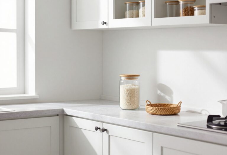
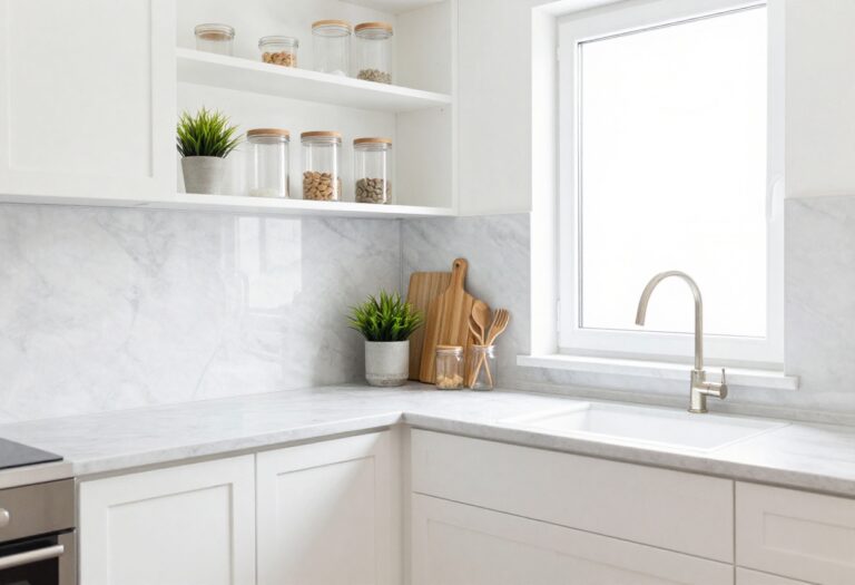
4. A Clear Glass Canister Set for Staples
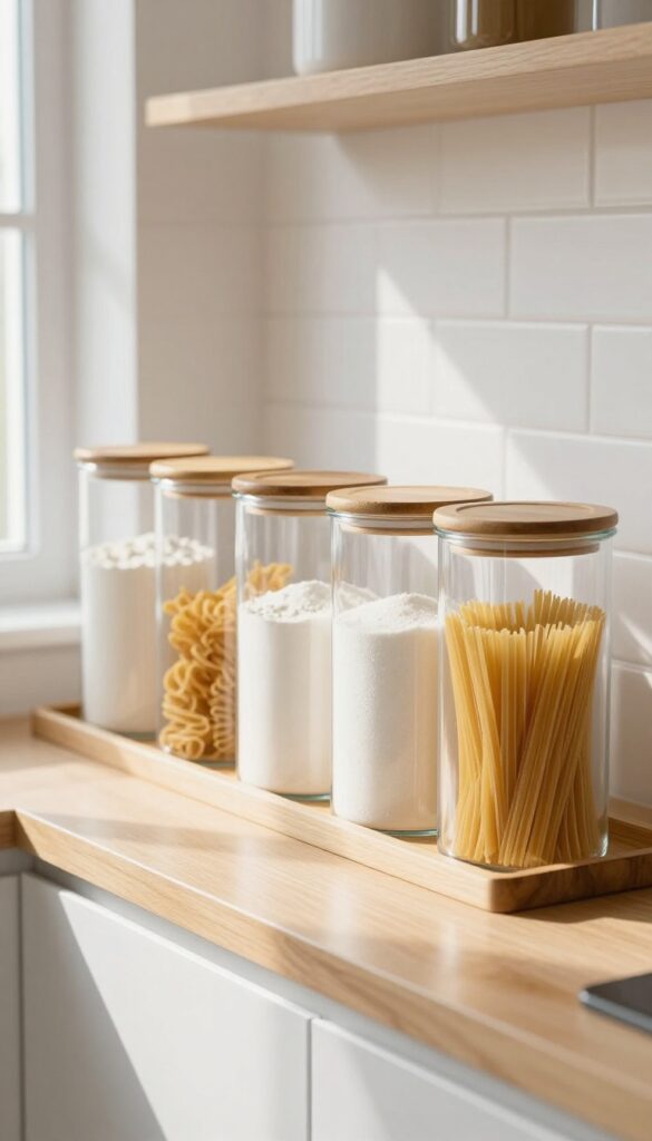
Matching clear glass canisters lined up on the counter create an instant sense of order. The transparency turns everyday ingredients into visual decor, while the uniform shapes keep the look tidy and intentional. It’s a simple swap that makes your kitchen feel more curated and calm.
Fill matching clear glass canisters with flour, sugar, or pasta. The uniform look keeps essentials visible and organized, adding a clean, pantry-inspired aesthetic. This idea works especially well on open shelving or a narrow counter between the stove and sink.
The glass reflects light, making the space feel brighter and more open. For a cohesive look, choose canisters with the same shape and lid style—wood, bamboo, or stainless steel tops all pair nicely with a light and airy kitchen. Avoid mixing too many sizes; stick to two or three heights for visual rhythm without clutter.
Best Materials
Opt for thick, clear glass with airtight seals to keep contents fresh. Lids in bamboo or brushed stainless steel add a warm or cool accent, depending on your kitchen’s finish. Avoid plastic or tinted glass—they can look less refined and hide the contents you want to show off.
Styling Tip
Group canisters on a small tray or wooden board to anchor them and catch any stray grains. Place the most-used staples like flour and sugar closest to your prep area. For a lighter look, fill them with white or pale ingredients—flour, rice, pasta—rather than dark beans or spices that can feel heavy.
Small-space Fix
If counter space is tight, use a slim tiered shelf or a wall-mounted magnetic rack to hold smaller canisters for spices or tea. This keeps the clear glass look without sacrificing valuable workspace. Just ensure the shelf matches your kitchen’s finish to maintain the airy feel.
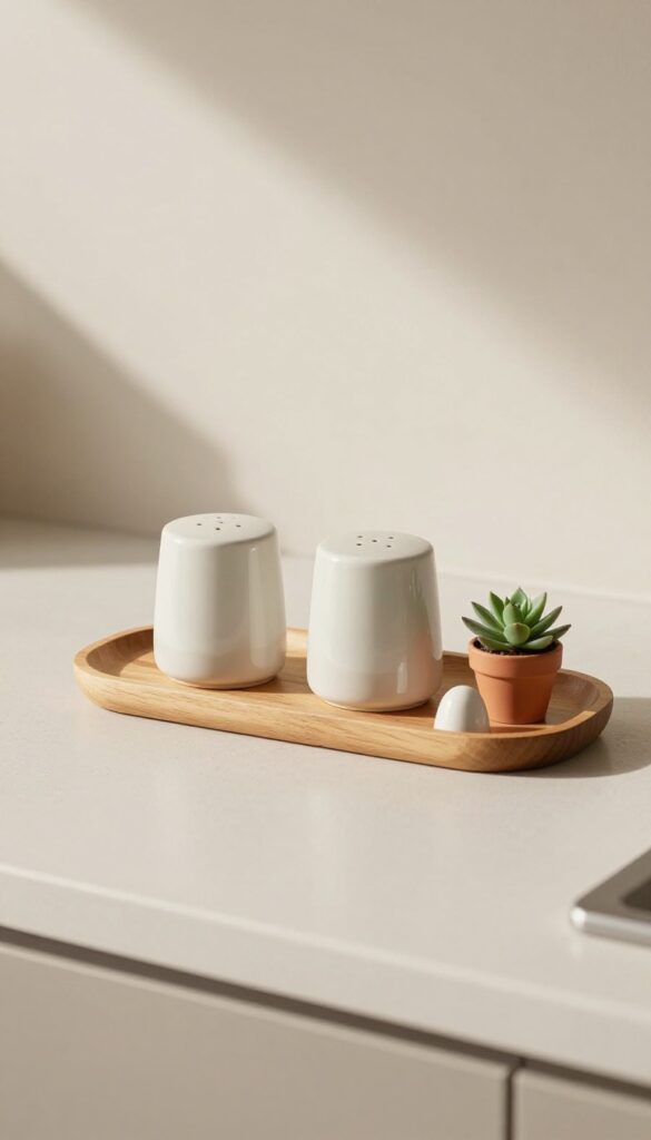
5. A Small Marble or Ceramic Tray for Oils
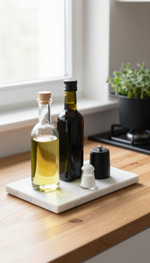
Your everyday cooking essentials—olive oil, vinegar, salt, pepper—often end up scattered across the counter, gathering sticky splatters. A small marble or ceramic tray brings them together in one tidy spot. It not only catches drips and prevents stains but also creates a little vignette that feels intentional and calm.
The cool, smooth surface contrasts nicely with warm wood or matte black appliances, adding a touch of elegance without trying too hard.
Think of this tray as a landing zone for your most-used kitchen tools. It keeps the counter looking clean even when you're mid-recipe, and it makes grabbing the oil or salt feel effortless. Plus, because the tray is small, it works on even the tightest counter space—next to the stove, beside the sink, or near the coffee station.
The key is choosing a tray that's just big enough to hold a few bottles and a small dish, so it stays purposeful and uncluttered.
Best Materials
- Marble and ceramic are the top choices here. Marble adds a natural stone veining that feels luxe but not fussy, while ceramic offers more color options—think soft white, pale blush, or matte black. Both are easy to wipe clean and heavy enough to stay put when you reach for a bottle.
- Avoid wood or acrylic; they can stain or slide around.
What To Include
- Keep it minimal: one bottle of olive oil, one of vinegar, a small salt cellar, and maybe a pepper grinder. That's it. Resist the urge to add a utensil crock or a plant—the tray should stay focused on cooking essentials.
- If you have room, a tiny dish for used tea bags or a spoon rest can work, but only if it doesn't crowd the tray.
Placement Tip
Set the tray near your primary cooking zone, but not directly behind the stove where heat and splatter are constant. A few inches to the left or right of the burners is ideal. If your counter is especially narrow, choose a rectangular tray that fits flush against the backsplash, leaving the rest of the counter free for prep.
6. A Single Potted Herb Plant

Sometimes the simplest touches make the biggest difference. A single potted herb plant—like basil, rosemary, or thyme—placed near a sunny window adds a fresh, lively focal point to your kitchen counter. It’s not just decor; it’s a practical companion for cooking, letting you snip fresh herbs straight into your dishes.
This idea keeps your counter feeling light and airy, with a clean, natural look that fits any modern kitchen.
A single potted herb plant brings life to your counter without clutter. Choose a small ceramic or terracotta pot in a neutral tone—cream, sage, or warm terracotta—to keep the look clean and understated. Place it near a window where it gets indirect light, and let its green leaves soften the hard edges of your kitchen.
This works especially well on a corner of the counter or next to the sink, where you can easily grab a sprig while cooking. The key is to keep it simple: one plant, one pot, no fuss.
Best Herbs To Use
- Basil, rosemary, and thyme are top choices because they’re hardy, fragrant, and easy to maintain indoors. Basil offers broad, lush leaves that create a bold visual statement, while rosemary’s needle-like texture adds a more delicate, sculptural feel. Thyme trails slightly, perfect for a small pot on a shelf or windowsill.
- Pick one that matches your cooking style and the light in your kitchen.
Pot And Placement Tips
- A simple terracotta or matte ceramic pot in a muted color keeps the focus on the plant. Avoid overly decorative pots that compete with the greenery. Place the pot on a small wooden trivet or a ceramic saucer to catch water and protect your counter.
- Position it where it won’t block your work area but is still within easy reach—near the stove or prep zone is ideal.
Styling For A Clean Look
- Keep the area around the plant bare to maintain that airy, uncluttered feel. If your counter tends to get busy, this single plant can act as a visual anchor. Pair it with a simple salt cellar or a small cutting board for a cohesive, functional vignette.
- Avoid adding other decor items nearby—the herb should stand alone as a quiet, living accent.
7. A Minimalist Utensil Crock
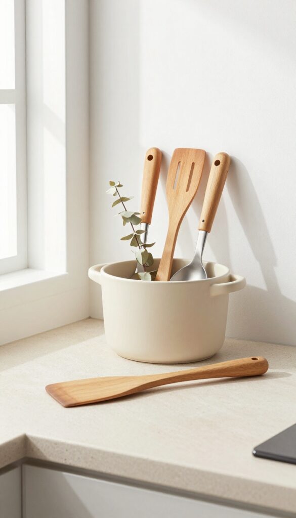
Countertop clutter can sneak up fast, especially around the stove where spatulas, spoons, and tongs tend to pile up. A minimalist utensil crock solves that without adding visual noise. The trick is choosing a vessel that blends in rather than stands out—think matte ceramic or concrete in a neutral tone that complements your countertop.
Keep it intentionally underfilled with only your most-used tools, and let the clean silhouette do the work.
This idea is all about restraint. Instead of cramming every gadget you own into one container, pick three to five essential utensils and let them sit loosely in a simple crock. The result is a countertop accent that feels more like a sculpture than storage.
It works especially well on a stretch of counter between the stove and sink, where you naturally reach for cooking tools. The low-profile shape keeps sightlines open, and the muted color palette prevents the crock from competing with other decor.
Best Materials
- Matte ceramic and raw concrete are the top choices here. Both have a soft, tactile finish that feels modern and grounded. Avoid glossy or heavily patterned crocks—they draw too much attention.
- A warm beige, soft gray, or pale terracotta blends seamlessly with light stone or butcher block counters.
Styling Tip
Limit the crock to long-handled tools like a wooden spatula, a slotted spoon, and tongs. Keep the handles facing up and varied in height for a casual, organic look. If the crock feels too empty, add a single dried eucalyptus stem or a wooden spoon with a sculptural handle for a subtle finishing touch.
Small-space Fix
In a galley kitchen or on a narrow counter, a slim rectangular crock takes up less visual real estate than a round one. Look for a version with a flat back so it can sit flush against the backsplash. This keeps the counter clear and the utensils still within easy reach.
8. A Slim Cookbook Stand With a Favorite Book
A cookbook stand does more than hold pages open—it brings a lived-in, personal energy to your counter. When you prop up a favorite book on a slim metal or wood stand, it becomes a subtle focal point that feels intentional without trying too hard. The clean lines of the stand keep the look light and airy, while the book itself adds a touch of warmth and personality.
This is one of those small additions that makes a kitchen feel like it belongs to someone who actually cooks and enjoys being there. The stand lifts the book off the counter, freeing up space and keeping recipes at eye level so you're not craning your neck while stirring a pot. Choose a stand with a slim profile—think matte black metal or light oak—so it doesn't compete with other counter items.
The book can be a well-loved family cookbook, a minimalist baking guide, or even a beautifully photographed food memoir. Either way, it adds a layer of texture and story that no appliance can replicate.
Best Materials
For a light, airy feel, go with a slim metal stand in matte brass, brushed nickel, or black. If you prefer warmth, a solid wood stand in maple or bamboo blends nicely with butcher-block counters. Avoid bulky or ornate stands—they'll weigh down the look.
Styling Tip
Place the stand near the backsplash or at the back of the counter so it doesn't block your work area. Pair it with a small vase of fresh herbs or a simple salt cellar to create a mini vignette that feels curated but not cluttered.
Layout Note
Keep the stand within arm's reach of your main prep zone, especially if you use it regularly. If counter space is tight, tuck it next to the stove or sink where it's handy but out of the way.
9. A Pair of Small Ceramic Salt and Pepper Shakers
Sometimes the smallest details make the biggest difference. A set of ceramic salt and pepper shakers in a soft, muted tone can feel like a tiny sculpture on your counter. They sit quietly, doing their job, without screaming for attention.
That's the kind of functional decor that keeps a modern kitchen feeling light, airy, and thoughtfully styled.
These shakers are more than just seasoning holders—they're a finishing touch. Choose a pair in a neutral like warm beige, pale sage, or dusty blush. The matte ceramic finish adds a subtle texture that contrasts nicely with glossy countertops or stainless steel appliances.
Place them near the stove or on a small tray next to the cooktop. They'll be within easy reach for cooking, and they'll look like they belong there. The key is keeping the design simple: no bold patterns, no loud colors.
Just clean, quiet shapes that blend into the background while still adding a hint of handmade charm.
Best Colors
- Stick with muted, earthy tones that complement your existing palette. Think soft clay, light terracotta, oatmeal, or pale olive. These colors feel natural and understated, so the shakers won't compete with other decor elements.
- Avoid glossy finishes or bright hues—they tend to draw the eye and break the calm vibe.
Styling Tip
Set the shakers on a small ceramic or wooden tray with a tiny plant or a sleek salt cellar. This groups them into a cohesive vignette rather than leaving them as two lonely objects. A tray also catches any stray grains, keeping the counter clean and tidy.
Material Note
- Ceramic is ideal because it feels warm and handmade. It pairs well with wood, marble, and stainless steel. Avoid plastic or metal shakers—they can look cheap or too industrial.
- A matte glaze softens the look and makes the shakers pleasant to touch every day.
10. A Simple Linen or Cotton Dish Towel Over the Oven Handle
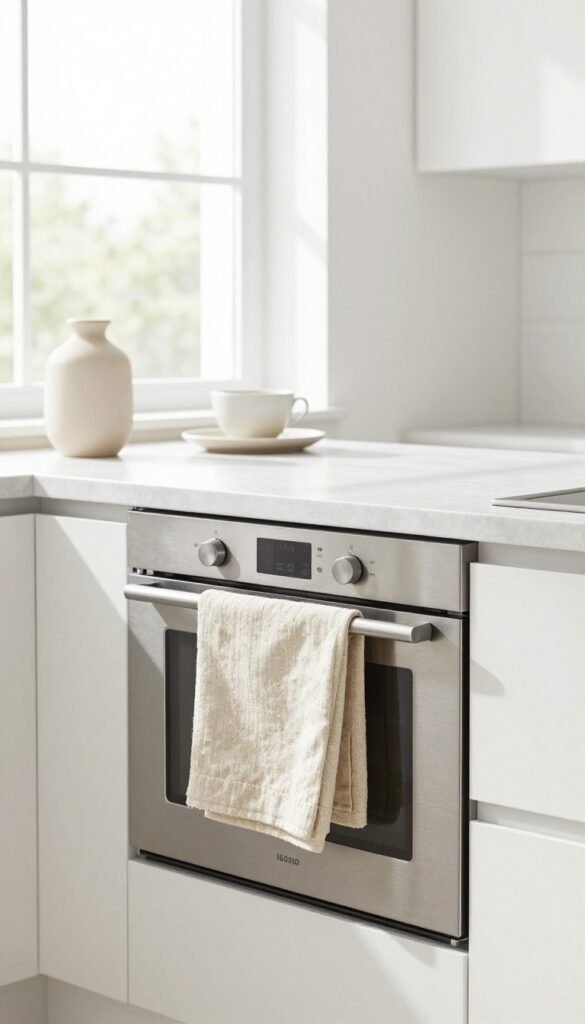
Sometimes the smallest details make the biggest difference in a kitchen. A neatly folded linen or cotton dish towel draped over the oven handle adds a soft, organic texture that instantly warms up the space. It's one of those effortless styling tricks that feels both intentional and lived-in—plus, it keeps a towel handy for drying hands or grabbing hot handles.
This idea works especially well in modern kitchens where hard surfaces like quartz, stainless steel, and tile can feel a bit cold. The towel introduces a natural fiber element that softens the look without cluttering the counter. Choose a solid neutral like oatmeal, sage, or a subtle stripe to keep the aesthetic clean.
Fold it into a neat rectangle and let it hang evenly over the handle—no fussy draping required. For an extra touch, swap towels seasonally: light linens in summer, thicker cottons in fall.
Best Colors And Patterns
Stick with muted tones that complement your kitchen's palette—think warm whites, soft grays, or earthy greens. A thin stripe or a simple border adds just enough interest without competing with other decor. Avoid bold prints or logos; the goal is understated elegance.
Placement And Practicality
Drape the towel over the oven handle or a nearby hook if you prefer not to block the handle. Make sure it's easily reachable from the stove and sink. Use a dedicated kitchen towel that you wash regularly—this isn't just decor, it's a functional tool that should stay fresh.
Texture Layering Tip
Pair the towel with other soft textures in the kitchen, like a woven rug or a ceramic dish brush with a natural handle. The contrast between smooth surfaces and the towel's woven texture creates depth without adding clutter.
11. A Low Profile Fruit Bowl
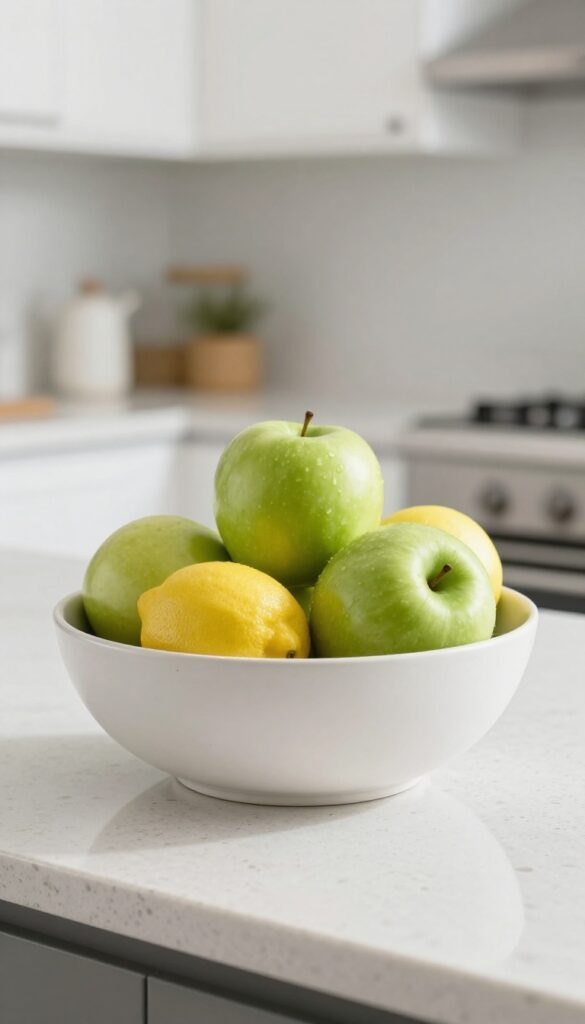
A cluttered countertop can make even the sleekest kitchen feel chaotic. The trick is to keep surfaces clean while still adding personality. A low profile fruit bowl does exactly that—it brings a natural pop of color without taking up visual space.
Think of it as functional decor that stays out of your way.
Instead of a towering wire basket or a bulky ceramic urn, reach for a shallow bowl in a neutral tone. A matte white ceramic or light wood piece works best. Drop in three lemons or a couple of green apples.
That's it. The bowl sits low, so it doesn't block your view across the counter. It also keeps fruit within easy reach for snacking or cooking.
The minimal arrangement feels intentional, not forgotten. Place it near the sink or coffee station for a fresh, airy vibe that lasts all week.
Best Materials
- Stick with natural or matte finishes. A hand-thrown ceramic bowl with a subtle glaze adds texture without glare. Light oak or bamboo brings warmth.
- Avoid shiny glazes or dark colors—they can feel heavy. The goal is for the bowl to blend into the counter, letting the fruit stand out.
Fruit Selection
- Choose fruits with strong, simple colors. Lemons, limes, green apples, or small oranges work well. Stick to one or two types at a time.
- Mixed fruit can look messy. Replace fruit as it ripens to keep the bowl looking fresh. This also gives you a reason to rotate the look with the seasons.
Placement Tip
- Set the bowl on an empty stretch of counter, not next to a pile of mail or appliances. Give it breathing room. A spot near the window or under a cabinet with under-lighting makes the fruit glow.
- Keep it away from the stove or sink to avoid heat and moisture spoiling the fruit faster.
FAQ
How do I keep my kitchen counter from looking cluttered?
Stick to a few intentional items and store everything else out of sight. Use trays or small containers to group similar objects, and leave plenty of empty space around each piece.
What colors work best for a light and airy kitchen counter?
Neutrals like white, beige, soft gray, and warm wood tones create an airy feel. Add subtle greenery or black accents for contrast without overwhelming the space.
Can I mix different materials on my counter?
Yes, mixing materials like wood, ceramic, glass, and marble adds depth. Just keep the palette cohesive and limit each material to one or two pieces.
How often should I change my counter decor?
Seasonal updates work well—swap greenery for dried flowers in fall or add citrus in winter. Otherwise, refresh whenever the arrangement feels stale.
What if I have very little counter space?
Focus on one or two small items, like a single vase and a utensil crock. Use vertical space with wall-mounted shelves or magnetic strips to keep the counter clear.
Conclusion
A clean, modern kitchen counter doesn't require a complete overhaul. Small, thoughtful choices—like a single vase or a tidy tray—can transform the look and feel of your space. The goal is to keep what you love visible and everything else tucked away.
Start with one or two ideas that resonate with your style, and build from there. Your kitchen counter should feel like a calm, inviting part of your home, not a catch-all.