11 Traditional Kitchen Backsplash Ideas With Timeless Detail
A kitchen backsplash does more than protect your walls. It sets the tone for the whole room, adding texture, color, and personality. Traditional styles have a way of feeling both familiar and fresh, grounding a space with details that never go out of fashion.
Whether you're remodeling or just refreshing, the right backsplash can make your kitchen feel warm and lived-in without trying too hard. Think soft glazes, subtle patterns, and materials that age gracefully.
Here are 11 traditional backsplash ideas that bring timeless detail into your home. Each one is practical, beautiful, and easy to picture in a real kitchen.
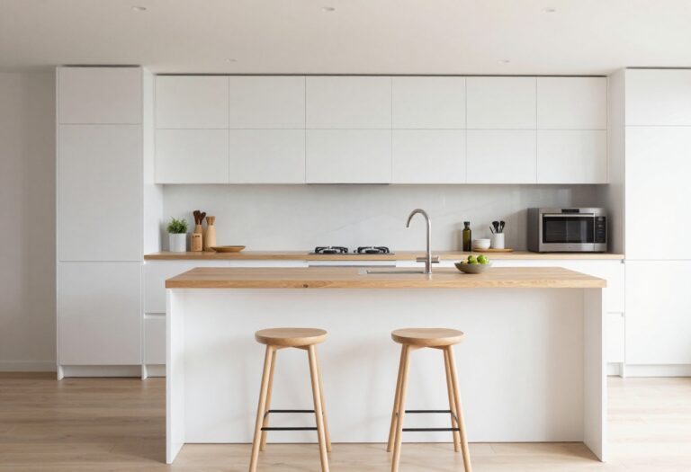
1. Classic Subway Tile With a Warm Twist
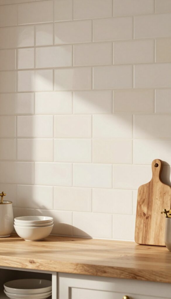
Subway tile is a timeless kitchen staple, but the standard bright white can sometimes feel a bit clinical. For a warmer, more lived-in look, swap stark white for a creamy off-white or soft beige. The herringbone layout adds movement and texture, so the backsplash feels anything but basic.
This approach keeps the classic appeal of subway tile while making the kitchen feel cozy and inviting. The warm tone pairs beautifully with natural wood cabinets, butcher-block countertops, and brass or oil-rubbed bronze fixtures. It's an easy way to add character without a full renovation.
Best Colors
Look for tiles labeled 'warm white,' 'cream,' or 'ivory.' Avoid anything with cool gray undertones. A soft beige with a hint of yellow or pink creates that lived-in warmth. For a subtle contrast, choose a grout in a similar tone rather than bright white.
Layout Tip
Herringbone is the star here, but you can also try a vertical stack or a 45-degree diagonal layout. The key is to avoid the standard horizontal brick pattern—it's too predictable. Herringbone draws the eye upward, making the kitchen feel taller and more dynamic.
Finishing Touch
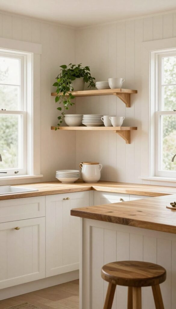
Pair the backsplash with open shelving in warm wood tones. Display a few ceramic dishes or cookbooks to reinforce the cozy, lived-in vibe. Add under-cabinet lighting with a warm LED bulb (2700K–3000K) to make the tile glow softly.
2. Hand-Painted Spanish Tiles for a Personal Touch
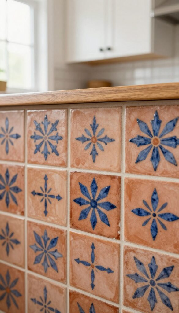
There’s something special about a backsplash that feels like it was made just for your kitchen. Hand-painted Spanish tiles bring that one-of-a-kind artisan quality, with each tile showing slight variations in brushstroke and glaze. The result is a warm, lived-in look that instantly adds character—especially when you choose earthy tones like terracotta, ochre, and deep blue.
Whether you use them as a bold focal point behind the stove or cover an entire wall, these tiles make the kitchen feel more personal and inviting.
Hand-painted tiles are a fantastic way to inject color and texture without overwhelming the space. Their irregular patterns and subtle imperfections are part of the charm, making the kitchen feel collected over time rather than decorated all at once. Pair them with simple white cabinets and natural wood accents to let the tiles shine, or go bolder with dark countertops for contrast.
Either way, you get a backsplash that feels both timeless and full of life.
Best Colors And Patterns
- Stick with traditional Spanish motifs like geometric stars, floral vines, or arabesque shapes. Earthy reds, warm yellows, and cobalt blues are classic choices that work well with neutral cabinets. If you want something softer, try tiles with cream backgrounds and muted green or rust details.
- Avoid overly busy patterns if your kitchen is small—use them as an accent strip instead of a full wall.
Where To Install Them
- The area behind the range hood or cooktop is the perfect spot for a hand-painted tile focal point. It draws the eye and becomes a natural conversation starter. For a more dramatic look, extend the tile to the ceiling or cover the entire backsplash wall.
- Just make sure to seal the tiles properly, especially near the stove, to protect them from grease and moisture.
Styling And Finishing Touches
- Let the tiles be the star by keeping surrounding surfaces simple. Open shelving with a few ceramic dishes or a small potted herb garden complements the artisan vibe. Use warm-toned metals like brass or copper for fixtures and hardware to tie the look together.
- A wooden cutting board or woven basket on the counter adds another layer of texture without competing with the tiles.
3. Brick Pattern With a Soft Whitewash
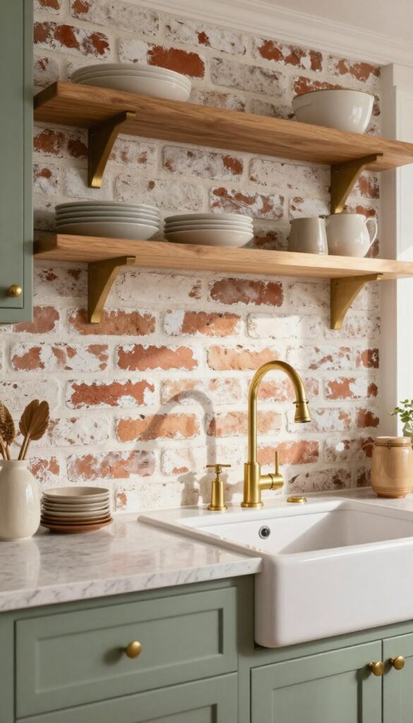
A full brick wall can feel a bit heavy for a kitchen, especially in a smaller space. But a whitewashed brick backsplash? That’s a whole different story.
The soft, uneven finish adds texture and a rustic, lived-in warmth without overwhelming the room. It pairs beautifully with natural wood shelves and warm brass fixtures, creating a kitchen that feels both cozy and thoughtfully styled.
This look works best when the whitewash is applied unevenly, letting some of the original brick color peek through. The result is a surface that feels aged and authentic, not painted over. It’s a great way to bring in character without committing to a full brick wall, and it complements a range of cabinet colors from creamy white to deep navy.
Best Colors
Stick with warm whites and soft grays for the whitewash itself. The underlying brick should be a warm red or brown tone to create contrast. For cabinets, consider sage green, warm cream, or even a soft charcoal to keep the space grounded.
Texture Mix
Balance the rough brick texture with smooth elements like polished quartz countertops or a sleek farmhouse sink. Add open wooden shelves and a few brass or copper accents to tie the rustic and refined together.
Finishing Touch
Install under-cabinet lighting with a warm bulb to highlight the whitewash’s subtle variations. This will make the brick feel dimensional and cozy, especially in the evening.
4. Marble Herringbone for Subtle Elegance
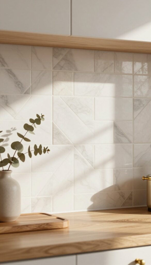
Marble herringbone is one of those backsplash choices that feels quietly luxurious. It doesn't shout for attention, but the repeating V-shaped pattern draws the eye in a way that plain subway tile just can't. The natural veining in marble adds organic movement, so the surface never looks flat or boring.
For a kitchen that leans warm and lived-in, a honed finish keeps the stone from feeling too glossy or formal. It's refined without being precious, and that balance makes it work beautifully in both traditional and transitional spaces.
Marble herringbone brings texture and depth to a kitchen without overwhelming the room. The pattern itself creates a sense of rhythm, and the subtle variations in the stone keep it from feeling repetitive. Because marble is a natural material, no two tiles are exactly alike, which adds a layer of authenticity that manufactured materials can't replicate.
This backsplash works especially well in kitchens with simple cabinetry and neutral countertops, where it can act as the main visual interest without competing for attention. Pair it with warm wood tones or soft brass fixtures to reinforce that cozy, collected feel.
Best Colors And Finishes
- White or cream marble with soft gray veining is the most versatile choice. It blends with almost any cabinet color and keeps the space bright. For a slightly warmer look, choose marble with beige or taupe undertones.
- A honed finish is key here—it reduces glare and makes the stone feel more tactile and approachable. Polished marble can look stunning, but it shows every fingerprint and water spot, which isn't ideal for a busy kitchen.
Layout And Grout Tip
- Herringbone requires careful layout planning. Start the pattern from the center of the wall so it looks balanced, especially if you have a range hood or window as a focal point. Use a grout color that matches the lightest tone in the marble.
- White or off-white grout keeps the pattern seamless, while a darker grout can make the herringbone pop more—but that might feel too bold for a subtle look.
Finishing Touch
- To keep the elegance understated, skip a decorative border or listello. Let the herringbone pattern speak for itself. A simple, clean edge with a matching marble pencil trim or a slim metal profile in brushed brass or nickel finishes the installation neatly.
- Add under-cabinet lighting to highlight the texture and veining at night—it transforms the whole kitchen into a warm, inviting space.
5. Zellige Tiles With Irregular Glaze
There’s something about handmade tiles that instantly makes a kitchen feel more personal. Zellige tiles, with their irregular glaze and subtle color variations, bring that artisanal quality without trying too hard. In soft whites, pale greens, or warm terracotta, they catch the light differently depending on the time of day, adding a layer of warmth and history that factory-made tiles just can’t replicate.
They’re not perfectly flat or uniform, and that’s exactly what makes them so inviting.
Zellige tiles work especially well in kitchens that want to feel lived-in rather than showroom-perfect. The glossy, uneven surface reflects light in a way that makes the whole space feel softer and more dynamic. Because each tile is slightly different, the backsplash becomes a subtle focal point without overwhelming the room.
Pair them with natural materials like butcher-block countertops, open wood shelving, and matte black or brass fixtures to keep the look grounded and warm. They’re also surprisingly durable—just seal them properly to protect against moisture and stains.
Best Colors For A Warm Vibe
- Stick with earthy tones to enhance the cozy feel. Soft white zellige tiles keep things bright but still textured, while pale sage green adds a gentle pop of color that pairs beautifully with warm wood tones. For a bolder look, terracotta or dusty rose brings in a rich, sunbaked warmth that feels especially inviting in kitchens with lots of natural light.
- Avoid cool grays or stark whites—they can make the handmade look feel disconnected from the warm, lived-in mood you’re going for.
Layout And Installation Tip
Because zellige tiles have natural size and thickness variations, they look best when installed with a tight, random offset rather than a perfect grid. This emphasizes the handcrafted feel and hides minor imperfections. If you’re working with a limited budget, use zellige tiles only on the main cooking wall and extend a more affordable subway tile to the sides—it keeps the visual impact where it counts without breaking the bank.
Finishing Touch For A Cohesive Look
To tie the backsplash into the rest of the kitchen, choose a grout color that matches the dominant tile shade. White or cream grout keeps the surface seamless, while a slightly darker grout can define each tile’s shape and add subtle contrast. Pair the tiles with warm under-cabinet lighting to make the glaze shimmer in the evening, turning your backsplash into a soft, glowing feature that makes the kitchen feel like the heart of the home.
6. Checkerboard Pattern in Neutral Tones
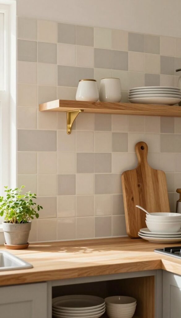
A checkerboard backsplash doesn't have to scream retro diner. When you dial down the contrast and stick with soft neutrals, it becomes something entirely different—refined, subtle, and surprisingly warm. Think cream and warm gray, or muted sage paired with off-white.
The pattern still adds that classic geometric interest, but the gentle palette keeps it from feeling loud or busy. It's playful without being overwhelming, which makes it a perfect fit for kitchens that want a touch of personality without sacrificing a calm, lived-in feel.
This approach works especially well in kitchens with natural wood tones or warm brass fixtures. The neutral checkerboard acts as a backdrop that ties everything together without stealing the show. It's also forgiving—those soft shades hide splatters better than stark white, and the pattern helps disguise minor grime between deep cleans.
If you love the idea of a patterned backsplash but worry about commitment, this is your sweet spot.
Best Color Combos
- Stick with low-contrast pairings. Cream and warm gray is a classic that reads as elegant and timeless. For a hint of color, try muted sage with off-white—it brings a gentle earthy vibe.
- Another favorite is pale blue-gray with cream, which feels airy and soft. Avoid pure black or navy here; the goal is a whisper, not a shout.
Material Choices
Subway tiles in a checkerboard layout are the most straightforward option, but don't overlook square tiles or even hexagons for a twist. Ceramic or porcelain is practical and easy to clean. If you want extra texture, consider matte finishes—they reduce glare and add a cozy, tactile quality that glossy tiles lack.
Grout Matters
Use a grout color that matches the lighter tile to keep the pattern subtle. Contrasting grout will make the checkerboard pop more, which might defeat the soft effect you're after. A warm ivory or light gray grout blends seamlessly and helps the whole surface feel like one gentle, cohesive design.
7. Beadboard Paneling for Cottage Charm
Beadboard brings instant cottage warmth to any kitchen. This classic paneling adds texture and depth without overwhelming the space, making it a favorite for cozy, lived-in homes. Paint it a soft cream or pale blue for a relaxed, coastal vibe that feels both fresh and timeless.
It's budget-friendly and easy to install, so it's a great DIY weekend project that delivers big visual payoff.
Beadboard paneling is a simple way to introduce cottage character without a full renovation. The vertical lines draw the eye upward, making ceilings feel higher and the room more spacious. For a warm, lived-in look, choose a matte finish in a light hue—think creamy white, buttery yellow, or dusty blue.
Pair it with open shelving and natural wood accents to keep the feel relaxed and inviting. Beadboard also hides wall imperfections and is easy to wipe down, making it practical for a busy kitchen. If you're renting, consider beadboard wallpaper or peel-and-stick panels for a temporary solution that still delivers charm.
Best Colors For A Cozy Feel
- Stick with soft, muted tones that enhance the cottage mood. Creamy white keeps things bright and airy, while pale blue or sage green adds a gentle pop of color. For a slightly more dramatic look, try a warm gray or a light buttercream.
- Avoid dark or glossy finishes, as they can make the space feel smaller and less relaxed.
Installation Tips For Diyers
Beadboard comes in sheets or individual planks—sheets are faster to install, while planks offer a more authentic look. Use a level and adhesive to attach panels directly to the wall, then finish with a small trim at the top and bottom for a polished edge. Paint before installing to save time, and use a high-quality primer to prevent the wood grain from showing through.
Styling With Open Shelving
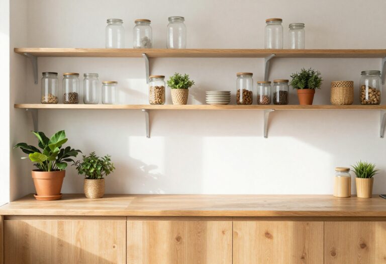
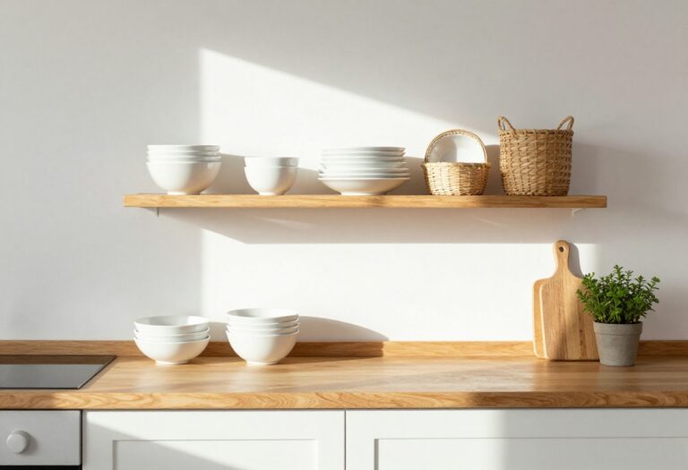
- Beadboard pairs beautifully with open shelves in a contrasting wood tone, like oak or walnut. Keep shelves uncluttered with a few ceramic dishes, glass jars, and small plants. This combination adds warmth and texture while keeping the kitchen functional.
- Add a simple pendant light above for a cozy glow that highlights the paneling's subtle grooves.
8. Stacked Stone Veneer for Natural Texture
There’s a reason stacked stone has been a go-to for centuries—it brings an earthy, grounded feel that ages beautifully. Unlike sleek tiles or polished marble, the uneven surfaces and subtle color variations in stone add warmth and depth. In a kitchen with natural wood elements and matte black hardware, this texture creates a cozy, lived-in look that never feels cold or overly designed.
Stacked stone veneer is more than just a backsplash—it’s a statement that says your kitchen is meant to be used and enjoyed. The irregular edges and organic tones make the space feel like it has evolved over time, not just been decorated. Warm limestone or fieldstone colors work best, as they complement wood cabinetry and black fixtures without competing.
This is a great choice for kitchens that already have natural materials like butcher block counters or open shelving with ceramic dishes. The stone adds visual weight, so it balances well with lighter elements like white walls or pale quartz. For a cohesive look, carry the same stone onto a small accent wall or behind a range hood.
Best Colors And Stone Types
- Stick with warm neutrals: creamy limestone, tan fieldstone, or soft gray ledge stone. Avoid cool blue or green tones that can feel too rustic or cold. The goal is a stone that looks like it was pulled from a local quarry—earthy, not polished.
- Thin veneer panels are easier to install and still give that authentic stacked effect.
Texture Mix And Pairings
- Let the stone be the star by pairing it with smooth surfaces. Matte black hardware, oil-rubbed bronze fixtures, and natural wood open shelving create a beautiful contrast. Avoid glossy finishes or busy patterns nearby—the stone already provides plenty of visual interest.
- A simple white or cream countertop keeps the look balanced.
Small-space Fix
- In a compact kitchen, use stacked stone only on the backsplash behind the stove or sink rather than the entire wall. This keeps the texture from overwhelming the room. Pair with light upper cabinets and a pale countertop to maintain an airy feel.
- The stone becomes a focal point without closing in the space.
9. Geometric Cement Tiles With a Vintage Feel
Cement tiles bring a handcrafted warmth that’s hard to replicate. Unlike glossy subway tiles, they have a matte, slightly textured surface that softens the kitchen’s overall look. The muted color palette—dusty rose, sage, charcoal—keeps the pattern from feeling loud, so it fits right into a cozy, lived-in home.
Geometric cement tiles are a fantastic way to add personality without overwhelming the space. Their durability means they can handle kitchen messes, and over time, they develop a subtle patina that only adds to their charm. Pair them with warm wood cabinets and brass fixtures for a cohesive, inviting feel.
Best Colors
Stick with earthy, muted tones like dusty rose, sage green, charcoal, and cream. These colors feel vintage without being dusty or dull. They also play well with natural stone countertops and open shelving.
Layout Tip
Use the tiles as a full backsplash behind the stove and sink, then transition to a simpler material like beadboard or painted drywall on the remaining walls. This keeps the pattern from competing with other design elements.
Finishing Touch
Seal the tiles with a matte sealer to protect against stains while preserving the natural, matte finish. A high-gloss sealer would ruin the vintage vibe.
10. Butcher Block Accent With Tile Border
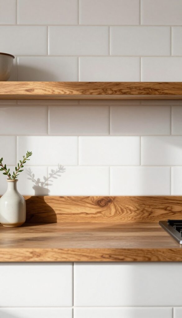
A full butcher block backsplash can feel heavy, but a narrow strip framed by bright white tile hits a sweet spot between warmth and airiness. This idea borrows from the kitchen counter, creating a visual break that draws the eye without overwhelming the room. It’s a smart way to add a functional ledge for spices, oils, or a small plant while keeping the rest of the backsplash easy to clean and classic.
The butcher block strip sits about six inches tall, running horizontally across the main cooking zone. White subway tile above and below it keeps the look crisp and timeless. The wood brings a natural, lived-in feel that softens the tile’s formality.
Use a food-safe finish so the ledge can actually hold items you reach for while cooking. This detail works especially well in kitchens where the countertop is also butcher block or another warm material like quartzite with wood tones.
Best Materials
Choose a hardwood like maple or walnut for the butcher block strip—these resist moisture better than softwoods. Pair it with classic 3×6 white subway tile or a slightly larger 4×8 format for fewer grout lines. Use a matte or satin finish tile to keep the look understated and let the wood grain shine.
Layout Tip
Install the butcher block at counter height or slightly above—about four to six inches up from the countertop. This creates a continuous visual line and makes the ledge feel like a natural extension of the work surface. Keep the strip directly behind the stove or sink where you’ll use it most.
Finishing Touch
Seal the butcher block with a waterproof, food-grade mineral oil or beeswax blend. Reapply every few months to maintain the warm glow and protect against splashes. Add a small wooden utensil holder or a salt cellar on the ledge to reinforce the practical, cozy vibe.
11. Mosaic Medallion as a Focal Point
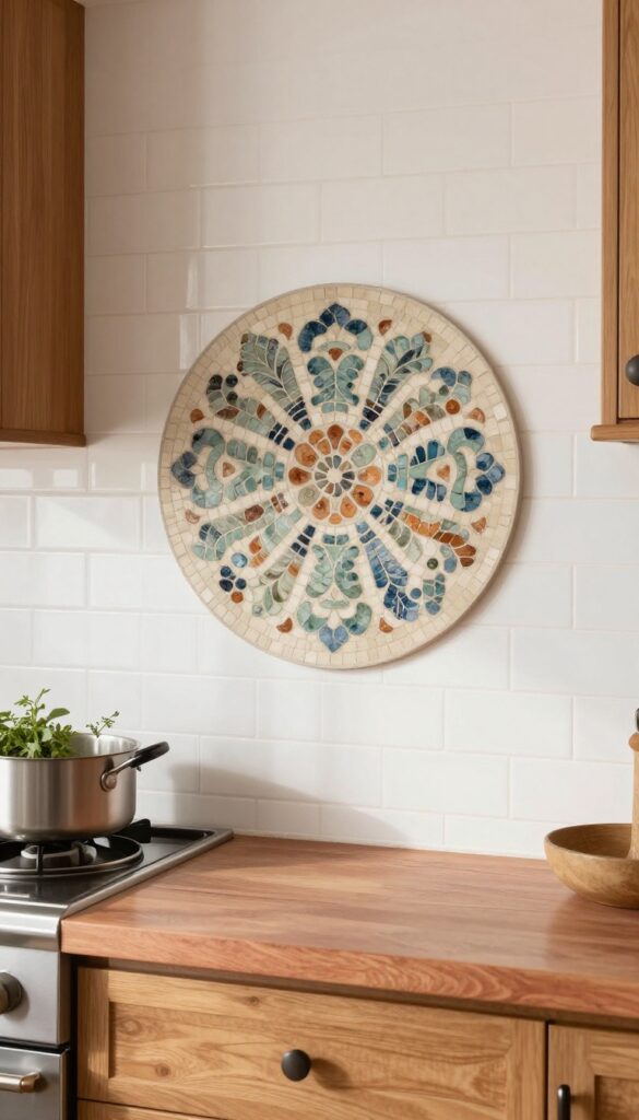
A mosaic medallion behind the range is like jewelry for your kitchen—it draws the eye and adds instant character. In a traditional space, this detail feels right at home, especially when the design features classic motifs like arabesques or soft florals in muted, earthy tones. The key is to let the medallion shine by keeping the surrounding tile simple and understated, so the pattern becomes the star without competing for attention.
This idea works beautifully in kitchens where you want a sense of history and craftsmanship without going over the top. The medallion becomes a natural gathering point, anchoring the cooking zone with a touch of artistry. For a warm, lived-in feel, choose colors that blend with your cabinetry and countertops—think dusty blues, sage greens, or warm terracottas against a cream or white backdrop.
The medallion doesn't have to be huge; even a 24-inch round or oval insert makes a strong statement. Pair it with simple subway tile or square tiles in a neutral shade, and you've got a backsplash that feels both special and timeless.
Best Colors For A Cozy Look
Stick with muted, earthy tones that feel inviting rather than stark. Warm grays, soft taupes, and aged golds keep the medallion from feeling too formal. If your kitchen has wood cabinets, pull a subtle accent from the grain—like a rusty orange or deep olive—to tie everything together.
Layout Tip: Placement And Scale
Center the medallion directly behind the range hood or cooktop, about 18 to 24 inches above the counter. For a standard 30-inch range, a 24-inch medallion feels proportional. If your range is larger, scale up slightly, but avoid going bigger than the hood width to keep the balance right.
Finishing Touch: Grout And Trim
Use a grout color that matches the background tile to let the medallion pop. A contrasting grout can make the whole backsplash feel busy. Frame the medallion with a thin metal trim—like brushed nickel or oil-rubbed bronze—to give it a polished, intentional edge.
FAQ
What is the most timeless backsplash material?
Subway tile is often considered the most timeless because it's simple, versatile, and has been used for over a century. It works with almost any style and never feels dated.
How do I choose a backsplash that won't go out of style?
Stick with neutral colors and classic patterns like subway, herringbone, or brick. Avoid overly trendy colors or very large-format tiles. Natural materials like marble and zellige also age well.
Can I mix different backsplash materials?
Yes, mixing materials can add depth and interest. For example, use a marble herringbone behind the stove and simple subway tile elsewhere. Just keep the color palette cohesive.
What backsplash works best for a small kitchen?
Light-colored tiles with a subtle pattern or texture can make a small kitchen feel larger. Subway tile laid vertically or a soft white zellige tile are great choices. Avoid dark or very busy patterns.
How do I clean a natural stone backsplash?
Use a pH-neutral cleaner and a soft cloth. Avoid acidic or abrasive cleaners. Seal the stone regularly to protect against stains and moisture.
Conclusion
A traditional backsplash is more than a backdrop—it's a chance to add character and warmth to your kitchen. Whether you lean toward hand-painted tiles or simple beadboard, each idea brings its own kind of timeless detail.
Take your time choosing something that feels right for your home. The best backsplash is one that makes you smile every time you walk into the room, year after year.