13 Blue and Gold Kitchen Ideas for a Chic Luxe Look
Blue and gold is one of those color combos that instantly feels polished. It’s cool and calming, but the gold adds just enough warmth to keep things from feeling cold.
Whether you’re planning a full remodel or just swapping out a few accessories, this palette works in all kinds of kitchens. The key is keeping the look light and airy, so the blue doesn’t overwhelm the space.
Think soft navy, pale sky tones, and touches of brass or gold that catch the light. Here are 13 ideas to help you bring that chic luxe vibe into your own kitchen.
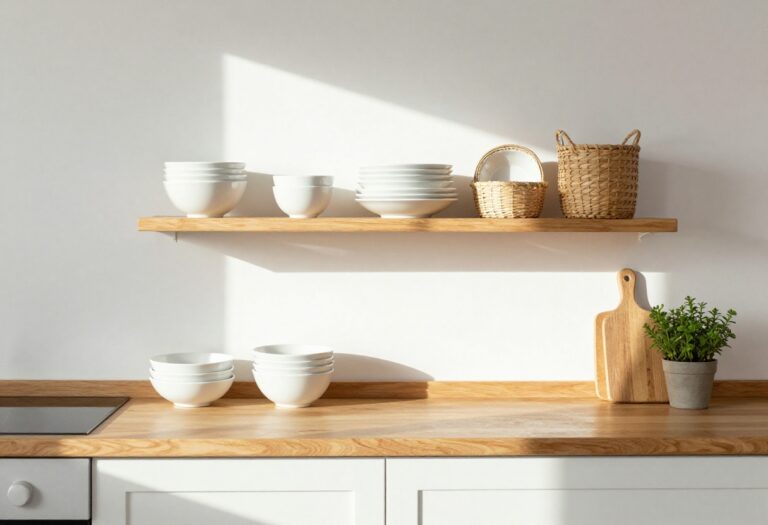
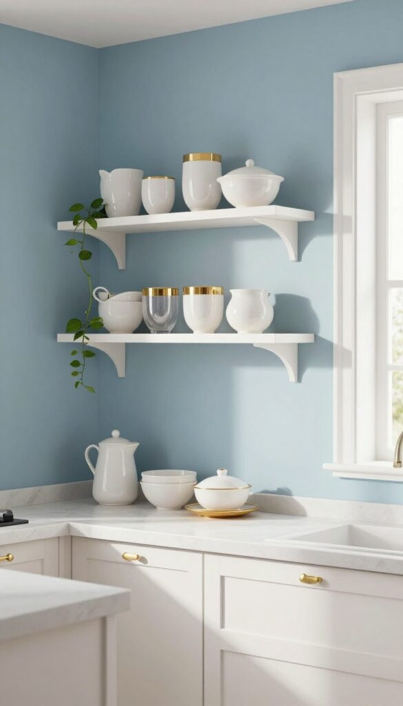
1. Navy Lower Cabinets with Open Upper Shelving
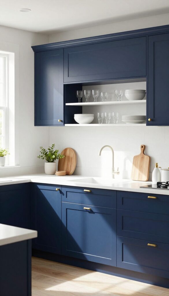
Deep navy cabinets on the bottom instantly anchor a kitchen, but pairing them with open upper shelving keeps the whole room from feeling too heavy. The contrast between rich color and bare wall space creates a balanced look that feels both grounded and breezy. It’s a smart way to introduce a bold hue without overwhelming the space.
This approach works especially well in kitchens with good natural light. The navy base adds a dose of sophistication, while the open shelves above keep sightlines clear and make the room feel larger. To maintain the light, airy vibe, stick with white dinnerware, clear glassware, and a few neutral accents on the shelves.
The result is a kitchen that feels polished but not stuffy, with plenty of visual interest at eye level.
Best Colors
Stick with a true navy (like Benjamin Moore Hale Navy) for the lower cabinets. Keep upper shelves and wall color bright white or soft cream to maximize contrast. Gold hardware or light brass pulls add warmth and tie into the blue-and-gold theme naturally.
Shelf Styling Tip
Arrange items in small groupings of three: a stack of plates, a pitcher, and a small plant. Mix in a few wooden cutting boards or marble pieces to break up the white and add texture. Leave some empty space so the shelves don’t look cluttered.
Finishing Touch
Install under-shelf lighting to highlight the dishes and create a warm glow in the evening. It also makes the navy cabinets pop and gives the whole kitchen a luxurious feel without a full renovation.
2. Brass Faucet as a Focal Point
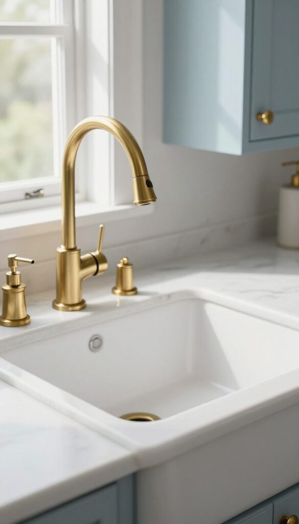
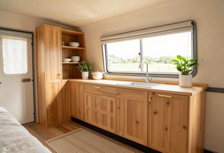
In a blue and gold kitchen, the faucet might seem like a small detail, but it can actually anchor the whole look. Swapping a standard chrome or stainless steel faucet for a polished brass one instantly draws the eye and adds a warm, luxurious touch. Against a white or pale blue sink area, that golden glow becomes a subtle statement piece—proof that sometimes the best upgrades are the simplest.
A brass faucet works because it bridges the coolness of blue with the warmth of gold, creating a balanced, cohesive palette. It doesn't require a full hardware overhaul; just this one swap can elevate the entire sink zone. Plus, brass develops a beautiful patina over time, adding character without looking worn.
Pair it with a white farmhouse sink or a pale blue ceramic basin for maximum contrast. The result is a focal point that feels intentional, not overdone.
Best Finishes
Polished brass gives a shiny, mirror-like gleam that feels classic and formal. For a more relaxed vibe, choose brushed brass or unlacquered brass, which will mellow into a soft, warm finish. Avoid overly yellow or orange tones—look for a true gold hue that complements your blue cabinets or backsplash.
Style Pairing
This idea shines in kitchens with white or light blue cabinetry and marble or quartz countertops. The brass faucet pops best against matte or satin finishes, so skip glossy tiles around the sink. For a cohesive look, add a few brass accents nearby, like a soap dispenser or cabinet knobs, but keep them minimal to let the faucet remain the star.
Practical Tip
Consider a pull-down or gooseneck style for functionality. Brass faucets are available in modern and traditional shapes, so choose one that fits your kitchen's overall style. Clean with a soft cloth and mild soap to maintain the shine—avoid harsh chemicals that can strip the finish.
3. Pale Blue Backsplash with Gold Grout
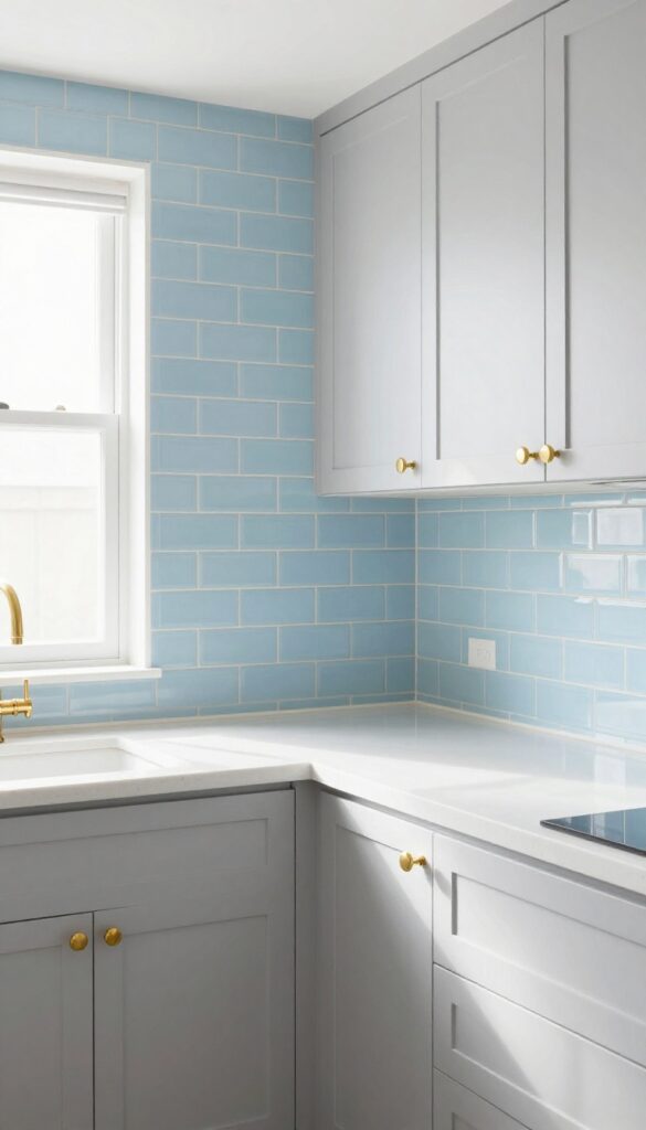
If you want to bring blue and gold into your kitchen without going full glam, a pale blue backsplash with gold grout is your answer. The soft sky blue keeps things light and airy, while the gold-toned grout adds just a hint of shimmer. It’s a permanent feature that feels special but never over the top—perfect for anyone who loves a subtle luxe touch.
This idea works beautifully in kitchens with white or light gray cabinetry. The pale blue tiles create a calm backdrop, and the gold grout lines catch the light, giving the whole wall a soft glow. You can use standard subway tiles for a classic look or try a herringbone pattern for extra interest.
Either way, the grout becomes the star without shouting for attention.
Best Colors
- Stick with pale blue tiles—think powder blue or a very light periwinkle. Pair them with warm white or cream cabinets to keep the space feeling open. For the grout, use a metallic gold epoxy or a gold-colored grout additive.
- Avoid anything too yellow or brassy; a soft, warm gold blends best with the cool blue.
Installation Tip
- Work with a tile installer who has experience with colored grout, because gold grout can be tricky. Make sure the tiles are evenly spaced so the grout lines look intentional. If you're DIYing, use a grout that’s easy to clean—kitchen backsplashes see a lot of splatter.
- Sealing the grout is a must to keep the gold from dulling over time.
Finishing Touch
- Let the backsplash be the main event. Keep countertops simple—white quartz or light marble works well. Add a few gold accents like a faucet or cabinet pulls to echo the grout, but don’t overdo it.
- A couple of open shelves with white dishes and a small plant will complete the look without competing.
4. Gold Cabinet Handles and Knobs
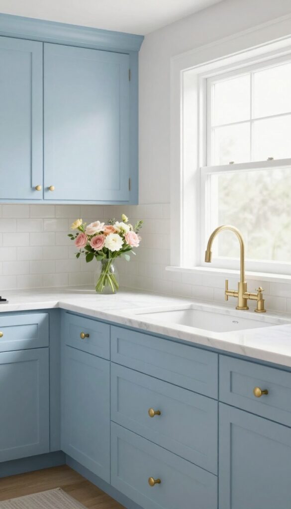
Swapping out standard cabinet hardware for gold or brass handles and knobs is one of those small changes that instantly elevates the whole kitchen. It’s a simple DIY project that takes an afternoon, yet the effect is anything but minor. On white or blue cabinets, the warm metallic gleam catches the light and adds a layer of polish that feels both intentional and luxurious.
Mixing different shapes—like sleek bar pulls on drawers and round knobs on doors—keeps the look from feeling too uniform, giving it a curated, collected vibe.
Gold hardware works beautifully with blue cabinets because it creates a striking contrast without being jarring. The warm tones of brass or gold soften the coolness of blue, making the space feel balanced and inviting. For a light and airy kitchen, pair pale blue cabinets with satin brass pulls—the subtle sheen reflects daylight and keeps the room feeling open.
If your cabinets are a deeper navy, go for polished gold for a more dramatic, jewel-box effect. The key is to choose a finish that complements your countertops and backsplash; for example, brushed brass pairs well with marble or quartz, while shiny gold pops against darker surfaces.
Best Finishes For Blue Kitchens
- Not all gold is created equal. For a light and airy kitchen, stick with brushed brass or unlacquered brass—they have a softer glow that won’t overpower pale blue cabinets. Polished gold works better with deeper navy or indigo cabinets, where the high shine adds a touch of glamour.
- Avoid overly dark or antique finishes if you’re going for that breezy feel; they can make the space feel heavier.
Mixing Shapes For Visual Interest
- Don’t be afraid to mix hardware styles. Use long bar pulls on drawers and larger cabinet doors, then add round knobs on upper cabinets or smaller doors. This variety creates rhythm and keeps the eye moving.
- Just make sure the finishes match—mixing brushed and polished gold in the same space can look accidental. Stick to one finish and vary the shape for a collected, designer look.
Small-space Upgrade
- In a compact kitchen, gold hardware can make a big difference without taking up any floor space. The reflective quality of the metal bounces light around, making the room feel larger. Choose slim, streamlined pulls for a clean look that doesn’t clutter the cabinet fronts.
- Even just swapping out the handles on your main cabinets can transform the entire feel of the space.
5. Blue Kitchen Island with a Gold Base
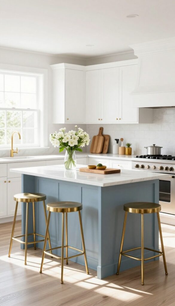
A kitchen island is often the centerpiece of the room, so why not make it a statement? Painting the base a deep, rich blue and swapping out standard legs for gold or brass ones instantly elevates the look. The solid, colorful top feels grounded, while the delicate metal legs keep the whole piece from looking too heavy or bulky.
It’s a perfect balance of bold color and airy elegance.
This idea works especially well in kitchens that already have neutral cabinetry or white walls, because the island becomes the focal point without competing. The gold base adds a touch of glamour, but the blue keeps it approachable and cozy. Finish the look with a couple of gold or brass bar stools to tie everything together.
The result is a kitchen that feels both luxurious and lived-in.
Best Blue Shades
For a light and airy feel, go with a soft dusty blue or a muted navy. Avoid shades that are too dark or saturated, as they can weigh down the space. A blue-gray tone also works beautifully, especially if your kitchen has warm wood accents or white marble countertops.
Material Pairing
Pair the blue island with a light countertop material like white quartz or Carrara marble. This keeps the overall look bright and clean. For the gold base, brushed brass or satin gold finishes are ideal—they add warmth without being too shiny or flashy.
Finishing Touch
Add a couple of gold or brass stools with slim profiles to maintain the airy vibe. Choose stools with open backs or no backs at all, so they don’t block the view of the island base. A small vase of fresh flowers or a wooden cutting board on the countertop adds a natural, inviting touch.
6. Gold Pendant Lights Over the Island
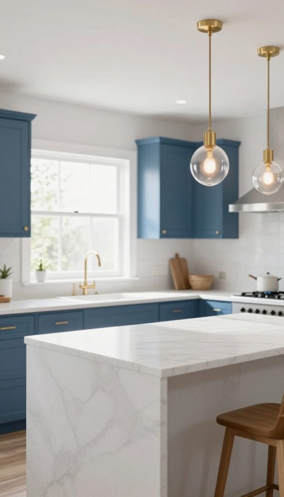
Adding gold pendant lights above the kitchen island is like putting a finishing touch on a well-styled room. The warm metallic glow instantly draws the eye upward and makes the whole space feel more polished. For a light and airy look, choose fixtures with open or glass shades that let the light flow freely rather than trapping it.
This keeps the kitchen bright while still giving you that luxe, warm ambiance.
Gold pendant lights bring both function and style to the heart of the kitchen. They create a focal point above the island, define the work zone, and cast a warm, flattering light that makes the space feel inviting. To keep the look clean and airy, opt for simple silhouettes like globes, cylinders, or elongated teardrops in brushed or polished gold.
Avoid overly ornate designs that can feel heavy. Hang them at different heights for a modern, curated feel, or keep them evenly spaced for a more traditional symmetry. The key is to let the light shine through—so skip solid metal shades and go for glass, acrylic, or open cage styles.
Best Placement And Spacing
For a standard island, two pendants work well, while a longer island might need three. Hang them about 30 to 36 inches above the countertop, and space them evenly so they don't crowd each other. If your island is used for prep, make sure the lights don't block your view or cast shadows on the work surface.
Choosing The Right Shade
- Glass shades in clear, ribbed, or seeded glass let light pass through easily and keep the space feeling open. For a softer glow, try opal or frosted glass. Avoid dark or heavily tinted shades that can dim the room.
- The goal is to balance the warm gold metal with a light, airy feel.
Styling The Rest Of The Island
- Keep the island surface clutter-free to let the pendants shine. Add a simple fruit bowl, a small vase with fresh flowers, or a stack of cookbooks. Use bar stools with slim profiles and neutral tones so they don't compete with the lights.
- A light-colored marble or quartz countertop will reflect the glow beautifully.
7. Blue and Gold Patterned Tile Floor
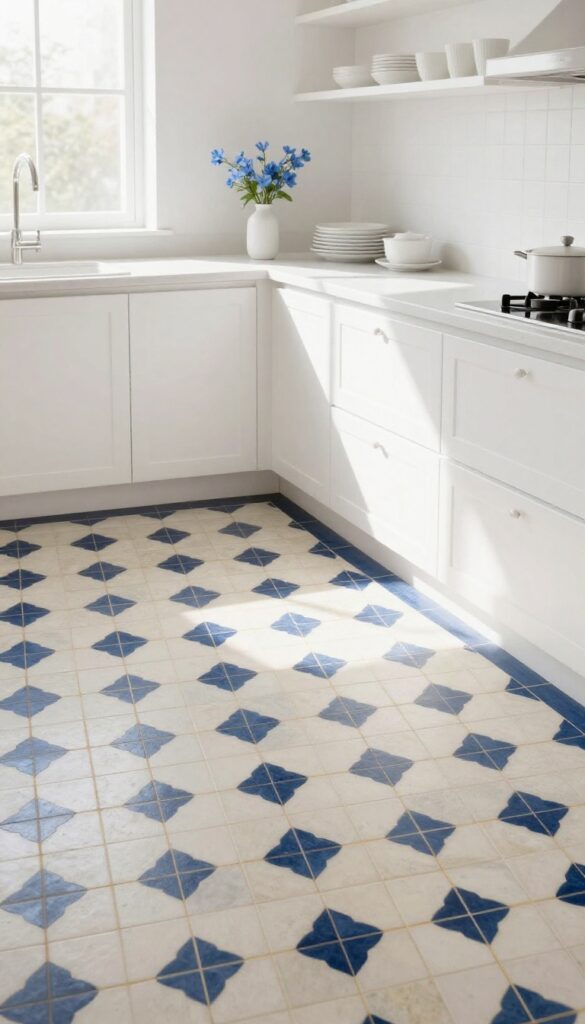
A patterned tile floor in blue and gold is the kind of statement that instantly elevates a kitchen from simple to stunning. Instead of playing it safe with plain flooring, you can let the ground beneath your feet become the focal point. The mix of blue and gold motifs—whether geometric, Moroccan, or floral—adds personality and a sense of artistry that anchors the entire room.
To keep the look light and airy rather than heavy, balance the busy floor with clean, neutral cabinetry and walls. This way, the tiles pop without overwhelming the space, and the kitchen feels both luxurious and inviting.
Patterned cement or ceramic tiles with blue and gold designs bring a bespoke, high-end feel to any kitchen. The key to making this work in a light and airy space is restraint: let the floor be the star. Choose a pattern that has plenty of white or cream background so the blue and gold read as accents rather than the main event.
A geometric or Moroccan-inspired design works beautifully because it adds visual texture without looking chaotic. Pair the floor with simple white or soft gray cabinets, a light quartz countertop, and open shelving to keep the eye moving upward. The result is a kitchen that feels curated and elegant, not busy.
Best Patterns For A Light Feel
- Look for tiles with a high proportion of white or cream background and blue and gold elements that are spaced out rather than dense. A repeating diamond or star motif with thin gold lines and blue corners keeps the pattern airy. Moroccan fish-scale or zellige-inspired tiles in pale blue with gold accents also work well.
- Avoid large, all-over dark patterns that can make the room feel smaller.
Color Pairing Tips
- Stick with soft, cool whites for walls and cabinetry—think Benjamin Moore’s Chantilly Lace or a pale dove gray. For a subtle contrast, add warm brass or gold hardware and light fixtures that echo the gold in the tiles. A pale blue or cream backsplash can tie the look together without competing.
- Keep countertops light, like white marble or quartz, to maintain the airy vibe.
Small-space Strategy
- In a compact kitchen, use the patterned tile only in a defined area, such as the cooking zone or under the island, and transition to a solid neutral tile elsewhere. This creates a feature without overwhelming the room. Alternatively, lay the tiles on a diagonal to make the space feel larger.
- Pair with open shelving and glass-front cabinets to keep the visual weight light.
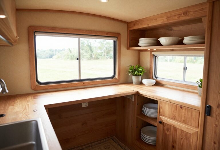
8. Gold-Framed Glass Cabinet Doors
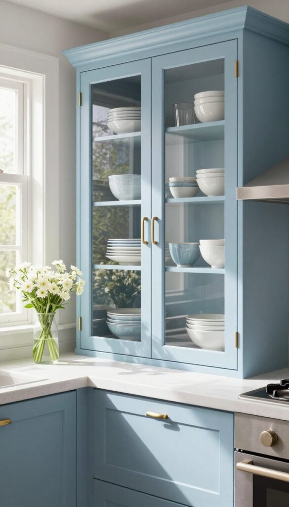
Nothing says luxe quite like the gleam of gold against soft blue cabinetry. Swapping a few solid cabinet doors for glass fronts framed in brushed brass or polished gold instantly elevates the whole kitchen. The transparent panels break up the visual weight of upper cabinets, letting the eye travel through the space and making the room feel airier.
Inside, a carefully arranged collection of blue and white dishes becomes part of the decor—functional storage that doubles as art.
This idea works especially well in kitchens that get good natural light, because the glass reflects and bounces brightness around the room. You don't need to replace every door—just a select few above the sink, stove, or an open counter creates a focal point without overwhelming the space. The key is keeping what's inside intentional: matching dinnerware, white ceramic bowls, or blue glassware all read as cohesive and curated.
Avoid cluttered stacks or mismatched mugs, which can make the display look messy rather than chic.
Best Glass And Frame Pairings
- Clear glass is the most versatile choice, but if you want a softer look, consider frosted or lightly textured glass. For the frame, brushed brass feels warm and modern, while polished gold reads more traditional and glamorous. If your kitchen leans contemporary, a slim gold frame with minimal detailing keeps the look clean.
- For a more classic vibe, choose a frame with a subtle bevel or mullion pattern.
Cabinet Styling Note
- Treat the inside of your glass-front cabinets like a display shelf. Start by grouping similar items—white plates stacked neatly, blue bowls nested together, and gold-rimmed glassware catching the light. Add a few small accents like a ceramic pitcher or a slim vase, but leave some breathing room.
- The goal is a balanced composition that feels intentional, not overcrowded. If your dishes are mostly white, a pale blue interior paint behind them adds a soft pop of color.
Lighting Tip
- Under-cabinet lighting becomes even more important with glass doors. Warm LED strips or puck lights installed inside the cabinet illuminate the dishware and make the gold frames glow. Position the lights toward the front edge so they highlight the objects without casting harsh shadows.
- Dimmable options let you adjust the mood from bright and functional to soft and ambient in the evening.
9. Blue Velvet Bar Stools with Gold Legs
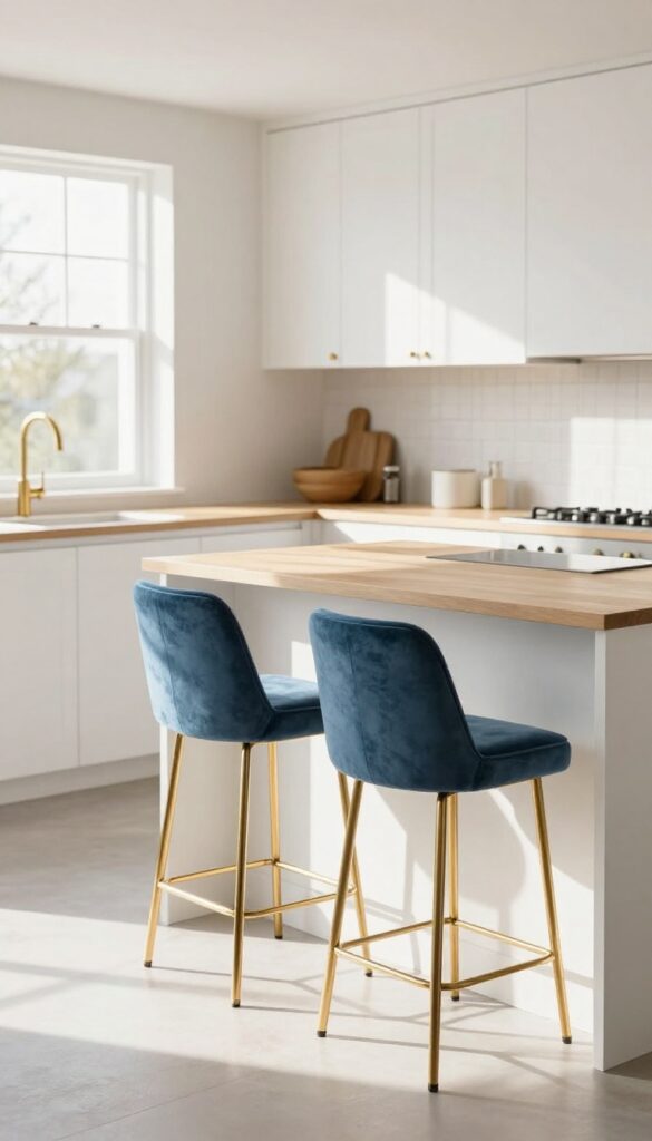
Bar stools are often an afterthought in kitchen design, but they can actually anchor the whole look. Velvet brings in a soft, luxurious texture that balances all the hard surfaces—countertops, backsplash, cabinets. In a soft blue, these stools feel fresh and inviting, while gold legs echo your hardware and light fixtures for a pulled-together finish.
Velvet bar stools in a muted blue add instant comfort and elegance to a kitchen island or peninsula. The plush fabric softens the room visually and physically, making the space feel more lived-in and less clinical. Gold legs are the perfect counterpart—they reflect light and tie into metallic finishes elsewhere, creating a cohesive, intentional design.
For a light and airy feel, choose a pale blue like powder or periwinkle, and pair with white or light wood cabinetry. This combination keeps the kitchen from feeling heavy while still delivering that luxe edge.
Best Colors And Fabrics
Stick with soft, muted blues—think dusty blue, powder blue, or slate. These shades feel airy and sophisticated without overpowering the space. Velvet is the go-to fabric for its rich texture and subtle sheen, but performance velvet (stain-resistant) is a smart choice for kitchens where spills happen.
Styling Tip: Coordinate Metals
- To make the gold legs pop, keep other metal finishes consistent. Match them to your cabinet pulls, faucet, and light fixtures. If your kitchen has mixed metals, choose one dominant finish (gold) and let the others play a supporting role.
- This creates a curated, intentional look rather than a chaotic one.
Small-space Fix
In a compact kitchen, backless or low-back stools keep the sightline open and make the room feel larger. Choose stools with slim gold legs to maintain a light, airy profile. A pair of stools instead of four can also prevent the area from feeling cramped while still offering seating.
10. Gold Range Hood as a Statement Piece
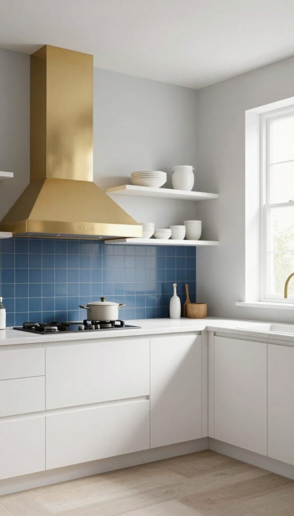
A range hood is usually just a functional appliance, but swap it for a gold or brass version and it instantly becomes the star of the kitchen. Against a blue tile backsplash or a navy wall, the warm metallic finish pops beautifully. This idea works best when you keep the surrounding cabinetry and countertops clean and simple, letting the hood shine as the focal point.
A gold range hood brings a sense of luxury without feeling over the top. The key is to choose a finish that complements your other hardware—think faucets, cabinet pulls, and light fixtures. Brushed brass or polished gold both work, depending on whether you want a softer or more glamorous look.
Pair it with a light blue or soft navy backdrop to create contrast that feels fresh and airy, not heavy. For the rest of the kitchen, stick with neutral tones like white, cream, or light gray to keep the space visually balanced.
Best Colors
The most striking combinations are gold against deep navy or soft powder blue. If you prefer a lighter feel, try a pale blue subway tile backsplash with a brushed gold hood. White or marble-look quartz countertops help maintain the light, airy vibe.
Material Pairings
Gold pairs beautifully with natural materials like marble, quartz, or matte white tile. Avoid mixing too many competing metals—stick to one or two other gold accents (like a faucet or pendant lights) to keep the look cohesive. Wood elements, like a butcher block island or open shelving, add warmth and prevent the space from feeling too cold.
Finishing Touch
To make the hood truly stand out, install under-cabinet lighting that casts a soft glow on the backsplash. This highlights the gold finish and adds depth. Keep the countertop around the range clutter-free so the eye goes straight to the hood.
11. Blue Accent Wall Behind Open Shelving
A blue accent wall doesn’t have to be a big commitment. When you place it behind open shelving, it becomes a backdrop that adds depth and personality without eating into your counter space. The muted blue feels calm and collected, while the shelves keep the kitchen open and airy.
It’s a smart way to bring color into a small or narrow kitchen without overwhelming the room.
Paint one wall—ideally the one above your counter or sink—a soft, muted blue like a dusty slate or pale denim. Then install two or three floating shelves in front of it. The contrast between the blue wall and the shelves makes the items on display pop.
Style the shelves with white ceramics, gold-rimmed glassware, and a few trailing plants. The blue wall adds visual interest and a sense of depth, while the open shelves keep the space feeling light and functional.
Best Blue Shades
Stick with muted, dusty blues that feel soft and airy. Think along the lines of Benjamin Moore’s ‘Pale Smoke’ or Farrow & Ball’s ‘Borrowed Light.’ These shades have a gray undertone that keeps them from feeling too bright or juvenile. They also pair beautifully with warm gold accents and crisp white trim.
Shelf Styling Tip
- Keep the styling simple and balanced. Group items in odd numbers—three white vases, five gold-rimmed glasses—and mix heights. Add a small trailing plant like pothos or ivy at one end to soften the look.
- Leave some empty space so the shelves don’t feel cluttered.
Lighting Note
If you can, add a small LED strip light under the bottom shelf. It will cast a warm glow onto the blue wall, making the color look richer and the dishes on display sparkle. This little touch makes the whole setup feel intentional and polished.
12. Gold and Blue Marble Countertops
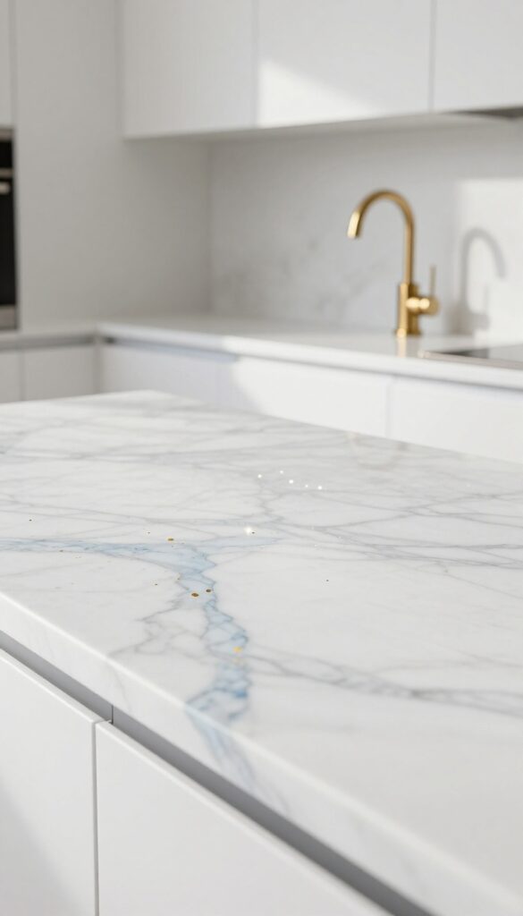
Marble countertops have always been a symbol of luxury, but when you choose a slab with blue veining and subtle gold flecks, you get a surface that feels both opulent and organic. The natural stone effortlessly marries the two colors of your palette, creating a cohesive look that doesn't feel forced. Pair it with crisp white cabinets and simple hardware to let the marble take center stage without competing for attention.
This idea works beautifully in kitchens that want a light and airy feel with a touch of glamour. The key is to select marble with soft blue veins running through a white or cream background, accented by tiny gold specks or veins. This combination adds depth and interest to your countertops or backsplash without overwhelming the space.
Because marble is a natural material, each slab is unique, giving your kitchen a one-of-a-kind focal point. To keep the overall look clean and fresh, stick to white or pale gray cabinetry and avoid busy patterns elsewhere. The result is a kitchen that feels both timeless and current, with just the right amount of sparkle.
Best Colors
Stick with white, cream, or light gray for cabinets and walls to keep the space feeling open and bright. The marble itself should feature cool blue tones and warm gold accents—think of a pale blue-gray vein with tiny flecks of gold that catch the light. Avoid adding other strong colors, as the marble should remain the star.
Finishing Touch
Add brushed gold or brass faucets and cabinet pulls to echo the gold in the marble. A simple gold faucet with clean lines will tie the whole look together without feeling overdone. For a backsplash, consider extending the marble slab behind the stove or sink for a seamless, high-end effect.
Texture Mix
Balance the polished marble with matte or textured finishes elsewhere. For example, use matte white subway tile for a secondary backsplash area, or choose a honed marble finish for a softer, less reflective surface. This contrast prevents the kitchen from feeling too glossy and adds tactile interest.
13. Blue and Gold Accessories: Canisters, Trays, and Textiles
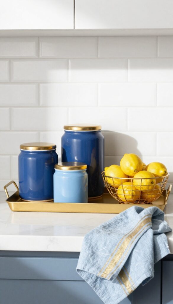
The easiest way to test a color duo without a major commitment is through accessories. Blue and gold accents let you dip into the trend while keeping your kitchen flexible for future updates. Think ceramic canisters with gold-finished lids, a sculptural gold fruit bowl, or a set of linen dish towels with subtle blue stripes.
These small touches pull the whole look together and make the space feel intentionally curated, not accidental.
Accessories are the finishing layer that makes a blue and gold kitchen feel complete. They add personality and polish without requiring a renovation. Start with functional pieces like canisters for flour, sugar, or coffee—choose matte navy or soft blue ceramic with brass or gold lids.
A gold wire fruit bowl or a wooden cutting board with gold inlay brings warmth and texture. For textiles, swap in blue and gold dish towels, a runner with metallic threads, or even a patterned rug. The key is to mix solid blues with gold accents so the palette feels balanced and intentional.
Best Materials To Look For
- Ceramic, glass, and linen work beautifully for blue and gold accessories. Ceramic canisters offer a solid color block that grounds the gold details. Glass pieces with gold rims or etched patterns add lightness.
- Linen dish towels in pale blue with gold embroidery or trim bring softness. Avoid plastic or overly shiny metals—stick to brushed brass or matte gold for a sophisticated feel.
Where To Place Them
- Group accessories on open shelving or a countertop near the backsplash. Place a set of three canisters on a gold tray for a cohesive vignette. Hang blue and gold towels on a brass bar or hook near the sink.
- A gold fruit bowl on an island or peninsula becomes a natural focal point. Keep the layout uncluttered—let each piece breathe so the color combination stands out.
Finishing Touch Tip
- Balance the blue and gold ratio so neither overwhelms. If you have a lot of blue cabinets or backsplash, lean into gold accessories for warmth. If your kitchen is mostly white with gold hardware, use deeper blue textiles and canisters to add contrast.
- The goal is harmony, not competition.
FAQ
What shade of blue works best for a light and airy kitchen?
Soft sky blue, pale powder blue, or a muted navy work well. Avoid dark, heavy blues that can make the space feel closed in. Lighter blues reflect light and keep the kitchen feeling open.
How do I add gold without it looking too flashy?
Stick to brushed brass or satin gold finishes instead of high-polish. Use gold in small doses like hardware, light fixtures, or a faucet. Balance it with plenty of white and light blue to keep the look elegant.
Can I mix gold with other metal finishes?
Yes, but keep it intentional. Mixing gold with matte black or chrome can work if you repeat the mix throughout the space. Stick to two finishes max to avoid a cluttered look.
Is blue and gold suitable for a small kitchen?
Absolutely. Use pale blue on walls or cabinets and add gold accents sparingly. Light colors make a small kitchen feel larger, and gold adds warmth without taking up space.
What countertop material goes best with blue and gold?
White marble with subtle veining is a classic choice. Quartz in white or light gray also works well. For a bolder look, choose marble with blue and gold flecks.
Conclusion
Blue and gold kitchens don’t have to be over the top. With the right balance of light tones and metallic warmth, they feel both luxurious and livable. Start with one or two ideas, like swapping hardware or adding a blue island, and build from there.
The best part is that this palette is flexible enough to grow with your style. Whether you go all in or just dip a toe, these 13 ideas can help you create a kitchen that feels chic, calm, and uniquely yours.