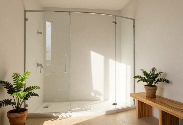
10 Fresh Walk-In Tiled Shower Ideas with Clean, Custom Style
A walk-in tiled shower can turn a plain bathroom into the best five minutes of your morning, and the difference usually comes down to a handful of smart choices. Tile, drainage, glass, and lighting do the heavy lifting, not a bigger footprint.
The ten ideas below focus on clean lines and custom details you can actually build. Some cut grout lines, some stretch a low ceiling, and others hide storage in plain sight.
Each one includes practical notes on layout, upkeep, and cost, so you can borrow what fits your space and skip the rest.
1. Large-Format Porcelain for a Seamless Look
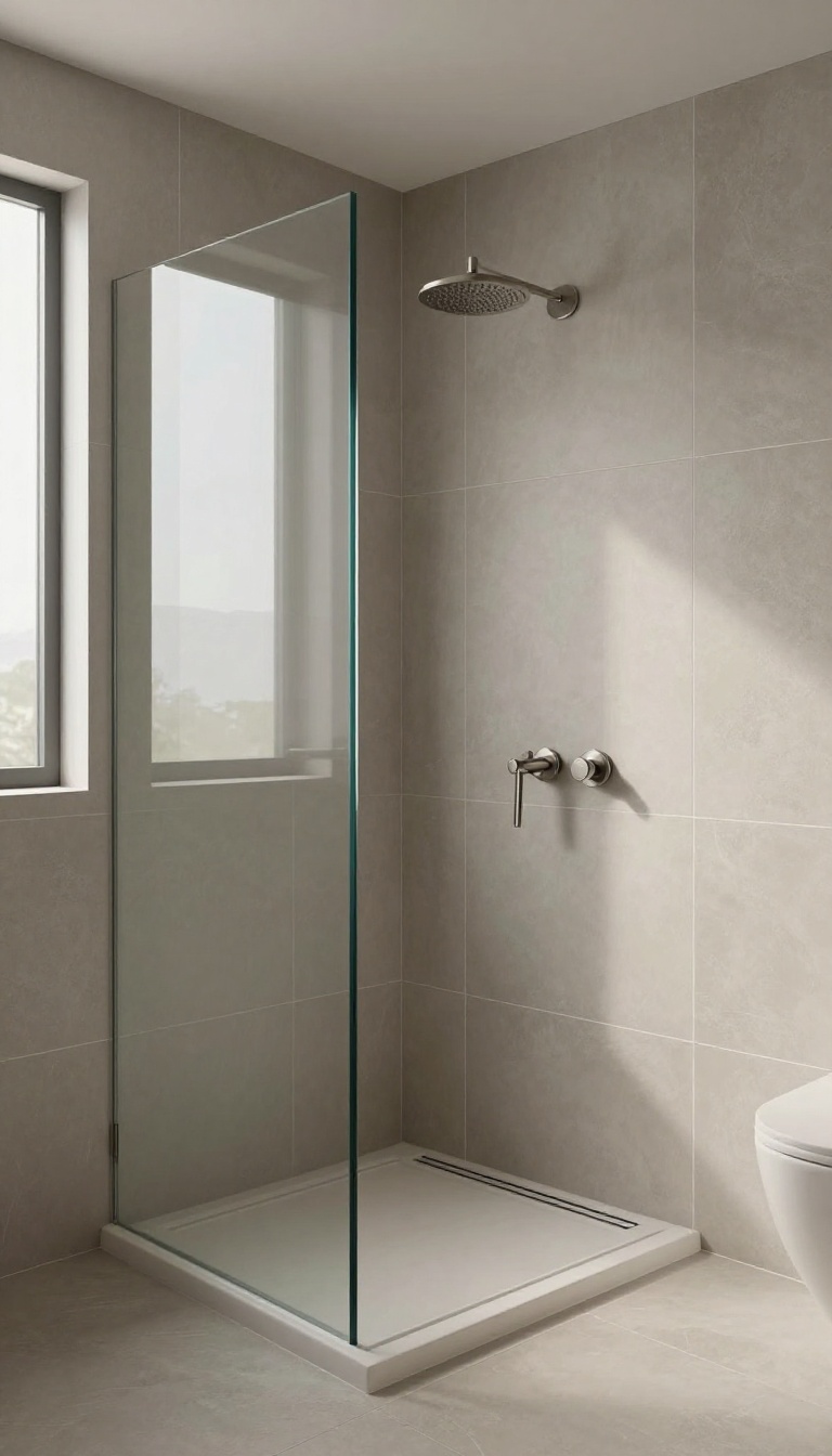
Large-format porcelain tiles are the quickest way to make a walk-in shower feel like a custom spa. Fewer grout lines mean less visual clutter and a surface that reads as one continuous plane. The trade-off is that big tiles demand more planning up front, but the payoff is a cleaner, more expansive look.
These tiles typically start at 24 by 48 inches and go up from there. Some manufacturers make slabs that are 5 feet long or more. The bigger the tile, the fewer seams you see, which makes even a small shower feel larger.
You also spend less time scrubbing grout, because there's simply less of it.
Why Fewer Grout Lines Matter
Grout lines break up the visual flow of a shower. When you use large tiles, your eye glides across the surface instead of stopping at every joint. That uninterrupted look is what gives high-end showers their calm, seamless feel.
It's not just about looks, either. Less grout means fewer places for mold and soap scum to hide.
Planning Your Layout
Before you buy a single tile, map out where every cut will land. You want full tiles in the most visible areas and cuts pushed to corners or less prominent spots. Think about the shower's focal point, usually the back wall or the valve wall.
Center your layout there, then work outward. A dry layout on the floor helps you catch problems before thinset is mixed.
The Level Substrate Rule
Large tiles don't bend, so your walls and floor need to be flat. A wavy substrate will cause lippage, where one tile edge sits higher than its neighbor. That's both ugly and a tripping hazard.
Spend the extra time prepping with a leveling system or a skim coat of thinset. It's the difference between a pro-looking install and a regret.
2. Vertical Stacked Tile to Stretch the Ceiling
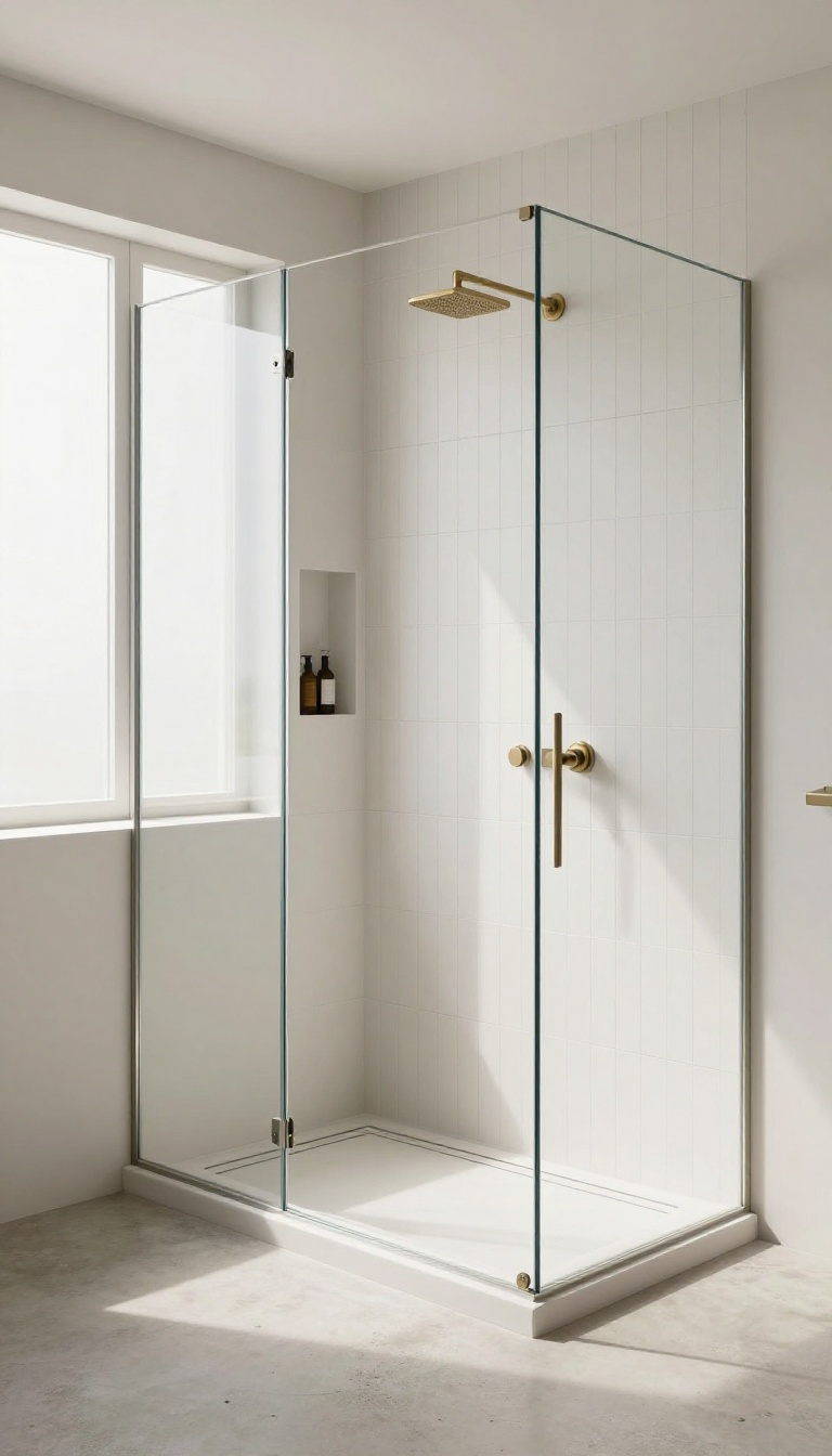
A low ceiling can make even a spacious walk-in shower feel like a cave. Stacking rectangular tile vertically instead of horizontally changes that in a hurry. The lines pull your eye upward, so the walls read taller and the whole space feels more open.
It’s a simple swap with a big payoff, and it works with almost any color or finish.
The trick is all in the orientation. When you lay a 4-by-12 or 6-by-18 tile in a vertical stack, the long edges run floor to ceiling. That creates continuous vertical lines that guide the eye up.
Horizontal layouts do the opposite—they widen the room and can make a short wall feel squat. Vertical stacking also cuts down on visible grout lines because you’re not breaking the pattern with staggered joints. The result is a clean, modern look that feels intentional, not busy.
But vertical tile isn’t a free-for-all. The size and proportion of the tile matter, and so does the grout color. Get those right and the pattern feels calm.
Get them wrong and it can look like a barcode. Below are the key details to keep it polished.
Pick The Right Tile Size
Long, narrow rectangles work best for vertical stacking. Think 4-by-12, 6-by-18, or even 3-by-12. The height-to-width ratio should be at least 2: 1, ideally 3: 1.
That gives you a clear vertical line without looking stretched. Avoid square tiles—they don’t create the same upward pull. Also skip very wide planks like 12-by-24; they can look chunky when stacked vertically.
A good rule: the taller the tile, the fewer grout lines you’ll see, which keeps the wall looking seamless.
Keep The Grout Subtle
Grout color is your secret weapon. Match it closely to the tile color, or go one shade lighter. That makes the vertical lines feel like soft shadows instead of hard stripes.
A contrasting grout will turn every joint into a bold line, which can quickly feel chaotic. If you want a little definition, use a light gray grout with white tile—just don’t go too dark. Also, choose a thin grout joint, around 1/16 to 1/8 inch.
Wider joints add visual noise and break the clean look.
Plan The Layout Before You Set
Vertical stacking doesn’t mean you can’t have a pattern. You can run a simple stack bond (all joints aligned) or a subtle offset. Stack bond is the cleanest and most modern.
Offset—where each row shifts slightly—adds a bit of movement but can look busier. For a shower, stack bond usually wins because it emphasizes the height. Start your layout from the most visible wall and work outward.
Cut tiles at the corners so the full tiles land in the center of each wall. That keeps the pattern balanced.
Watch The Niches And Fixtures
Vertical tile can make a niche or a shower valve look off if you don’t plan around them. Line up the niche so its top and bottom edges fall on a grout line. That way the tile pattern continues cleanly.
For fixtures, center them on a tile or a joint—whichever looks more intentional. If you have a bench or a curb, continue the vertical stack down the face for a cohesive look. And don’t forget the ceiling: if you tile it, run the pattern in the same direction to avoid a jarring change.
3. A Full-Height Tile Feature Wall
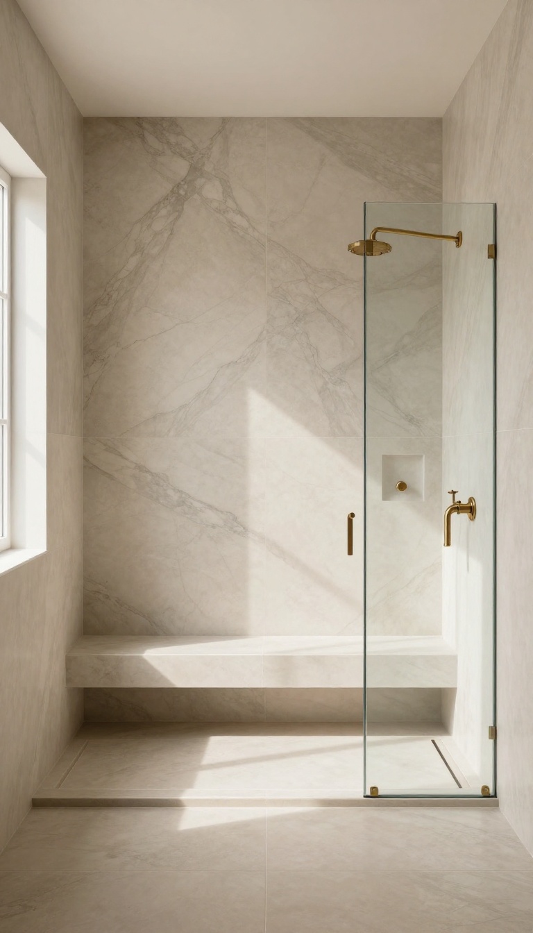
One tiled wall that runs from the shower floor all the way to the ceiling can anchor the whole room. It gives the eye a clear place to land without making the space feel busy. The trick is choosing a feature tile that earns the attention and still gets along with everything else.
A full-height feature wall works because it uses vertical space instead of floor space. In a walk-in shower, that matters. You get drama without blocking the drain, the bench, or your elbow room.
The wall usually sits behind the shower fixtures, but it can also be the wall you face when you walk in. Either way, it should be the one surface people notice first. Everything else plays a supporting role.
Pick A Tile That Can Carry The Wall
The feature tile needs enough movement or texture to hold a large vertical surface. A plain white subway tile will disappear. A marble-look porcelain with soft veining, a handmade-look ceramic with gentle color shifts, or a large-format slab with subtle pattern all work better.
Scale matters too. A tile that looks bold on a sample board can turn into visual noise once it covers eight feet of wall. If the pattern repeats every few inches, it may read as busy.
If it repeats every few feet, it feels calmer.
Keep The Other Walls Quiet
The feature wall only stands out if the surrounding walls step back. Use a simple, consistent tile on the other shower walls and the bathroom floor. A matte neutral in a similar tone keeps things cohesive without competing.
This doesn't mean boring. You can still add interest through grout color, a niche, or a bench. But the main event stays on that one wall.
Plan The Layout Before You Buy
Full-height tile means more cuts, more grout lines, and more chances for a awkward sliver at the ceiling or corners. Work out the layout on paper first. Decide where the full tiles land and where the cuts go.
If you're using a large-format tile, check that it can handle the wall height without looking stretched. A 12×24 tile set vertically can make a low ceiling feel taller. A 24×48 tile laid horizontally can make a narrow shower feel wider.
Don't Forget The Practical Stuff
A feature wall still has to deal with water, soap, and steam. Glazed porcelain and ceramic are easy to wipe down. Natural stone needs sealing and a bit more care.
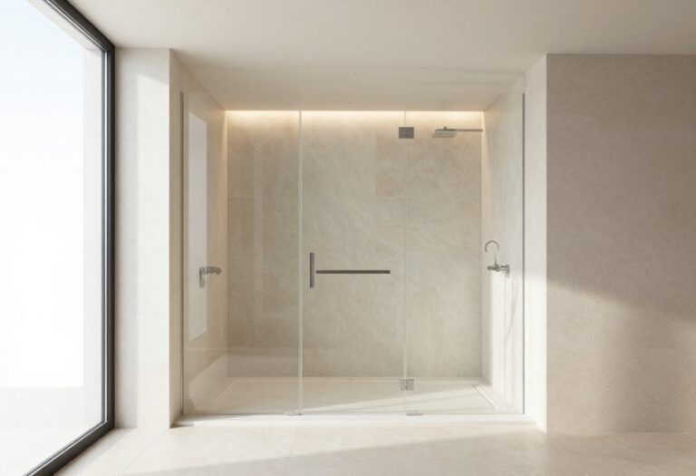
Textured tiles hide water spots better than glossy ones. Also think about lighting. A wall wash or a couple of recessed lights aimed at the feature wall will bring out the texture and color.
Without light, even a beautiful tile can look flat.
4. Linear Drain with a Curbless Entry
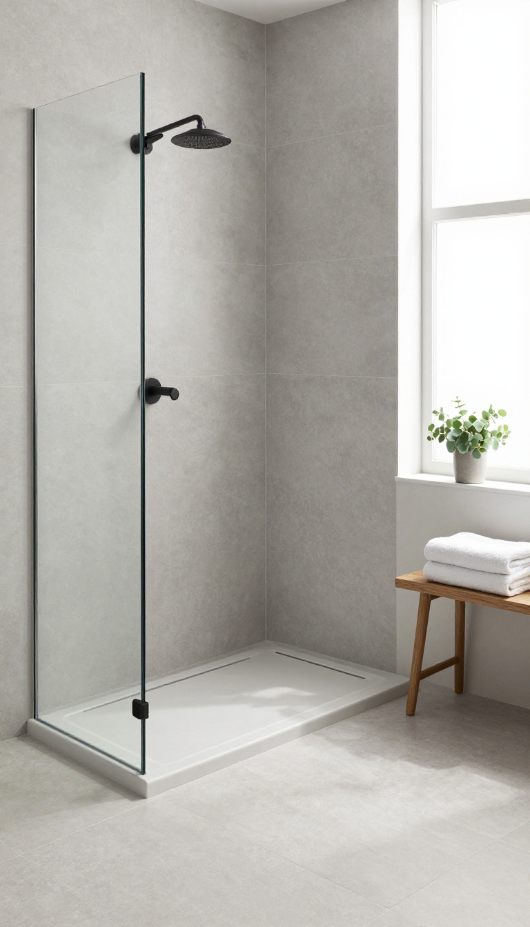
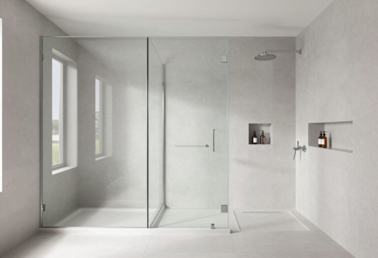
A curbless entry with a linear drain is the cleanest look you can give a walk-in shower. The floor runs straight into the shower with no lip to trip over, and the drain hides in a slim slot along one wall. It feels open, modern, and surprisingly practical once you get the details right.
The magic is in the slope. A linear drain lets you pitch the whole shower floor in one direction instead of four, which means you can use larger tiles with fewer cuts. That single-plane slope also makes the transition from bathroom floor to shower floor almost invisible.
But it has to be built correctly from the start, because fixing a bad slope later means tearing out tile.
Getting The Slope Right
You need a consistent slope of about 1/4 inch per foot toward the drain. With a linear drain, that slope runs in one direction, so the floor stays flat side to side. This is why curbless showers work best with a linear drain: a center drain would force a bowl shape that's harder to tile cleanly.
Your contractor should set the drain body and slope before any tile goes down.
Waterproofing Comes First
Curbless showers live or die by waterproofing. You need a bonded waterproof membrane that ties into the drain flange and runs up the walls at least a few inches. Liquid membranes or sheet membranes both work, but they have to be installed per the manufacturer's instructions.
Skip this step and you'll be dealing with rot and mold within a year or two.
Tile Layout Around The Drain
Large-format tiles look great with a linear drain because you can run them parallel to the drain slot. Cut them so the edge sits flush with the drain channel, leaving a clean line. Smaller mosaic tiles work too, but they give you more grout lines to scrub.
Either way, plan your layout so you're not left with tiny slivers at the walls.
Cost And Maintenance Realities
A curbless linear drain setup costs more than a standard curbed shower. You're paying for extra framing, waterproofing, and labor to get the slope perfect. But the payoff is a shower that's easier to clean and feels bigger.
Just be ready to squeegee the floor after each use to keep hard water spots from building up on the tile.
5. Recessed Niches with Matching Stone or Tile
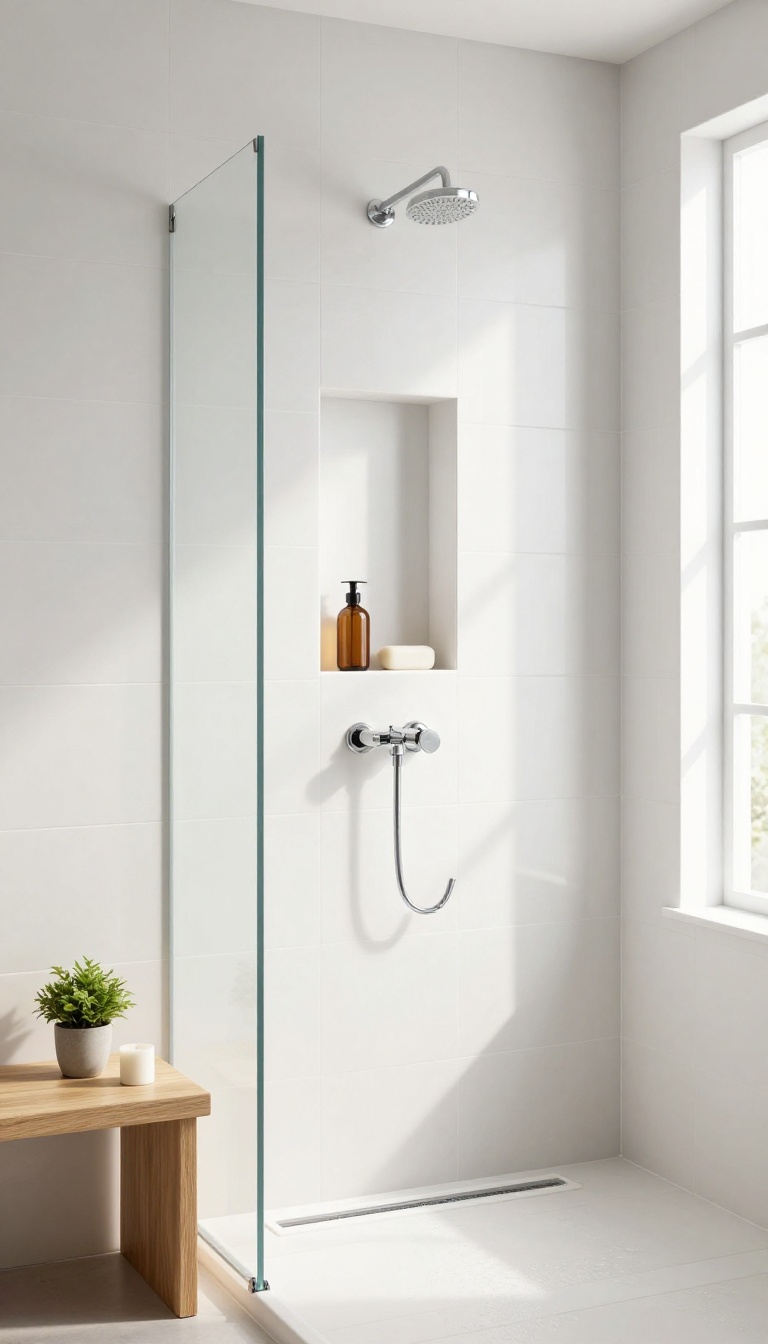
A recessed niche is the difference between a shower that looks finished and one that looks like a storage afterthought. It keeps bottles off the floor and out of the corners, and when the tile matches the walls, it practically disappears into the design. The trick is getting the size, placement, and materials right so it feels intentional, not like a hole someone cut in a hurry.
You do not need a big niche to make a big impact. A well-placed niche that holds two or three products per person is usually enough. The goal is to give every bottle a home without turning the wall into a shelving unit.
And because it sits flush with the tile, it reads as part of the architecture, not an add-on.
Sizing And Placement That Works
A niche that is too small becomes a frustration, and one that is too large can look like a missing wall panel. For a standard shower, a niche between 12 and 16 inches wide and 20 to 24 inches tall handles most bottles and a bar of soap. If two people share the shower, consider a double niche or one long horizontal niche instead of two separate boxes.
Place it at chest height for easy reach, and keep it at least 6 inches away from the showerhead to avoid constant water spray. In a walk-in shower with a bench, a niche just above the bench is a natural spot and doubles as a shelf for a candle or a small plant.
Matching Tile Vs. Contrasting Slab
Using the same tile inside the niche as on the walls creates a seamless look that makes the shower feel larger. The grout lines continue, and the niche almost vanishes. If you want a subtle focal point, use a contrasting slab or a different tile on the back of the niche.
A marble slab or a dark porcelain tile can add depth without shouting. Just keep the edges simple: a matching stone edge or a thin metal profile looks cleaner than a thick bullnose. And if you go with a contrasting back, repeat that material somewhere else in the bathroom, like a countertop or a floor accent, so it does not feel random.
Waterproofing And Everyday Upkeep
A niche is a wet area, so it needs the same waterproofing as the rest of the shower. That means a liquid waterproofing membrane or a bonded sheet membrane over the substrate before tile goes on. Skipping this step is the fastest way to get mold behind the walls.
For daily upkeep, a squeegee after each shower keeps soap scum from building up on the niche shelf. Avoid niches with a flat bottom that pools water; a slight slope toward the drain, even just a quarter inch, helps water run off. And if you use natural stone, seal it once a year to keep it looking fresh.
6. Warm Neutral Palette with Textured Accents
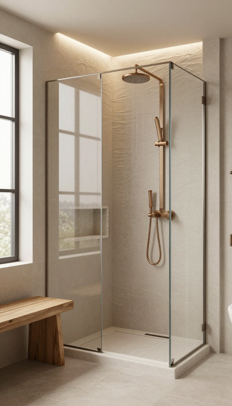
Warm neutrals are having a moment in walk-in showers, and for good reason. Soft beiges, greige, and warm grays feel calm and welcoming without turning bland. The trick is adding texture so the space reads custom, not cookie-cutter.
Start with a base tile in a warm neutral tone. Then layer in a second finish or a subtle pattern to create depth. You can mix matte and glossy surfaces as long as you keep the color family consistent.
Lighting plays a big role here, so test samples at different times of day. The goal is a shower that feels like a spa retreat, not a beige box.
Choosing Your Base Tile
Pick a large-format tile in a warm beige or greige for the walls. It cuts down on grout lines and makes the space feel bigger. For the floor, use a slightly darker tone in a matte finish for safety and contrast.
Keep the tile size consistent to avoid a busy look.
Layering Textures Without Clashing
Add texture with a 3D wave tile on one accent wall or a mosaic strip on the floor. Mix matte and glossy finishes in the same color family to catch light without shouting. A glossy subway tile on the ceiling can bounce light and add a subtle shimmer.
Just don't mix more than two textures or the space gets noisy.
Finishing Touches That Tie It Together
Choose fixtures in a warm metal like brushed bronze or satin brass to complement the neutrals. A teak bench or a stone-look niche shelf adds organic warmth. Keep grout in a matching tone to blend, or go slightly darker for definition.
Soft, warm lighting on a dimmer completes the spa vibe.
7. Floating Bench in a Matching Tile Finish
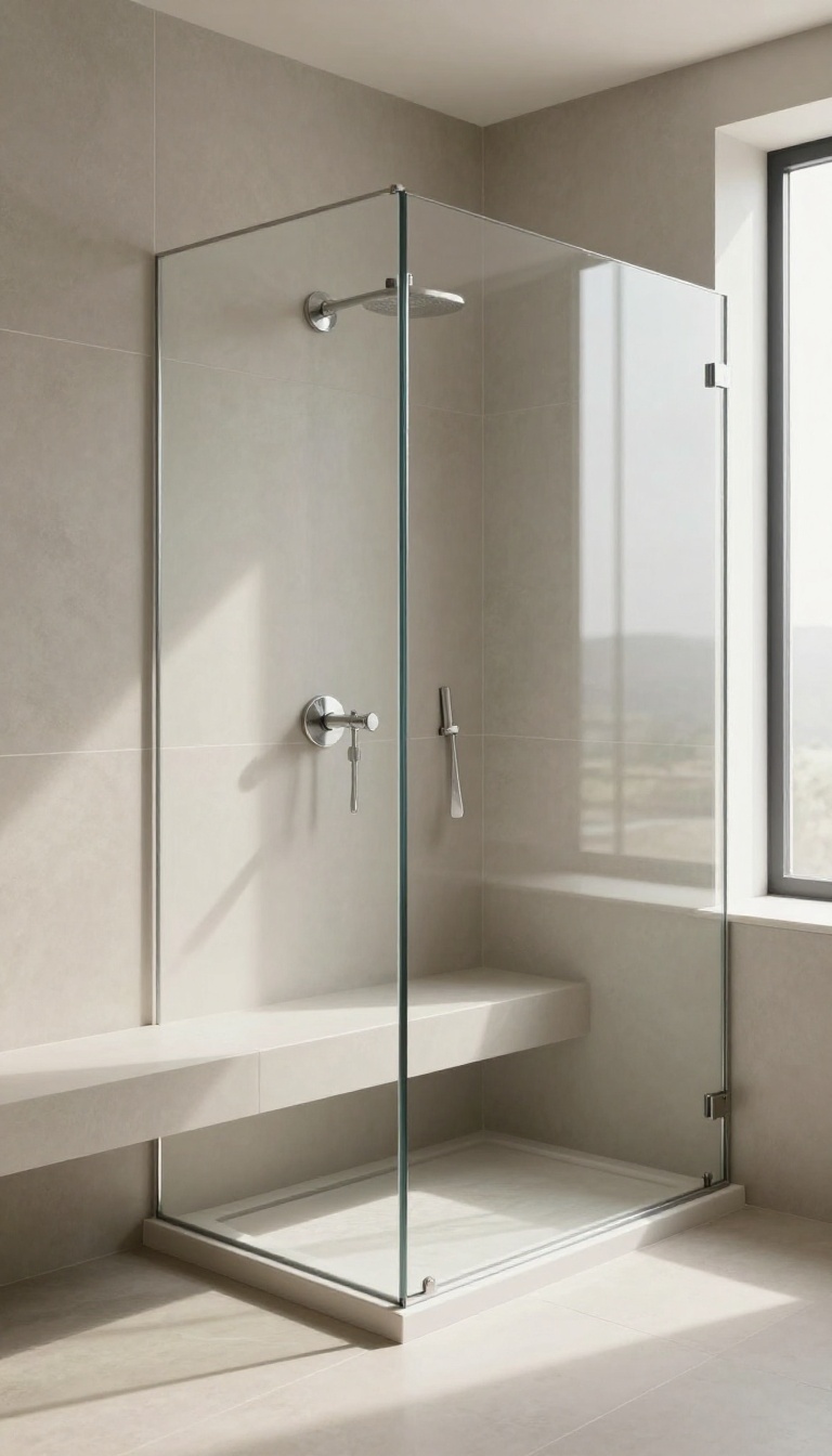
A floating bench gives you a spot to sit, shave, or set down a bottle without eating up floor space. When it's wrapped in the same tile as the walls, it reads as part of the architecture instead of a bolted-on accessory. The trick is getting the framing and waterproofing right so it stays solid and dry for years.
Floating doesn't mean unsupported. It means the support is hidden inside the wall, not visible as legs or brackets. That requires planning before the backer board goes up, because you're tying into studs and building a waterproof shell around the whole thing.
Framing That Carries Weight
You need solid blocking between studs at the bench height, plus a frame that cantilevers out from the wall. Most benches run 14 to 18 inches deep and 16 to 20 inches high, but check your local code for the seat depth you want. Use pressure-treated lumber or a metal frame designed for wet areas, and anchor it with structural screws into the studs, not just the drywall.
Waterproofing The Cantilever
The top, front, and underside all get the same waterproofing treatment as the shower walls. Coat the entire bench with a liquid-applied membrane or wrap it in a sheet membrane, then tape and seal every seam where the bench meets the wall. Slope the top slightly toward the drain so water never pools.
If you skip the underside, moisture can wick up from below and ruin the tile bond.
Tiling For A Seamless Look
Match the bench tile to the wall tile, and line up the grout joints so the pattern flows across the bench face. Miter the edges or use a matching trim piece instead of a raw cut. A slight overhang on the front edge keeps drips from running back under the bench.
Seal the grout once it cures, and you're done.
8. Frameless Glass with a Tiled Knee Wall
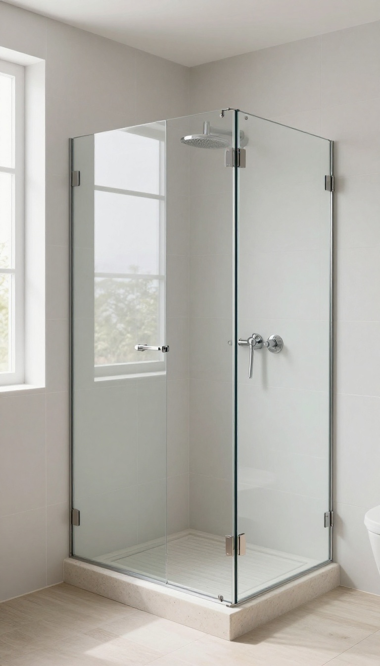
A knee wall does two jobs at once: it hides the plumbing and gives the glass something solid to sit on. Pair it with frameless glass and you get an open, airy shower that still feels like its own room. The trick is getting the proportions right so the tile and glass look intentional, not like two separate projects.
The knee wall usually runs about 36 to 42 inches high, which is tall enough to block most overspray but low enough to keep sightlines open. Cap it with a matching tile or a slim stone slab so water sheds instead of pooling. Then bring in 3/8-inch frameless glass panels with minimal hardware, and the whole thing reads as one clean plane.
Height And Cap Details That Work
Measure from the finished shower floor, not the subfloor, when you set the knee wall height. A 36-inch wall works for most adults, but go to 42 inches if you want extra splash control near a freestanding tub. For the cap, use a solid surface or quartz piece that overhangs the tile by a quarter inch on both sides.
That small lip keeps water from running down the wall face and into the grout lines.
Hardware That Disappears
Frameless glass still needs a few connectors, so choose finishes that blend with your tile and fixtures. Brushed nickel and matte black are the two safest bets, but polished chrome can vanish against light stone. Use wall-mount hinges instead of top rails whenever the glass panel is under 30 inches wide.
For wider panels, a slim header bar in the same finish keeps everything stable without shouting for attention.
Tile Choices For A Clean Look
Large-format tiles on the knee wall mean fewer grout lines and a smoother surface for water to run off. A 12 by 24 inch porcelain tile set in a stacked pattern feels modern and calm. If you want a little texture, try a honed finish instead of polished so the wall doesn't glare under shower lighting.
Keep the same tile on the shower floor in a smaller mosaic for grip and visual continuity.
9. Herringbone or Chevron on a Single Wall
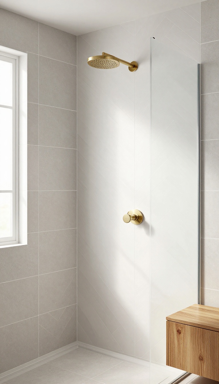
A single patterned wall can wake up a walk-in shower without making the whole space feel busy. Herringbone and chevron both bring movement, but they do it in different ways. The trick is knowing where to start, where to stop, and how to keep the pattern from overwhelming the room.
Herringbone tiles meet at 90-degree angles, creating a classic zigzag that feels traditional but still sharp. Chevron tiles are cut at an angle so they meet in a continuous V-shape, giving a more modern, flowing look. Both work best when you treat them as a focal point, not a full-room takeover.
Pick The Right Scale
Small tiles mean more grout lines, which can look busy in a shower. Go with tiles that are at least 2 by 6 inches, or larger if your wall is big. A larger pattern reads clearly from a distance and feels more custom.
Choose A Grout That Blends
Contrasting grout turns the pattern into a loud graphic. For a cleaner look, match the grout to the tile color or go one shade darker. That keeps the focus on the shape, not the lines between them.
Stop The Pattern At The Right Spot
Run the pattern on the main shower wall, then switch to a simple stacked or large-format tile on the side walls. Stop at an inside corner or where the glass meets the wall. That way the pattern feels intentional, not like it ran out of steam.
10. Matte Black or Brushed Brass Fixtures as the Finishing Touch
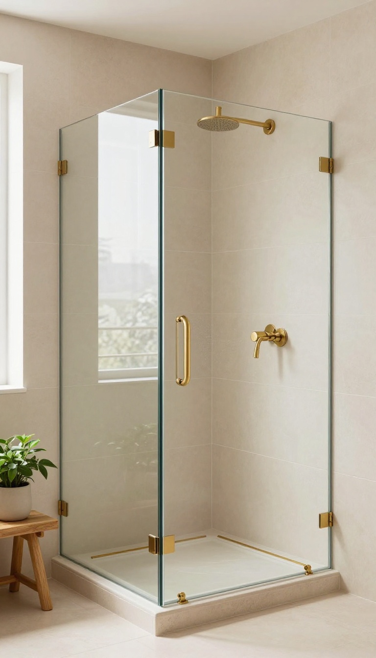
Fixture finish is the jewelry of a walk-in shower. Choose right, and the tile looks intentional from every angle. Choose wrong, and even expensive tile can feel off.
Matte black and brushed brass are the two finishes doing the most work right now. One leans modern and graphic, the other warm and slightly vintage. Both can look custom if you match them to the tile instead of fighting it.
The goal is cohesion, not contrast for its own sake. A shower head, valve trim, and drain should feel like they belong to the same family. When they do, the whole stall reads as designed rather than assembled.
Here is how to pick a metal that elevates your tile instead of distracting from it.
Match The Metal To The Tile Temperature
Tile has a temperature. Cool grays, whites, and blues pair naturally with matte black or polished chrome. Warm beiges, creams, and terracottas soften next to brushed brass or antique gold.
If you are stuck between two finishes, hold a sample of each against the tile in the actual shower light. Daylight and artificial light change everything. What looks subtle in a showroom can turn harsh or muddy at home.
Keep The Finish Consistent From Head To Drain
A brushed brass shower head with a chrome drain looks like a mistake, even if you spent hours choosing each piece. Pick one finish and repeat it on every visible metal part: valve trim, hand shower, drain cover, and any glass clamps. Small hardware stores often sell mixed sets online, so check the finish name carefully.
Matte black from one brand can be flat, while another brand's matte black has a slight sheen. Buy from the same collection when you can.
Let The Fixture Finish Do One Job
If your tile is busy, keep the metal quiet. A patterned floor or a bold vertical stack deserves a simple, single finish with no extra shine. Matte black works well here because it recedes instead of competing.
If your tile is calm and monochrome, brushed brass can add the only bit of warmth the shower needs. It becomes the detail people notice without overwhelming the space.
Plan For Wear And Cleaning
Matte finishes hide water spots better than polished chrome, but they can show soap scum if you skip wiping. Brushed brass develops a natural patina over time, which some people love and others do not. Either way, a quick squeegee after each shower keeps the finish looking new.
Avoid abrasive cleaners on both matte black and brass, since they can scratch or strip the surface.
FAQ
What tile size works best for a walk-in shower?
Large-format tiles like 12×24 or 24×48 inches reduce grout lines and make the space feel bigger. Smaller tiles work well on shower floors for better grip and slope control.
Do I need a curb for a walk-in shower?
Not always. A curbless design with a linear drain can work if the framing and waterproofing allow for proper slope. It costs more upfront but gives a cleaner, more accessible entry.
How do I keep a tiled shower looking clean?
Choose a mid-tone grout that hides water spots, squeegee glass after use, and run the exhaust fan. A weekly spray of diluted vinegar keeps soap scum from building up.
Can I mix tile finishes in one shower?
Yes, and it often looks more custom. Pair a matte field tile with a glossy or textured accent, but keep the color palette tight so the space still feels calm.
What's the most budget-friendly way to get a custom look?
Splurge on one feature wall or a niche and use an affordable field tile everywhere else. Good grout lines and a frameless glass panel do a lot of the heavy lifting.
Conclusion
Walk-in tiled showers rarely come together in one weekend. They get better through small decisions you can actually live with, like a curb you barely notice or a niche placed where your hand naturally reaches.
Pick one idea from this list that solves your biggest daily annoyance, try it, and give it a week before adding anything else. The rest tends to sort itself out once the basics feel right.