15 Two Tone Kitchen Cabinets Ideas for Stylish Color Blocks That Maximize Storage
Two tone kitchen cabinets are a fantastic way to add personality without overwhelming the space. By pairing different colors on upper and lower cabinets, you create visual interest and can even make a small kitchen feel larger.
But beyond looks, the right two tone scheme can also boost storage efficiency—think darker lower cabinets that hide dirt better and lighter uppers that reflect light. This listicle focuses on ideas that are both stylish and storage-smart.
Each concept is designed to help you maximize every inch of your kitchen while keeping the color blocking fresh and intentional. Whether you're planning a full remodel or just a cabinet refresh, these 15 ideas will inspire you to think beyond plain white.
1. Navy Lower Cabinets with White Uppers for a Classic Contrast
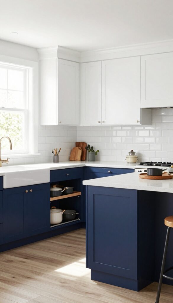
This pairing is a go-to for a reason. Dark navy on the bottom anchors the room and hides everyday wear, while bright white uppers keep the space from feeling heavy. It’s a balanced look that works in both traditional and modern kitchens, and it gives you a smart storage advantage—darker cabinets show less dirt and scuffs, so high-traffic lower cabinets stay looking fresh longer.
The contrast between deep navy and crisp white creates a clean, timeless aesthetic that feels both grounded and open. By placing the darker color on the lower cabinets, you visually lower the center of gravity, making the kitchen feel stable and grounded. Meanwhile, the white uppers reflect light, keeping the room airy and bright.
This combination is especially effective in kitchens with limited natural light, as the white helps bounce light around while the navy adds depth. For a cohesive look, carry the navy into open shelving or a kitchen island to tie the whole space together.
Best Finishes
For the navy cabinets, a matte or satin finish works best—it hides fingerprints and smudges better than high-gloss. Pair with a semi-gloss white on the uppers for easy cleaning and a subtle sheen that catches light. If you want extra durability, consider a lacquer or conversion varnish on the lower cabinets.
Storage Tip
Use the navy lower cabinets for items you access daily—pots, pans, and small appliances—since the darker color won’t show wear as quickly. Install pull-out drawers or deep organizers to maximize every inch. Reserve the white uppers for lighter, less-used items like serving dishes or glassware to keep the visual weight balanced.
Finishing Touch
Add open shelving in the same navy hue on a wall or above a sink. Use it to display everyday dishes or cookbooks—it breaks up the cabinetry and gives you extra storage without closing off the room. Keep the shelves clutter-free with a few curated pieces.
2. Sage Green Base Cabinets with Warm Wood Uppers for a Natural Feel
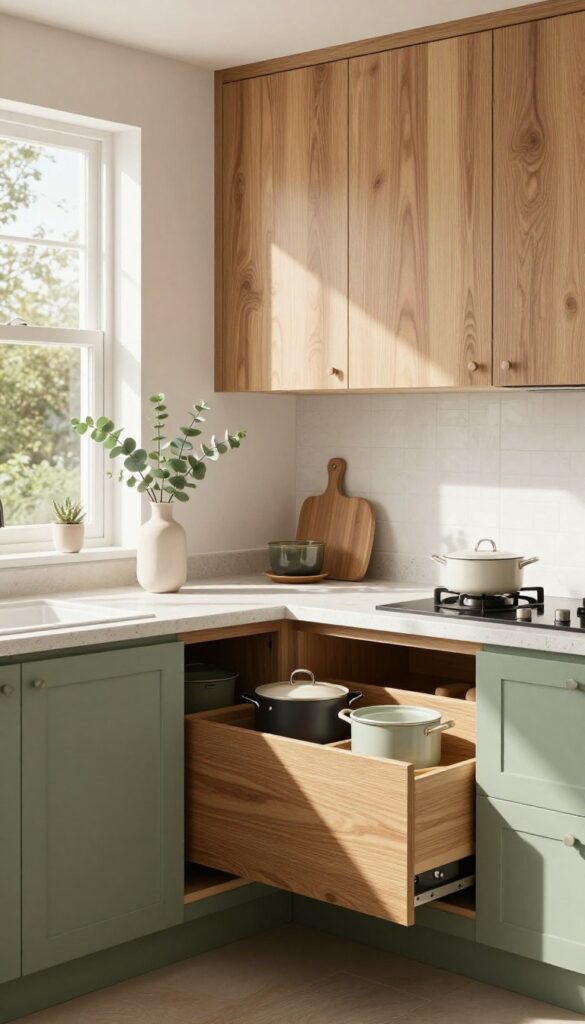
Sage green is having a serious moment in kitchens, and for good reason—it's calming, earthy, and pairs beautifully with natural wood tones. By using sage green on your base cabinets and warm wood on the uppers, you create a grounded, organic look that feels both fresh and cozy. The green anchors the room visually while the wood adds warmth and texture, making the space feel inviting without being too trendy.
This two-tone approach works especially well in kitchens that get plenty of natural light, as the sage green can read a bit darker in low-light spaces. The key is choosing a wood tone that complements the green—think oak, walnut, or even a warm birch. Avoid overly red or orange woods, which can clash with the cool undertones of sage.
For the base cabinets, opt for deep drawers instead of standard cabinets; they're perfect for storing pots, pans, and bulky items, keeping everything accessible and organized.
Best Wood Pairings
- Walnut is a top choice because its rich, chocolatey brown contrasts beautifully with sage green without feeling heavy. Oak with a honey stain also works well, adding a lighter, more casual warmth. If you prefer a more modern look, go for white oak with a matte finish.
- Avoid pine or ash, which can look too yellow next to sage.
Storage Tip
- Maximize the base cabinet storage by using deep, full-extension drawers. They make it easy to see and reach everything, from cookware to dry goods. Add dividers inside to keep lids, baking sheets, and cutting boards upright and organized.
- This setup reduces clutter and makes cooking more efficient.
Finishing Touch
Tie the look together with brushed brass or matte black hardware. Brass pulls and knobs add a touch of elegance that complements both the green and wood tones. For the countertop, a light quartz or marble-look surface keeps the space feeling airy and prevents the dark base from weighing down the room.
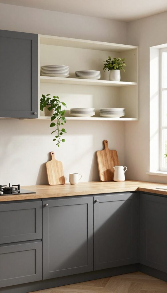
3. Charcoal Gray Lower Cabinets with Light Gray Uppers for a Modern Look
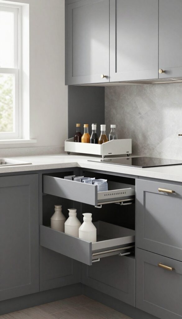
Gray kitchens have been popular for a while, but this two-tone approach feels fresh and intentional. By using a deep charcoal on the lower cabinets and a soft light gray on the uppers, you get a grounded, sturdy base that hides everyday scuffs and splashes, while the lighter shade keeps the space from feeling heavy. It’s a balanced look that works in both open-plan kitchens and galley layouts, adding depth without overwhelming the room.
The contrast also helps define the work zone visually, making the kitchen feel organized and purposeful.
This color combo is especially smart for busy households. The charcoal lower cabinets are forgiving with fingerprints, dirt, and minor scratches, so they stay looking good longer. The light gray uppers reflect natural light, making the kitchen feel airy and open.
To maximize the storage-smart angle, focus on the lower cabinets: install pull-out trash bins for recycling and waste, and add pull-out spice racks or utensil organizers. This keeps everyday items accessible but out of sight, maintaining the clean, modern aesthetic. Pair with brushed nickel or matte black hardware for a cohesive finish.
Best Materials For Durability
- Choose matte laminate or thermofoil for the charcoal lowers—they resist moisture and clean easily. For the light gray uppers, painted wood or a high-quality MDF with a satin finish works well. Avoid glossy finishes on the lowers, as they show smudges more.
- Quartz or solid-surface countertops in white or light gray tie the two tones together seamlessly.
Storage Tip: Pull-outs And Drawers
- The lower cabinets are prime real estate for storage upgrades. Install deep drawers for pots and pans, and use pull-out shelves for pantry items. A pull-out trash bin with two compartments (one for trash, one for recycling) keeps waste hidden and accessible.
- Add a pull-out spice rack next to the stove for easy access while cooking.
Lighting And Hardware Pairing
- Under-cabinet lighting is essential to highlight the two-tone effect and brighten countertops. Use warm LED strips to soften the charcoal. For hardware, go with long bar pulls in brushed nickel or matte black—they complement the modern look and are easy to grip.
- Avoid ornate handles, which can clash with the clean lines.
4. Black Base Cabinets with White Uppers for Bold Drama
Black lowers make a statement and hide fingerprints. Add under-cabinet lighting to brighten countertops and make the contrast pop. This two-tone look feels both grounded and airy—darkness below anchors the room while white above keeps it from feeling heavy.
It’s a perfect choice for kitchens that want a touch of drama without going full dark.
Black base cabinets paired with white upper cabinets create a striking visual contrast that instantly elevates any kitchen. The dark lower half grounds the space, making it feel substantial and intentional, while the white uppers keep the room bright and open. This combination is especially smart for busy kitchens because black cabinets are surprisingly forgiving—they hide smudges, crumbs, and everyday wear better than lighter shades.
To make the most of this look, invest in quality under-cabinet lighting. It not only illuminates your countertops for tasks but also highlights the dramatic shift between the two colors, making the contrast even more pronounced. For a cohesive finish, choose hardware in a metallic tone like brushed brass or matte black to tie the two halves together.
Best Materials
- For the black base cabinets, opt for a matte or satin finish to minimize fingerprints and give a modern, soft look. Thermofoil or painted wood with a durable topcoat works well. White uppers look crisp in a gloss or semi-gloss finish, which reflects light and adds a subtle sheen.
- Avoid flat paint on white—it shows marks too easily.
Storage Tip
Use the black base cabinets for heavy or frequently used items like pots, pans, and small appliances. The dark color hides scratches and stains from daily use. Install pull-out drawers or deep organizers to maximize every inch, and keep the white uppers for lighter, less-used items to maintain visual balance.
Lighting Tip
Under-cabinet lighting is non-negotiable here. LED strip lights in a warm white (2700K–3000K) create a cozy glow that softens the contrast and prevents the black from feeling too harsh. Position the lights close to the front edge of the cabinets to cast light onto the countertops and backsplash, making the whole space feel larger and more functional.
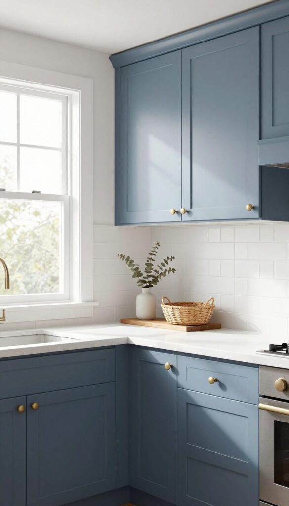
5. Soft Blue Lower Cabinets with Cream Uppers for a Coastal Vibe
Coastal kitchens don't have to scream seashells and starfish. Soft blue lower cabinets anchor the room with a calm, grounded feel, while cream uppers keep things light and airy. This color combo works especially well in kitchens that get plenty of natural light, making the space feel open and breezy without being cold.
The real trick is using the lower cabinets for bulky items like mixing bowls and small appliances, so the cream uppers stay uncluttered and visually quiet.
This two-tone scheme is a natural fit for a coastal-inspired kitchen, but it's also practical. The darker blue hides wear and tear on cabinets that get the most action, while the cream uppers reflect light and make the room feel larger. To keep the look cohesive, choose a warm cream with yellow undertones rather than stark white, and pair it with a soft, muted blue that isn't too bright or nautical.
Hardware in brushed brass or unlacquered brass adds warmth and a subtle vintage touch.
Best Colors
- Look for a blue that reads more like a dusty denim or a weathered sky than a primary blue. Sherwin-Williams 'Rainwashed' or Benjamin Moore 'Blue Gray' are solid picks. For the cream, go with something like 'Creamy' by Sherwin-Williams or 'Ivory White' by Benjamin Moore.
- The key is contrast without harshness.
Storage Tip
Use the lower cabinets for heavy or bulky items like stand mixers, Dutch ovens, and large mixing bowls. Install deep drawers with dividers for pots and lids. The cream uppers should hold lighter, everyday dishes and glassware, keeping them easy to reach and visually tidy.
Finishing Touch
Add open shelving in the same cream color above the sink or stove to display a few ceramic pieces or glass jars. This breaks up the cabinet run and reinforces the coastal, collected-over-time feel. A simple white subway tile backsplash with a sandy grout completes the look.
6. Mint Green Lower Cabinets with White Uppers for a Retro Touch
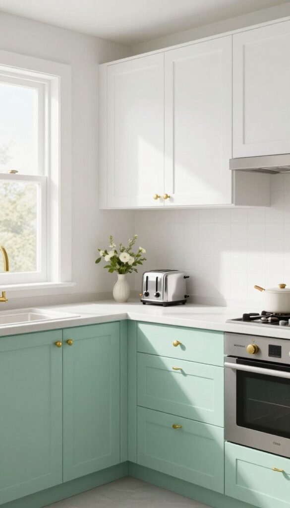
Mint green is having a moment in kitchens, and for good reason. It’s cheerful without being loud, and it pairs beautifully with crisp white for a look that feels both nostalgic and fresh. This color combo works especially well in smaller kitchens where you want personality without overwhelming the space.
The white uppers keep things light and airy, while the mint lowers anchor the room with a playful pop of color.
The key to pulling off this retro-inspired look is balance. Mint green can read as sweet or kitschy if overdone, but when used on lower cabinets only, it feels intentional and grounded. White uppers keep the visual weight above the countertops light, which is especially smart in kitchens with limited natural light.
For a cohesive finish, choose a mint with a slightly muted or pastel tone—think vintage diner, not bubblegum. Pair with brass or chrome hardware to reinforce the retro vibe, and consider a white or light gray countertop to keep the focus on the cabinet colors.
Best Colors And Finishes
- Stick with a soft, dusty mint rather than a bright neon version. Benjamin Moore’s "Mint Julep" or Farrow & Ball’s "Pigeon" (a gray-green) are great starting points. For the uppers, a warm white like "Swiss Coffee" keeps the look from feeling sterile.
- Matte finishes work best for both—they hide fingerprints and add a soft, vintage feel.
Storage-smart Detail
Install pegboard panels inside the lower cabinet doors to hang pots, lids, and utensils. This makes use of vertical space that often goes wasted, and it keeps everyday items within easy reach. Since the lower cabinets are the star of the show, opening them to reveal clever storage adds to the functional charm.
Finishing Touch
Add a retro-inspired backsplash in a geometric tile pattern, like black and white hexagon or a subtle checkerboard. This ties the mint and white together without competing. Keep countertops clutter-free—let the cabinet colors do the talking, and use open shelving sparingly to display a few ceramic pieces or glass jars.
7. Dark Wood Lower Cabinets with Light Wood Uppers for a Rustic Modern Blend
Dark wood on the bottom and light wood on top is a classic two-tone move that feels both grounded and airy. The darker base hides everyday scuffs and spills, while the lighter uppers reflect light and keep the kitchen from feeling heavy. It’s a rustic modern look that works especially well in open-plan spaces, where the contrast adds depth without clashing.
For a storage-smart twist, build in a pull-out cutting board and knife storage right below the counter—it keeps prep tools handy and frees up drawer space.
This cabinet combo brings warmth and practicality together. The dark lower cabinets anchor the room and hide wear, while the light uppers make the ceiling feel higher and the space brighter. It’s a natural fit for kitchens that want a cozy, lived-in feel without sacrificing modern function.
To make the most of the storage potential, consider adding a pull-out cutting board in the base cabinet—it slides out when you need it and tucks away when you don’t. Pair it with a slim knife drawer underneath, and you’ve got a prep zone that’s both stylish and clutter-free.
Best Wood Pairings
- For the dark base, go with walnut, espresso-stained oak, or dark mahogany. These woods have rich grain that adds texture. For the uppers, choose a lighter wood like maple, birch, or white oak with a natural or light stain.
- The contrast should be noticeable but not jarring—think warm coffee and cream, not black and white.
Storage Tip: Pull-out Cutting Board
- Install a pull-out cutting board in the base cabinet right under the countertop. It saves counter space and gives you a dedicated prep area. Add a shallow drawer beneath it for knife storage—magnetic strips or custom slots keep blades organized and accessible.
- This setup keeps your most-used tools within arm’s reach.
Finishing Touch
Tie the two wood tones together with hardware in a warm metal like brushed brass or oil-rubbed bronze. A matte black faucet and pendant lights with wooden accents also help bridge the rustic and modern elements. Keep countertops neutral—white quartz or light concrete lets the cabinets shine.
8. Blush Pink Lower Cabinets with White Uppers for a Soft Feminine Look
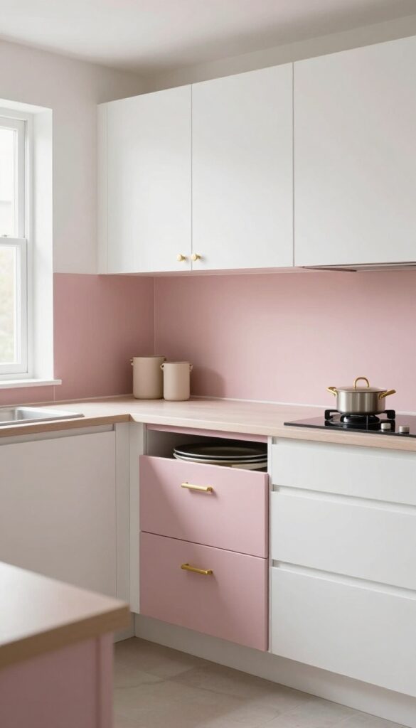
Blush pink is having a moment in kitchens, and it’s easy to see why. When used on lower cabinets, it adds a gentle pop of color without overwhelming the space. Paired with crisp white uppers, the look feels balanced, airy, and surprisingly practical—especially when you lean into smart storage below.
This combination works beautifully in kitchens that get good natural light, since the white uppers reflect brightness while the pink grounds the room. To keep the look from feeling too precious, choose a blush with a hint of warmth (think dusty rose rather than bubblegum). Then, make those lower cabinets work hard: deep drawers are perfect for stashing baking sheets, trays, and bulky pots.
Add brushed brass or matte black hardware for a subtle contrast that ties the whole scheme together.
Best Colors
Stick with a muted blush—something like Farrow & Ball’s Setting Plaster or Sherwin-Williams’ Rosy Outlook. White uppers should be a true white with no yellow undertones to keep the contrast clean.
Storage Tip
Use the lower cabinets for your heaviest and largest items. Deep pull-out drawers with dividers make it easy to organize baking sheets, cutting boards, and mixing bowls without digging through stacks.
Finishing Touch
Add a warm metal like unlacquered brass for knobs and pulls. It softens the pink-and-white palette and adds a touch of elegance that feels intentional, not fussy.
9. Teal Lower Cabinets with White Uppers for a Vibrant Contrast
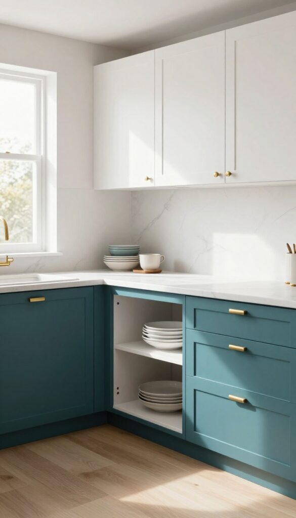
Teal is one of those colors that feels both lively and grounded—it brings personality without screaming for attention. Pairing it with crisp white uppers keeps the look balanced and prevents the kitchen from feeling too dark or heavy. This combo works especially well in kitchens that get decent natural light, where the teal can really pop against the bright white.
To make the most of this color block approach, go for a deep teal on the lower cabinets and a soft white on the uppers. This draws the eye upward and makes the ceiling feel higher, while the darker base anchors the room. Add brushed brass or matte black hardware for a refined contrast that ties the two colors together.
For a storage-smart twist, incorporate a pull-out pantry in the lower section—it hides away dry goods and keeps countertops clutter-free.
Best Colors
Stick with a rich teal like Benjamin Moore's 'Caribbean Teal' or Sherwin-Williams' 'Rainwashed' for the lowers. For the uppers, a warm white like 'Swiss Coffee' or 'Alabaster' keeps the look soft and inviting. Avoid stark whites that might feel too clinical against the teal.
Storage Tip
Use the lower cabinets for a pull-out pantry system. Install deep drawers with dividers for canned goods, spices, and snacks. This keeps everything accessible and reduces the need for upper cabinet storage, which is perfect for smaller kitchens.
Finishing Touch
Add open shelving in white or light wood above the sink or prep area. Display a few ceramic dishes or glass jars to break up the cabinet runs and add a personal touch. A small trailing plant on the top shelf softens the look even more.
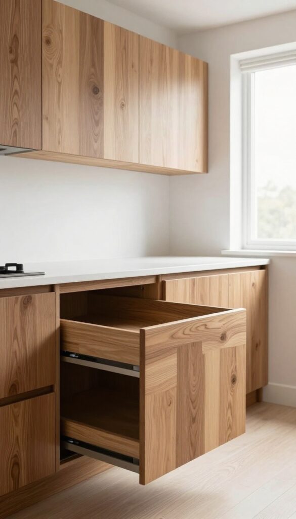
10. White Lower Cabinets with Wood Uppers for an Upside-Down Two Tone
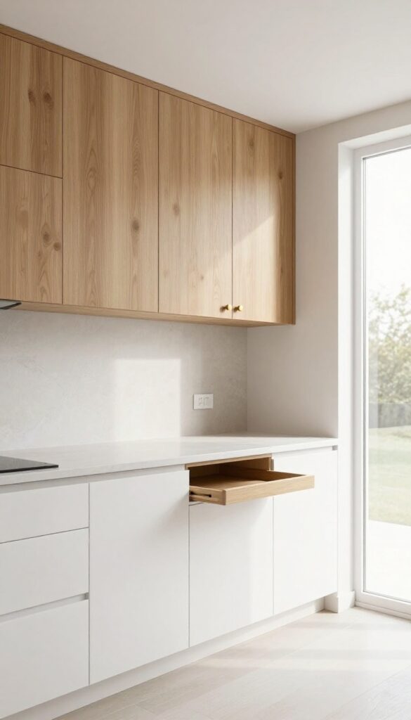
Flip the script on the usual two-tone kitchen by putting white cabinets on the bottom and warm wood on top. It’s a clever twist that feels fresh and unexpected. The white bases keep the floor area feeling light and open, while the wood uppers wrap the room in natural warmth—like a cozy hug from above.
This setup works especially well in kitchens with lower ceilings because the wood draws the eye upward, making the space feel taller.
This upside-down two-tone approach is a smart storage solution too. White lower cabinets hide everyday dishes and glassware behind a crisp, clean facade that’s easy to wipe down. The wood uppers become a feature wall of sorts, adding texture and depth without overwhelming the room.
Pair it with a neutral backsplash and warm metallic hardware for a cohesive look that’s both stylish and practical.
Best Wood Tones
Stick with medium to light wood tones like oak, maple, or birch to keep the contrast gentle. Darker woods like walnut can work, but they’ll make the uppers feel heavier—ideal if you want a more dramatic, cozy vibe. For a modern farmhouse feel, go with a wire-brushed oak that shows off the grain.
Storage Tip
Use the white lower cabinets for your most-used items: plates, bowls, and everyday glasses. The wood uppers are perfect for less-frequently accessed pieces like serving platters, specialty cookware, or seasonal dishware. Add pull-out shelves or lazy Susans in the lower cabinets to maximize accessibility.
Finishing Touch
Tie the two tones together with a warm metal finish on handles and faucets. Brass or brushed nickel in a satin finish complements both white and wood beautifully. A wooden open shelf above the sink or stove can echo the uppers and create a seamless flow.
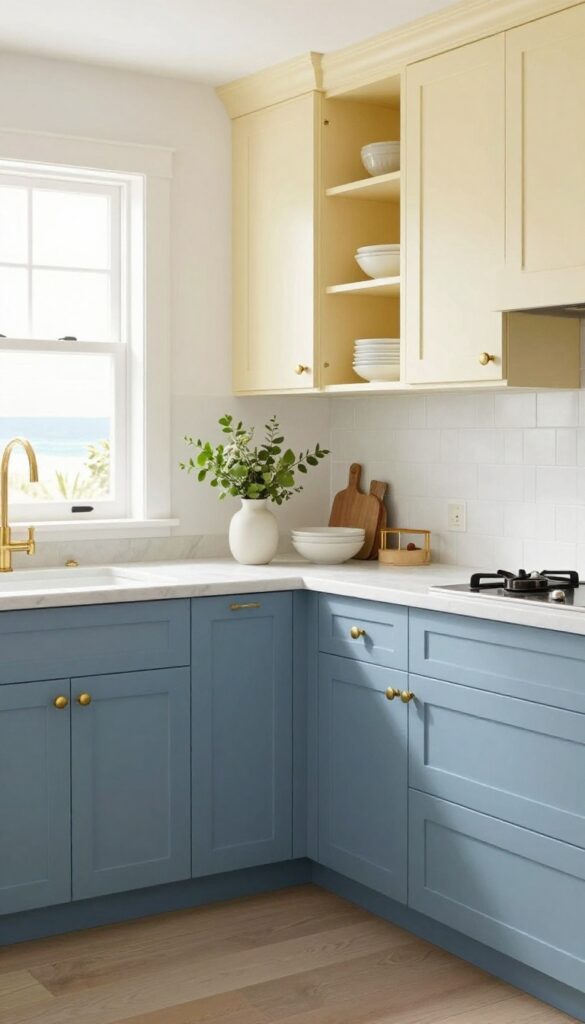
11. Mustard Yellow Lower Cabinets with Gray Uppers for a Cheerful Pop
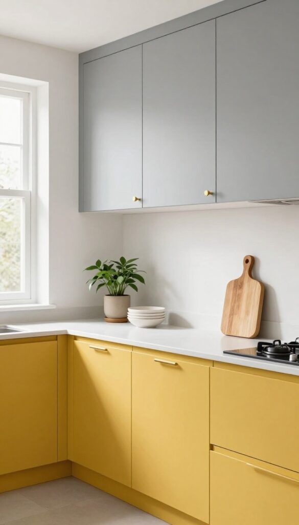
Yellow and gray is a classic combo that instantly lifts a kitchen without overwhelming it. Mustard yellow on the lower cabinets adds a warm, sunny vibe that feels both retro and fresh, while soft gray uppers keep the look grounded and sophisticated. This pairing works especially well in kitchens with good natural light, where the yellow can really glow without feeling too intense.
Plus, the two-tone approach naturally draws the eye downward, making the room feel more anchored and spacious.
The key to pulling off this look is choosing the right shades. A muted mustard—think goldenrod with a touch of brown—pairs beautifully with a warm gray that has beige undertones (greige). Avoid bright lemon yellow or cool grays, as they can clash.
For materials, matte finishes on both colors keep the look modern and easy to maintain. Consider using a durable laminate or painted wood for the lowers, as they see more wear and tear. The gray uppers can be a slightly lighter shade to keep the ceiling feeling high.
Add brushed brass or matte black hardware for a polished contrast. This color scheme works in both traditional and contemporary kitchens, but it really shines in a galley or L-shaped layout where the two tones can define separate zones.
Best Color Pairings
- Stick with a warm mustard like Sherwin-Williams 'Garden Gate' or Benjamin Moore 'Hawthorne Yellow'. For the gray, try 'Agreeable Gray' or 'Revere Pewter'. These have enough warmth to harmonize with the yellow.
- If you want a cooler gray, add wood accents or warm lighting to balance it out.
Storage-smart Detail: Built-in Spice Drawer
- Since the lower cabinets are already a focal point, make them work harder. A pull-out spice drawer next to the stove keeps seasonings organized and out of sight. Use deep drawers with adjustable dividers to fit tall bottles and small jars.
- This keeps countertops clutter-free and adds a custom feel without a major renovation.
Lighting Tip
Under-cabinet lighting in a warm LED tone (2700K-3000K) will make the mustard yellow look rich and inviting, not flat. Avoid cool white lights, which can make the yellow appear greenish. Pendant lights with brass or black finishes above an island or peninsula tie the whole look together.
12. Slate Blue Lower Cabinets with White Uppers for a Serene Palette
Slate blue brings a quiet, grounded feel to a kitchen without going full navy or gray. It’s a color that reads as calm but still has enough depth to hide everyday smudges and splashes. Pairing it with crisp white uppers keeps the room airy and bright, so you get the best of both worlds: a soothing lower half and an open, light upper half.
This combo works especially well in kitchens that get a lot of natural light, but it can also warm up a darker space when you add under-cabinet lighting.
The trick to making slate blue and white feel intentional is to let the lower cabinets carry the weight of the color while the uppers stay clean and minimal. Use the upper cabinets for items you don’t reach for daily—like serving platters, extra mugs, or seasonal bakeware—so the countertops stay clutter-free. This setup naturally encourages a storage-smart layout: heavy or frequently used pots and pans go in the lower drawers, and the uppers become a reserve zone.
The serene palette also makes it easy to introduce natural textures like warm wood cutting boards, woven baskets, or a live-edge shelf for a soft contrast.
Best Hardware Pairings
- Matte brass or brushed nickel pulls work beautifully with slate blue. Brass adds a touch of warmth that keeps the cool blue from feeling too cold, while nickel stays understated and modern. Avoid shiny chrome—it can clash with the muted tone.
- For a cohesive look, carry the same hardware finish to the white uppers.
Countertop And Backsplash Ideas
A white quartz or marble-look countertop keeps the palette light and seamless. For the backsplash, consider a soft white subway tile or a subtle herringbone pattern in a warm off-white. If you want a bit of texture, a zellige tile with slight variations in tone adds depth without competing with the blue.
Storage-smart Layout Tip
- Reserve the upper cabinets for less-used items to keep countertops clear. Install pull-out shelves or deep drawers in the lower cabinets for pots, pans, and pantry staples. This way, the serene look isn’t just pretty—it’s functional.
- Add a few open shelves on one wall for everyday dishes to break up the cabinet mass.
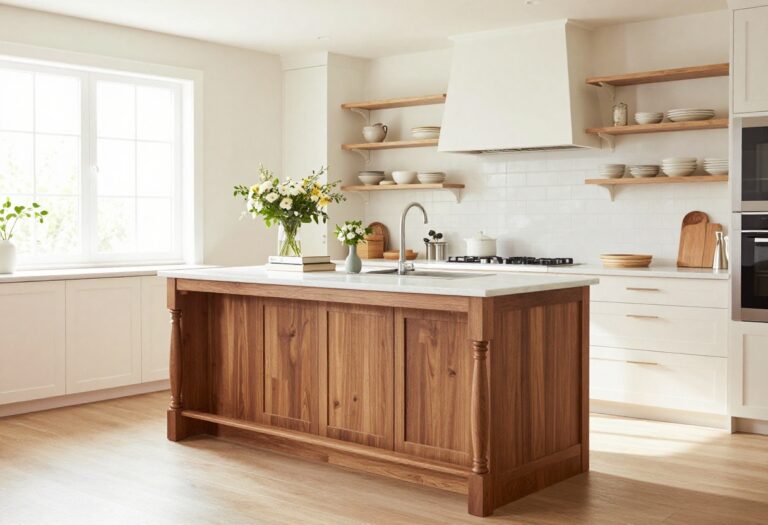
13. Two Tone with a Contrasting Island: Dark Base, Light Perimeter
A dark island paired with light perimeter cabinets creates a natural focal point without overwhelming the room. The contrast draws the eye to the center, making the island feel like a sturdy anchor while the lighter cabinets keep the edges airy and open. This setup works especially well in open-plan kitchens where the island doubles as a dining or prep zone.
The dark base hides wear and tear, and the light upper cabinets reflect light to maintain brightness.
This two-tone approach is both stylish and practical. The dark island grounds the space, while the light perimeter cabinets prevent the kitchen from feeling closed in. To maximize storage, add deep drawers and open shelves to the island.
The drawers can hold pots, pans, and small appliances, while shelves are perfect for cookbooks or decorative baskets. Choose a dark finish like navy, charcoal, or espresso for the island, and stick with white, cream, or soft gray for the perimeter. This combination works in both large and small kitchens, as the light cabinets keep the room from feeling cramped.
Best Colors
- For the island, go with a deep navy, charcoal, or espresso. These colors add richness and hide stains well. For the perimeter, opt for white, off-white, or a light warm gray.
- The contrast should be clear but not jarring—avoid pairing a very dark island with stark white if you prefer a softer look.
Storage Tip
Maximize the island's storage potential by incorporating deep drawers on one side and open shelves on the other. Use the drawers for heavy items like cast-iron pans or mixing bowls. The shelves can hold everyday items like coffee mugs or a few pretty canisters, keeping them within easy reach.
Layout Tip
- Position the island so there's at least 36 inches of clearance on all sides. If the island includes seating, leave 18 inches of knee space per stool. This ensures smooth traffic flow and comfortable dining.
- Consider adding a waterfall edge on the island for a sleek, modern touch.
14. Two Tone with a Single Color Block: One Wall in a Bold Hue
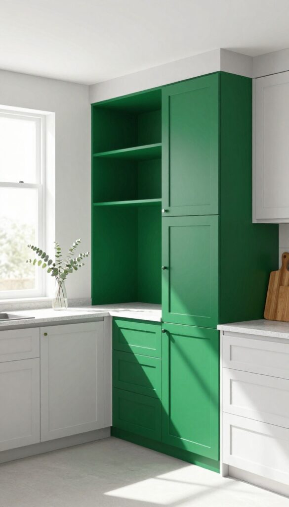
Not every two-tone kitchen needs a symmetrical split. Sometimes the smartest approach is to pick one wall—ideally the one housing your pantry or deep storage—and give it a dramatic shot of color. Think of it as an accent wall for your cabinets.
The rest of the kitchen stays calm and neutral, so the bold wall becomes a deliberate focal point that also serves a practical purpose.
This approach works especially well in galley kitchens or layouts where one wall is naturally set back or deeper. By painting just that bank of cabinets in a rich shade like emerald green, navy, or charcoal, you create visual depth without overwhelming the space. The neutral cabinets on the other walls keep the room feeling open and airy, while the color block adds personality and a sense of intention.
From a storage standpoint, using the colored wall for tall pantry cabinets or deep drawers makes the bold hue feel purposeful—it's not just decorative, it's marking the storage zone. This trick also helps define zones in an open-plan kitchen, subtly separating the cooking area from the dining or living space without any physical barriers.
Best Colors For The Bold Wall
- Deep jewel tones like emerald green, sapphire blue, or amethyst work beautifully because they feel luxurious but grounded. If you prefer something moodier, go for charcoal or black-green. For a warmer vibe, terracotta or deep ochre can be stunning.
- The key is to choose a color that contrasts enough with your neutral cabinets (white, cream, or light gray) so the block reads as intentional.
Storage Tip: Make It The Pantry Wall
Use the colored wall for tall pantry cabinets, pull-out drawers, or a built-in hutch. This way the bold hue visually anchors the storage zone, making it easy to find what you need. Add open shelving in the same color for frequently used items—it keeps the look cohesive and functional.
Finishing Touch: Hardware And Lighting
Match the hardware on the bold cabinets to the rest of the kitchen for continuity, or go slightly darker (like matte black on emerald) for extra depth. Under-cabinet lighting along that wall will make the color pop even more, especially in the evening. A simple linear fixture above the area can also highlight the block as a feature.
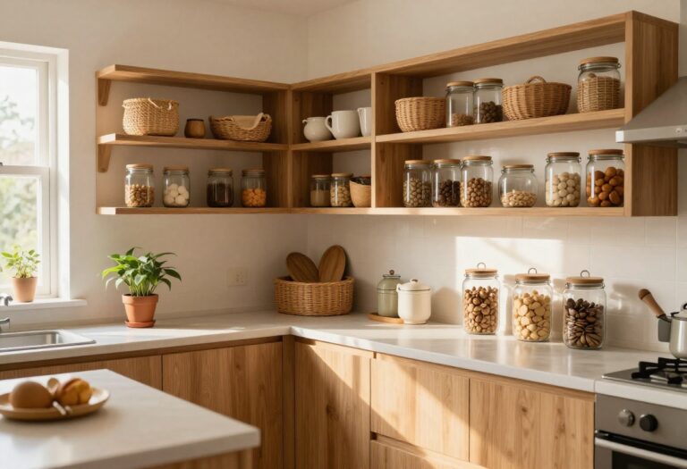
15. Two Tone with Open and Closed Storage: Mixing Colors and Functions
This idea is all about blending beauty with brains. By pairing closed lower cabinets in a deep, grounded color with open upper shelving in a light, airy tone, you create a kitchen that feels both spacious and intentional. The dark base anchors the room, while the open shelves keep everyday dishes and decor within easy reach.
It’s a smart way to break up visual weight and make your kitchen work harder for you.
The contrast between solid cabinetry below and open storage above does more than just look good—it solves real storage dilemmas. Dark lower cabinets hide the mess of pots, pans, and cleaning supplies, while open shelves display your prettiest plates and glassware. This setup also tricks the eye into thinking the ceiling is higher, making even a compact kitchen feel larger.
For the best effect, choose a warm wood or charcoal for the lowers and a soft white or pale sage for the uppers. Keep the shelves clutter-free by limiting them to items you use daily, like mugs, bowls, and a few small plants.
Best Colors For This Look
Go with a moody navy or slate gray for the lower cabinets—they hide fingerprints and spills well. For the open shelves, stick to a creamy white or light oak to keep the space bright. If you want a bolder pop, try a deep forest green below with natural wood shelves above.
Shelf Styling Tip
Group items in odd numbers and vary heights with a mix of stacked plates, tall vases, and small jars. Leave about 30% of each shelf empty to avoid a cluttered feel. Add a trailing plant like pothos at one end for a soft, organic touch.
Storage-smart Layout
Place your most-used items—coffee mugs, everyday glasses, cooking oils—on the lowest open shelf so they’re easy to grab. Reserve higher shelves for decorative pieces or seldom-used serving dishes. This keeps the workflow smooth and the look intentional.
FAQ
What are the best two tone kitchen cabinet color combinations for small kitchens?
Light uppers (white, cream, light gray) paired with slightly darker lowers (navy, sage, soft blue) create depth without closing in the space. This combo makes the kitchen feel taller and more open.
How do I choose which cabinets to paint dark and which to keep light?
Generally, paint lower cabinets dark because they hide dirt and wear better. Keep uppers light to reflect light and make the room feel airy. But you can reverse it if your kitchen gets a lot of natural light.
Can two tone cabinets work in a rental kitchen?
Yes, if you use removable contact paper or peel-and-stick vinyl on cabinet fronts. You can also paint the cabinets with a landlord's permission and repaint before moving out.
How do I incorporate storage into a two tone cabinet design?
Use the darker lower cabinets for pull-out drawers, trash bins, and deep storage. Lighter uppers can have open shelving or glass fronts for display. Add organizers inside doors for spices and utensils.
What hardware works best with two tone cabinets?
Brass or matte black hardware complements most two tone schemes. For a cohesive look, choose hardware that matches the undertone of your darker cabinet color.
Conclusion
Two tone kitchen cabinets are a smart way to add style and function without a full renovation. By choosing colors that contrast and complement, you can make your kitchen feel larger, more organized, and uniquely yours.
Remember to think about storage from the start—darker lower cabinets hide mess, while lighter uppers keep things bright. Whether you go bold with navy and white or subtle with sage and wood, these ideas prove that two tone cabinets are both practical and beautiful.