13 Red Kitchen Decor Ideas for a Bold Stylish Kitchen
Red kitchens can feel intimidating, but they don't have to. With the right approach, a splash of red adds warmth and personality without making the room feel heavy or closed in. The trick is to let red breathe—pair it with plenty of white, natural light, and smart storage choices.
Think of red as an accent, not the main event. A red backsplash, a few red bar stools, or even a red tea kettle can give your kitchen a confident focal point.
The goal is to keep the space feeling open and inviting, not cluttered or dark. In this list, you'll find 13 ways to weave red into your kitchen decor.
1. Red Backsplash Tiles for a Focal Point That Pops
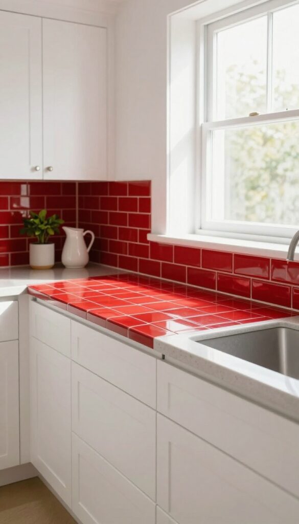
A red backsplash is one of the quickest ways to inject personality into a kitchen. It draws the eye immediately, acting like a piece of art that also happens to protect your walls from splatters. The key is balancing that bold color with lighter, airier elements so the room still feels open and inviting rather than heavy or cramped.
Glossy red subway tiles laid in a classic brick pattern create a sleek, reflective surface that bounces light around the room. For a more modern twist, matte hexagon tiles in a rich crimson add texture without glare. Keep your cabinets white or pale gray and your countertops in a light quartz or butcher block to let the backsplash take center stage without overwhelming the space.
This approach works especially well in galley kitchens or small L-shaped layouts where you want a single strong focal point.
Best Tile Shapes
Subway tiles are timeless and easy to install, while hexagon or fish-scale shapes add a playful, custom look. For a budget-friendly option, consider peel-and-stick red tiles—they come in various patterns and are renter-friendly.
Grout Color Matters
White grout keeps the look crisp and light, while dark gray or charcoal grout makes each tile stand out and hides stains better. In a light and airy kitchen, white grout is your best bet to maintain that open feel.
Finishing Touch
Add under-cabinet lighting to highlight the texture and color of the tiles. Warm LED strips create a cozy glow, while cool white lights keep the space feeling fresh and modern.
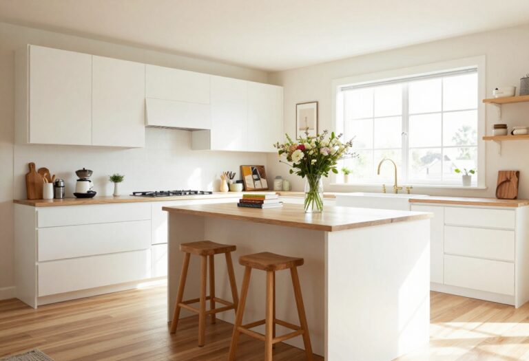
2. Red Bar Stools That Anchor a Kitchen Island
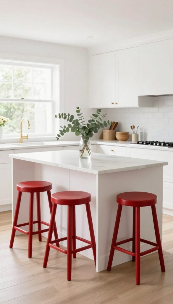
A kitchen island can feel a little unfinished without the right seating. Red bar stools change that instantly. They add a pop of color that draws the eye and makes the island the heart of the room.
In a light and airy kitchen, a few red stools create a focal point without overwhelming the space. The key is choosing a shade and style that feels intentional, not loud.
Red bar stools are a simple swap that brings energy and personality to your kitchen. They work especially well with light wood or white islands, where the contrast feels fresh and modern. For smaller kitchens, slim backless stools keep the visual flow open while still adding that bold touch.
The red hue can be a true cherry, a deep burgundy, or a muted brick depending on the mood you want. Pair them with warm metals like brass or copper for extra polish. This idea is perfect for anyone who wants a statement piece that's also functional every day.
Best Red Shades For A Light Kitchen
- Not all reds are created equal. In a light and airy kitchen, you want a red that feels cheerful, not heavy. A bright cherry red or a slightly muted tomato red works beautifully against white cabinets and light wood tones.
- If your kitchen has warm undertones, try a brick red or a rusty orange-red. For a more sophisticated look, a deep burgundy can add richness without darkening the space. Avoid neon or overly cool reds, as they can clash with the airy vibe.
Style And Material Choices
- The material of your stools matters as much as the color. For a light kitchen, consider wooden stools with a red painted finish or upholstered seats in a red fabric. Metal stools with a red powder-coated frame offer a sleek, modern look.
- Backless stools are great for saving visual space and tucking under the island when not in use. If you prefer more comfort, go for a low back design that still feels open. Velvet or leather upholstery adds a touch of luxury, while woven or rattan seats keep things casual and textural.
Placement And Styling Tips
- How you arrange the stools affects the whole kitchen's flow. For a standard island, three stools spaced evenly along one side create a balanced look. If your island is small, two stools are enough to avoid crowding.
- Leave about 6 to 8 inches between each stool for easy movement. To tie the red stools into the rest of the room, repeat the red color in small accents like a vase, a utensil holder, or a tea towel. This creates a cohesive palette without overdoing it.
- Also, consider the flooring—red stools pop nicely against light wood, white tile, or neutral stone.
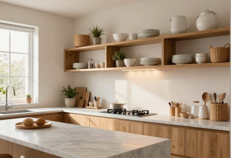
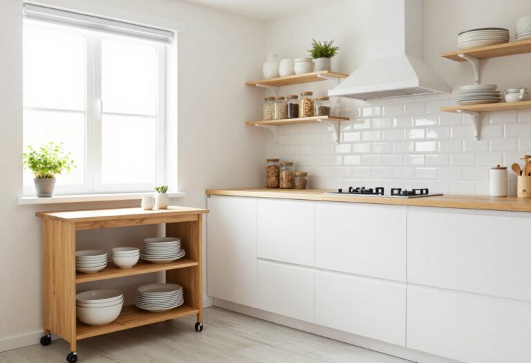
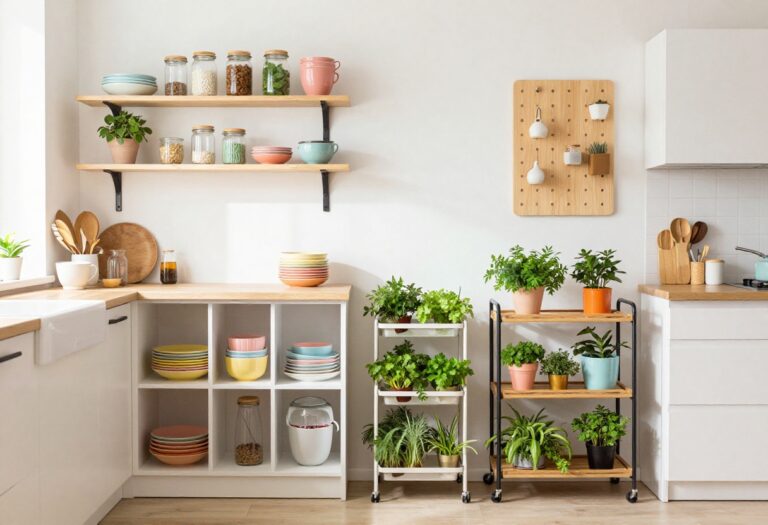
3. Red Open Shelving for Display and Function
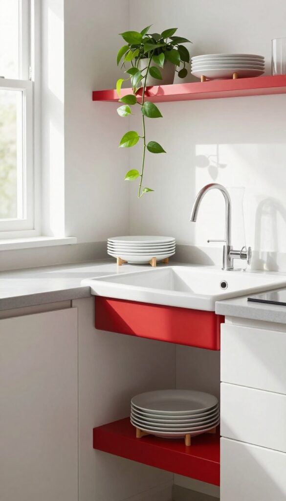
Open shelving is a go-to for kitchens that want to feel larger and more connected. By painting a set of shelves red or choosing ready-made red ones, you add a bold pop of color without overwhelming the room. The trick is to keep the display light—think white dishes, glass jars, and a few trailing plants—so the red feels warm and intentional, not heavy.
Red open shelving works best when it balances color with airy styling. The red draws the eye and adds personality, but the items you place on the shelves keep the look from feeling too intense. White ceramics and glass reflect light, while greenery brings in a natural touch.
This setup is perfect for a kitchen that wants a focal point without closing off the space.
Best Colors
Pair red shelves with crisp white, soft cream, or pale gray walls. The contrast keeps the red from feeling too aggressive. For a warmer look, try a brick red or a muted tomato shade instead of a bright cherry red.
Shelf Styling Tip
Group items in odd numbers and vary heights. Stack white plates on a small stand, add a clear glass carafe, and finish with a low, trailing pothos. Leave some empty space so the shelves don't look cluttered.
Small-space Fix
In a tiny kitchen, use narrow floating shelves that stop short of the counter depth. This keeps the walkway clear while still giving you that red accent. Mount them above a sink or prep area for easy access.
4. Red Range Hood as a Statement Piece
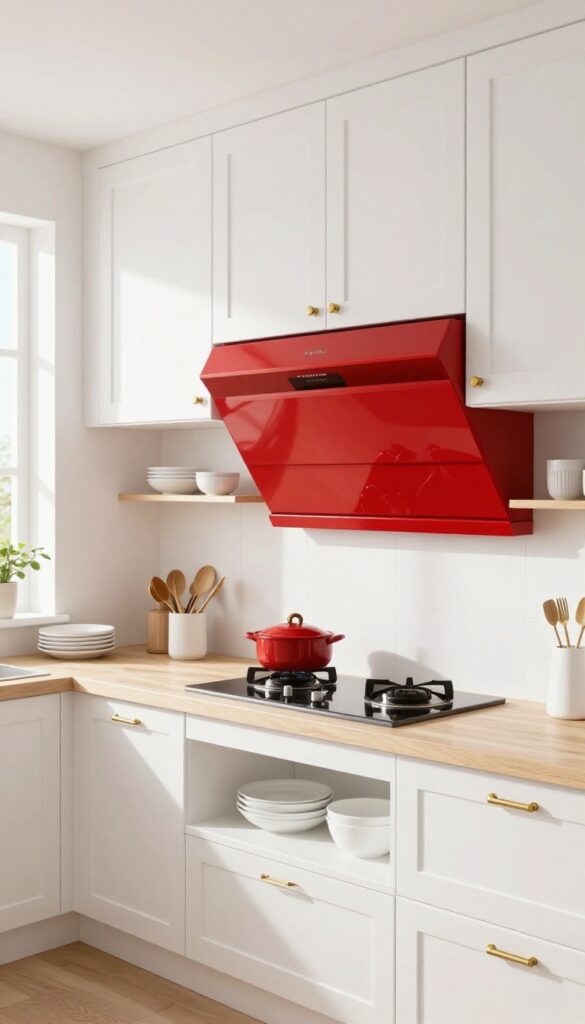
A red range hood is one of those bold moves that instantly pays off. Instead of blending into the background, it becomes the main event—a sculptural focal point that draws the eye upward and adds serious personality. The trick is to let it breathe: keep surrounding cabinets simple and neutral so the hood can truly shine without competing for attention.
A red range hood works best when it feels intentional, not accidental. Go for a sleek, modern style in a vibrant red finish—think glossy lacquer or powder-coated metal. Pair it with white, cream, or light gray cabinetry to keep the overall look airy and balanced.
The contrast will make the hood pop while maintaining a light, open feel. Add open shelving in a matching light tone on either side to reinforce the clean, uncluttered vibe. For a touch of warmth, consider a matte red finish paired with brass or black hardware on the cabinets.
Best Colors For Balance
- The red hood should be the star, so keep the palette around it subdued. White, pale gray, or soft beige cabinetry creates a crisp backdrop. For a slightly warmer look, try a creamy off-white or a light wood tone.
- Avoid competing colors like bright blue or green nearby—let the red stand alone.
Material Matters
A glossy lacquer finish gives a high-impact, reflective quality that bounces light around the kitchen. Powder-coated metal is durable and offers a matte option if you prefer a softer sheen. Stainless steel with a red accent is another route, but a fully red hood makes a stronger statement.
Styling Around The Hood
Keep the area around the hood minimal. Skip bulky cabinets or busy backsplashes directly behind it—a simple white subway tile or a light marble slab lets the hood breathe. Add a single pendant light or a pair of small sconces on either side to frame the hood and draw attention upward.
5. Red Kitchen Island That Grounds the Room
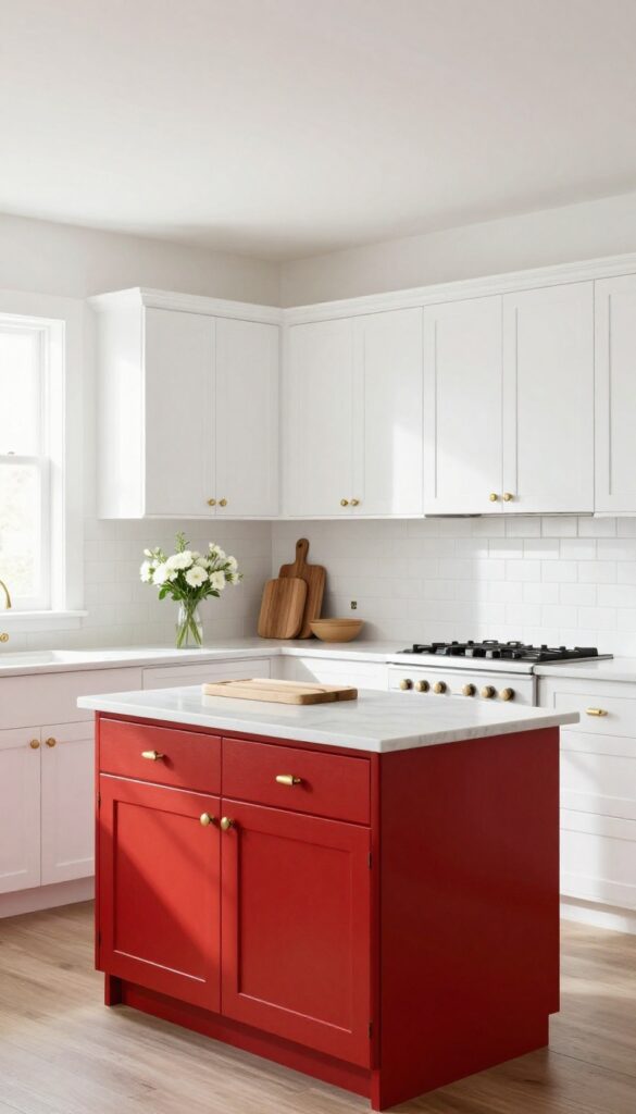
A red kitchen island acts like an anchor in a light, airy space. It draws the eye without overwhelming the whole kitchen, especially when the surrounding cabinets stay white or light gray. This pop of color adds warmth and personality, making the island feel like a built-in focal point rather than an afterthought.
Painting your kitchen island red is a smart way to introduce bold color without committing to red cabinets everywhere. The key is balance: keep perimeter cabinets light to let the island stand out. A glossy red finish reflects light and adds a touch of glamour, while a matte red feels more grounded and modern.
This look works especially well in open-concept kitchens where the island connects to living or dining areas—the red helps define the kitchen zone without closing it off.
Best Red Shades For A Light Kitchen
- Not all reds are created equal. For a light and airy kitchen, choose a red with warm undertones like brick, tomato, or a slightly muted crimson. Avoid deep burgundy or cool cherry reds that can feel heavy.
- A rich, warm red complements white marble or quartz countertops and pairs beautifully with brass or matte black hardware.
Finishing Touch
To keep the red island from feeling too loud, add a subtle contrast with the countertop and backsplash. A white or light gray countertop keeps things crisp, while a simple subway tile backsplash in the same light palette lets the island remain the star. For extra polish, add a wooden cutting board or a small vase of fresh flowers on the island to soften the bold color.
6. Red Accent Wall for a Subtle Pop
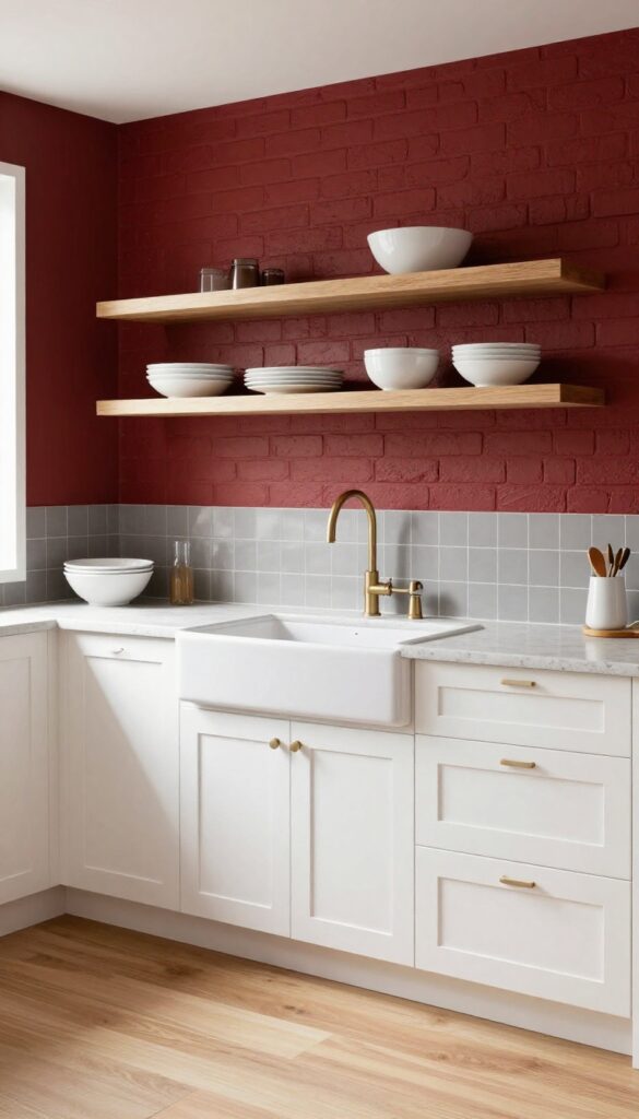
A single red wall can transform your kitchen without committing to a full color overhaul. It's a smart move if you want boldness but worry about going overboard. By keeping the rest of the space light and neutral, the red wall becomes a statement that feels intentional, not chaotic.
Pick the wall behind the sink or stove—these natural focal points draw the eye and anchor the room. A matte finish works best to avoid glare, and a deep crimson or brick red adds warmth without screaming. The key is balance: white cabinets, pale countertops, and light flooring let the red wall breathe.
It's a look that's both energetic and serene, perfect for kitchens that get lots of natural light.
Best Colors To Pair
- Stick with soft whites, warm grays, or pale beige for surrounding walls and cabinetry. A red wall pops beautifully against off-white shaker cabinets or light oak shelves. Avoid cool grays or stark white—they can make the red feel harsh.
- Instead, go for creamy tones that soften the contrast.
Where To Place It
- The wall behind the sink is ideal because it's a natural visual anchor. If that's not an option, try the wall behind the stove or a narrow wall between cabinets. Avoid placing it on a wall with windows or doors—it works best when it's a solid, uninterrupted surface.
- In a galley kitchen, one short end wall can create a nice focal point without overwhelming the narrow space.
Finishing Touch
- Add open shelving in a light wood tone against the red wall. The warm wood softens the bold color and adds texture. Keep shelf decor minimal—a few white dishes or clear glass jars let the red wall stay the star.
- A small pendant light with a brass or matte black finish above the sink ties the look together.
7. Red Small Appliances for Easy Color Drops
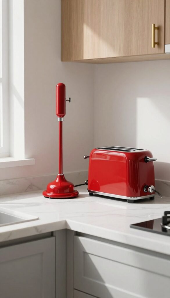
If painting cabinets or swapping backsplash tiles feels too permanent, red small appliances offer a low-commitment way to test the waters. A stand mixer, toaster, or kettle in a cheerful cherry or tomato red becomes an instant focal point without demanding a full renovation. These pieces sit right on your countertops, so they pull the eye and add personality the moment you walk in.
Best of all, if your taste shifts later, you can simply swap them out—no paint stripper required.
Red appliances work especially well in light, airy kitchens where they can stand out without competing against busy patterns or dark cabinetry. A single red kettle on a white marble countertop feels like a deliberate styling choice, not an accident. For a cohesive look, stick to one or two red pieces rather than a full set—too many can tip into theme-park territory.
Place them near each other, like a toaster and kettle side by side, to create a mini color vignette. If your kitchen already has warm wood tones or brass fixtures, red complements those beautifully, tying the whole space together.
Best Colors To Pair With Red Appliances
- Red pops best against neutral backdrops like white, cream, light gray, or soft beige. If your kitchen has cool-toned cabinets, a true red adds warmth. For warmer wood cabinets, opt for a slightly brickier red to keep things harmonious.
- Avoid pairing red with other bright primaries unless you're going for a retro diner vibe—stick to one bold color and let the rest of the kitchen stay calm.
Placement And Styling Tip
- Group red appliances on one section of countertop rather than scattering them around the kitchen. This creates a deliberate color block that feels intentional. Keep the surrounding area clutter-free so the red really sings.
- A small tray underneath can anchor them and catch crumbs or drips. If you have open shelving nearby, pull a red dish towel or a couple of red canisters into the same zone to echo the color without overwhelming.
Budget-Friendly Swap
- You don't need to splurge on a high-end stand mixer to get the effect. Many budget-friendly brands offer red kettles and toasters for under $50. If you're still unsure, start with a single red kettle—it's the smallest investment and easiest to swap.
- Thrift stores and online marketplaces often have vintage red appliances that add character and a slightly muted, retro hue that feels unique.
8. Red Cabinet Hardware for a Quick Update
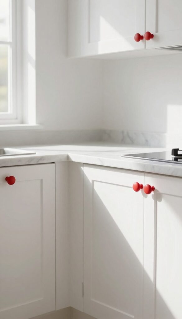
Sometimes the smallest swap makes the biggest splash. Swapping out standard knobs and pulls for red ones is like giving your kitchen a shot of espresso—suddenly everything feels more awake and intentional. It's a low-commitment change that works whether you rent or own, and it doesn't require a contractor or a weekend of your time.
Plus, you get to test the red trend without painting a single cabinet door.
Red hardware adds a pop of color that draws the eye and creates a focal point without overwhelming the space. Because knobs and pulls are small, they feel like a deliberate accent rather than a loud statement. This trick is especially effective in light and airy kitchens—think white, cream, or pale gray cabinets—where the red stands out cleanly.
For a modern look, choose matte red finishes; for a classic feel, go glossy. Either way, you'll refresh the entire kitchen with a few twists of a screwdriver.
Best Finishes To Try
- Matte red gives a soft, contemporary vibe that pairs well with brushed brass or black fixtures. Glossy red feels more traditional and pops beautifully against white subway tile. If you want a touch of warmth, look for red with a slight orange undertone; for a cooler look, choose a cherry or crimson shade.
- Mixing red pulls with black or nickel cabinet hinges keeps the look grounded.
Where To Place Them
- Focus on high-use cabinets like the ones near the stove or sink—those are the spots your eye naturally lands on. You don't have to replace every single knob; even swapping just the upper cabinet hardware creates a balanced accent. For a cohesive feel, repeat the red on the pantry door or a single drawer bank.
- This selective approach keeps the update affordable and intentional.
Styling Tip: Balance The Color
Since red is bold, balance it with neutral countertops and backsplash. A white quartz or marble-look surface lets the hardware shine without competition. Add a couple of red accents elsewhere—like a tea towel or a small vase—to tie the look together, but keep them sparse so the hardware remains the star.
9. Red Window Treatments That Frame the View
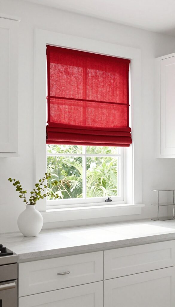
Windows are often the focal point of a kitchen, so dressing them in red instantly draws the eye upward and adds a bold layer of color at eye level. The trick is to keep the treatment light and airy—think Roman shades or simple valances in a crisp red fabric that doesn’t feel heavy or overpowering. Paired with white or neutral walls, the red pops without competing, creating a balanced look that feels both energetic and refined.
Red window treatments bring warmth and personality to a kitchen without taking up any floor space. They’re especially effective in rooms with limited wall area for art or decor, as they add a generous splash of color right where you need it. To maintain that light and airy feel, choose fabrics like linen, cotton, or a lightweight polyester blend that filter sunlight softly.
Avoid heavy drapes or dark linings that can make the room feel smaller. For a smart, space-aware approach, mount the shades inside the window frame to keep sightlines clean and make the windows appear larger. This also leaves the surrounding wall space free for open shelving or a simple backsplash, letting the red do its job without clutter.
Best Colors And Patterns
A true tomato red or a slightly muted brick red works beautifully with white trim and neutral walls. If you want a softer look, try a red-and-white stripe or a subtle geometric pattern that adds texture without overwhelming the space. Avoid dark burgundy or maroon, as they can feel heavy in a kitchen that aims to stay airy.
Fabric And Finish Tips
Lightweight linen or cotton blends are ideal because they let natural light filter through while still providing privacy. Look for shades with a white or light-colored backing to keep the room bright even when the shades are drawn. A matte finish on the fabric helps the red feel sophisticated rather than glossy or cheap.
Styling And Placement
Mount the shades as close to the ceiling as possible to draw the eye upward and make the ceiling feel higher. For a cohesive look, repeat the red in small accents elsewhere—like a vase, a utensil holder, or bar stools—so the windows feel intentional rather than isolated. Keep the windowsill clear or style it with a single small plant to maintain that clean, uncluttered vibe.
10. Red Runner Rug That Defines the Path
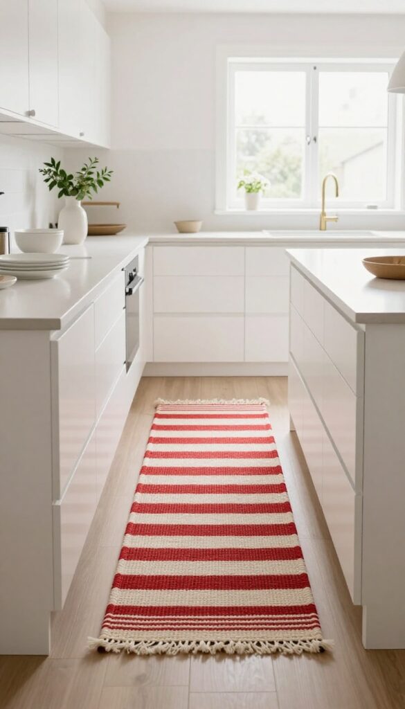
A runner rug does more than protect your floors—it quietly shapes how a kitchen feels. In a light and airy space, a red runner becomes a deliberate focal point without overwhelming the room. It grounds the walkway, adds warmth underfoot, and introduces pattern in a controlled way.
The key is choosing the right weave and scale so the rug feels intentional, not like an afterthought.
A low-pile or flatweave runner is the smartest choice for a kitchen. It lies flat against the floor, so cabinet doors swing freely and chair legs don't catch. Spills wipe up quickly, and crumbs don't hide in deep fibers.
Look for a design that mixes red with white or cream—stripes, geometric motifs, or subtle tribal patterns keep the look fresh and airy. Place the runner along the main walkway between counter and island, or in front of the sink and stove zone. It should extend past the work areas by at least a foot on each end so it feels anchored.
In a galley kitchen, a runner can visually lengthen the space; in an open plan, it helps define the kitchen zone without closing it off.
Best Patterns For A Light Kitchen
- In a kitchen with white cabinets, pale countertops, and natural light, a red-and-white striped runner keeps things crisp. A narrow stripe feels tailored; a wider stripe adds a bolder statement. For a softer look, choose a red-on-cream geometric or a faded brick red that reads almost terracotta.
- Avoid busy all-over patterns that compete with countertop clutter.
Placement And Size Tips
- Measure your main walkway and choose a runner that leaves at least 4 inches of bare floor on each side. In a standard kitchen, a 2×6 or 2×8 foot runner works well. If your island has seating, stop the rug before the stools so legs stay stable.
- Use a rug pad underneath to prevent slipping and to protect the rug from shifting.
Material And Maintenance
- Flatweave cotton or wool blends are durable and easy to shake out. Avoid shag or high-pile rugs—they trap crumbs and are hard to clean. For extra practicality, look for indoor-outdoor flatweave rugs that can handle spills and are machine washable.
- Vacuum weekly and spot-clean stains immediately with mild soap and water.
11. Red Pendant Lights Over the Island or Table
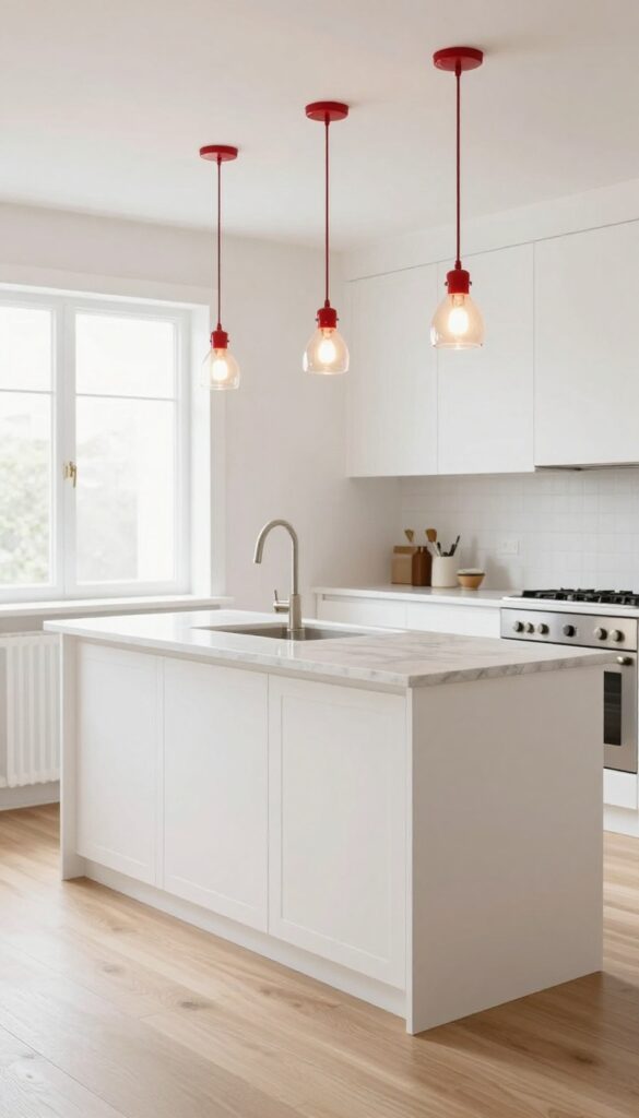
Hanging red pendant lights above your island or dining table instantly draws the eye upward, making the room feel taller and more open. The warm glow from glass or metal shades creates a cozy, inviting atmosphere without eating into any counter or floor space. It’s a simple swap that packs a lot of personality, especially when the rest of your kitchen stays light and neutral.
Red pendants act like jewelry for your kitchen—they add a bold focal point while keeping the overall look airy. Choose a sleek metal shade for a modern edge or a ribbed glass one for a softer, more traditional feel. Either way, the red hue warms up the space without overwhelming it.
Keep the surrounding lighting fixtures minimal and neutral, like white or brushed nickel, so the red really pops. This works especially well in kitchens with white cabinets, light wood floors, or marble countertops, because the contrast feels intentional and fresh.
Best Materials And Finishes
For a light and airy kitchen, opt for red glass pendants that let light filter through softly, or go with matte metal shades for a more grounded look. Avoid glossy or dark red finishes that can feel heavy. A clear glass globe with a red interior or a slim metal cone in tomato red keeps the silhouette clean and the color vibrant without being too dominant.
Placement And Spacing Tip
- Hang pendants about 30 to 36 inches above the counter or table surface. If you have a long island, use two or three smaller pendants evenly spaced rather than one large fixture—this keeps the visual rhythm light and balanced. For a round table, a single pendant centered above works beautifully.
- Make sure the lights don’t block sightlines across the room.
Balancing The Color Palette
- Let the red pendants be the only strong color in the upper part of the kitchen. Pair them with white or cream walls, light wood or pale quartz countertops, and maybe a few red accents like a vase or dish towel on the counter. This way the pendants feel like a deliberate statement rather than a chaotic splash.
- The rest of the room stays serene and spacious.
12. Red Dish Towels and Pot Holders for a Low-Commitment Pop
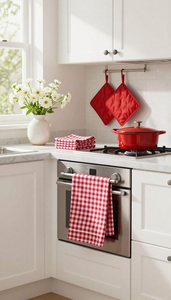
Not ready to paint a wall or commit to red appliances? That’s completely fine. The easiest way to test this bold color is through textiles—specifically, your dish towels and pot holders.
Swapping out your everyday linens for red versions adds an instant shot of energy without any permanent changes. It’s a low-risk, high-reward move that lets you see how red feels in your kitchen before going all in.
Red linens bring a playful yet sophisticated touch to a light and airy kitchen. They create a focal point that draws the eye without overwhelming the space. Whether you choose a bright cherry red or a deeper burgundy, the contrast against white cabinets or neutral countertops is striking.
Fold them neatly over the oven handle, hang them on a hook, or drape them over the edge of the sink for a casual, lived-in look. Pot holders can sit on the counter or hang on a magnetic strip, adding both function and style. This small swap can transform the mood of your kitchen, making it feel more vibrant and inviting.
Best Colors And Patterns
- For a light and airy kitchen, stick with clear, uncomplicated reds. A true tomato red or a slightly muted brick red works beautifully. Avoid overly dark or muddy shades that could weigh down the space.
- If you want a little pattern, go for classic gingham, subtle stripes, or a simple plaid. These add visual interest without competing with the rest of the room. Solid reds are also a great choice for a clean, modern look.
Where To Display Them
- Hang your red dish towels on a sleek bar or hook near the sink for easy access. Drape one over the oven door handle for a pop of color at eye level. Fold pot holders neatly and stack them on the counter, or use a magnetic hook to attach them to the side of the fridge.
- The key is to keep them visible but not cluttered. A single red towel on a hook can be enough to make an impact.
Styling Tip For A Cohesive Look
- To keep the space feeling cohesive, echo the red in a few other small details—maybe a red utensil crock, a red vase, or a red fruit bowl. This creates a subtle visual thread that ties the room together. But don’t overdo it.
- The beauty of this idea is its simplicity. Let the red linens stand out against a mostly neutral backdrop for the best effect.
13. Red Artwork or Wall Decor That Ties the Room Together
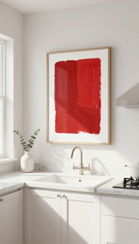
Blank walls can make even the most stylish kitchen feel unfinished. Adding a piece of red artwork—whether it's a bold abstract print, a vintage food sign, or a framed botanical—instantly pulls the room together without committing to permanent changes. The key is choosing a piece that complements your kitchen's existing vibe, not competes with it.
For a light and airy kitchen, a red print with plenty of white space keeps things fresh and balanced.
Artwork is one of the easiest ways to introduce red into a kitchen because it's flexible and easy to swap. A single large piece above the sink or a small gallery wall near the breakfast nook can anchor the space and add personality. Since kitchens are often busy with cabinets and appliances, a red artwork acts as a visual pause—drawing the eye and creating a focal point.
Stick to one or two red accents within the art to keep the look intentional rather than chaotic.
Best Placement
- Hang red artwork where it can be seen but not overwhelmed. Above the sink is a classic spot, but a blank wall between upper cabinets and the counter also works well. If you have open shelving, lean a framed print against the backsplash for an effortless look.
- Avoid placing red art next to other red elements like a red kettle or red canisters—let it stand out.
Frame And Style Tips
- Choose a frame that matches your kitchen's hardware and finishes. For a light and airy kitchen, a thin white or natural wood frame keeps things breezy. A black or brass frame adds contrast and sophistication.
- If your kitchen has warm wood tones, a dark wood frame can tie the piece to the cabinetry. The frame should feel like an extension of the room, not an afterthought.
Small-space Fix
- In a small kitchen, one medium-sized red print is better than several small ones. It creates a stronger visual impact without cluttering the walls. You can also use a red fabric wall hanging or a tapestry for a softer, more textural approach that doesn't take up counter space.
- Just make sure it's easy to clean—kitchens get greasy.
FAQ
Will red make my small kitchen feel smaller?
Not if you use it strategically. Stick to red as an accent on one element, like a backsplash or stools, and keep walls and cabinets light. This creates a focal point without closing in the space.
What colors pair well with red in a kitchen?
White, cream, light gray, and natural wood tones are safe bets. They keep the kitchen feeling airy and let red stand out. Avoid pairing red with dark colors like black or navy unless you want a dramatic look.
How can I add red without painting or renovating?
Use red accessories like dish towels, a rug, small appliances, or artwork. These are easy to swap and let you test the color before committing to bigger changes.
Is red a good choice for a rental kitchen?
Absolutely. Stick to removable or temporary options like a red rug, bar stools, or peel-and-stick backsplash tiles. You can take them with you when you move.
How do I keep a red kitchen from looking too busy?
Balance red with plenty of neutral space. Use red on only one or two elements, and keep countertops clutter-free. Let the red be the star, not one of many competing colors.
Conclusion
Red doesn't have to be overwhelming. With a light hand and a focus on balance, you can bring warmth and personality into your kitchen without sacrificing an open, airy feel. Start small with a few accessories, or go bold with a red island or backsplash.
The key is to let red work as an accent, not the whole story. Pair it with whites, woods, and natural light, and your kitchen will feel both stylish and welcoming.