13 Red Living Room Ideas with Warm Dramatic Character
Red doesn't just change a room. It changes the mood, the energy, and the way people feel when they walk in. A living room with red becomes a place you want to linger in, not just pass through.
The trick is knowing how much red to use and where to place it. Too little and it disappears. Too much and it overwhelms.
The sweet spot sits somewhere in between, and that's exactly what these ideas help you find. Whether you want a bold statement or a subtle glow, there's a red approach here that fits your space. Let's look at 13 ways to bring warmth and drama into your living room.
1. Paint One Wall a Deep Brick Red
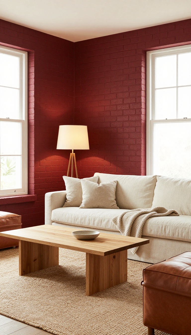
A single wall in deep brick red can transform your living room without making it feel like a dungeon. This rich, earthy shade adds instant warmth and depth, drawing the eye and creating a cozy focal point. The key is balance: pair it with neutral furniture and warm lighting so the space feels inviting, not overwhelming.
Brick red is a classic choice for a reason. It's bold enough to make a statement, but its brown undertones keep it grounded and versatile. Unlike brighter reds, brick red feels natural and timeless, working well with wood tones, leather, and natural fabrics.
It's the kind of color that makes a room feel lived-in and loved. When you paint just one wall, you get all the drama without the commitment of a full red room. It's perfect for highlighting an architectural feature like a fireplace or a built-in shelf.
Plus, it's an easy DIY project that can be done in a weekend. To get the look right, start by choosing the right wall. The wall behind your main seating area or the one with a focal point like a fireplace or TV usually works best.
Then, pick a brick red that complements your existing decor. Test a few samples in different lighting to see how the color shifts throughout the day. Once the wall is painted, balance it with neutral furniture.
Think cream sofas, beige rugs, and wooden tables. Add warm lighting with table lamps and floor lamps that cast a soft glow. This combination keeps the room feeling cozy and welcoming, not dark and cave-like.
Choosing The Right Wall
The wall you choose makes all the difference. A wall with a window or door can break up the color, so consider a solid wall that stands alone. If you have an open floor plan, pick a wall that defines the living area without closing it off.
The goal is to create a focal point that draws people in.
Balancing With Neutrals
Neutrals are your best friend when working with a bold wall. A light-colored sofa, a jute rug, and simple curtains in cream or gray will keep the room from feeling too heavy. Add a few metallic accents like brass or gold for a touch of glam.
Lighting For Warmth
Warm lighting is crucial. Opt for bulbs with a color temperature around 2700K to 3000K. Layer your lighting with a mix of overhead, task, and accent lights.
Dimmers let you adjust the mood from bright and lively to soft and intimate.
2. Choose a Red Velvet Sofa as the Centerpiece
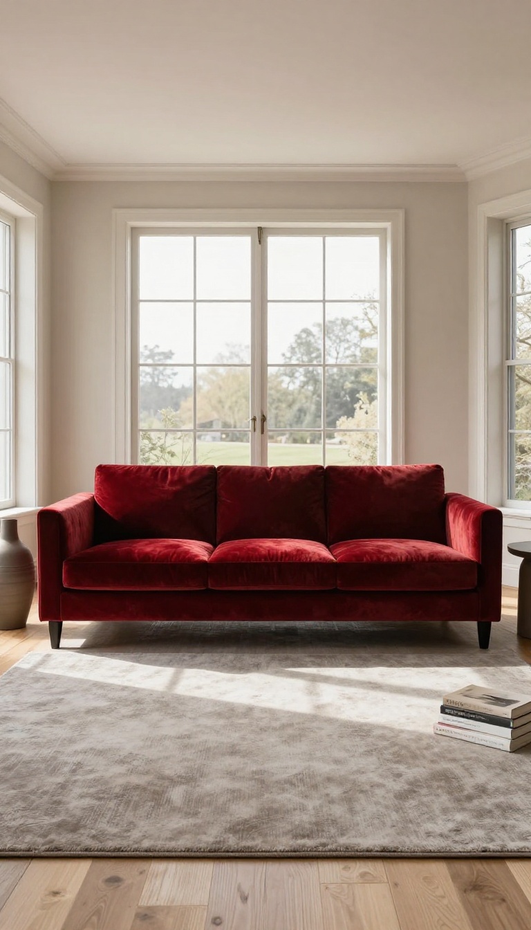
A red velvet sofa doesn't just sit in a room—it commands it. The rich texture and deep color draw every eye the moment someone walks in. That kind of presence can feel intimidating, but it's also what makes the room memorable.
The key is letting the sofa lead while everything else supports it. Get the balance right, and you have a living room that feels both luxurious and livable.
Velvet has a way of catching light that no other fabric quite matches. It shifts from bright crimson to deep burgundy depending on the angle, which gives the sofa a living, breathing quality. That natural depth is why a red velvet piece works as a centerpiece even in rooms with otherwise simple furniture.
But a sofa this bold needs a supporting cast that knows its role. You're not trying to match its intensity—you're trying to frame it. Think of the sofa as the painting and the rest of the room as the wall it hangs on.
Pick The Right Shade Of Red
Not all reds behave the same way. A true cherry red feels energetic and youthful, while a deep oxblood or burgundy reads more classic and moody. Brick red sits somewhere in between, warm but not loud.
Hold fabric swatches against your floor and walls at different times of day. Velvet changes with the light, so what looks perfect at noon might feel flat at night. Choose the shade that still feels right when the lamps are on.
Keep The Walls Calm
A red velvet sofa against red walls is a lot to process. Instead, let the walls recede with warm neutrals like cream, greige, or soft taupe. These shades don't compete—they give the sofa room to breathe.
If you want a touch of color on the walls, try a muted olive or dusty rose. Both pair beautifully with red velvet without stealing the show.
Add Metallic Accents Sparingly
Brass, gold, or aged bronze brings out the warmth in red velvet. A slim metal floor lamp, a side table with brass legs, or a framed mirror with a gold edge is enough. You don't need to go overboard.
Skip shiny chrome or cool silver—they can make red feel harsh. Stick with warm metals that echo the sofa's glow.
Ground It With A Simple Rug
A busy patterned rug will fight the sofa for attention. Choose a solid rug in a neutral tone, or one with a subtle geometric weave. Wool or jute adds texture without visual noise.
Size matters too. The rug should be large enough that the sofa's front legs sit on it. That anchors the seating area and makes the whole arrangement feel intentional.
3. Layer Red and Warm Wood Tones
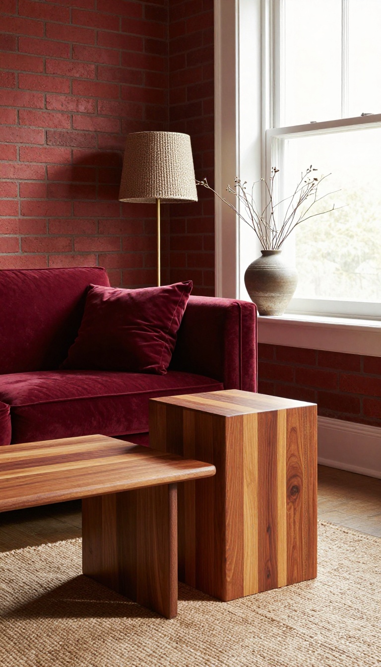
Red and wood are a natural pair, like cinnamon and cedar. The earthy grain of wood softens red's intensity, while red gives wood a lively backdrop. Together, they create a living room that feels grounded yet full of character.
Wood brings an organic texture that keeps red from feeling too sharp or synthetic. Think of how a red wall looks next to a walnut console—suddenly the red feels richer, not louder. The key is to choose wood tones that share red's warmth: cherry, mahogany, teak, or reclaimed pine with a honey finish.
Cool-toned woods like ash or gray-washed oak can work, but they create a different, more modern tension. For a cozy, dramatic vibe, stick with warm woods and let them do their thing.
Pick The Right Wood For Your Red
Not all wood plays nicely with every shade of red. Brick red and deep burgundy love dark woods like mahogany or walnut—they echo each other's depth. Brighter reds, like tomato or coral, pair well with lighter woods such as oak or maple to keep things from getting too heavy.
If you're unsure, grab a few wood samples and hold them against your red fabric or paint swatch. The right match will feel instantly harmonious.
Balance The Proportions
You don't want red and wood fighting for attention. Let one lead and the other support. For example, a red sofa can be the star, with a wood coffee table and side chairs as supporting players.
Or flip it: a large wood bookcase becomes the focal point, and red appears in pillows, a throw, or an accent chair. Aim for roughly 60% wood, 40% red, or vice versa. That ratio keeps the room from feeling one-note.
Mix Wood Finishes For Depth
Using more than one wood tone adds layers without clutter. A dark wood floor, a medium wood coffee table, and a light wood accent piece can all live together if they share a warm undertone. Just avoid mixing cool and warm woods in equal measure—it can look accidental.
Stick to warm tones, and the red will tie everything together like a ribbon.
4. Use Red as a Repeating Accent
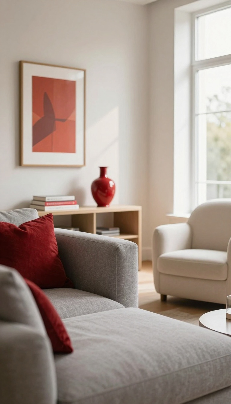
Not every red living room needs a dramatic focal wall or a massive velvet sofa. Sometimes the smartest move is to thread red through the space in smaller doses, letting it pop up in unexpected places. This approach keeps the room feeling lively and cohesive without locking you into a single bold commitment.
Think of red as a seasoning rather than the main course. A few well-placed accents can wake up a neutral room and give it a pulse. You get the warmth and energy of red, but you also keep the flexibility to dial it up or down as your taste evolves.
Start With Textiles
Pillows and throws are the easiest entry point. A pair of crimson lumbar pillows on a gray sofa instantly adds a jolt of color. Drape a red herringbone throw over the arm of a chair for a cozy, lived-in touch that you can swap out seasonally.
Layer In Art And Objects
A piece of art with red tones can anchor the accent color without dominating the wall. Look for abstract prints, vintage posters, or even a gallery wall where red appears in one or two frames. On shelves, a red ceramic vase or a stack of books with red spines repeats the hue in a subtle way.
Repeat, Don't Scatter
The key is repetition. Use red in at least three spots around the room so it feels intentional. A pillow, a candle, and a small sculpture on the coffee table create a visual echo that ties everything together.
Avoid placing all your red pieces in one corner—spread them out so your eye travels around the space.
5. Go Bold with Red Walls and Dark Trim
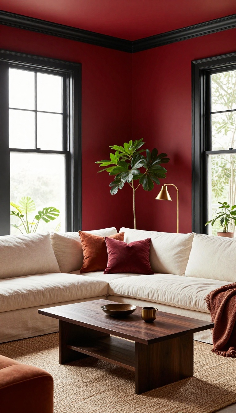
Saturated red walls paired with black or deep charcoal trim create a look that feels both classic and slightly rebellious. The dark trim acts like a frame, giving all that rich color a crisp edge instead of letting it blur into the rest of the room. This combination shines brightest in spaces that get plenty of natural light.
Sunlight keeps the red from turning cave-like during the day, while evening lamps make the dark trim recede and the walls glow.
The contrast does most of the heavy lifting here. Red walls bring warmth and intensity, and dark trim adds structure, so the room reads as intentional rather than accidental. You do not need a huge budget to pull this off.
Paint is one of the cheapest ways to completely change how a living room feels, and this pairing delivers more drama per dollar than almost anything else you can do.
Pick The Right Red First
Test a few swatches on the wall before you commit. Brick, oxblood, and cranberry all read differently depending on your light, so paint large samples and check them at morning, afternoon, and night. Cooler reds with a hint of blue tend to look more sophisticated against black trim.
Warmer, orange-leaning reds feel cozier and a little more rustic.
Black, Charcoal, Or Something Softer
True black trim gives the sharpest contrast and the most modern edge. Deep charcoal is a gentler option that still reads dark but feels less graphic. If you want a slightly softer landing, try a very dark espresso brown or even a deep forest green.
Both keep the moody vibe while warming up the palette.
Balance The Rest Of The Room
With walls and trim doing so much talking, keep furniture and rugs relatively quiet. Cream, camel, warm gray, and aged brass all play nicely without competing. Add a few black accents, like a lamp base or picture frame, to tie the trim into the rest of the space.
Skip bright primary colors unless you want a playful, maximalist feel.
Make Natural Light Work For You
Rooms with big windows handle saturated red walls beautifully. The daylight keeps things airy, and the dark trim gives the glare something to push against. If your living room is on the darker side, use this combo on a single wall or in a smaller space like a reading nook.
You still get the drama without the dungeon effect.
6. Add a Red Rug to Anchor the Seating Area
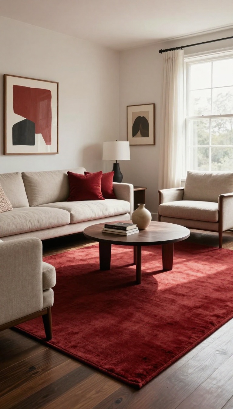
A red rug does more than cover bare floors. It draws an invisible boundary around your seating area, telling everyone where to gather and where the conversation lives. That simple visual cue makes a room feel intentional, not just furnished.
It also adds warmth underfoot, which matters in a space that leans dramatic. Cold floors can make even the coziest red scheme feel a little distant. A rug softens that edge and invites you to kick off your shoes.
The best part? You can go as bold or as subtle as you like. A deep crimson statement rug and a washed-out brick red both work, just in different ways.
The right red rug pulls your furniture together without stealing the show. It should feel like it belongs, not like it was dropped in from another room. That means paying attention to pattern, texture, and scale before you buy.
Start by measuring your seating area. You want the rug to sit under at least the front legs of your main pieces. If it's too small, the room feels disjointed.
If it's too big, it swallows the space. Then think about how the red interacts with your existing colors. A rug with a touch of the same red as your pillows or artwork creates a quiet thread that ties everything together.
A completely different red can work too, but it needs a neutral buffer to keep things from clashing. Finally, consider the pile. A plush, thick rug says cozy and casual.
A flatweave or low-pile rug says polished and modern. Both can be red, but they send different messages.
Pick A Pattern That Plays Well With Your Furniture
If your sofa is solid, a patterned red rug adds energy without competing. Think geometrics, faded Persian motifs, or simple stripes. They give the eye something to explore.
If your furniture already has a lot going on, go with a solid or subtly textured red rug. It grounds the space without adding more visual noise. A tone-on-tone pattern works well here too.
Get The Size And Placement Right
A rug that's too small makes the seating area feel like an island. Aim for at least 8×10 feet in a standard living room, or larger if your furniture is oversized. In an open-concept space, the rug should define the conversation zone clearly.
Leave 12 to 18 inches of bare floor between the rug's edge and the walls. That breathing room keeps the room from feeling wall-to-wall carpeted.
Layer For Extra Warmth And Character
Layering a smaller red rug over a larger neutral one adds depth and lets you experiment with red without committing to a full wall-to-wall look. It's a great trick for renters or anyone who likes to change things up. Just keep the top rug thin and the bottom one flat.
A shaggy rug over a shaggy rug gets lumpy fast.
7. Mix Red with Warm Neutrals
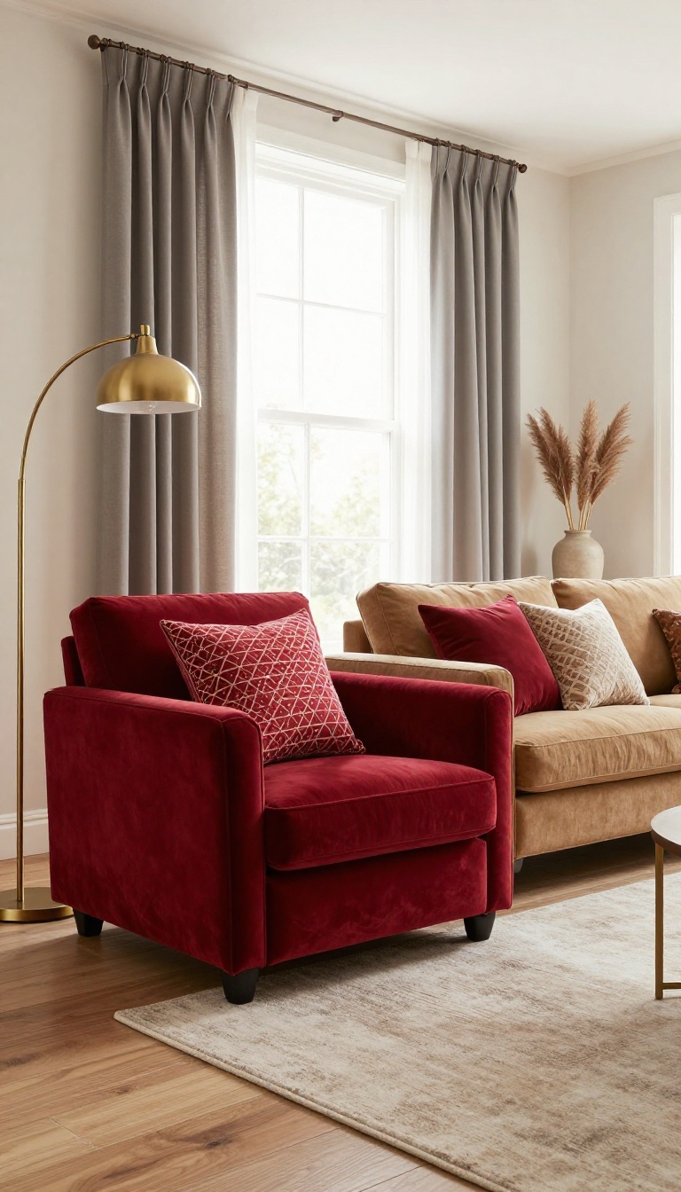
Red has a way of taking over a room if you let it. Pair it with warm neutrals like cream, tan, or soft gray, and suddenly it feels balanced instead of bossy. These quiet tones give red a stage without stealing the spotlight.
The result is a living room that feels cozy and collected, not chaotic. You get all the warmth and drama of red, but with a calm backdrop that makes everyday life feel easy.
Warm neutrals are the unsung heroes of a red living room. They don't compete with red; they support it. Think of them as the bass line in a song—you might not notice them at first, but they hold everything together.
The key is to choose neutrals with a little warmth of their own. Cream, tan, greige, and soft gray all have subtle undertones that play nicely with red. Cool whites or stark grays can make red feel harsh, so lean toward shades that feel like a cozy sweater rather than a blank canvas.
Once you have your palette, distribute the colors with intention. Let red be the accent that draws the eye, and let neutrals do the heavy lifting on walls, floors, and large furniture. This way, the room feels layered and livable, not like a red bomb went off.
Pick The Right Neutrals
Not all neutrals are created equal. For a red living room, you want shades that feel warm and inviting. Cream, oatmeal, and tan are safe bets.
They have a hint of yellow or brown that echoes red's warmth. Soft gray can work too, but choose one with a greige or taupe undertone rather than a cool blue-gray. Test swatches next to your red pieces to see how they interact.
If the neutral makes the red look brighter and richer, you've found a winner.
Balance The Ratio
A good rule of thumb is 60-30-10: 60% neutral, 30% secondary neutral or texture, and 10% red. But rules are made to be broken. If you want more red, go for it—just keep the neutrals generous enough to give the eye a rest.
In a small room, more neutral can make the space feel larger. In a big room, you can afford more red. Pay attention to how the room feels as you add pieces.
If it starts to feel intense, add a neutral throw or swap a red pillow for a cream one.
Layer In Texture
Neutrals can sometimes fall flat, especially next to a bold color like red. That's where texture comes in. A chunky knit throw, a woven jute rug, or linen curtains add depth without adding color.
Mix smooth and rough textures to keep things interesting. A velvet red sofa looks even more luxurious against a rough plaster wall or a nubby wool rug. The contrast makes both the red and the neutrals feel more intentional.
Use Red As A Repeating Accent
Instead of one big red piece, try scattering red around the room in smaller doses. A red lampshade, a red vase, a red frame—these little moments tie the room together without overwhelming it. This approach works especially well in open-plan spaces where you want red to flow from one area to another.
Just make sure the reds are in the same family—warm reds with warm neutrals, cool reds with cool neutrals—so the palette feels cohesive.
8. Create a Red Reading Nook
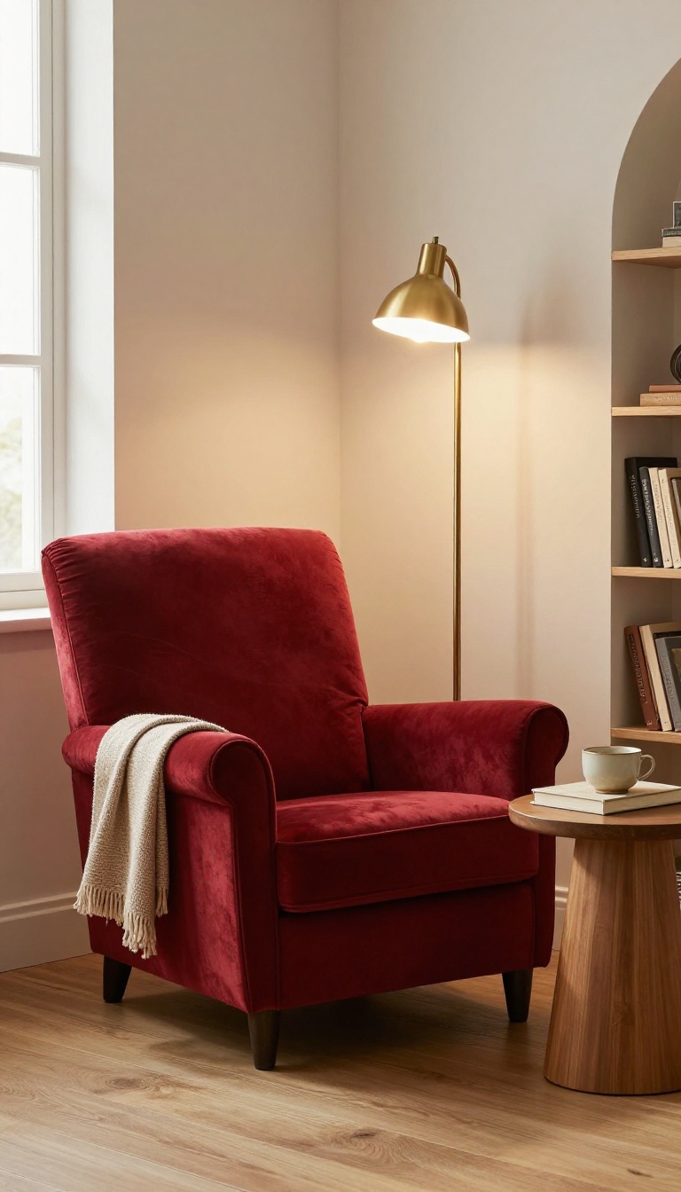
A reading nook is one of the easiest ways to bring red into your living room without repainting a single wall. You only need three things: a comfortable red chair, a floor lamp, and a small side table. Together, they carve out a corner that feels intentional, warm, and entirely your own.
This approach works because it keeps red contained. Instead of spreading the color across the whole room, you concentrate it in one spot where you actually spend time. That makes the red feel purposeful rather than random.
It's also a low-commitment move. If you ever want to change things up, you can swap the chair or move the lamp without undoing an entire design scheme.
Think of the nook as a room within a room. The red armchair becomes the anchor, the lamp gives it a glow, and the side table gives you a place to set down a cup of tea or a book. That trio does most of the work.
The best part is that you don't need a large space. A corner near a window, the end of a hallway, or the awkward spot beside a bookshelf can all become a reading nook with the right pieces. Red simply makes that small zone feel deliberate.
You can also adjust the intensity. A deep burgundy chair feels moody and rich, while a bright cherry red feels playful and energetic. Either way, the nook stays cozy because the color is concentrated in one area.
Pick The Right Chair
The chair sets the tone, so choose one that feels good to sit in for at least thirty minutes. A wingback, a club chair, or a simple upholstered armchair all work well in red. If you want texture, velvet adds depth and catches the light beautifully.
If you prefer something more casual, a red slipcover on an existing chair is a budget-friendly option.
Add A Floor Lamp For Warmth
A floor lamp does more than light the page. It creates a pool of warm light that makes the red feel richer and the corner feel separate from the rest of the room. Look for a lamp with a shade that directs light downward, like a drum or cone shape.
A brass or black metal base pairs well with almost any red.
Keep The Side Table Simple
The side table should be small enough to fit beside the chair without crowding it. A round accent table, a slim C-table, or even a stack of sturdy books can work. Keep the surface mostly clear so you have room for a mug, a small plant, or the book you're currently reading.
Layer In A Throw And A Cushion
A soft throw blanket and one or two cushions make the nook feel finished. Choose colors that support the red instead of competing with it. Cream, camel, charcoal, or a muted pattern all work.
This is also your chance to add a second red tone if you want a layered look.
9. Hang Red Curtains for Instant Drama
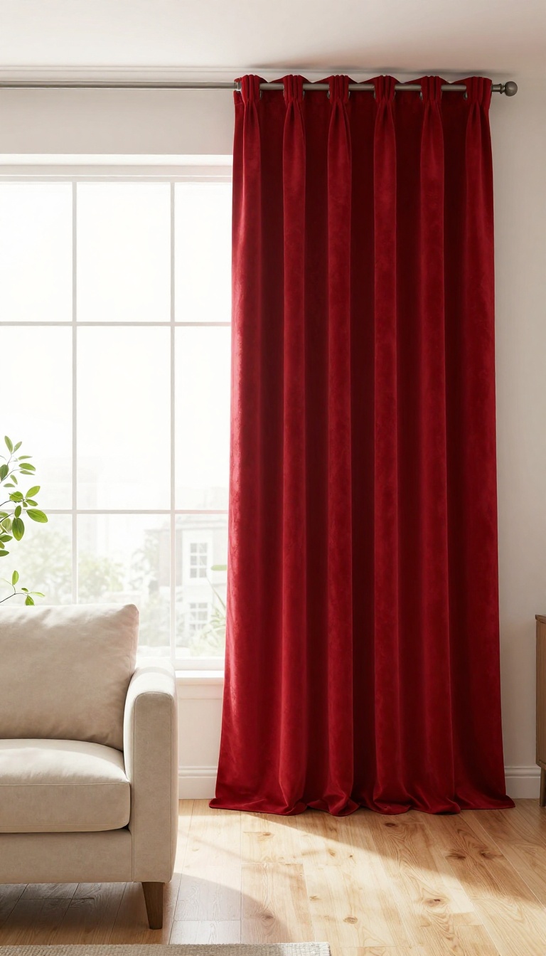
Curtains are often an afterthought, but in a red living room, they can be the main event. Floor-to-ceiling panels in a rich red instantly add height, color, and a sense of occasion. They frame the windows, soften the light, and make the whole space feel more intentional.
The best part? You don't have to commit to red walls or a red sofa to get the effect. Curtains are a low-commitment way to test how red feels in your room.
And if you love it, they'll become the detail everyone remembers.
Red curtains bring a theatrical quality that few other decor elements can match. They draw the eye upward, making ceilings feel taller and windows feel grander. Whether you choose breezy sheers or heavy velvet, the color alone shifts the room's personality.
Think about how you use the space. If you want a cozy, enveloping feel, go for a heavier fabric that blocks light and insulates. If you want a lighter, more airy look, sheers in a softer red will do the trick without weighing things down.
Pick Your Fabric: Sheer Vs. Velvet
Sheer red curtains let daylight filter through, casting a warm glow across the room. They're perfect for spaces where you want a hint of red without full commitment. Velvet, on the other hand, is all about luxury and drama.
It absorbs sound, blocks light, and adds a plush texture that feels expensive. Both work—just decide whether you want breezy or bold.
Hang Them High And Wide
Mount the rod close to the ceiling and extend it several inches past the window frame on each side. This trick makes windows appear larger and lets more light in when the curtains are open. For floor-to-ceiling drama, hem them so they just brush the floor.
A small puddle can look elegant too, but too much fabric pooling can feel messy.
Layer With Blinds Or Shades
For flexibility, pair red curtains with simple blinds or shades in a neutral tone. During the day, keep the curtains open to show off the red edges. At night, close everything for a cozy, cocooning effect.
This layering also helps with insulation and light control, making your living room more comfortable year-round.
10. Pair Red with Brass and Gold Accents
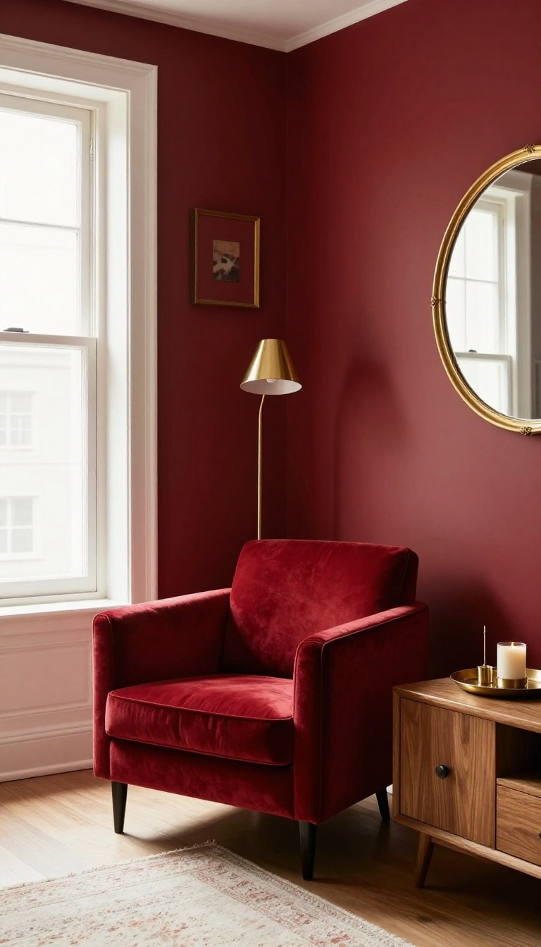
Red and metallics are a natural match. Brass and gold bring out the warmth in red, making it feel richer and more layered. The shine also adds a bit of drama without competing with the color.
You don't need a lot of metallic to make an impact. A few well-placed pieces can transform the whole room. Think of brass and gold as the jewelry of your living room—they catch the light and draw the eye.
The key is balance. Let the red be the star, and use metallics to support it. Here's how to do it right.
Choose The Right Metallic For Your Red
Not all metallics play nicely with every shade of red. Warm reds with orange or yellow undertones love brass and gold. Cool reds with blue undertones pair better with silver or nickel, but brass can still work if you keep it minimal.
If you're unsure, test a small brass object against your red wall or furniture. See how it looks in different lighting. Natural light brings out different tones than artificial light, so check both.
Brass with a slightly aged or brushed finish tends to look more sophisticated than shiny gold. It feels less flashy and more timeless.
Where To Add Brass And Gold
Lighting is the easiest place to start. Swap out a plain lamp base for a brass one, or add a gold floor lamp near a red armchair. The metallic will reflect the red and create a warm glow.
Picture frames are another simple swap. Gold frames around art or mirrors add a touch of luxury. If you have a gallery wall, mix in a few brass frames with wood or black ones for variety.
Small accessories like vases, candle holders, or trays can also bring in metallic. A copper vase on a red side table adds a pop of shine without overwhelming the space.
Keep It Balanced
Too much metallic can make a room feel cold or cluttered. Aim for a few key pieces rather than covering every surface. Let the red remain the focus.
Mix metals if you want, but stick to two types at most. For example, brass and copper work well together because they're both warm. Adding silver might dilute the effect.
Also, consider the finish. Matte brass feels more casual, while polished gold is more formal. Match the finish to the overall vibe of your living room.
11. Use Red in a Gallery Wall
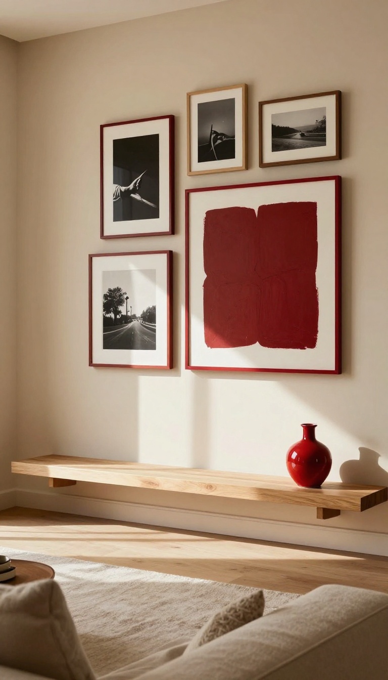
Gallery walls already tell a story about who you are. Adding red to the mix gives that story a pulse. It's a smart way to bring warmth and drama into the room without turning every wall into a statement.
You get the color, but you also get control.
Red in a gallery wall works because it's contained. Each frame, print, or object holds its own small dose of color, so the eye moves around the arrangement instead of getting stuck. That's how you keep red from taking over.
You're not painting the room red. You're curating it in. The best gallery walls feel collected, not decorated.
Red gives you a built-in thread to tie mismatched pieces together. A red frame here, a red abstract there, a small red ceramic object on a shelf nearby. Suddenly the whole wall feels intentional.
Start with what you already own. Pull out any art with red in it, even if it's just a tiny accent. Then build around those pieces with neutrals, black-and-white photos, or warm wood tones.
The red doesn't need to be loud. It just needs to repeat.
Mix Red Frames With Neutral Art
A red frame around a black-and-white photo does more than a red painting sometimes. The contrast makes both the color and the image pop. Try one or two red frames in a larger grid of black, white, or wood.
It reads as deliberate, not chaotic. If you want more red, add a second frame in a deeper shade like burgundy or brick.
Let One Red Piece Anchor The Wall
Pick a single red artwork as the focal point, then arrange smaller neutral pieces around it. This keeps the wall from feeling busy. The red piece can be a bold abstract, a vintage poster, or even a textile in a frame.
Everything else supports it. That's how you get drama without the room feeling like a fire alarm.
Add Red Through Objects, Not Just Art
Gallery walls don't have to be all frames. Hang a small red ceramic plate, a woven wall hanging with red threads, or a sculptural piece on a shelf below. These objects add texture and a different kind of red.
They also break up the flatness of a frame-only wall. Mixing materials makes the color feel richer.
Keep The Layout Loose And Personal
Don't overthink the grid. A slightly uneven, collected arrangement feels more like you. Lay everything on the floor first and move pieces around until the red feels balanced.
You want the eye to travel, not stop dead. Once it's up, live with it for a week before you adjust anything. Gallery walls settle in over time.
12. Try a Red Ceiling for a Surprise Element
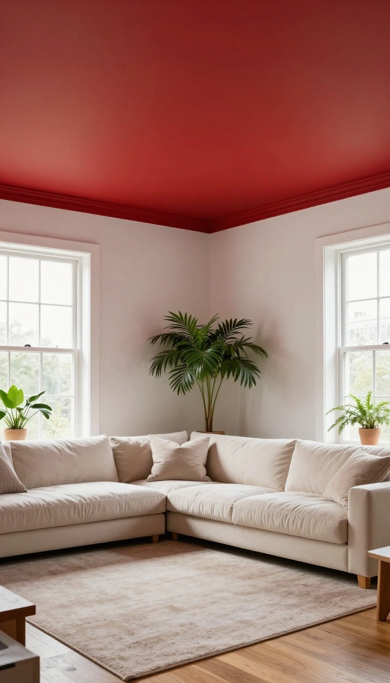
Most people never think to look up when they decorate. That’s exactly why a red ceiling works so well—it catches everyone off guard. The moment someone steps into the room, their eyes drift upward, and the whole space feels instantly more dramatic.
The ceiling becomes the star without screaming for attention at eye level. Keep your walls calm and neutral, and the red overhead does all the talking. It’s a simple swap that delivers a big payoff.
A red ceiling flips the usual decorating logic. Instead of anchoring the room with a bold wall or a bright sofa, you lift the energy above your head. The result is a room that feels taller, warmer, and a little bit unexpected.
You don’t need a massive budget or a professional painter to pull it off. A gallon of paint and a free weekend can completely change how the space feels. The key is balancing that overhead punch with a quiet foundation below.
Pick The Right Red For Overhead
Ceilings catch less direct light than walls, so colors often read darker up there. A deep brick red or muted terracotta can turn almost black in a dim room. If you want the red to stay true, choose a shade one or two steps lighter than you think you need.
Warm reds with a hint of orange or brown feel cozy and grounded. Cooler reds with blue undertones can feel sharp and modern. Test a sample on a piece of foam board and hold it up to the ceiling at different times of day before you commit.
Keep The Walls Quiet
The ceiling can’t be the surprise if everything else is shouting too. Stick with soft whites, warm creams, or light greiges on the walls. Those neutral tones give the red above a clean stage to perform on.
If you want a little more depth, paint the trim the same color as the walls instead of bright white. That keeps the focus upward and makes the red feel intentional rather than random.
Balance The Room Below
A red ceiling changes the light in the room, so your furniture and fabrics will look a bit different. You might notice warm wood tones glow more, while cool grays can feel a little muddy. Add a few red accents down low—a throw pillow, a vase, a rug with a red thread—to tie the ceiling into the rest of the space.
Metallic finishes like brass or aged bronze also help bridge the gap. They reflect the red overhead and keep the room from feeling top-heavy.
13. Balance Red with Plants and Natural Textures
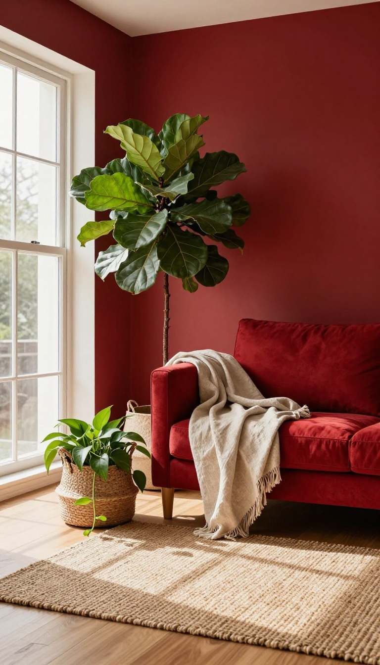
Red brings heat. Plants and natural textures bring life. Put them together and the room stops shouting and starts breathing.
You're not diluting the drama. You're giving it somewhere to land. A deep crimson wall feels richer when a monstera leaf cuts across it.
A red sofa feels more inviting when a linen throw is draped over one arm. This is the easiest way to make red livable without losing its punch. A few green leaves and a basket or two can change everything.
The goal here is contrast that feels organic, not staged. Red is intense and saturated. Plants and natural materials are softer, more irregular, more relaxed.
When they sit side by side, each one makes the other look better. You don't need a jungle or a rustic cabin vibe. You just need enough green and texture to break up the red so your eye has places to rest.
Think of it as giving the room a little breathing room. Start with one or two large plants near the red focal point. Then layer in natural textures through rugs, baskets, or throws.
That's it. The balance happens on its own.
Pick Plants That Hold Their Own
Not every plant can stand next to bold red. You want something with presence. A fiddle leaf fig, a rubber tree, or a large snake plant works because their leaves are big and structured.
They won't disappear against a red wall. Hang a pothos or philodendron near a red bookshelf and let the vines trail down. The green softens the shelf's edge and adds movement.
Just make sure the plant gets enough light, or it'll look sad instead of lively. If you're not great with live plants, dried branches or preserved eucalyptus still give you the same effect. The point is the color and shape, not whether it's growing.
Layer In Rattan, Jute, And Linen
Natural textures keep red from feeling too polished or too heavy. A jute rug under a red sofa grounds the whole seating area. Rattan chairs or a woven pendant light add warmth without competing with the red.
Linen is your best friend for upholstery and curtains. It has a slight slub and a matte finish that contrasts nicely with red's intensity. A linen slipcover on a red armchair tones it down just enough.
Wood works too. A raw oak coffee table or a reclaimed wood shelf brings an earthy note that makes red feel more grounded. Skip the glossy finishes here.
You want texture you can see and almost feel.
Use Green As A Repeat, Not A Flood
You don't need green walls or a green sofa. Small repeats are enough. A green ceramic vase on a red console.
Green throw pillows on a red couch. A green glass lamp base on a side table. These little moments tell your eye that green belongs here.
They also keep the room from feeling like a red theme park. The green doesn't have to match. Olive, emerald, and sage all work with most reds.
If you want to go bigger, try a green rug or a green ottoman. Just keep the rest of the room neutral so the red and green can do their thing without a fight.
FAQ
What shades of red work best in a living room?
Warm shades like brick, terracotta, and burgundy tend to work best because they feel cozy and inviting. Cooler reds can feel harsh, so test samples in your lighting before committing.
How do I keep a red living room from feeling overwhelming?
Balance red with neutrals, natural textures, and plenty of lighting. Use red as an accent or on one focal wall instead of covering every surface.
Can I use red in a small living room?
Yes, but be strategic. A red accent chair, rug, or curtains can add warmth without shrinking the space. Avoid dark red on all walls in a small room.
What colors pair well with red in a living room?
Cream, tan, gray, navy, and forest green all pair beautifully with red. Metallic accents like brass and gold also complement red's warmth.
Is red still a popular choice for living rooms?
Absolutely. Red remains a classic choice for adding warmth and personality. Modern takes often use it as an accent rather than the dominant color.
Conclusion
Red living rooms don't have to be loud or overwhelming. With the right balance of color, texture, and light, red can make your space feel warm, welcoming, and full of character. Start with one idea that speaks to you, whether it's a velvet sofa or a simple rug.
You can always layer in more red as you go. The goal is a room that feels like you, only a little more dramatic.