15 Brown and Yellow Living Room Ideas Full of Warm Contrast
Brown and yellow can go one of two ways: rich and inviting, or straight out of a 1970s basement. The difference usually comes down to contrast, texture, and how you balance the shades.
You don't need a full renovation to get it right. A few smart swaps—like a mustard throw, a chocolate accent wall, or a caramel leather chair—can shift the whole mood.
These 15 ideas cover everything from bold to subtle, so you can pick what fits your space and your budget. Each one solves a specific problem, like a room that feels too dark or too flat.
1. Mustard Yellow Accent Wall with Brown Furniture
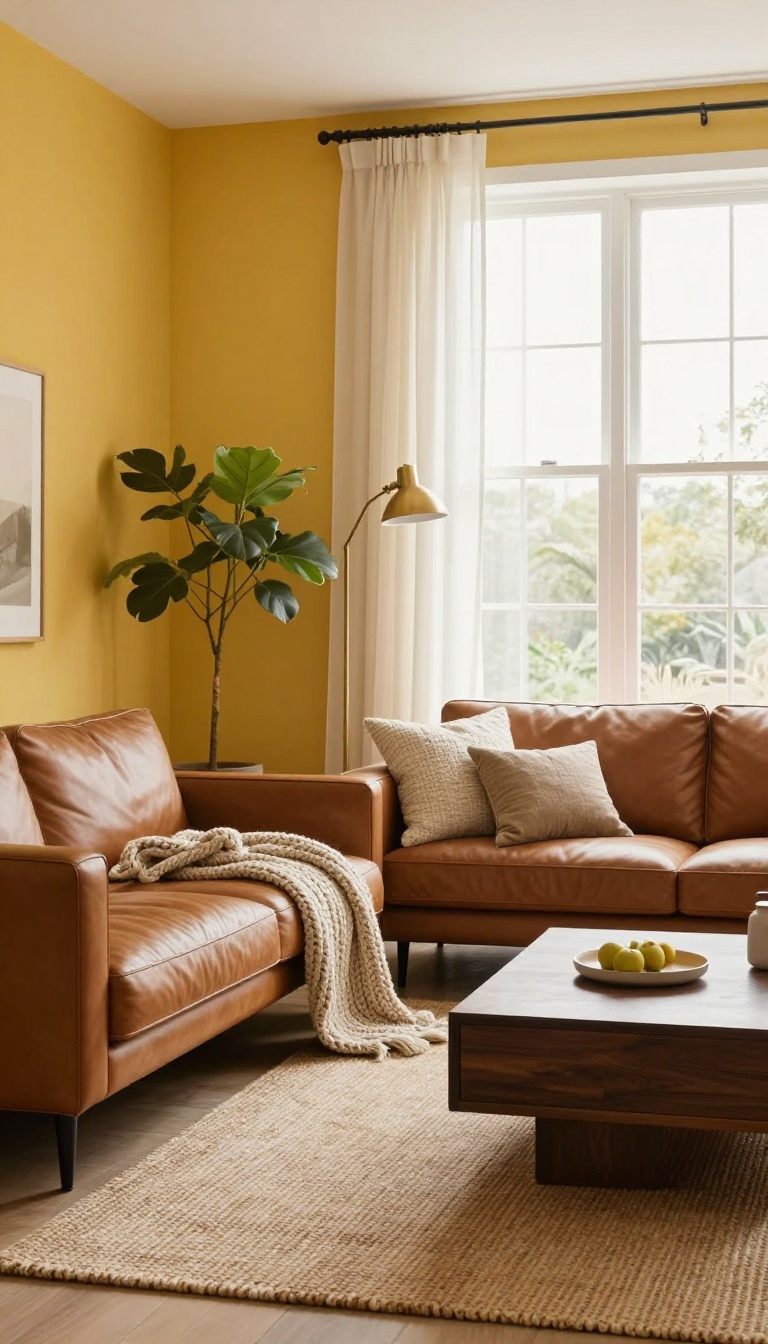
A single mustard yellow wall can wake up a room that feels flat and forgettable. Pair it with brown wood or leather furniture, and you get warmth that feels intentional, not overwhelming. The key is letting the yellow lead while the brown grounds everything.
Mustard yellow is bold enough to make a statement, but it's also earthy and easy to live with. When you paint just one wall, you get all that energy without turning the whole room into a sunflower. Brown furniture—whether it's a worn leather sofa or a dark wood console—adds weight and keeps the yellow from floating away.
This combo works in living rooms of any size because the contrast does the heavy lifting. You don't need to match every shade perfectly; a little variation in tone makes it feel collected over time.
Pick The Right Wall
Choose a wall that already gets some natural light, or one that faces the main seating area. That way, the yellow feels like a backdrop instead of a cave. Avoid painting a wall with lots of doors or windows—it breaks up the color and weakens the effect.
A solid, uninterrupted wall gives you the biggest impact for the least effort.
Balance With Brown
Brown furniture doesn't have to mean dark and heavy. A caramel leather chair, a walnut coffee table, or even a woven jute rug can do the job. The goal is to repeat brown tones at least twice in the room so the yellow doesn't feel random.
If your brown pieces are light, add a darker wood frame or a chocolate throw to deepen the contrast.
Add Texture And Light
Mustard yellow can look flat if everything else is smooth. Mix in a chunky knit blanket, a rattan basket, or a linen curtain to give the wall something to play against. A brass floor lamp or a warm white bulb will make the yellow glow instead of turning it green.
Keep the rest of your palette neutral—cream, tan, and soft white—so the yellow and brown stay the stars.
2. Caramel Leather Sofa on a Honey Yellow Rug
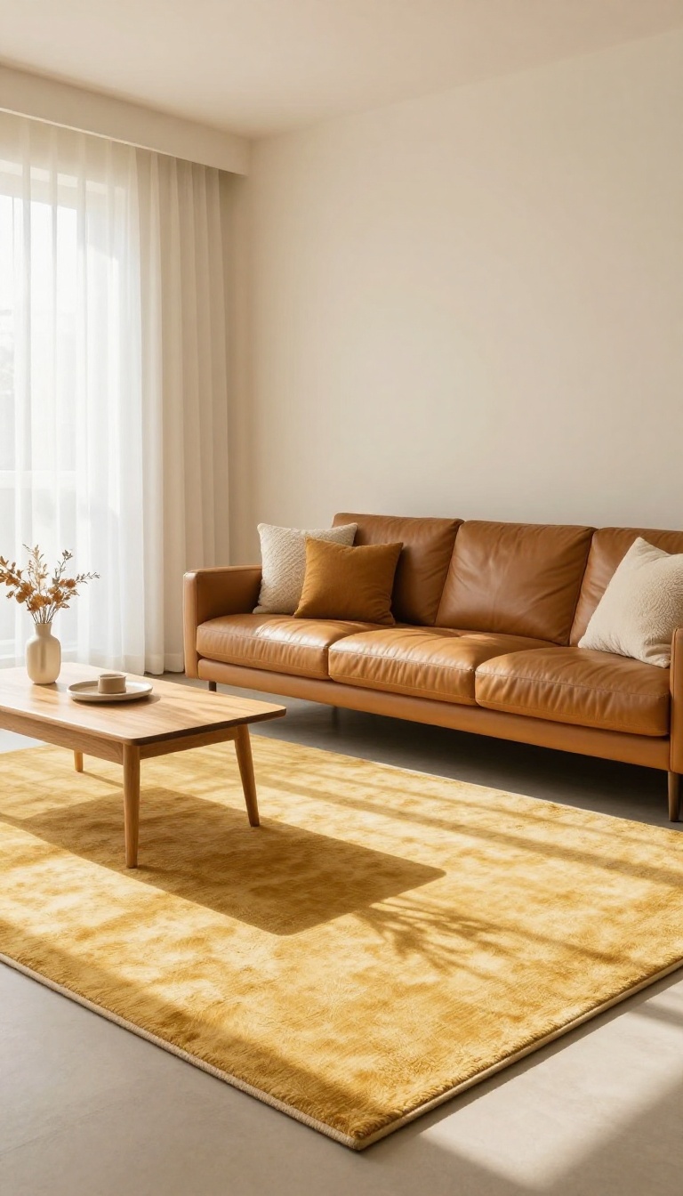
A caramel leather sofa brings instant warmth, but its rich tone can sometimes make a room feel heavy. Placing it on a honey yellow rug flips that script. The rug acts like a soft glow underfoot, lifting the sofa and adding a layer of airy contrast.
The trick is in the balance: the caramel stays grounded, while the honey yellow keeps things light. It's a simple pairing that works in both small and large spaces.
A caramel leather sofa is a statement piece. It's durable, ages beautifully, and adds a cozy, lived-in feel. But without the right foundation, it can dominate a room and make it feel smaller than it is.
That's where a honey yellow rug comes in. The warm, golden tones of the rug echo the sofa's caramel hues but in a lighter, more luminous way. The result is a space that feels grounded yet open, cozy yet not cramped.
This combination works because it plays with contrast in both color and texture. Leather is smooth and reflective; a plush rug is soft and matte. Together, they create visual interest without competing.
The honey yellow also bounces light around the room, which is especially helpful in spaces with limited natural light. You don't need to overthink the rest of the decor. Keep the walls neutral, add a few textured pillows, and let the sofa and rug do the heavy lifting.
It's an easy way to get that warm, inviting look without feeling like you're stuck in a time capsule.
Why The Combo Works
Caramel and honey yellow sit next to each other on the color wheel, so they harmonize naturally. The rug's lighter shade keeps the sofa from feeling like a dark blob. It's a subtle contrast that adds depth without shouting.
Picking The Right Rug
Look for a honey yellow rug with a low to medium pile. A flatweave or vintage-style rug works well because it doesn't compete with the leather's texture. Size matters too: the rug should extend at least a few inches beyond the sofa's front legs to anchor the seating area.
Styling Around It
Keep other elements simple. A couple of cream or rust-colored throw pillows, a wooden coffee table, and a floor lamp with a warm bulb will enhance the glow. Avoid cool-toned accents like icy blues or grays—they can clash with the warmth.
3. Chocolate Brown Walls with Golden Yellow Curtains
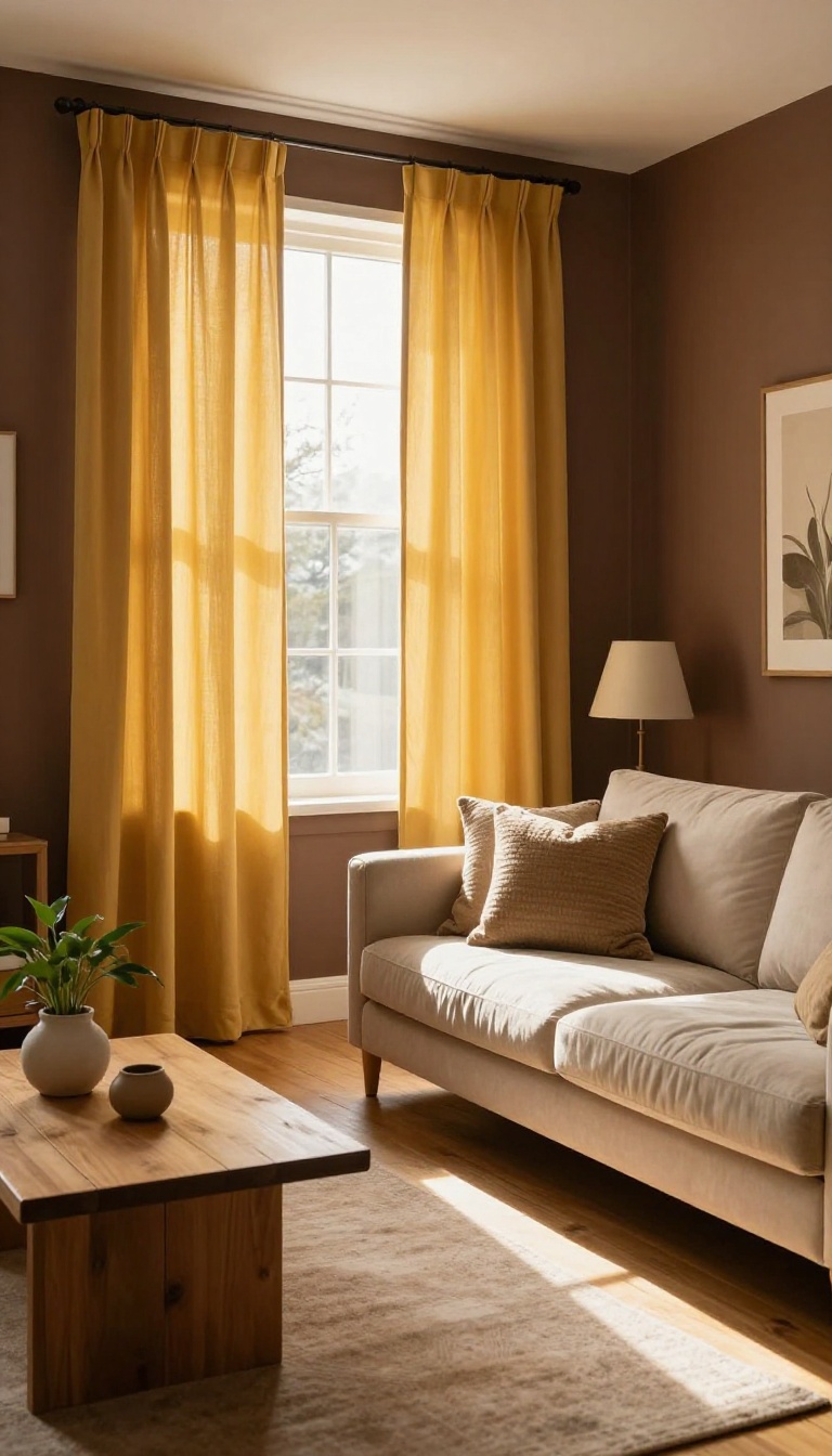
Painting a room chocolate brown can feel like a bold move—until you realize it's basically a cave. The color absorbs light, shrinks the space, and can make even a sunny day feel like midnight. Golden yellow curtains flip that script.
They bounce light around, add a soft glow, and bring just enough movement to keep the dark walls from feeling flat. Suddenly, that moody brown becomes a dramatic backdrop instead of a black hole. The trick is picking the right shade of yellow and hanging the curtains so they actually work with the walls, not against them.
Chocolate brown walls have a reputation for being heavy, and for good reason. They soak up light like a sponge, which can make a room feel cozy in a cabin sort of way—or suffocating in a small apartment. The fix isn't to repaint; it's to introduce a light source that feels intentional.
Golden yellow curtains do exactly that. They're bright without being neon, warm without being orange, and they catch whatever light you have, whether it's from a window or a lamp. The contrast works because brown and yellow are neighbors on the color wheel.
Brown is just a dark, muted yellow, so pairing them feels harmonious instead of jarring. The curtains become the focal point, and the walls recede into a rich, supportive background. You get drama without the doom.
But not all yellows are created equal. A pale butter yellow might wash out against dark brown, while a bold sunflower could clash. Golden yellow—think honey, marigold, or a muted mustard—has enough depth to hold its own.
It also plays well with other warm tones like brass, cognac leather, and cream trim. Fabric matters too. Heavy velvet curtains in golden yellow add luxury and block drafts, while lightweight linen or cotton keeps things breezy.
If you want maximum glow, go with a slight sheen. If you prefer a softer look, choose a matte finish. Either way, the curtains should feel like a deliberate choice, not an afterthought.
Hang them high and wide. Mount the rod close to the ceiling and extend it a few inches past the window frame on each side. This makes the window look bigger and lets the curtains pool slightly on the floor, which adds to the dramatic vibe.
Skip the tiebacks if you want a clean, modern feel, or use them to create a gentle curve that softens the room's angles. One more thing: don't forget the trim. If your walls are chocolate brown, white or cream baseboards and crown molding will sharpen the contrast and keep the room from feeling like a fuzzy blur.
The yellow curtains then become the star, not the only thing holding the room together.
Why This Combo Works
Brown and yellow are natural partners. Brown is essentially a dark yellow, so the two colors share an undertone that makes them feel related. When you put golden yellow curtains against chocolate walls, you're not creating tension—you're creating depth.
The yellow lifts the brown, and the brown grounds the yellow. It's a balancing act that feels effortless once you see it in place.
Choosing The Right Yellow
Stay away from lemon or pastel yellows; they'll look washed out against dark brown. Instead, look for golden, honey, or mustard tones. These shades have enough pigment to stand out without screaming.
If you're unsure, hold a fabric swatch against the wall in both daylight and evening light. The right yellow will look warm and inviting in both.
Hanging And Styling Tips
Hang your curtains as high as possible—ideally right below the ceiling or crown molding. This draws the eye upward and makes the room feel taller. Let them graze the floor or pool slightly for a relaxed, luxurious look.
Add a brass or black rod to tie in with other metals in the room, and keep the rest of the decor simple so the curtains remain the focus.
4. Butterscotch Throw Pillows on a Brown Sectional
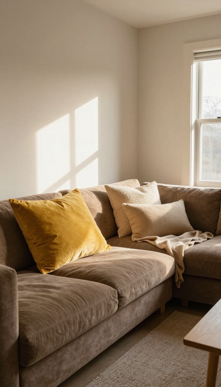
A brown sectional is a workhorse piece—durable, roomy, and neutral enough to handle daily life. But sometimes it feels a little too neutral, like it's waiting for someone to give it a personality. That's where butterscotch throw pillows come in.
They add a pop of yellow that's warm and inviting, not loud or permanent. You get the lift of color without repainting walls or buying new furniture.
Butterscotch sits in that sweet spot between yellow and orange, so it plays nicely with almost any shade of brown. On a dark chocolate sectional, it glows like a little lantern. On a lighter tan or caramel sofa, it adds just enough contrast to keep things interesting.
The best part? Pillows are easy to swap, so you're never stuck with a look you don't love.
Mix Textures For Depth
One butterscotch pillow is nice, but a mix of textures makes it feel intentional. Try pairing a smooth velvet pillow with a nubby linen one. The light hits them differently, so the color seems to shift throughout the day.
Add a third in a woven cotton or boucle, and you've got a little collection that feels curated, not cluttered.
Play With Size And Placement
Don't just line up identical pillows like soldiers. Start with two large butterscotch pillows in the corners, then layer a smaller lumbar pillow in front. Or mix in a patterned pillow that has butterscotch as one of its colors.
That way, the yellow feels connected to the rest of the room instead of floating on its own.
Balance The Rest Of The Room
Since butterscotch is a warm color, it pairs well with other warm tones like rust, olive, or cream. If your room leans cool with gray walls or blue accents, the pillows will still work—they'll just stand out more. In that case, repeat the butterscotch somewhere else, like a vase or a throw blanket, so it doesn't look random.
5. Yellow Ochre Artwork Above a Walnut Console
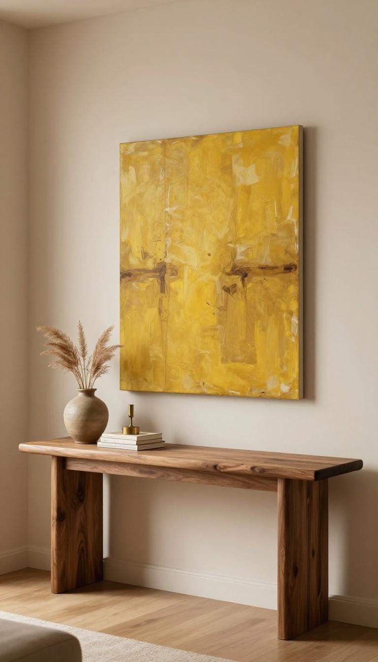
A walnut console against a bare wall can look like it's waiting for something. The wood is beautiful, but without a focal point, the arrangement feels incomplete. That's where a large piece of yellow ochre artwork comes in.
It bridges the brown and yellow in your room, creating a cohesive look that feels intentional.
Hanging art above a console isn't just about filling space. It's about creating a visual anchor that ties the room together. Yellow ochre—a earthy, muted yellow—pairs perfectly with walnut's rich brown tones.
The artwork becomes the connector, pulling the eye and balancing the palette. But size and placement matter. Too small, and it gets lost.
Too high, and it floats. You want the art to feel like it belongs to the console, not like an afterthought. Here's how to get it right.
Pick The Right Scale
The artwork should be about two-thirds the width of your console. If your console is 60 inches wide, aim for a piece around 40 inches. That ratio keeps things balanced.
A piece that's too small will make the console look oversized, while one that's too large can overwhelm the space.
Hang It At Eye Level
The center of the artwork should sit around 57 to 60 inches from the floor. That's standard gallery height. But if your console is tall, you might need to adjust.
Leave 6 to 8 inches between the bottom of the art and the top of the console. This gap prevents the art from feeling cramped.
Choose Ochre With Depth
Not all yellows are equal. Look for ochre with brown undertones—think mustard, amber, or burnt gold. These shades echo the walnut and add warmth.
A bright lemon yellow might clash. Abstract pieces with layers of ochre and brown work especially well because they mirror the room's mix.
Style The Console Below
Keep the console top simple so the art stands out. A pair of small lamps, a stack of books, or a single ceramic bowl is enough. Avoid clutter.
The artwork is the star here, and the console is its stage.
6. Tan Walls with Mustard and Brown Patterned Drapery
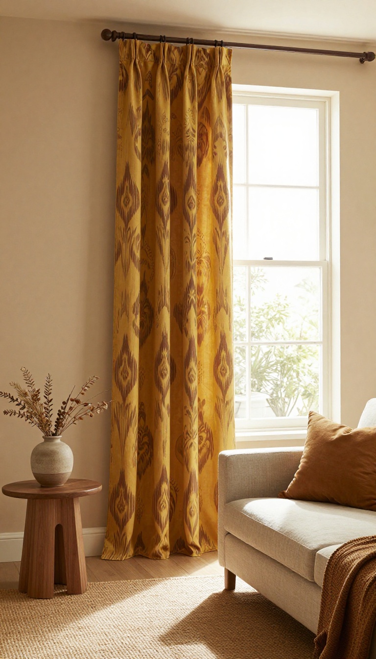
Tan walls are the quiet friend in the room—reliable, easy to live with, but not exactly the life of the party. They don't demand attention, and that's often why they end up feeling a little forgettable. The fix isn't repainting.
It's giving those walls something to talk to. Patterned drapery in mustard and brown does exactly that. It frames the windows with color and movement, pulling the eye up and outward instead of letting it settle on a flat beige backdrop.
Suddenly the tan isn't boring—it's the calm that makes the pattern pop.
Think of drapery as the jewelry of a room. You wouldn't wear a plain outfit with no accessories and expect it to feel finished. Tan walls are the outfit; mustard and brown patterned drapes are the necklace that makes people look twice.
The key is choosing a pattern that feels intentional, not accidental. A small geometric print reads modern. A loose botanical or medallion motif leans traditional.
Either way, the mustard brings warmth and the brown grounds it, so the window becomes a focal point instead of an afterthought.
Pick A Pattern That Plays Well With Tan
Tan is essentially a muted orange-brown, so it already shares DNA with both mustard and brown. That means you have room to go bolder than you think. A large-scale ikat or a block-print floral in mustard and chocolate will feel cohesive, not chaotic.
Avoid patterns with too much white or gray—they can make tan look dingy by comparison. Stick to warm undertones and you'll keep the whole wall looking rich.
Get The Scale Right For Your Windows
A tiny print on a huge window can look like static from across the room. A giant pattern on a small window can feel overwhelming. Match the scale of the print to the size of the window, not the wall.
Floor-to-ceiling panels in a medium-scale pattern are the sweet spot for most living rooms. They add height and drama without turning the window into a circus.
Hang Them High And Wide
Mount the rod close to the ceiling and extend it several inches past the window frame on each side. This makes the window look bigger and gives the drapes room to breathe. When the panels stack back, you should still see plenty of pattern.
If they bunch up too tightly, the effect gets lost. Let them hang with a gentle wave, not a crush.
Tie The Rest Of The Room Together
Once the drapes are up, echo those colors in small doses. A mustard throw pillow, a brown leather ottoman, or a brass floor lamp will make the pattern feel like part of a plan. You don't need to match everything.
Just repeat the hues once or twice so the eye has a path to follow around the room.
7. Brown Wicker Chair with Yellow Cushions
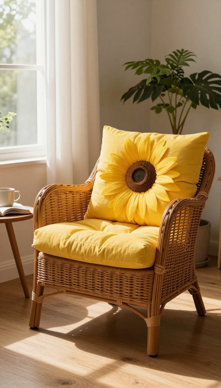
A brown wicker chair has a way of blending into the background—or worse, looking like it never left your grandmother's sunroom. The woven texture is great, but the color can read as dull and dated. Bright yellow cushions are the fix.
They wake up the chair, add a pop of cheer, and turn a forgotten corner into the coziest reading spot in the house.
You don't need to replace the chair. Just swap the cushions. A pair of sunny yellow seat and back cushions instantly modernizes the look.
The contrast between the warm brown weave and the zesty yellow keeps things interesting without feeling chaotic. It's a small change with a big payoff. This combo works because yellow is energetic and brown is grounding.
Together, they create a balanced vibe that feels fresh but still inviting. Whether your chair is in a living room, bedroom, or sunroom, it becomes a focal point for all the right reasons.
Pick The Right Yellow
Not all yellows are created equal. A soft butter yellow feels calm and subtle, while a bold lemon or sunflower shade makes a louder statement. If your room already has a lot of warm tones, go for a brighter yellow to cut through.
If you want something more relaxed, choose a muted mustard or honey tone. Hold a few swatches next to the chair in natural light to see what clicks.
Cushion Style And Fit
Wicker chairs come in all shapes and sizes, so fit matters. Measure your seat and back before you buy. Look for cushions with ties or non-slip backs so they stay put.
A thick, high-density foam cushion will feel comfortable for long reading sessions. If you can't find the perfect size, a custom cover is an easy DIY project.
Style Around The Chair
Once the chair is updated, build on it. Add a small side table for a lamp and a cup of tea. Drape a soft throw blanket over one arm for extra texture.
A potted plant nearby brings in a touch of green that plays nicely with yellow. Keep the surrounding decor simple so the chair remains the star.
8. Golden Yellow Floor Lamp Next to a Brown Recliner
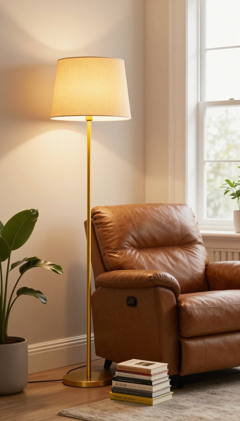
Dark corners are where good living rooms go to die. A brown recliner parked in one can feel like a black hole—comfortable, but invisible. A golden yellow floor lamp changes that in about five minutes.
The lamp becomes a bright anchor. It pulls the eye, warms the leather or fabric, and makes the chair look intentional instead of forgotten. You get light where you actually sit, not just overhead glow that leaves the corner dim.
This setup works because yellow and brown are natural partners. The brown grounds the space; the yellow lifts it. No repainting, no new furniture—just one well-placed light.
Pick The Right Shade Of Yellow
Golden yellow leans warm, almost honey-like. It flatters brown without turning brassy. Avoid neon or lemon tones—they fight the cozy vibe.
A matte or brushed gold finish on the lamp base keeps things subtle.
Placement That Actually Works
Put the lamp behind or just beside the recliner’s shoulder. That way the light falls over your reading material, not into your eyes. Keep it about 12 to 18 inches from the chair so it feels connected, not crowded.
Bulb And Brightness Tips
Use a warm white bulb around 2700K. Anything cooler makes the yellow look green. A dimmable bulb lets you go from bright task light to soft evening glow without moving a thing.
9. Brown Bookshelves Styled with Yellow Accents
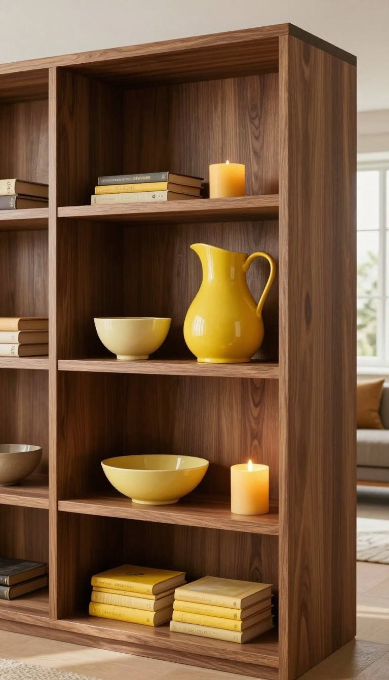
A wall of brown bookshelves can anchor a living room beautifully, but it can also turn into a dark, heavy mass that swallows the space. The fix isn't to repaint or replace them—it's to interrupt all that brown with small, bright moments of yellow. Think of it as adding punctuation to a long, serious sentence.
A few well-placed yellow pieces make the shelves feel intentional, lively, and far less like a solid block of wood.
Yellow works on brown shelves because the two colors share a warm base. Mustard, honey, and soft butter tones feel natural next to walnut, oak, or espresso finishes. The trick is to scatter the yellow instead of clustering it.
You want the eye to bounce around the shelves, not stop at one bright spot. Start with what you already own—books, ceramics, a candle—and build from there.
Use Books As Your Base
Books are the easiest yellow accent because they're already there. Pull every yellow-spined book you own and group them in loose stacks of three or four. Place one stack on a middle shelf and another on a lower shelf to create a diagonal rhythm.
If your collection is thin, turn a few books spine-in so the pages show, then tuck a yellow vase or bowl in front. This breaks up the brown without buying a thing.
Add Yellow Ceramics And Vases
A single yellow vase on a brown shelf reads like a lit candle in a dark room. Choose matte finishes over glossy ones—they feel more collected and less like a store display. Mix heights: a tall yellow pitcher on the top shelf, a small yellow bowl on a lower one.
If you want a softer look, go for pale butter yellow instead of bright lemon. Two or three pieces across a full wall of shelves is usually enough.
Balance With Texture And Negative Space
Yellow accents pop harder when the shelves around them breathe. Leave a few gaps between objects so the brown wood shows through as a frame. Add texture with woven baskets, rough pottery, or a linen-covered box in a muted gold tone.
Avoid putting yellow next to every brown item—space them out so each one gets its own moment. The goal is contrast, not clutter.
10. Yellow and Brown Striped Area Rug Under a Glass Coffee Table
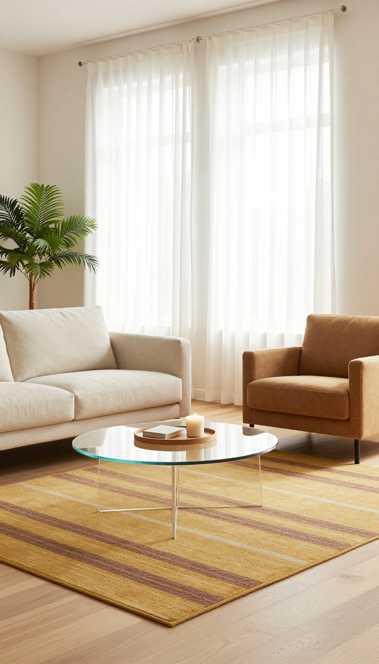
A glass coffee table is a sleek choice, but on a bare floor it can almost vanish. The fix is simple: slide a striped yellow and brown rug underneath. The stripes give the eye something to follow, and the warm colors keep the room from feeling cold.
Suddenly the table has a home, and the seating area feels intentional.
This setup works because the rug does two jobs at once. It anchors your furniture arrangement, and it adds a dose of warmth that glass and metal tend to lack. The stripes also bring a subtle energy that plain floors don't have.
You get contrast without clutter.
Why Stripes Work With Glass
Glass tables are see-through, so they don't visually hold a space the way wood or stone does. A striped rug gives the table a base, making it look grounded instead of floating. The lines also draw attention downward, which balances the airy feel of glass.
Choose stripes that are medium-width—thin lines can look busy, and wide bands can overwhelm a small room.
Picking The Right Yellow And Brown Tones
Stick with yellows that lean warm, like mustard, honey, or ochre. Pair them with browns in chocolate, camel, or espresso. If your room already has a lot of dark wood, go with a lighter brown stripe to keep things from feeling heavy.
For a brighter space, a deeper brown adds welcome depth. The goal is contrast that feels cozy, not muddy.
Styling Around The Rug
Keep the glass table mostly clear so the rug pattern stays visible. A small tray with a candle or a single book is enough. Choose a sofa or chairs in a solid neutral—cream, tan, or soft gray—so the stripes remain the star.
Add one or two yellow accents, like a throw pillow or a vase, to tie the rug into the rest of the room.
11. Brown Leather Ottoman with a Yellow Tray
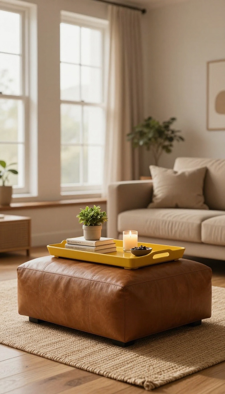
A brown leather ottoman is the workhorse of the living room. It holds your feet, doubles as extra seating, and sometimes acts as a coffee table. But left bare, it can read as a big brown blob—practical, yes, but not exactly interesting.
A yellow tray fixes that in about five seconds. It gives the ottoman a job and a focal point, turning a plain surface into a styled moment. The contrast is instant: warm brown below, bright yellow above.
Best of all, it's functional. The tray corrals drinks, remotes, and whatever else ends up on the ottoman, so the leather stays protected and the room looks pulled together.
The trick is picking a tray that adds color without fighting the leather. You want contrast, not competition. A glossy yellow tray on matte brown leather creates a nice tension—one feels polished, the other relaxed.
Size matters more than you think. The tray should cover about a third to half of the ottoman's top. Too small and it looks like a coaster; too big and you can't use the ottoman for anything else.
Style-wise, you have options. A simple round tray in mustard or marigold feels modern. A rectangular tray with a bamboo edge leans coastal.
A vintage brass tray painted yellow adds character. Any of them work as long as the yellow is clear and confident. Once the tray is in place, style it like you would a coffee table.
A small stack of books, a candle, a little plant, maybe a bowl for keys. Keep it light—three to five objects max. The tray is the star; everything else supports it.
If you want to tie the yellow into the rest of the room, repeat it once or twice. A yellow pillow on the sofa, a yellow vase on a shelf, or a piece of art with yellow in it. That repetition makes the tray look intentional instead of random.
And don't worry about matching the exact shade. Brown leather plays well with almost any yellow, from pale butter to deep ochre. Just avoid neon unless you're going for a real jolt.
Choosing The Right Tray
Look for a tray with a lip or raised edge so things don't slide off. Round, oval, or rectangular all work—just match the shape to your ottoman. If your ottoman is square, a round tray softens the lines.
If it's round, a square tray adds structure. Material matters for durability. Metal, lacquered wood, and melamine are easy to wipe down.
Avoid untreated wood if you plan to set down drinks. A yellow tray with a glossy finish reflects light and makes the color pop even more.
Styling The Tray Without Clutter
Start with one tall object, one medium, and one small. A candle, a small vase, and a dish, for example. That gives you height variation without a mess.
Leave some empty space on the tray. It's not a storage bin—it's a display. A little breathing room makes the arrangement look curated, not crowded.
If you actually use the ottoman for drinks, keep a coaster or two on the tray. They add color and protect the leather at the same time.
Tying Yellow Into The Room
You don't need much. A single yellow throw blanket draped over a chair, a yellow lampshade, or even a yellow book spine on a shelf can echo the tray. The goal is to make the yellow feel like part of a palette, not a one-off.
If your room already has warm tones—terracotta, rust, cream—yellow will blend right in. If it's cooler, with grays and blues, a yellow tray becomes a deliberate accent. Either way, it works.
12. Mustard Yellow Sofa with Brown Wood Trim
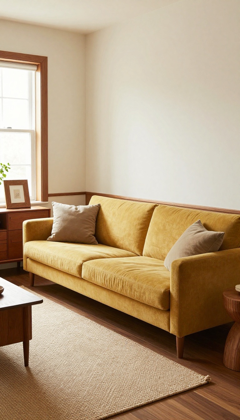
A mustard yellow sofa is not a shy piece of furniture. It grabs attention the second someone walks into the room, which is exactly why the rest of the space needs something to push back. Brown wood trim does that job quietly.
Whether it shows up on baseboards, window frames, or a vintage sideboard, the deep earthy tone keeps the yellow from floating away into cartoon territory. The pairing works because both colors come from the same warm family. Mustard is basically brown with the volume turned up, so the two shades speak the same language without matching too perfectly.
The trick is deciding how much wood you want in the frame. Too little and the sofa looks stranded. Too much and the room turns into a cabin.
Aim for three to four wood moments spread around the seating area so your eye keeps bouncing between the yellow and the brown. You also want to think about finish. A glossy walnut trim reflects light and feels more formal.
A matte oak or teak trim feels relaxed and a little coastal. Pick the finish that matches the energy you want the room to have on a random Tuesday night.
Where To Put The Wood Trim
Baseboards and door casings are the easiest win because they already exist in most homes. If yours are painted white, stripping them back to natural wood is a weekend project that changes everything. Window frames are the next best spot.
A wood frame behind the sofa gives the yellow something to lean against visually, almost like a built-in headboard. If you rent or cannot touch the trim, bring in a wood console table, a chunky wood picture frame, or a wood side table instead. The effect is the same even if the wood is not attached to the wall.
Picking The Right Brown
Not every brown plays nice with mustard. Reddish browns like mahogany and cherry make the yellow look orange, which can feel dated fast. Go for cooler or more neutral browns instead.
Walnut, espresso, and weathered oak keep the contrast crisp without turning muddy. If you already own reddish wood furniture, balance it with a few cream or off-white accents so the room does not tip into full autumn territory.
What To Add Around It
Mustard is loud, so give it a couple of quiet friends. A cream rug, a soft gray throw, or a plain linen curtain lets the sofa stay the star. One or two dark green plants work wonders here too.
The green sits between yellow and brown on the color wheel, so it bridges them without competing. Skip bright reds and oranges nearby. They fight the mustard for attention and the room starts to feel chaotic instead of cozy.
Lighting And Scale Tips
Mustard changes color depending on the bulb. Warm white light makes it glow like honey, while cool white light makes it look almost green. Stick with 2700K to 3000K bulbs in this room.
If your sofa is a large three-seater, the wood trim around it should have some visual weight too. Thin trim next to a bulky sofa looks flimsy. Thicker casings or a chunky wood coffee table balance the scale better.
13. Brown and Yellow Gallery Wall with Mixed Frames
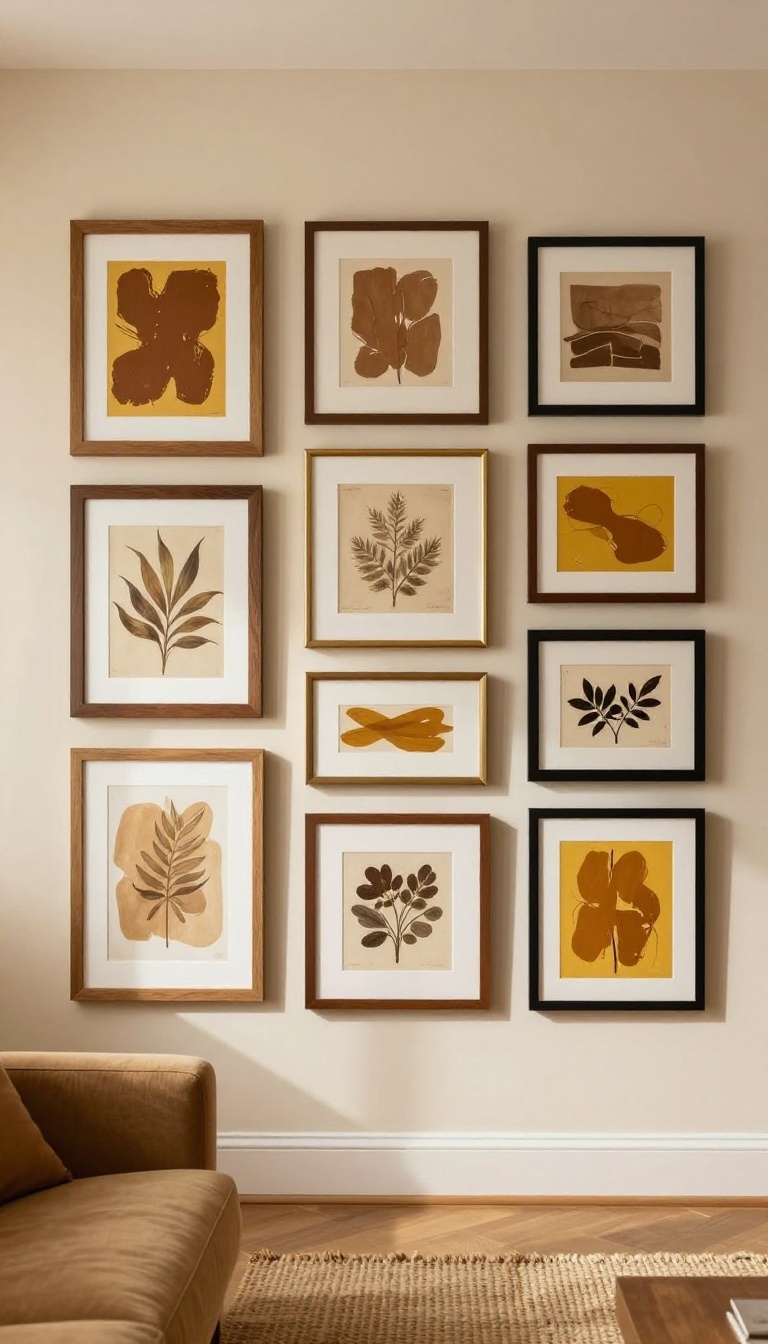
A big blank wall can make even a cozy living room feel unfinished. A gallery wall solves that, but only if it has warmth and personality. Brown and yellow art in mixed frames gives you both—a collected look that feels intentional, not matchy.
The trick is to mix tones and textures so the wall reads as one cohesive piece. Start with a few brown-heavy prints or photos, then layer in mustard, ochre, or soft yellow pieces. Vary frame sizes and finishes—wood, brass, black—to keep it interesting.
You don't need expensive art; thrifted finds, postcards, and even fabric scraps work.
Pick A Palette That Plays Well
Stick to two or three shades of brown and two of yellow. Think chocolate, caramel, and tan paired with mustard and pale butter. That range keeps the wall from looking chaotic while still feeling rich.
Mix Frames Like You Mean It
Use at least three different frame styles. A chunky wood frame next to a thin brass one and a simple black frame creates rhythm. Keep the matting consistent—white or cream—so the art pops without fighting the frames.
Lay It Out Before You Hang
Trace each frame onto paper and tape the shapes to the wall. Move them around until the spacing feels right—usually 2 to 3 inches apart. Then hammer away.
This step saves you from a dozen unnecessary holes.
14. Yellow Ceiling with Brown Walls for a Cozy Effect
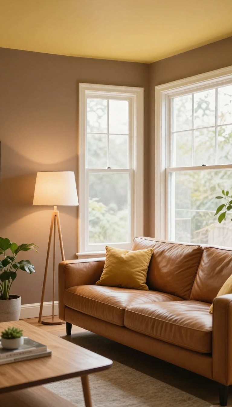
Brown walls can feel like a warm hug, but pair them with a standard white ceiling and the room starts to feel top-heavy. The white lid fights the rich walls below, making the space feel chopped in two. Painting the ceiling a soft yellow flips that dynamic.
Instead of a stark divide, you get a gentle glow that wraps the whole room in warmth.
The trick is choosing the right yellow. You want something buttery and muted, not bright lemon. Think pale straw, soft butter, or a whisper of honey.
These shades bounce light around without screaming for attention. They also soften the brown walls, making them feel intentional rather than heavy. Finish the look with warm white bulbs and maybe a subtle yellow throw.
The ceiling becomes a quiet hero, not a gimmick.
Pick A Buttery Shade
Stay away from saturated yellows that belong on a school bus. A pale, creamy yellow with a hint of warmth works best. Test a few swatches on the ceiling near a window and a lamp.
You want a color that looks like soft sunlight, not a highlighter.
Balance The Brown
If your walls are dark chocolate, a slightly deeper yellow can hold its own. For lighter tan or caramel walls, go even softer with the ceiling. The goal is contrast without competition.
A general rule: the darker the walls, the more muted the yellow should be.
Light It Right
Yellow ceilings shine with warm lighting. Swap cool white bulbs for warm white or soft white. Add a floor lamp with a linen shade to cast a gentle glow upward.
At night, the ceiling will look like it's lit from within.
15. Brown Slipcover Sofa with Yellow and White Striped Throw
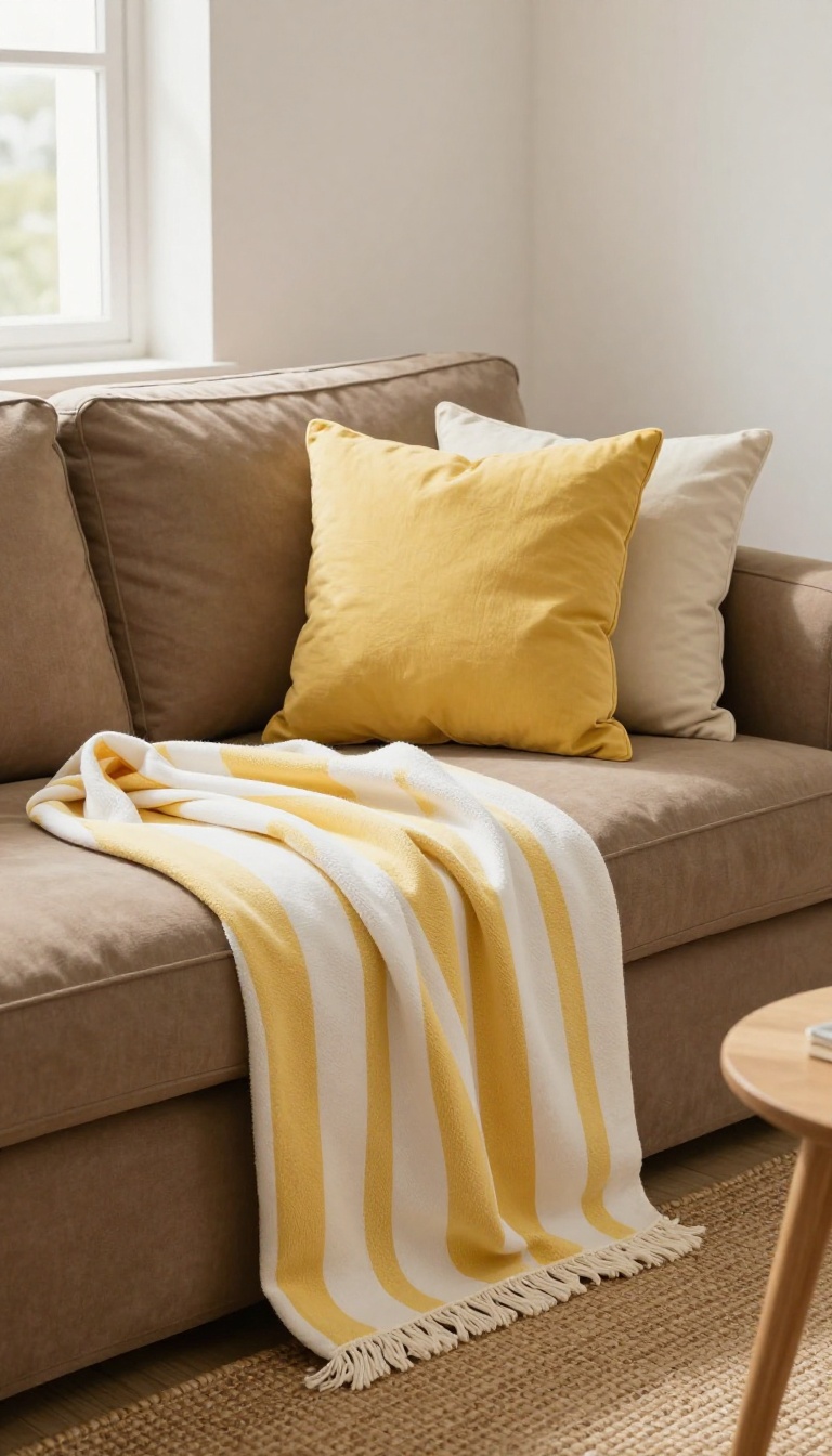
Slipcovers are the practical choice for anyone with kids, pets, or a habit of eating on the couch. But a plain brown slipcover can read as flat and a little sad, like a couch that gave up. The fix is a yellow and white striped throw, which adds crisp contrast and a breezy, nautical feel without committing to a full makeover.
The trick is to treat the throw as the personality piece and let the slipcover stay neutral. You're not fighting the brown; you're giving it something to play against. A striped throw draped across one arm or folded over the back breaks up all that solid color and instantly makes the sofa look intentional.
Why Stripes Work With Brown
Yellow and white stripes bring two things brown usually lacks: brightness and structure. The white keeps the yellow from turning muddy, and the repeating lines add visual rhythm to a big, blocky piece of furniture. It's a classic coastal combination, so the sofa ends up looking relaxed rather than heavy.
How To Drape It Without Looking Messy
Fold the throw in half lengthwise, then lay it over one arm and let the ends fall down the side. Or fold it into a wide band across the back cushions, leaving the seat clear. Either way, keep the stripes running in one direction so the eye doesn't bounce around.
Pillows And Extras That Pull It Together
Add one or two solid yellow pillows in a slightly deeper shade than the throw, plus a white or cream pillow for breathing room. A jute rug and a small wood side table reinforce the nautical vibe without going full theme park. If the room feels too sweet, swap the white for navy in a second throw or a lamp base.
FAQ
What shades of brown and yellow work best together in a living room?
Warm browns like caramel, chocolate, and walnut pair well with golden yellows, mustard, and butterscotch. Avoid cool browns with neon yellows, as they can clash.
How can I keep a brown and yellow living room from looking dated?
Mix in modern textures like velvet, linen, and metal. Keep patterns updated and avoid heavy floral prints. Use yellow as an accent rather than covering every surface.
What color rug goes with a brown sofa and yellow walls?
A cream, beige, or light gray rug can balance the warmth. If you want more contrast, try a rug with brown and yellow patterns or a soft blue for a complementary touch.
Can I use brown and yellow in a small living room?
Yes, but keep the brown lighter and use yellow sparingly. Opt for tan or honey browns and add yellow through pillows, art, or a small accent chair to avoid feeling closed in.
What accent colors pair well with brown and yellow?
Olive green, burnt orange, and cream are natural companions. For a fresher look, add a touch of teal or navy blue to create a balanced contrast.
Conclusion
Brown and yellow do not need to take over the whole room to work. Start with the idea that fixes your biggest problem, whether that is a dark corner, a flat wall, or a couch that blends into the floor. Live with it for a week before adding the next layer.
One warm swap done well beats five rushed ones. Let the browns ground the space and the yellows lift it, then stop when the room feels right. Warm contrast should feel collected, not decorated.