13 Unique Gray Shower Tile Ideas with Crisp, Cohesive Appeal
Gray shower tile gets a bad rap for feeling safe or boring. But the right shade, shape, and finish can turn a basic stall into the sharpest corner of your home. The trick is treating gray as a foundation, not the whole story.
You can go warm or cool, matte or glossy, oversized or tiny. Each choice shifts the mood without demanding a wild color palette. That's what makes gray so forgiving—and so easy to get wrong if you stop at the first sample.
These 13 ideas cover real-world layouts, grout tricks, and accent moves that keep gray looking crisp instead of cloudy. Pick one, mix a couple, and watch the whole bathroom snap into focus.
1. Large-Format Gray Slabs for a Seamless, Modern Look
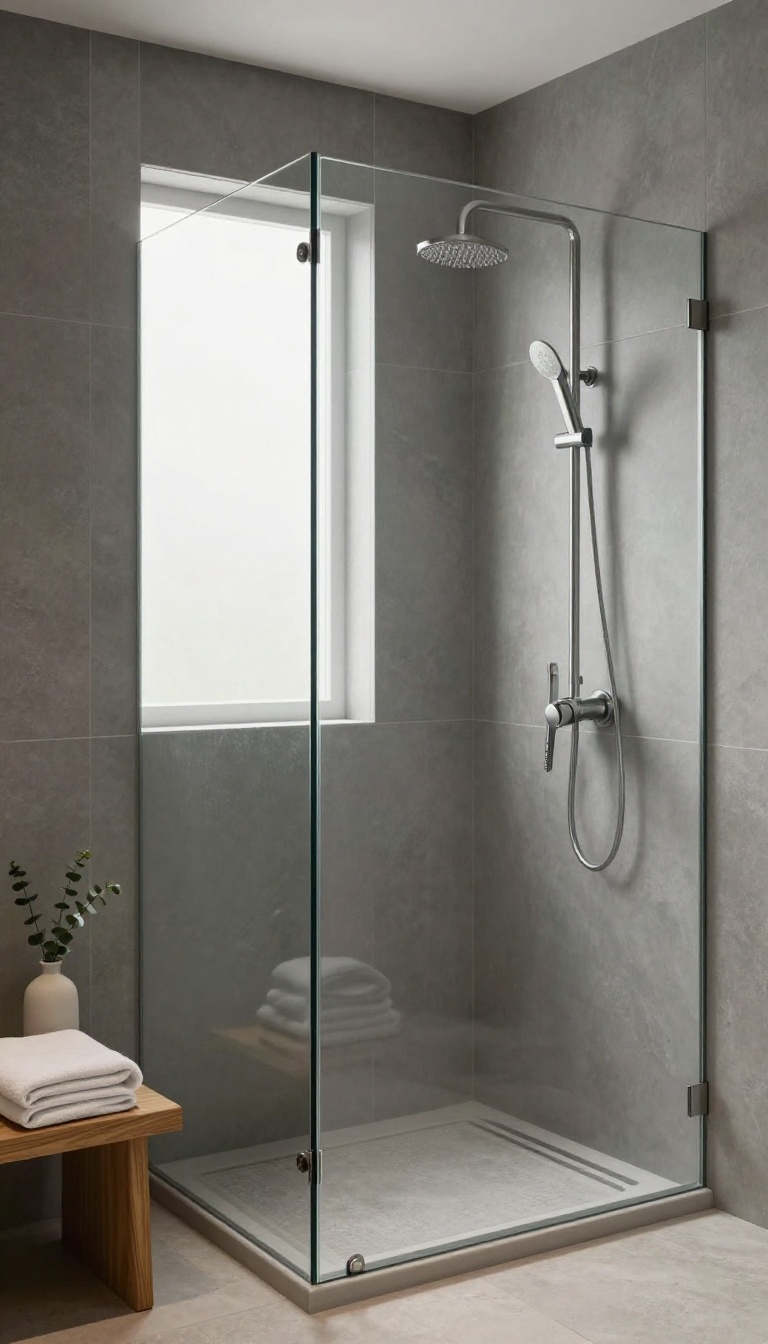
Large-format gray slabs turn a shower wall into one continuous surface. Fewer grout lines mean less visual clutter and a cleaner, more modern feel. They also make small showers feel bigger because your eye isn't stopping every few inches.
These slabs typically measure 24 by 48 inches or larger, and some go up to 63 by 126 inches. The bigger the tile, the fewer seams you see. That seamless look is what gives high-end spas their calm, uninterrupted walls.
Gray works especially well here because it doesn't compete with the slab size. A soft matte gray reads as quiet and sophisticated, while a polished gray bounces light around and adds a subtle gleam. Either way, the focus stays on the clean lines, not the pattern.
You can install them vertically to emphasize height or horizontally to widen the space. In a small shower, vertical installation draws the eye up and makes the ceiling feel farther away. Horizontal installation can make a narrow stall feel more expansive.
Why Fewer Grout Lines Matter
Grout lines break up the surface and collect soap scum over time. With large slabs, you have fewer lines to scrub and fewer places for mildew to hide. That means less maintenance and a surface that stays looking fresh longer.
Fewer lines also create a quieter backdrop. Your fixtures, glass, and towels become the stars instead of the tile pattern. It's a simple way to get a polished look without adding busy details.
Choosing The Right Gray Tone
Cool grays with blue or green undertones feel crisp and modern. Warm grays with beige or taupe undertones feel softer and more inviting. Hold samples against your flooring and vanity to see how they interact.
Light grays keep small showers bright and airy. Medium grays add depth without feeling heavy. Dark grays make a bold statement but need good lighting to avoid feeling cave-like.
Installation Tips For A Flawless Finish
Large slabs are heavy, so you'll need a pro with the right tools and experience. They should use a leveling system to keep the surface perfectly flat. A 1/16-inch grout line is standard for a nearly invisible seam.
Choose a grout color that matches your tile as closely as possible. That makes the seams disappear and enhances the seamless look. Epoxy grout is a smart choice because it resists stains and doesn't need sealing.
2. Warm Greige Tile That Softens Cool Bathroom Lighting
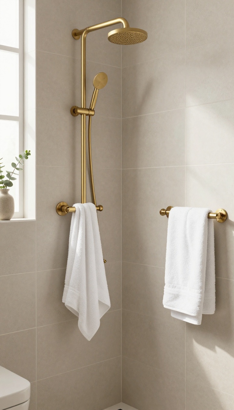
Greige is the love child of gray and beige, and it's a game-changer for bathrooms with harsh or cool lighting. If your shower feels more like a walk-in fridge than a spa, this hybrid shade can warm things up without going full-on beige. It's the Goldilocks of tile colors—not too cold, not too warm, just right.
North-facing bathrooms and windowless showers often suffer from a lack of natural light, which makes cool gray tiles look even colder. Greige steps in with a subtle warmth that balances the blue undertones in overhead lights. The result is a space that feels inviting, not sterile.
Plus, it plays well with a range of metals and fixtures, so you're not locked into one look.
Why Greige Works In Low-light Showers
In rooms with little natural light, cool grays can turn downright icy. Greige has just enough beige to counteract that chill, making the space feel cozy. It's like adding a soft blanket to a cold room—instant comfort.
And because it's neutral, it won't clash with your existing fixtures or accents.
Pairing Greige With The Right Grout And Fixtures
To keep greige looking crisp, choose a grout that's one shade lighter or darker for subtle contrast. A warm white grout can enhance the beige tones, while a charcoal grout adds modern definition. For fixtures, brushed nickel or warm brass complements greige beautifully, while chrome can lean a bit cool.
Mixing metals? Stick to two finishes max to keep it cohesive.
Tile Shapes And Finishes That Enhance Warmth
Matte finishes absorb light and feel softer, which enhances greige's warm vibe. Try large-format rectangles to minimize grout lines and create a seamless look. Or go with a subtle picket or hexagon shape for a touch of texture.
Avoid high-gloss finishes here—they can reflect cool light and undo the warmth you're after.
3. Stacked Vertical Gray Subway Tile for Height and Flow
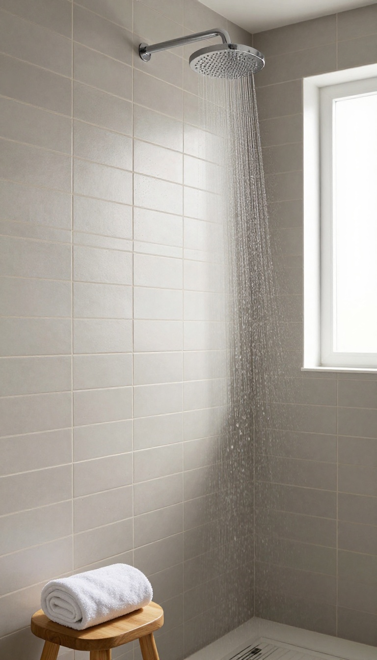
Most subway tile gets laid horizontally, which is fine but predictable. Flip it 90 degrees and something interesting happens: the lines pull your eye up, making even a standard shower feel taller and more open. This trick works with any gray shade, from pale fog to deep charcoal, and it plays nicely with both matte and glossy finishes.
Vertical subway tile also creates a subtle rhythm that horizontal layouts can't match. The stacked pattern—where tiles align in perfect columns rather than a staggered brick joint—adds a modern, grid-like look. It's clean without feeling sterile, especially when you choose a gray with a little warmth or texture.
The key is to treat the vertical lines as a design feature, not an accident. That means paying attention to spacing, grout, and where the pattern ends.
Spacing And Scale
Standard 3-by-6-inch subway tiles work great vertically, but you can also go narrower (2-by-8) for a more dramatic stretch. Wider tiles like 4-by-12 give a bolder, more contemporary feel. Whatever size you pick, keep the grout lines thin—around 1/16 to 1/8 inch—so the vertical flow stays uninterrupted.
Thick grout can chop up the lines and kill the height effect.
Grout Color Matters
Matching grout to your tile creates a seamless, monolithic look that emphasizes height. Contrasting grout, like white on medium gray, highlights the grid and adds graphic punch. Just know that high contrast makes every tiny spacing inconsistency visible, so your installer needs to be precise.
For a middle ground, choose a grout one or two shades lighter or darker than the tile.
Where To Stop The Pattern
Vertical tile doesn't have to run floor to ceiling. Stopping it at the showerhead height or a few inches above the valve keeps the focus on the wet zone. You can cap it with a horizontal border tile, a pencil liner, or a simple schluter strip.
If you want a seamless transition, continue the same tile horizontally above the shower—just be ready for the pattern shift to draw attention.
4. Herringbone Gray Tile with a Crisp Contrasting Grout
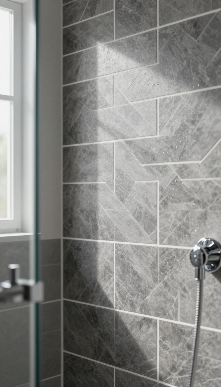
Herringbone is the pattern that makes gray tile feel alive. It adds movement and a subtle rhythm without introducing a single new color. The real magic, though, comes from the grout.
Choose the wrong shade and your crisp pattern turns into a muddy blur. Get it right and the whole wall looks custom and intentional.
The herringbone layout itself is timeless. Rectangular tiles set at 45-degree angles create a woven, interlocking look that draws the eye. But gray tile can easily blend into itself.
That's where contrasting grout steps in. It outlines every tile, turning the pattern into a graphic feature. You can go light grout on dark gray for a bold, almost retro vibe.
Or dark grout on light gray for a softer, more modern edge. The contrast doesn't have to be extreme. Even a two-shade difference adds definition.
Just avoid matching grout exactly to the tile unless you want a seamless, texture-only effect. That can work, but it's a different look entirely.
Light Grout On Dark Gray
This combo packs a punch. White or pale gray grout on charcoal or slate tile makes the herringbone pattern pop like a graphic print. It's great for small showers because the lines add visual interest without making the space feel busy.
Just know that light grout shows dirt and soap scum more easily. A quick squeegee after each shower keeps it looking sharp.
Dark Grout On Light Gray
Flip the contrast and you get a softer, more sophisticated look. Dark grout on light gray tile defines the pattern without shouting. It hides stains better and feels calmer.
This works well in larger showers where you want subtle movement rather than a bold statement. Pair it with matte tile for a modern, spa-like feel.
The Middle Ground
If high contrast feels too risky, try a mid-tone grout that's one or two shades off from your tile. You'll still see the herringbone pattern, but the effect is gentle. It's a safe bet for resale and works with almost any fixture finish.
Just test a small area first—grout can dry lighter or darker than the sample.
5. Matte Gray Hexagon Tiles for Subtle Retro Character
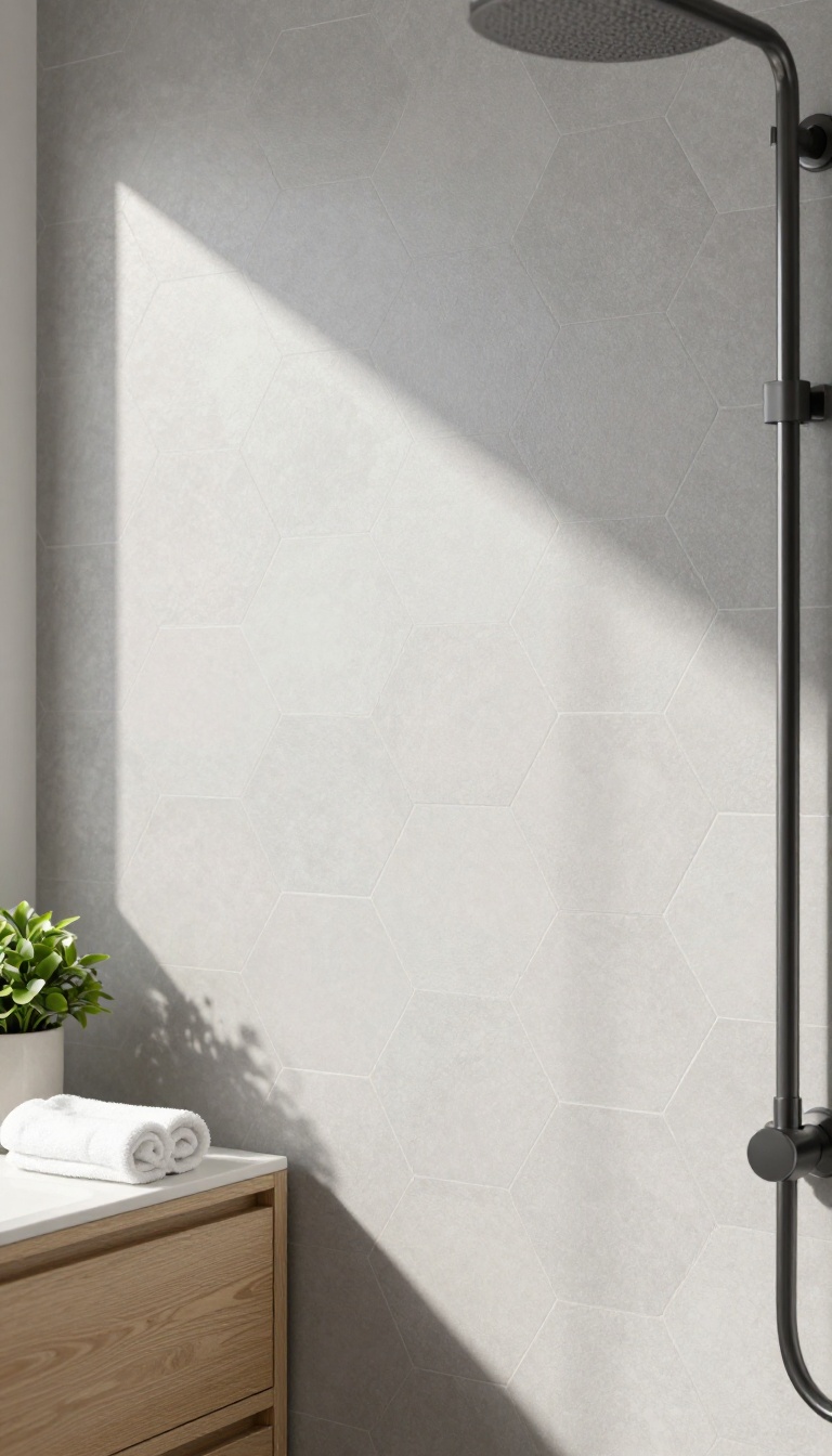
Hexagon tiles have a way of softening a room without making it feel themed. They nod to mid-century floors and old-school penny rounds, but the shape reads cleaner today. Matte gray keeps that nostalgia in check, so you get character instead of kitsch.
The finish matters as much as the shape. A flat surface absorbs light and hides water spots better than glossy ceramic, which means your shower stays looking sharp between squeegee sessions. Pair it with the right grout and layout, and hexagons feel surprisingly modern.
Hexagons work on both floors and walls, but they behave differently in each spot. On the floor, they add grip and a gentle pattern underfoot. On the wall, they create a quiet rhythm that keeps large gray expanses from going flat.
You can run them edge to edge for a seamless look or frame them with a border for extra definition. Either way, the matte finish does the heavy lifting, muting the retro vibe into something crisp and current.
Pick The Right Gray
Warm grays with a hint of taupe feel softer and pair well with wood vanities. Cool grays lean crisp and work with chrome or black fixtures. Grab samples and look at them in your actual shower light before you commit.
If your bathroom gets little natural light, go a shade lighter than you think you need. Matte finishes already absorb some light, so a mid-tone can read almost charcoal in a dim corner.
Grout Makes Or Breaks It
Matching grout turns hexagons into a subtle texture instead of a busy pattern. Contrasting grout highlights every edge, which can look great but also dates faster. For a modern feel, stay within one or two shades of the tile.
Use unsanded grout for tight joints and sanded for wider ones. Epoxy grout costs more but resists mold and staining, which matters in a wet zone.
Where To Use Them
A full hexagon shower floor is a classic move that adds slip resistance and visual interest. On walls, try a single accent band at eye level or tile the entire stall for a cohesive look. If you want to keep things calm, use hexagons on the floor and large-format gray tiles on the walls.
The mix gives you texture where you need it and simplicity where you don't.
Keep It From Feeling Kitschy
Skip glossy finishes and bright grout colors that scream retro diner. Stick with matte gray and let the shape do the talking. Add modern fixtures in black, brushed nickel, or matte white to balance the vintage undertone.
A simple glass panel instead of a shower curtain also helps the space feel open and current. The goal is a nod to the past, not a full-on time warp.
6. Glossy Gray Tile That Bounces Light Around Tight Showers
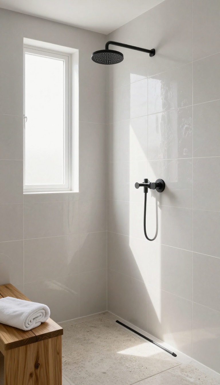
A glossy gray tile can turn a cramped shower into a light-filled nook. The shine bounces daylight and fixture glow across every surface, making the space feel bigger and brighter. But all that reflectivity has a flip side: it can also highlight water spots and feel a little cold if you don't balance it right.
Glossy gray works best when you treat it like a mirror with a purpose. It multiplies whatever light you already have, so a small window or a single overhead bulb suddenly feels like enough. The key is picking the right shade and pairing it with finishes that keep the room from feeling like a wet showroom.
Where Glossy Gray Shines
Use glossy gray on the back wall of a narrow shower to push the space visually outward. It also works on a full wall if the shower gets decent natural light. Avoid putting it on the floor—slippery when wet and it can look like a skating rink.
Pick The Right Gray
Light grays with a hint of blue or green feel fresh and clean; warm grays with a touch of taupe stay cozy. Mid-tones are the safest bet because they reflect light without turning into a mirror. Steer clear of very dark glossy grays in tiny showers—they absorb light and make the space feel like a cave.
Balance The Shine
Pair glossy gray tiles with matte fixtures, a textured stone floor, or a wood bench to ground the look. A single matte accent tile strip breaks up the reflection and adds visual interest. Without that contrast, the shower can feel too slick and sterile.
Keep It Clean
Glossy surfaces show water spots and soap scum more than matte ones. A quick squeegee after each shower keeps them looking sharp. Choose a light grout color that blends with the tile so hard water stains don't scream for attention.
7. Gray Marble-Look Porcelain with Dramatic Veining
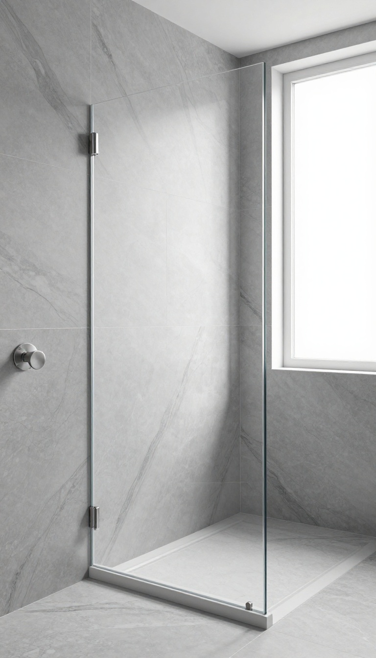
Marble makes a statement, but the real thing costs a fortune and needs sealing. Porcelain with a marble-look finish gives you the drama without the maintenance. The key is picking veining that looks natural, not printed.
Gray marble-look porcelain works in showers because it handles water, steam, and daily scrubbing without flinching. You get the high-end look, but you can actually use the space. The trick is knowing what to look for so it doesn't read as fake.
Start by looking at the vein pattern up close. Real marble has veins that flow in one direction with soft, blurred edges. Cheap porcelain often has sharp, repeating lines that look like a stencil.
Run your hand across a sample—if the veining feels flat and repetitive, it will look that way on the wall. Scale matters too. Large-format tiles with bold veins can feel overwhelming in a small shower.
A 12×24 tile with subtle veining keeps things calm. If you want drama, go bigger—24×48—but limit it to one accent wall. Mixing too many busy patterns turns the shower into visual noise.
Grout color is your secret weapon. Match it to the lightest shade in the tile to let the veining stand out. Or go a shade darker to define the layout and add depth.
Either way, use a narrow grout line—1/16 inch—so the tile feels more like solid stone. Finally, keep the fixtures simple. Chrome or brushed nickel in a clean, rounded shape won't compete with the veining.
Skip ornate handles or busy trim. The tile is the star here, and everything else should support it.
How To Spot A Realistic Vein Pattern
Look for tiles with veins that vary in thickness and direction. Real marble has veins that branch and fade, not repeat every few inches. Ask for a layout guide—many manufacturers provide one so you can see how the pattern flows across multiple tiles.
If the veins line up perfectly from tile to tile, it will look manufactured. A little randomness is your friend.
Choosing The Right Tile Size For Your Shower
Small showers benefit from larger tiles because fewer grout lines make the space feel bigger. A 12×24 porcelain tile with soft veining is a safe bet. For a dramatic floor-to-ceiling look, go with 24×48 slabs.
Just make sure your walls are flat—large tiles highlight any bumps. If your shower is oddly shaped, a 12×12 tile gives you more flexibility for cuts.
Pairing Fixtures Without Competing
Matte black fixtures add contrast and a modern edge. Brushed nickel or chrome blends in and keeps the focus on the tile. Avoid polished brass unless you want a warmer, more traditional feel.
Whatever you choose, stick to one finish throughout the shower. Mixing metals can work, but it's tricky—keep it simple and let the marble-look porcelain do the talking.
8. Two-Tone Gray Tile Split for a Bold Horizontal Line
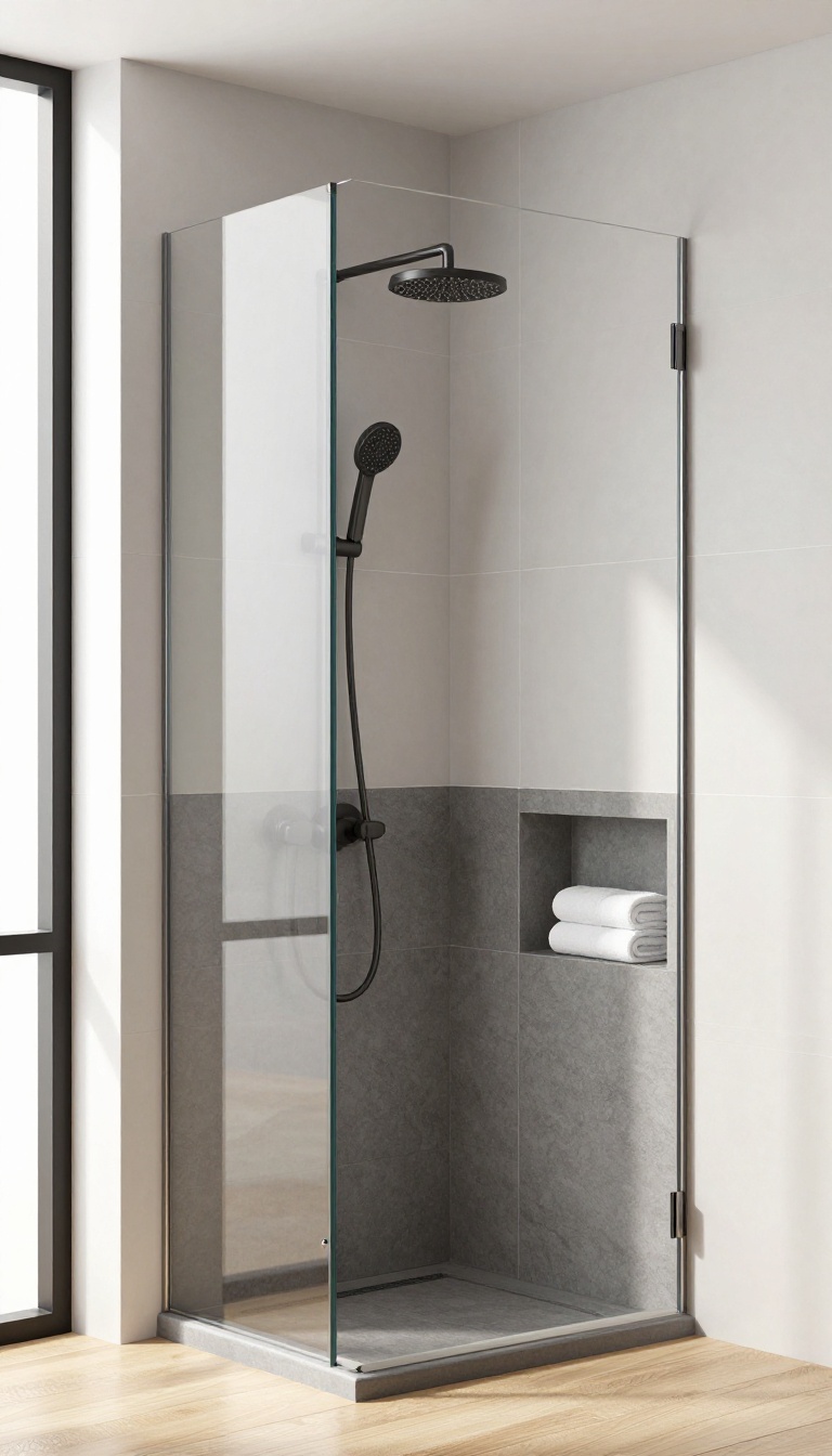
Splitting your shower wall into two gray tones gives the space an instant architectural feature. You get contrast, depth, and a strong horizontal line that draws the eye exactly where you want it. The trick is picking which tone goes where and how high the break should sit.
A light-over-dark split feels grounded and calm, while dark-over-light reads more dramatic and moody. Both work, but they change the room's proportions in different ways. Get the ratio right and the line flatters your ceiling height instead of fighting it.
Two-tone tile is one of the easiest ways to make a standard shower look custom. You are not adding a pattern or a bold color, just letting two shades of gray do the talking. The horizontal seam becomes the design moment, so everything else can stay simple.
This approach works in small bathrooms and large ones, but the split height matters more than most people expect. Too low and the top section feels like an afterthought. Too high and the lower tile looks like a wainscot that never got finished. ### Choosing Which Tone Goes on Top Light gray on the upper wall keeps the shower feeling open and airy.
It bounces light around and makes the ceiling feel taller. Pair it with a darker charcoal or slate below for a grounded, spa-like base. Flip the order and you get a moodier, more enclosed feel.
Dark tile above can make a tall shower feel cozier, almost like a wet room carved out of stone. Just be sure your lighting can handle it. ### Getting the Split Height Right A good rule of thumb is to place the break at about one-third or two-thirds of the wall height. That keeps the proportion visually pleasing without measuring like a scientist.
In most showers, a split around 36 to 42 inches from the floor hits the sweet spot. If your shower has a bench or a niche, line the split up with it. The horizontal line will feel intentional instead of random.
Aligning the break with a window or a glass panel edge also helps the eye settle. ### Grout and Trim Details That Make It Work Use a grout color that matches the lighter tile so the seam stays crisp. A contrasting grout on the split line itself can look busy and pull focus. If you want extra definition, a thin metal or stone trim strip at the break adds a clean finish.
Keep the tile size consistent on both halves unless you want the split to feel even bolder. Mixing a large format below with a small mosaic above can work, but it changes the mood fast. For most showers, one size across both tones keeps things cohesive.
Choosing Which Tone Goes On Top
Light gray on the upper wall keeps the shower feeling open and airy. It bounces light around and makes the ceiling feel taller. Pair it with a darker charcoal or slate below for a grounded, spa-like base.
Flip the order and you get a moodier, more enclosed feel. Dark tile above can make a tall shower feel cozier, almost like a wet room carved out of stone. Just be sure your lighting can handle it.
Getting The Split Height Right
A good rule of thumb is to place the break at about one-third or two-thirds of the wall height. That keeps the proportion visually pleasing without measuring like a scientist. In most showers, a split around 36 to 42 inches from the floor hits the sweet spot.
If your shower has a bench or a niche, line the split up with it. The horizontal line will feel intentional instead of random. Aligning the break with a window or a glass panel edge also helps the eye settle.
Grout And Trim Details That Make It Work
Use a grout color that matches the lighter tile so the seam stays crisp. A contrasting grout on the split line itself can look busy and pull focus. If you want extra definition, a thin metal or stone trim strip at the break adds a clean finish.
Keep the tile size consistent on both halves unless you want the split to feel even bolder. Mixing a large format below with a small mosaic above can work, but it changes the mood fast. For most showers, one size across both tones keeps things cohesive.
9. Gray Penny Round Mosaic for Texture and Grip
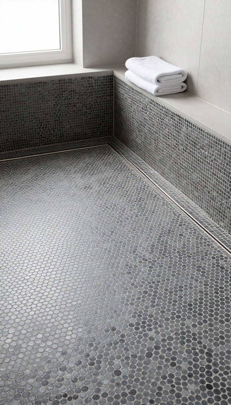
Penny round mosaic tile is the small, circular tile that comes in sheets and looks like a cluster of tiny coins. In a gray shower, it adds a soft, bumpy texture that breaks up the flatness of larger tiles. And because of all those grout lines, it gives you a built-in grip underfoot that glossy porcelain can't match.
You'll see penny tile most often on shower floors, and for good reason. The rounded shape and dense grout grid create natural slip resistance, even when the tile itself is smooth. It's a practical pick for a wet zone that still looks polished.
Gray penny rounds come in matte, glossy, and even metallic finishes. A cool charcoal reads modern, while a warm greige feels softer and more organic. The color you choose sets the tone, but the texture is what makes it interesting.
The real challenge is keeping it from looking busy. Penny tile is small, so it can easily turn into visual noise if you pair it with too many other patterns or colors. The fix is to let it be the star in one area and keep everything else quiet.
Why Penny Tile Works On Shower Floors
Those tiny circles create more grout lines per square foot than almost any other tile. That means more friction, which helps you stay steady when the floor is wet. It's a smart choice for aging-in-place bathrooms or any shower that gets heavy use.
The shape also handles slope well. Installers can follow the drain's pitch without awkward cuts, so water flows where it should. You get function first, with a look that still feels intentional.
How To Keep The Look Calm, Not Chaotic
Stick to one gray tone for the penny rounds and match the grout closely. A tonal grout makes the floor read as a single textured surface instead of a dotted mess. If you want a little definition, go one shade lighter or darker, but keep it subtle.
Use penny tile on the floor only, and choose a larger, simpler tile for the walls. That contrast in scale keeps the shower from feeling like a patchwork. A clear glass door or a simple niche also helps the eye rest.
Grout And Finish Choices That Matter
Unsanded grout is usually the right call for penny tile because the joints are narrow. Epoxy grout costs more but resists stains and mold, which is a big win in a wet, soapy environment. Either way, seal it properly and plan to refresh it every year or two.
For finish, matte gray penny rounds feel more contemporary and hide water spots better. Glossy versions bounce light around and can make a small shower feel brighter. Just know that glossy floors can feel slicker, so keep a bath mat handy.
10. Concrete-Look Gray Tile for an Industrial Edge
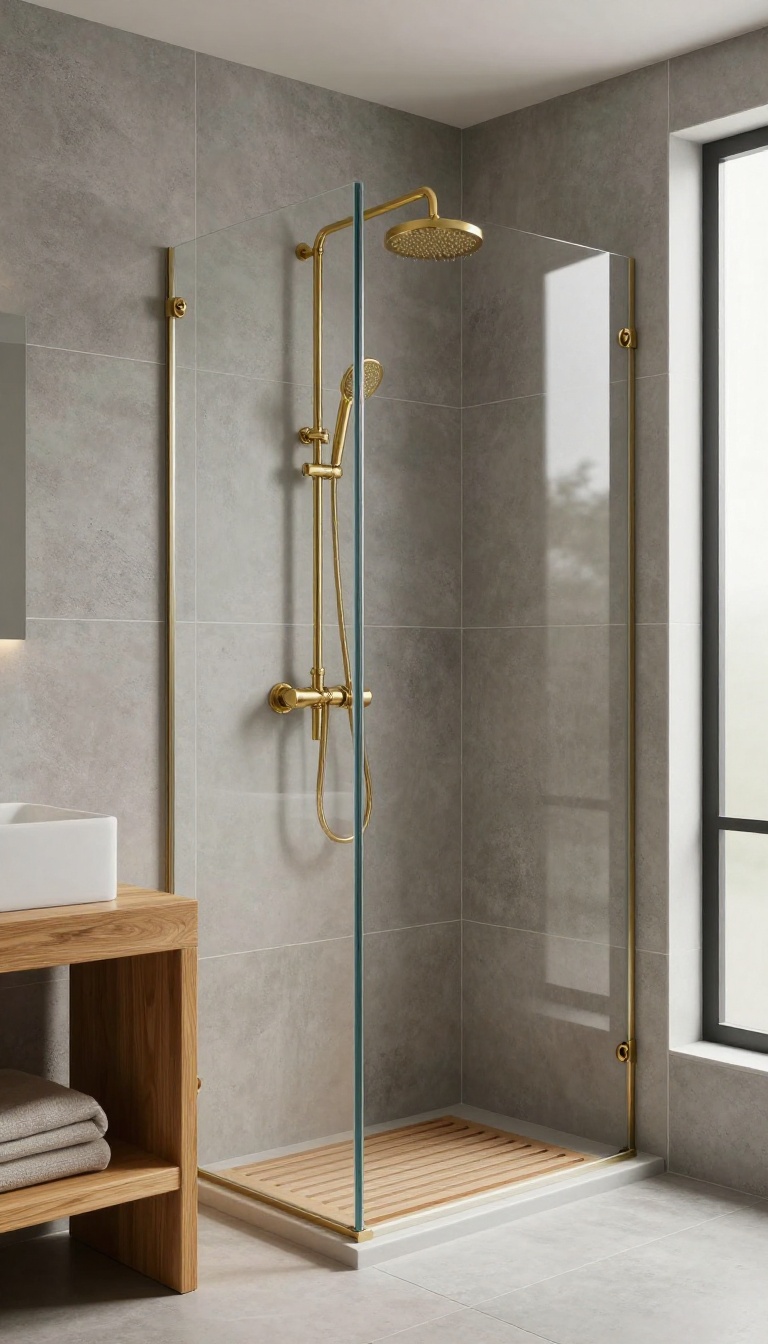
Concrete-look porcelain gives you that raw, modern texture without the sealing headaches of real concrete. It's a solid pick if you want a shower that feels a little gritty and urban, but still clean and polished. The key is balancing all that cool gray with warm accents so it doesn't feel like a parking garage.
Concrete-look tile comes in large formats, which means fewer grout lines and a more seamless surface. That's a big win in a shower because it cuts down on scrubbing and makes the space feel bigger. The finish is usually matte or slightly textured, so it has a natural, tactile quality that glossy tiles can't match.
But here's the thing: without a little warmth, concrete gray can read as cold and unfinished. You need to layer in materials that soften the edge and add contrast. Think wood, brass, or even a touch of black for a sharper look.
Warm It Up With Wood
A teak or cedar shower mat or bench does wonders for concrete-look tile. The natural grain and honey tones break up the gray and make the space feel inviting. You can also use a wood-look porcelain plank on the floor or as an accent wall—it's water-resistant and gives you the same effect without the maintenance.
Add Brass Or Black Fixtures
Brass fixtures bring a warm, golden glow that contrasts beautifully with cool gray concrete. If you prefer a more industrial vibe, matte black hardware creates a crisp, graphic look. Either way, stick with one finish for a cohesive feel—mixing metals can get messy in a small shower.
Play With Grout And Scale
For a seamless look, match your grout to the tile color. If you want to highlight the tile shape, go with a contrasting grout like charcoal or white. Large-format tiles (like 12×24 or even bigger) reduce grout lines and make the space feel more expansive.
Just make sure your shower floor uses smaller tiles or a mosaic for slip resistance.
11. Gray Tile with a Niche in a Contrasting Stone
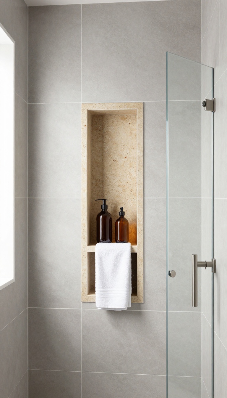
A niche is one of those details that can either make a shower wall look custom or like a random hole someone patched in. When you set it in a contrasting stone, it becomes a deliberate focal point that breaks up all that gray. The key is treating it like a design element, not just a shelf for your shampoo.
Stone niches add depth, texture, and a hint of luxury without overwhelming the space. They also give your eye a place to land, which keeps a monochrome shower from feeling flat. Get the size and placement right, and it reads as intentional from every angle.
The contrast doesn't have to be loud. A soft white marble or a warm travertine niche against cool gray tile creates a subtle tension that feels polished. Even a darker charcoal stone can work if you want a moodier vibe.
The goal is to pick a stone that complements the gray rather than fighting it. Think about how the niche interacts with your tile layout. If your gray tile is large-format, a stone niche can act like a picture frame.
If your tile is busy, a solid stone niche gives the eye a rest. Either way, the niche should feel like it belongs there, not like an afterthought. One common mistake is making the niche too small.
A tiny niche looks like a soap dish, not a design feature. Go bigger than you think you need, especially if you plan to store bottles. A good rule is to make it at least 12 inches wide and 24 inches tall for a single shelf, or wider if you want two.
Placement matters just as much as size. Centering the niche on the wall is classic, but offsetting it can feel more modern. Just make sure it lines up with your grout lines or tile edges so it looks intentional.
And don't forget lighting—a small LED strip inside the niche makes the stone glow and adds a high-end touch.
Choosing The Right Stone
Marble is a classic choice for a contrasting niche because its veining adds movement. But it needs sealing and a little maintenance. Quartz is more durable and comes in consistent colors, which can be great if you want a clean, modern look.
Travertine or limestone brings warmth and texture, perfect for a soft, earthy bathroom. Just make sure the stone's tone doesn't clash with your gray—cool grays pair well with white marble, while warm grays look better with beige or taupe stones.
Sizing And Placement Tips
Measure your tallest shampoo bottle and add a few inches. A niche that's 12 inches wide and 24 inches tall works for most showers, but if you have the space, go wider. For placement, align the bottom of the niche with a grout line or the top of your tile course.
Centered niches feel formal; offset niches feel more contemporary. If you're tiling around it, consider a stone frame or a slight overhang to make the niche pop.
Lighting And Finishing Touches
A niche without light can look like a dark cave. Add a waterproof LED strip along the top or sides to wash the stone in soft light. It's an inexpensive upgrade that makes a big difference.
For the edges, use a stone sill or a bullnose tile to frame the opening. This hides the cut tile edges and gives the niche a finished, furniture-like quality. Keep the grout color consistent with the rest of the shower to avoid visual clutter.
12. Slate Gray Tile with Natural Cleft Texture
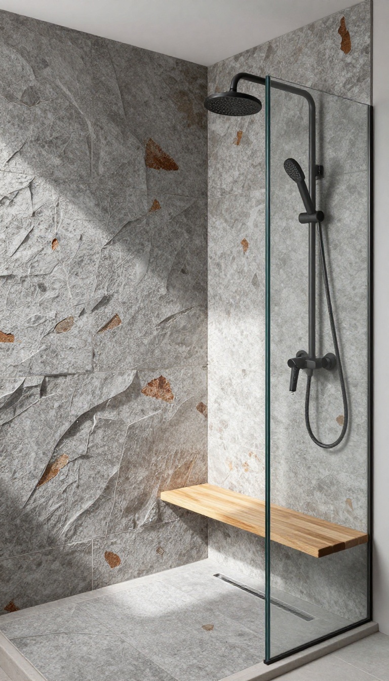
Real slate brings a depth and grip that porcelain can only imitate. Its cleft surface—split along natural layers—creates a tactile, undulating finish that catches light and hides water spots. But slate demands a bit more care than ceramic, especially when it comes to sealing and color variation.
Here's how to make it work in a shower without the headaches.
Slate is a metamorphic rock, so every tile carries its own story. The cleft texture gives you natural slip resistance, which is a big plus for shower floors. But that same texture can trap soap scum if you don't seal it properly.
And because slate is porous, it needs a penetrating sealer to keep water out and stains at bay. Color variation is part of the charm—and the challenge. Slate gray can range from cool charcoal to warm, rusty tones, sometimes within the same batch.
That's why you should always dry-lay your tiles before installing. Mix them from multiple boxes to avoid clustering similar shades in one area. When it comes to maintenance, a little routine goes a long way.
Squeegee after each shower, and clean with a pH-neutral stone cleaner. Avoid acidic or abrasive products that can dull the surface. With proper care, slate will develop a rich patina over time, looking better with age.
Sealing: The Non-negotiable Step
Slate is porous, so sealing is not optional. Use a penetrating sealer designed for natural stone. Apply it after the tile is clean and dry, usually 24 to 48 hours after installation.
Reapply every one to two years, or when water stops beading on the surface. A good sealer won't change the look of the stone—it just protects it.
Embracing The Color Shift
Slate's color variation is a feature, not a flaw. To keep it cohesive, choose a grout that blends with the mid-tone of your tiles. A medium gray works well.
If you want more contrast, go darker, but be aware that light grout can highlight the irregular edges. And remember: slate looks best when you let its natural range show.
Cleaning Without The Damage
Harsh chemicals are the enemy of slate. Stick to a pH-neutral cleaner and a soft brush or microfiber cloth. For tougher stains, use a poultice made for stone.
Never use vinegar, bleach, or abrasive scrubbing pads—they'll etch the surface and strip the sealer. A quick squeegee after every shower keeps soap scum from settling in the cleft.
13. Gray Tile Paired with Warm Wood-Look Accents
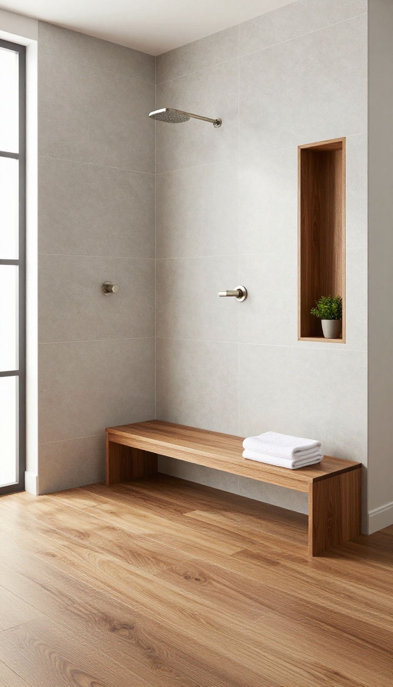
Gray tile can read as cold, especially in a shower where water and shadow already cool things down. Bringing in wood-look accents flips that script. A wood-look floor or bench adds instant warmth without fighting the gray.
The contrast feels intentional, not accidental, and it makes the whole space feel more livable.
Wood-look tile has come a long way. You can get planks that mimic oak, walnut, or teak with realistic grain and texture. In a shower, that means you get the cozy look of wood with the water resistance of porcelain or ceramic.
Pair a wood-look floor with gray walls and you get a balanced, grounded feel. The gray stays crisp, but it no longer feels like a cold box. The trick is picking the right wood tone.
A medium brown with visible grain works with almost any gray. Too red and it clashes with cool grays. Too yellow and it can look dated.
Look for planks with a matte finish and subtle variation. That keeps the floor from looking like a sticker. You do not have to stop at the floor.
A wood-look bench seat gives you a place to sit and a warm focal point. A wood-look niche shelf or curb adds another layer. Even a small wood-look accent wall behind the showerhead can soften the gray.
The goal is balance, not a wood cabin.
Choosing The Right Wood Tone
Medium browns with gray undertones are the safest bet. They echo the gray without disappearing into it. If your gray tile is warm, lean toward a honey or teak tone.
If your gray is cool, a greige or ash wood-look plank keeps things cohesive. Always bring samples home and look at them under your actual shower lighting. What looks warm in the store can turn orange in a dim bathroom.
Where To Use Wood-look Accents
The shower floor is the most impactful spot. It grounds the space and feels good underfoot. A bench is a close second.
It adds function and warmth at eye level. For a subtler touch, use wood-look tile on the curb or as a narrow accent strip on the wall. Avoid using wood-look on every surface.
One or two accents are enough to warm the gray without overwhelming it.
Mixing Patterns And Textures
Wood-look planks usually run in a straight pattern. That pairs well with large-format gray tiles on the walls. If your gray walls have a subtle pattern, keep the wood-look simple.
If your gray is plain, you can afford a wood-look with more grain. Mixing a matte wood-look floor with glossy gray wall tile adds depth. Just keep the grout lines consistent to avoid visual clutter.
FAQ
What grout color looks best with gray shower tile?
It depends on the look you want. Matching grout creates a seamless, modern surface. Contrasting grout—like white with dark gray—highlights the tile pattern and adds crisp definition.
For a safe middle ground, choose a grout one shade lighter or darker than the tile.
Does gray tile make a bathroom look dark?
Not necessarily. Light grays with glossy finishes reflect light and keep things bright. Dark grays can feel moody, which works well in larger bathrooms with good lighting.
If your shower is small or windowless, stick to mid-to-light grays and add a well-placed light.
What tile size is best for a small shower?
Large-format tiles (12×24 inches or bigger) reduce grout lines and make small showers feel bigger. Just make sure the floor tile is small enough for slope and slip resistance—mosaic sheets are ideal there.
Can I mix different gray tiles in one shower?
Yes, but keep it intentional. Use one tile for the main field and another for an accent band, niche, or floor. Stick to two or three gray tones max, and repeat one of them elsewhere in the bathroom to tie the room together.
How do I keep gray tile from looking flat?
Vary the finish and texture. Combine matte walls with a glossy accent, or mix a smooth field tile with a textured mosaic. Adding warm metals, wood, or a stone niche also breaks up the gray and adds depth.
Conclusion
Gray tile doesn't have to feel cold or boring. Pick a shade that matches your light, pair it with warm accents, and let the texture do the talking. The right finish can make even a small bathroom feel intentional.
Start with one idea that fits your space and budget, then build from there. Whether you go glossy, matte, or patterned, gray gives you a calm backdrop that lasts. Your shower should feel like a retreat, not a compromise.