15 Accent Tile in Shower Ideas for a Smart, Practical Finish
A shower wall covered in the same tile from top to bottom can look flat, and it gives your eye nowhere to land. An accent strip or panel fixes that without a full remodel, and it usually costs less than a single new fixture. The trick is placement.
Run a band too high and it disappears behind the showerhead. Drop a mosaic in the wrong spot and it fights the grout lines around it. Get the position right and the same tile suddenly looks deliberate.
We gathered fifteen accent tile ideas that solve real problems, from hiding a crooked niche to breaking up a tall wall. Each one covers where to put it, what pairs well, and what to skip.
1. Vertical Accent Strip from Floor to Ceiling
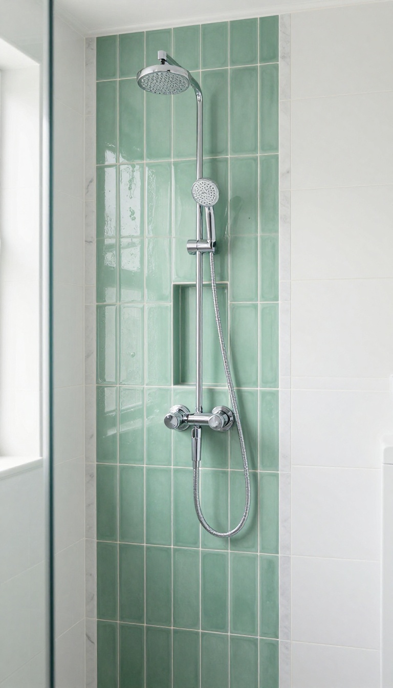
A single narrow column of tile running from the shower floor to the ceiling does more visual work than almost any other accent. It pulls the eye upward in one clean motion, which tricks the brain into reading the whole room as taller. That matters most in basements, guest baths, and any shower tucked under a standard eight-foot ceiling.
The strip itself can be almost anything: a glossy subway laid on end, a marble pencil liner, or a mosaic that contrasts with the field tile around it. Width usually lands between two and six inches, though three to four inches is the sweet spot for most walls. Narrower than that and it reads as a grout line; wider and it starts to look like a second wall.
Where To Place The Strip
Centering the strip on the showerhead wall is the safest bet, because it creates a natural focal point without competing with fixtures. If your shower has a bench or a niche, line the strip up with one edge of that feature so the two elements feel connected. On a very wide wall, consider running two matching strips instead of one, spaced evenly on either side of the shower valve.
Avoid placing the strip directly behind the showerhead or the valve trim. Hardware will cover it, and you lose the effect you paid for. A few inches to the left or right keeps the line visible from the doorway.
Tile And Grout Pairings That Work
Contrast is what makes a vertical strip pop, so pick a tile that differs from the field in either color or finish, not both at once. A matte white field with a glossy green pencil liner looks intentional. A busy patterned mosaic against a busy field just looks noisy.
Grout matters more here than anywhere else in the shower. Use a grout color that matches the accent tile if you want the strip to read as one solid line, or a contrasting grout if you want the individual pieces to stand out. Unsanded grout works better for narrow mosaic joints and won't scratch polished stone.
Cost And Installation Notes
A floor-to-ceiling strip uses very little material, often less than a single box of accent tile, so the cost is mostly labor. Expect a modest upcharge over a plain install because your tiler has to cut and align the strip carefully on every course. Ask your installer to dry-lay the strip before setting anything.
It's the easiest way to catch a tile that's slightly out of square or a grout line that drifts. Once the thin-set cures, fixing a crooked strip means demolition.
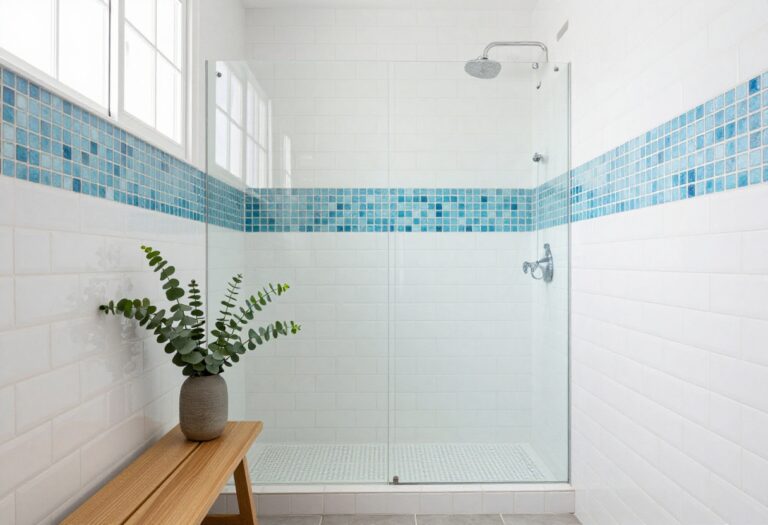
2. Horizontal Band at Eye Level
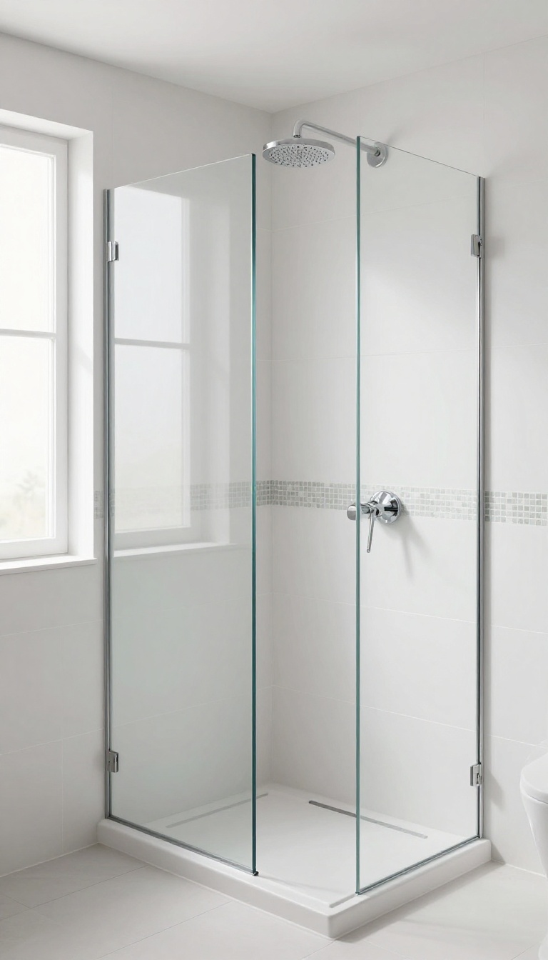
A horizontal band of accent tile at eye level is the classic way to break up a large shower wall. It sits right where you look when you step in, so it adds interest without shouting. The stripe runs around the shower at a consistent height, usually 48 to 60 inches from the floor, and it works with almost any tile style.
This approach is simple, clean, and timeless. It gives the eye a resting point and makes a big tile field feel intentional instead of plain. You can go subtle with a matching tone or bold with a contrasting color, but the placement stays the same.
Why Eye Level Works
Eye level is where you naturally look when you enter a shower, so a band there gets noticed without being overwhelming. It also breaks up the wall into manageable sections, which makes tall showers feel less like a tile tunnel. And because it's a straight line, it's easy to align with grout joints and niches.
Choosing The Right Height
Measure from the shower floor to about 48 to 60 inches, or align it with the bottom of your showerhead. If you have a niche, line the band up with the top or bottom of the niche for a cohesive look. Just avoid placing it where the showerhead spray will constantly hit it, which can wear down some materials.
Tile Pairings That Work
A glass mosaic band adds shimmer and pairs well with large porcelain tiles. For a subtle look, use the same tile in a different finish, like matte against glossy. If you want contrast, pick a color that ties into your fixtures or floor.
What To Skip
Don't make the band too wide, or it starts to look like a stripe of its own. Also, avoid busy patterns that clash with the main tile's texture. And if your shower is small, keep the band narrow so it doesn't chop up the space.
3. Accent Tile Inside the Niche
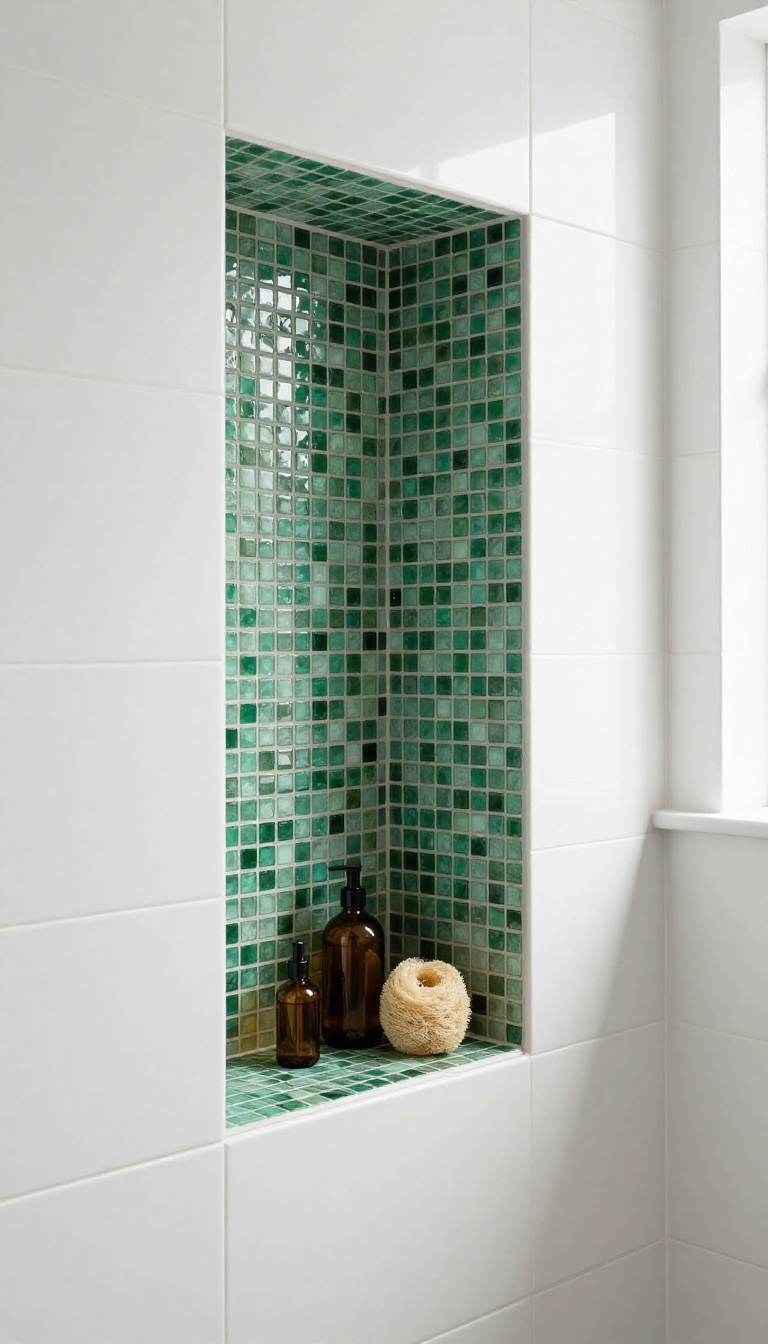
Niche shelves are the one spot in a shower where your eye naturally pauses, so it makes sense to give that little rectangle some personality. Tiling just the back wall of the niche with a contrasting material turns a purely practical cutout into a deliberate display moment. Because the square footage is tiny, you can pick a tile that would blow your budget across a whole wall and still keep the total cost reasonable.
Most builders tile the niche in the same field tile as the shower and call it done. The result works, but it reads as an afterthought rather than a feature. Swapping the back panel for something different is one of the cheapest ways to make a standard shower look custom.
You are only covering a few square feet, so the material cost stays low even when you choose something special. The trick is treating the niche like a framed picture. The surrounding tile becomes the frame, and the back panel becomes the art.
Keep the sides and shelves in the field tile so the transition feels intentional, and let the back do the talking. This also hides the awkward reality that niche boxes are rarely perfectly square or centered. A contrasting back panel draws attention upward and inward, which makes a small shower feel taller and more considered.
It also gives you a place to repeat a color from the rest of the bathroom without committing to it everywhere. Done well, guests notice the niche before they notice the wall tile.
Pick A Back Panel That Pops
Glass mosaic, penny rounds, and small hexagons are the easiest wins because they read as jewelry against a larger field tile. A polished stone slab or a leftover piece of quartz from the vanity works too, and it wipes clean with one swipe. If you want something quieter, choose a matte ceramic in a deeper tone of the same color family.
The back panel should contrast in either color or texture, not both at full volume.
Line Up The Grout Lines
Nothing makes a niche look sloppy faster than grout lines that almost line up with the surrounding tile. Decide before installation whether you want the back panel to align perfectly with the field tile or to deliberately break from it. A clean break with a visible border or trim piece looks intentional.
A near-miss looks like a mistake. Talk it through with your installer while the layout is still on the wall.
Seal It And Keep It Simple
Niche back panels collect soap scum, shampoo drips, and hard water spots faster than any other surface in the shower. Choose a material that can handle weekly cleaning without etching or dulling. Natural stone needs sealing every year or two, while porcelain and glass usually just need a squeegee.
Skip anything with a rough, porous finish, no matter how good it looks in the showroom.
4. Contrasting Shower Floor Mosaic
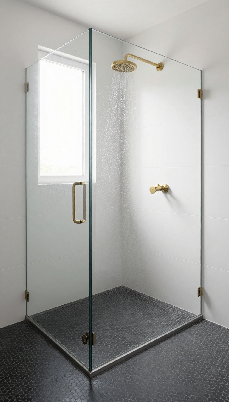
Shower floors take a beating, and they also set the visual foundation for the whole stall. A contrasting mosaic down there does two jobs at once: it adds grip underfoot and gives the eye a clear boundary for the shower zone. This works especially well in open bathrooms where the shower shares space with the rest of the room.
A darker or patterned floor tile quietly says "the wet area starts here" without needing a glass wall or a curb to spell it out. The contrast doesn't have to be dramatic. Even a few shades deeper than the walls is enough to read as intentional, and it keeps the floor from blending into a wall of matching tile.
Why A Darker Floor Works
Darker floors hide water spots, soap scum, and the occasional stray hair far better than white or light gray. That alone makes them a practical pick for a space you actually use every day. They also ground the shower visually.
When the walls are light and the floor is dark, the eye reads the floor as a stable base, which makes the whole shower feel more anchored and less floaty. Just keep the contrast in the same color family. A charcoal floor under warm beige walls looks muddy.
A deep gray floor under cool white walls looks sharp. Match the undertone, not just the shade.
Grip And Slip Resistance
Small mosaics come with more grout lines, and more grout lines mean more texture underfoot. That texture is what gives you traction when the floor is wet. Look for tiles with a matte or slightly rough finish rather than polished.
Polished mosaics look great in photos but get slick fast, especially with conditioner residue. A 2×2 or 1×1 mosaic sheet is the sweet spot. It's small enough to follow the slope toward the drain, but not so tiny that cleaning becomes a chore.
Defining The Zone In An Open Bathroom
In a curbless or open shower, the floor change does the work a wall would normally do. The moment the tile shifts, your brain registers a new zone. Run the mosaic right up to the edge of the shower footprint, then stop.
A clean line between the two floors looks deliberate. A wavy or uneven transition looks like a mistake. If you want extra definition, match the floor mosaic to a thin accent band on the wall or to the niche interior.
That small repeat ties the whole shower together without adding another material.
5. Accent Tile on the Shower Ceiling
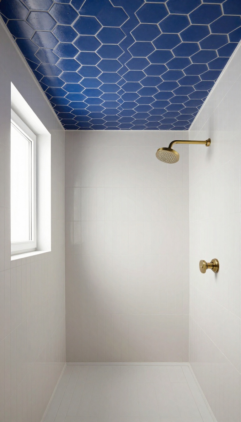
Most people never think to look up in a shower, which is exactly why a tiled ceiling works. It catches you off guard in a good way, and it adds personality without stealing an inch of wall space. The ceiling is also a spot where you can go bolder than you would on a vertical surface, because you rarely stare at it straight on.
The ceiling is the one surface in a shower that gets almost no design attention, so even a small change reads as intentional. You can tile the whole thing, run a border around the perimeter, or drop in a single accent panel above the showerhead. Each option gives you a different level of impact and a different level of effort.
Why The Ceiling Works
A tiled ceiling reflects light and makes the stall feel taller instead of closed in. It also hides water stains and paint peeling, which are common problems above a steamy shower. And because it is out of reach, you can use a pattern or color you might not want at eye level.
Patterns And Colors That Fit
Small hex or penny tiles in a soft gray or warm white add texture without shouting. A deep blue or green in a matte finish feels calm and spa-like when it is overhead. If you want something more playful, try a geometric pattern in two tones that match your wall tile.
Installation And Practical Notes
Use a waterproof membrane and a thinset rated for wet areas, because ceiling moisture is constant. Keep the tile size small enough to handle overhead, and plan your layout so cuts land at the edges, not in the middle. A slightly textured finish gives better grip during installation and hides water spots later.
6. Penny Round Accent Wall
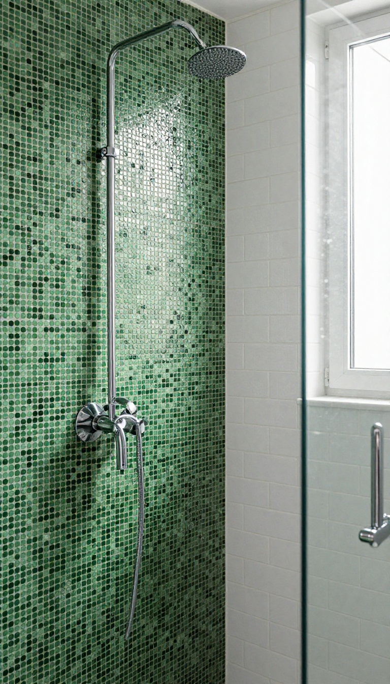
Penny rounds bring a texture you can't get from big flat tiles. Cover one full wall in a contrasting color and the shower instantly feels more playful and custom. The small scale adds detail that larger tiles simply miss.
A full wall of penny rounds works best when you treat it like a backdrop, not a stripe. Pick a color that contrasts with the main tile but still feels intentional. Then let the shape do the talking.
This idea shines in showers that feel a little plain or builder-grade. It's also a smart way to add personality without changing the layout or plumbing.
Penny round tiles are small, round mosaics that come on mesh-backed sheets. They bend around curves and fill odd spaces better than large format tiles. A full accent wall in a contrasting color becomes the focal point of the shower.
The key is contrast. If your main tile is white subway, go with matte black or deep green penny rounds. If your main tile is dark, try warm white or soft blush.
The shape difference alone adds interest, but the color shift makes it pop. Because penny rounds are so small, the grout lines become part of the design. A contrasting grout can make the circles stand out even more.
Just keep in mind that more grout means more surface to clean. A squeegee after each shower helps. Installation takes more time than large tiles because of all the tiny pieces.
But the sheets make it manageable for a skilled DIYer. Just make sure the wall is flat and waterproofed first. Penny rounds will telegraph any bumps underneath.
Cost-wise, penny rounds are mid-range. You'll pay more for the labor if you hire out, but the material itself won't break the bank. And because you're only doing one wall, the total square footage stays low.
Choosing The Right Color
Contrast is what makes a penny round accent wall work. A deep navy or charcoal against white tile feels bold but classic. Soft pastels against gray create a gentler, spa-like look.
If you want something more subtle, pick a tone that's a few shades darker than your main tile. The texture still reads, but the color shift is quieter. Either way, test a sample sheet in your actual shower light before you commit.
Grout Makes Or Breaks It
With penny rounds, grout is a design decision, not an afterthought. Matching grout blends the circles into a smooth field. Contrasting grout turns each penny into a tiny dot.
A light grout with dark tiles creates a graphic, almost polka-dot effect. Dark grout with light tiles feels more muted. Just remember that lighter grout shows soap scum faster, so seal it well and clean regularly.
Installation Tips And Costs
Penny rounds come on 12×12 sheets, so you're not placing each circle by hand. But you still need to stagger the sheets so the seams don't line up. A level ledger board helps keep rows straight.
Budget around $10 to $20 per square foot for materials, plus labor if you hire a pro. Since you're only tiling one wall, the total cost stays reasonable. Just factor in a little extra for waste and cuts around the showerhead and valve.
7. Subway Tile with a Bold Border
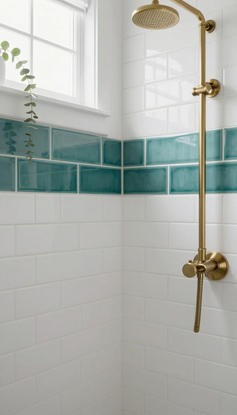
Subway tile is the reliable friend of shower design—it shows up, does its job, and never asks for attention. But run a bold border around it, and that same dependable tile suddenly looks custom. The border does the talking while the subway tile keeps things calm in the background.
This approach works because it gives your eye a clear stopping point. Without a border, subway tile can feel like it goes on forever, especially on a tall wall. A thick band of color or a different shape frames the field and makes the whole shower feel intentional.
It's also one of the most budget-friendly ways to add personality. You're not tiling the whole shower in expensive glass or marble—just a single row or two of something with punch. That keeps the cost down while still delivering a look that reads as high-end.
Subway tile with a bold border is a classic move with a twist. The subway tile stays neutral and familiar, while the border tile brings the color, texture, or pattern that makes the shower feel designed. You get the best of both worlds: a timeless base and a custom-looking finish.
The border can be almost anything—a contrasting color, a different material, even a mosaic strip. The key is that it's visually heavier than the subway tile around it. That weight is what creates the frame.
Where you place the border matters as much as what you choose. It can run horizontally at eye level, vertically along the edges, or even wrap around a niche. Each placement gives a different effect, so think about what you want the border to do before you commit.
Choosing The Right Border Tile
The border needs to contrast with your subway tile, but it doesn't have to clash. If your subway tile is white, a deep navy or charcoal border looks crisp and modern. A warm terracotta or sage green border feels more earthy and relaxed.
Material matters too. Glass or ceramic borders give a clean, polished look. Natural stone borders add texture and a bit of rustic charm.
Just make sure the border tile is the same thickness as your subway tile, or you'll end up with a lip that catches water and soap scum. Size is another factor. A border that's too thin gets lost.
Too thick and it overwhelms the subway tile. A good rule of thumb is to keep the border between one and three inches wide, depending on the scale of your shower.
Placement That Works
The most common spot for a border is a horizontal band at eye level, but that's not your only option. You can run a vertical border up the corners of the shower to frame the whole space. That works especially well in a narrow shower where a horizontal band might feel chopped up.
Another smart placement is around the perimeter of a niche or bench. It draws attention to the feature without making it look like an afterthought. If you have a shower niche, a border that outlines it can make the niche feel like a built-in display shelf.
For a more subtle look, consider a border that runs along the top of the tile field, just below the ceiling. It acts like a crown molding for your shower and gives the eye a natural place to rest.
What To Skip
Don't use a border tile that's too busy. If your subway tile has a subtle texture or variation, a highly patterned border can create visual noise. Stick with a solid color or a simple linear pattern.
Also, avoid placing a border where it will be interrupted by fixtures. A showerhead, valve, or grab bar cutting through your border line looks messy. Plan the layout so the border runs continuously or stops cleanly at a corner.
Finally, skip the urge to use multiple borders. One bold border is enough. Two competing borders will make the shower feel cluttered and dated.
8. Hexagon Tile Feature Panel
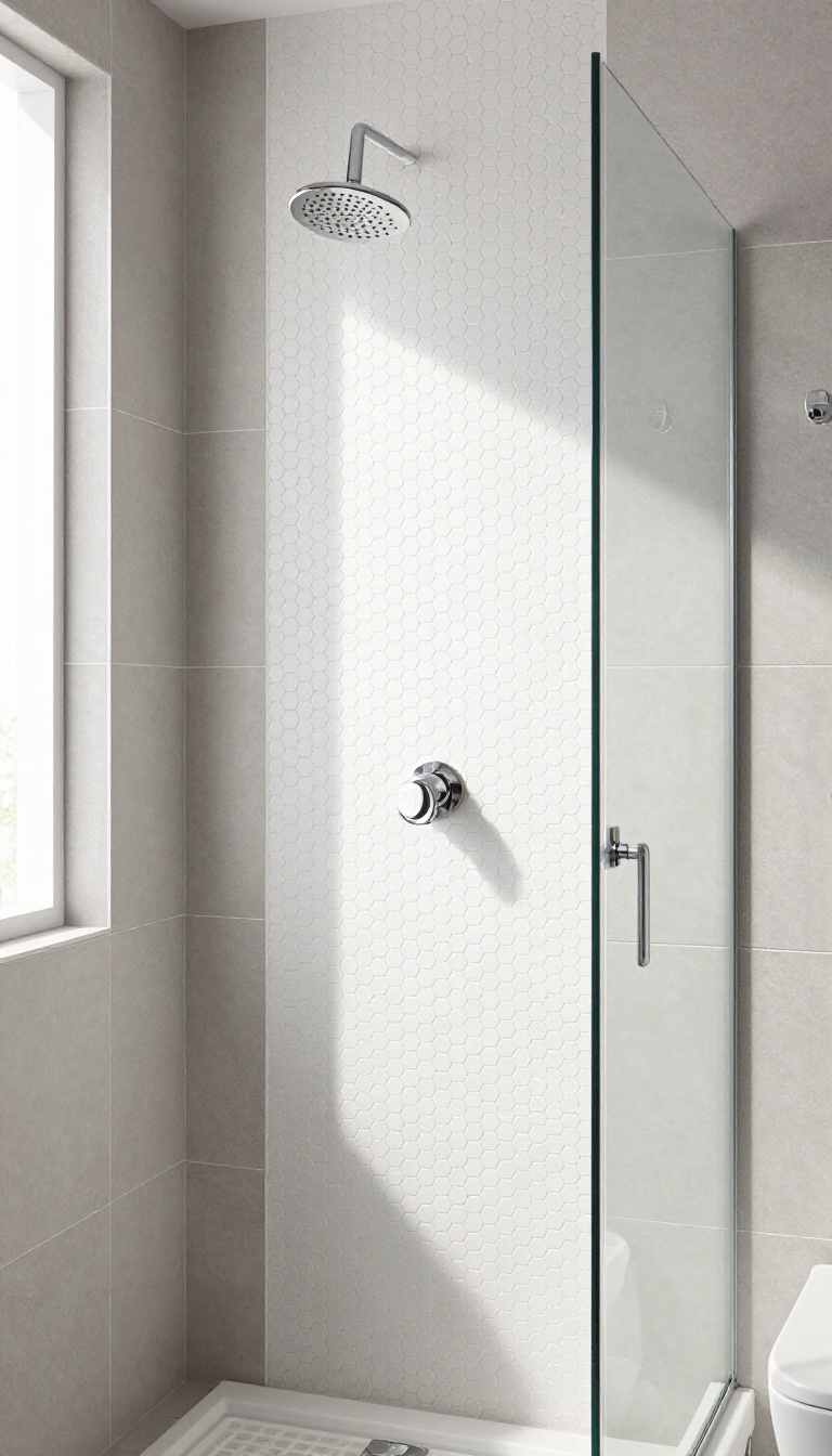
Hexagon tiles have a way of making a shower wall feel intentional without much effort. A single panel of them—behind the showerhead or centered on one wall—adds geometric interest that reads as modern, not busy. The shape does the heavy lifting, so you can keep your fixtures simple and let the tile be the star.
A hexagon feature panel is exactly what it sounds like: a defined section of hex tiles set into a larger field of something plainer. You might run a rectangle of hexagons from floor to ceiling behind the showerhead, or float a square panel on the back wall like a piece of art. Either way, the contrast between the hex pattern and the surrounding tile creates a focal point that feels deliberate.
What makes this idea practical is how well it plays with simple fixtures. A basic chrome showerhead and a plain valve trim suddenly look sharp against a wall of hexagons. The shape brings enough visual texture that you don't need fancy hardware or a complicated tile layout to make the space feel finished.
Hexagons also work in almost any size. Large-format hex tiles feel calm and contemporary, while small ones give you a mosaic-like texture. You can pick a color that matches your main tile for a subtle shift, or go bold with a contrasting shade for a real feature moment.
Where To Place The Panel
The most natural spot is directly behind the showerhead, running from the top of the tile to the floor or to a bench. That area already draws the eye, so giving it a different shape feels logical. Another option is a centered panel on the longest wall, framed by your main tile like a picture.
Just keep the panel edges aligned with grout lines or fixture centers so it looks planned, not accidental.
Picking The Right Hex Size
Small hexagons—around 1 to 2 inches—create a dense, textured look that hides water spots well. They also mean more grout lines, so choose a grout color that blends if you want a softer effect. Larger hex tiles, say 6 to 8 inches, feel more modern and are easier to clean.
They also let the shape read clearly from a distance, which matters in a small shower.
Pairing With Simple Fixtures
Let the hex panel be the only pattern in the shower. Stick with matte black, brushed nickel, or chrome fixtures that have clean lines and no extra detailing. A single-function showerhead and a round valve trim keep things uncluttered.
If you want a little warmth, add a teak bench or a simple niche, but skip busy hardware that competes with the tile.
9. Accent Tile Behind the Shower Bench
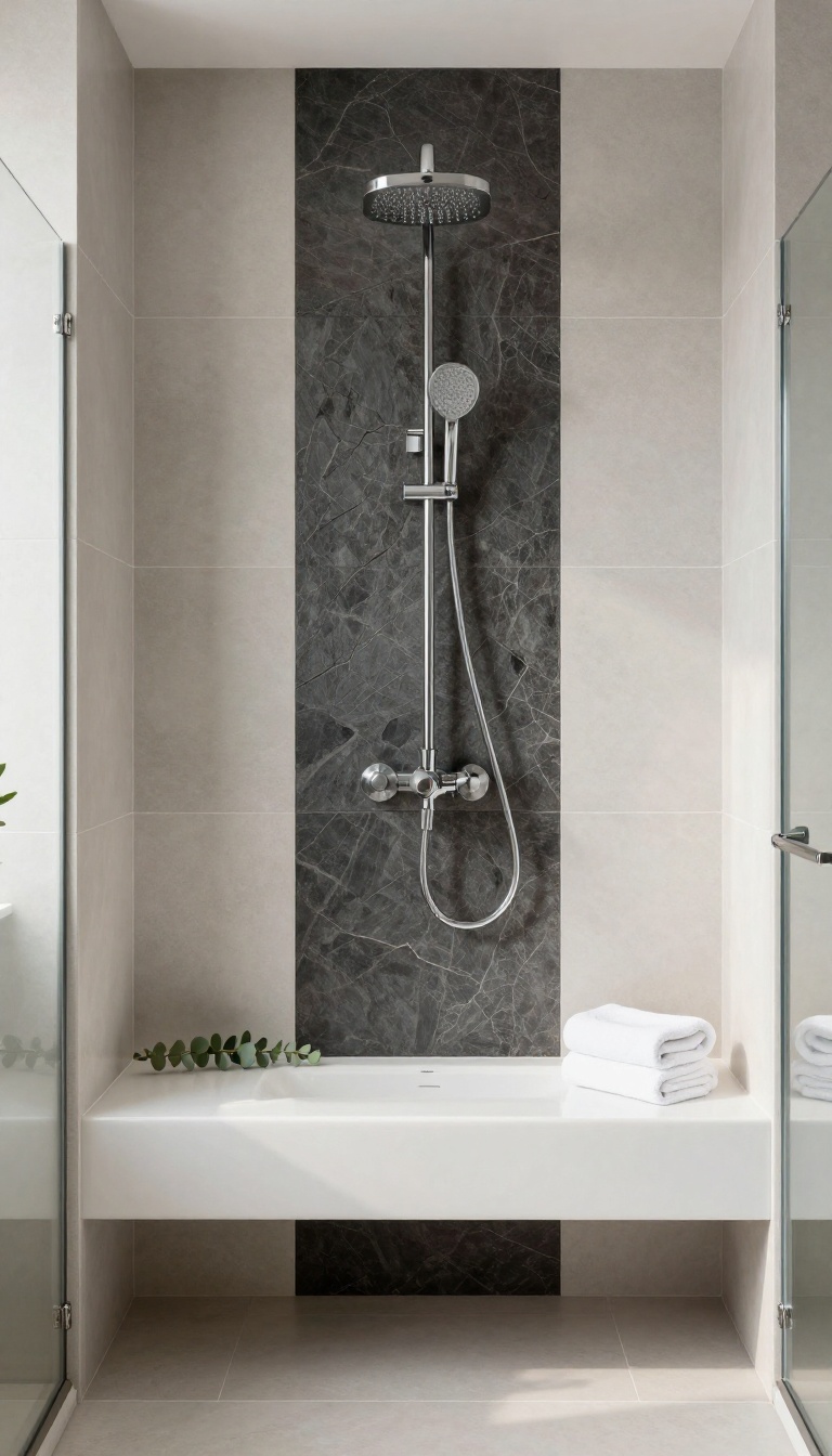
A built-in bench already stands out because it breaks up the wall. The back wall behind that bench is prime real estate for an accent tile, and most people leave it plain. Tiling that vertical strip with a contrasting material turns a functional seat into a design moment.
It also adds depth without making the shower feel busy.
The back wall of a bench is a small, contained area. That makes it low-risk for trying a bolder tile you wouldn't use across the whole shower. A dark slate or a glossy ceramic behind a white bench creates an instant focal point.
The bench itself becomes a frame for the accent, and your eye naturally lands there when you walk in. This spot works because it's vertical and mostly protected. Water hits the bench top and the front face, but the back wall gets less direct spray.
That means you can use materials that might not hold up on a shower floor. A textured stone or a handmade-look tile can live there happily for years. Just seal it properly if it's porous.
One practical bonus: the accent tile can hide small imperfections. If the bench meets the wall at a slightly uneven angle, a busy mosaic or a linear pattern distracts from that gap. A solid color would highlight every wobble.
So if your bench was framed by a less-than-perfect carpenter, this idea quietly saves you. Keep the accent tile to the back wall only. Wrapping it around the sides or onto the bench top usually looks like too much.
Let the bench top match the shower floor or the main wall tile. That way the accent reads as a deliberate panel, not an accident. The contrast should feel sharp but controlled.
Pick A Tile That Contrasts Without Clashing
If your main shower tile is matte white, a glossy black or deep green accent behind the bench will pop. If your main tile is busy, choose a solid color or a simple linear pattern. The goal is contrast in sheen or tone, not a fight between two loud patterns.
A safe bet is a smaller version of your floor tile in a different finish.
Watch The Height And Width
The accent should cover the full height from the bench top to the top of the bench back, or to the ceiling if the bench is tall. Width-wise, stop at the edges of the bench. Going wider makes the accent look like a random stripe.
If the bench is floating, tile the wall behind it from the floor to the bench underside too. That creates a clean vertical column.
Grout And Edge Details Matter
Use a grout color that matches the accent tile if you want a seamless look. Use a contrasting grout if you want the tile shape to stand out. For the edges where the accent meets the main tile, a slim metal profile or a pencil tile keeps the transition crisp.
Without it, the cut edges can look unfinished.
10. Mosaic Border Around a Window
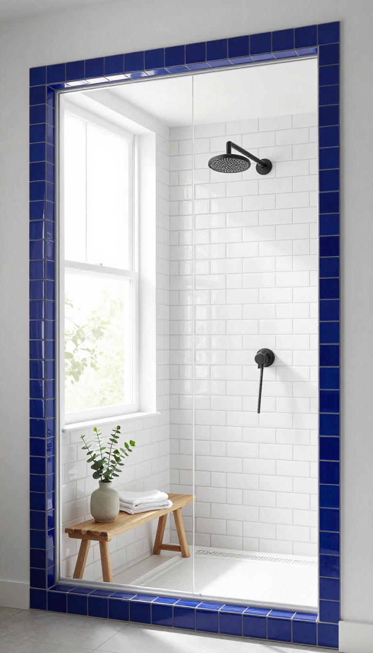
A window in a shower is a gift. It brings in daylight, makes a small bathroom feel bigger, and gives you something to look at besides grout. But an untreated window opening can look like a hole punched through the tile, especially if the frame is plain or the edges are rough.
A mosaic border changes that. It wraps the window in a slim band of smaller tiles, turning the opening into a framed feature instead of an afterthought. The border draws your eye to the light and gives the window a finished edge that looks intentional.
Best of all, it works with almost any main tile. You can match the mosaic to your floor, pull a color from the vanity, or go bold with a contrasting shade. The window becomes the focal point, and the rest of the shower gets a little breathing room.
The border itself is usually one to two mosaic tiles wide, which is enough to read as a frame without overwhelming the window. You can run it around all four sides for a classic picture-frame look, or just along the top and sides to keep the sill clean. Either way, the mosaic softens the transition between the tile field and the window casing.
Placement matters more than you might think. The border should sit flush with the window frame, not float a few inches away. If there's a gap, it looks like a mistake.
Measure twice, and dry-fit the mosaic before you commit. Color is where you get to have fun. A border in the same tone as your main tile adds texture without shouting.
A contrasting color—think deep blue around a white subway tile—makes the window pop. Just keep the grout consistent with the rest of the shower so the border doesn't look like a patch.
Choosing The Right Mosaic
Small formats work best here. Penny rounds, hexagons, and skinny linear mosaics all bend around corners without looking stiff. Avoid anything larger than two inches, or the border will feel clunky.
Glass mosaics catch the light from the window and add a little sparkle, while matte ceramic keeps things calm and understated.
Installation Tips
Waterproofing is non-negotiable around a window. Make sure the membrane wraps into the opening before you set any tile. Use a thin-set mortar designed for mosaics, and take your time with the cuts at the corners.
A mitered edge looks cleanest, but a simple butt joint with a matching grout line works fine too.
What To Skip
Don't use a border that's wider than the window trim—it will fight for attention. Skip glossy mosaics if the window gets direct sun, because the glare can be harsh. And if your window is small, keep the border thin; a heavy frame will make the opening feel cramped instead of bright.
11. Two-Tone Split Wall
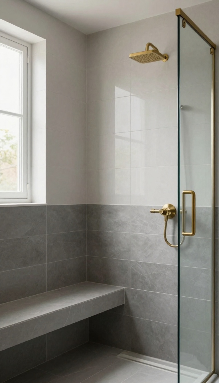
A two-tone split wall divides your shower into a darker lower half and a lighter upper half. It adds visual weight at the bottom and keeps the top feeling open. The best part?
You don't need any extra materials—just two colors of the same tile.
This approach works because it mimics the way we naturally see a room: darker at the base, lighter as you go up. It grounds the shower without making it feel heavy. And since you're using the same tile type, installation is straightforward—no special cuts or trims required.
The split usually happens at a horizontal line, often around waist or chest height. You can align it with a niche, a bench, or a window to make it look intentional. The contrast does the decorating for you.
Where To Place The Split
A common spot is 36 to 42 inches from the floor—roughly waist height. That puts the darker tile where water hits most, hiding splashes and soap scum. If you have a bench, line the split with its top edge for a seamless look.
For tall showers, a higher split (around 60 inches) keeps the dark tile from dominating.
Choosing Your Two Colors
Stick with the same tile in two different shades—like charcoal and light gray, or navy and white. That keeps the texture consistent and the contrast clean. If you want more drama, pick a matte finish for the bottom and a glossy one for the top.
Just avoid mixing tile sizes; it can make the split look accidental.
Making The Transition Look Sharp
The line between the two colors needs to be crisp. Use a thin trim piece or a pencil tile to bridge the gap. That covers any slight unevenness and gives the split a finished edge.
Also, make sure your grout lines up horizontally across both sections—it's a small detail that makes a big difference.
12. Accent Tile on the Curb
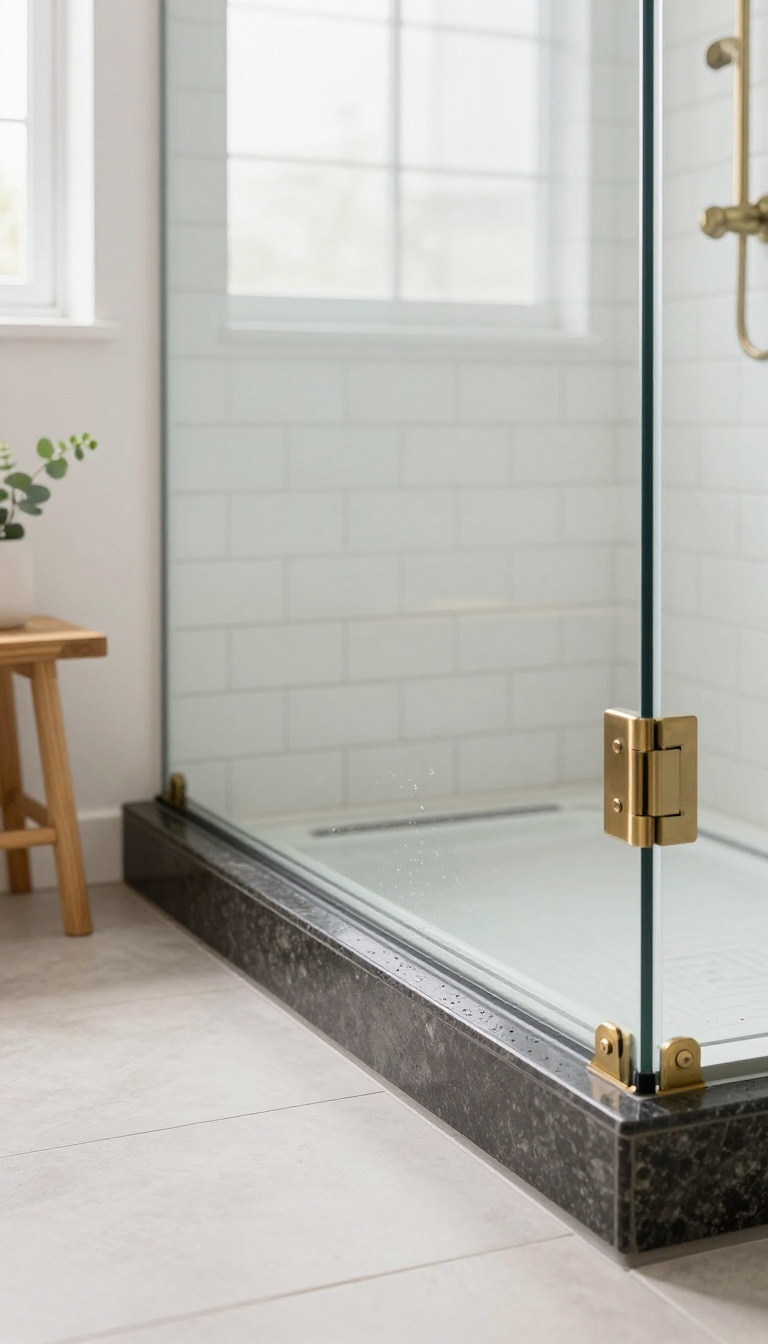
The curb is the one part of your shower you touch every single day, yet it usually gets whatever tile is left over from the walls. That's a missed chance. Wrapping the curb in a contrasting material turns a purely functional edge into a deliberate design move, and it costs almost nothing extra in labor if you plan it before the pan goes in.
It's a small change that reads as intentional rather than accidental.
Think of the curb as the frame around your shower floor. When it matches the walls exactly, it disappears. When it contrasts, it draws the eye down and gives the whole enclosure a finished, custom look.
You're not adding square footage or tearing anything out—just choosing a different tile for a strip that's typically three to five inches wide and four to six feet long. That's a tiny surface area, so you can afford a material you'd never use on a full wall.
Why The Curb Deserves Its Own Tile
A curb takes more abuse than any wall in the shower. It gets stepped on, sat on, and soaked every time the water runs. That's exactly why a contrasting tile works so well—it signals that this edge is different and built for wear.
A dark quartz or a honed stone slab on top reads as sturdy and intentional. It also hides water spots better than a glossy white ceramic that shows every drip. If you've ever scrubbed a curb and still seen streaks, you already know the struggle.
What Pairs Well With Your Walls
You don't need a wild color to make this work. A matte black curb under white subway tile looks sharp and modern. A warm wood-look plank on the curb softens an all-gray shower.
If your walls are busy with pattern, keep the curb solid and quiet—a single slab of marble or a plain porcelain tile in a matching tone. The rule is simple: if the walls are loud, the curb should be calm, and vice versa. Contrast in texture counts too, so a glossy curb against matte walls can be enough.
Installation Details That Matter
The curb needs a slight slope toward the drain, and your tile setter has to build that into the mortar bed before the tile goes on. Skipping the slope means standing water and eventual mildew. Use a single piece of stone or a full-length tile if you can, because fewer grout lines mean less maintenance.
If you're using small mosaics, seal the grout well. Also, make sure the curb tile overhangs the pan slightly so water drips into the shower, not onto the bathroom floor. These are small things, but they're the difference between a detail that lasts and one that leaks.
13. Glass Mosaic Accent Strip
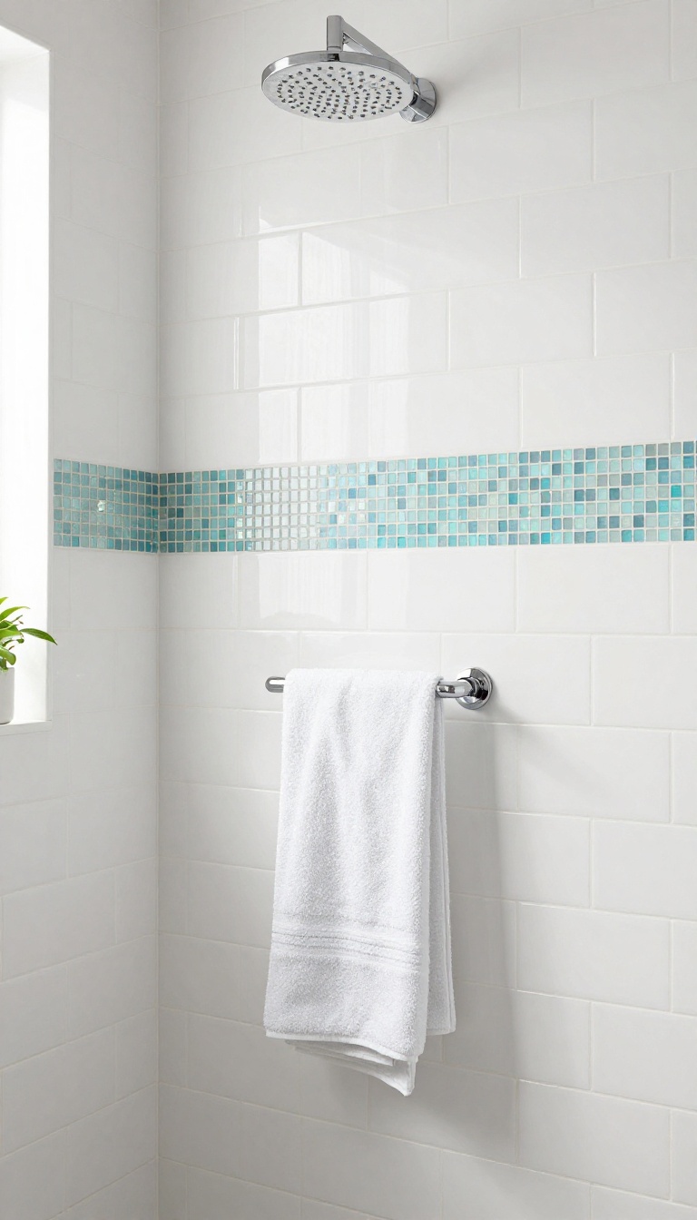
Glass mosaic strips catch light in a way that matte ceramic or stone simply can't. They add a subtle shimmer to your shower without overwhelming the space, making them a smart pick for small bathrooms. The key is treating the strip as a deliberate detail, not an afterthought.
A horizontal band of glass mosaic tiles, usually 3 to 6 inches tall, works as a visual break on an otherwise plain wall. Because glass reflects light, it bounces ambient light around the shower, which helps small, dim spaces feel brighter. It's also a practical choice: glass doesn't absorb water, so it resists stains and mildew better than porous materials.
You can run the strip at eye level, just above the showerhead, or align it with a niche or bench. The goal is to make it look intentional. Pair it with a simple subway tile or large-format porcelain to let the glass stand out.
Avoid busy patterns around it, or the strip will get lost.
Where To Place It
The most common spot is a horizontal band about 12 to 18 inches below the showerhead, where it's visible but not in the direct spray. If you have a niche, line the strip up with its top or bottom edge for a clean look. In a small shower, a single strip on the back wall can make the space feel wider.
Choosing The Right Glass Mosaic
Look for mosaics with a slight iridescent or frosted finish if you want subtle shimmer. Clear or glossy glass can look too shiny in bright showers. Smaller mosaics (1×1 inch or smaller) create a finer, more jewel-like strip, while larger rectangles give a more modern, linear feel.
Installation Tips
Use a bright white thinset and grout to keep the glass looking crisp. Dark grout can dull the reflection and make the strip look muddy. Seal the grout if you're using a cement-based product, especially in a steam shower.
And always back-butter glass mosaics to ensure full coverage and prevent cracking.
14. Patterned Cement Tile Accent
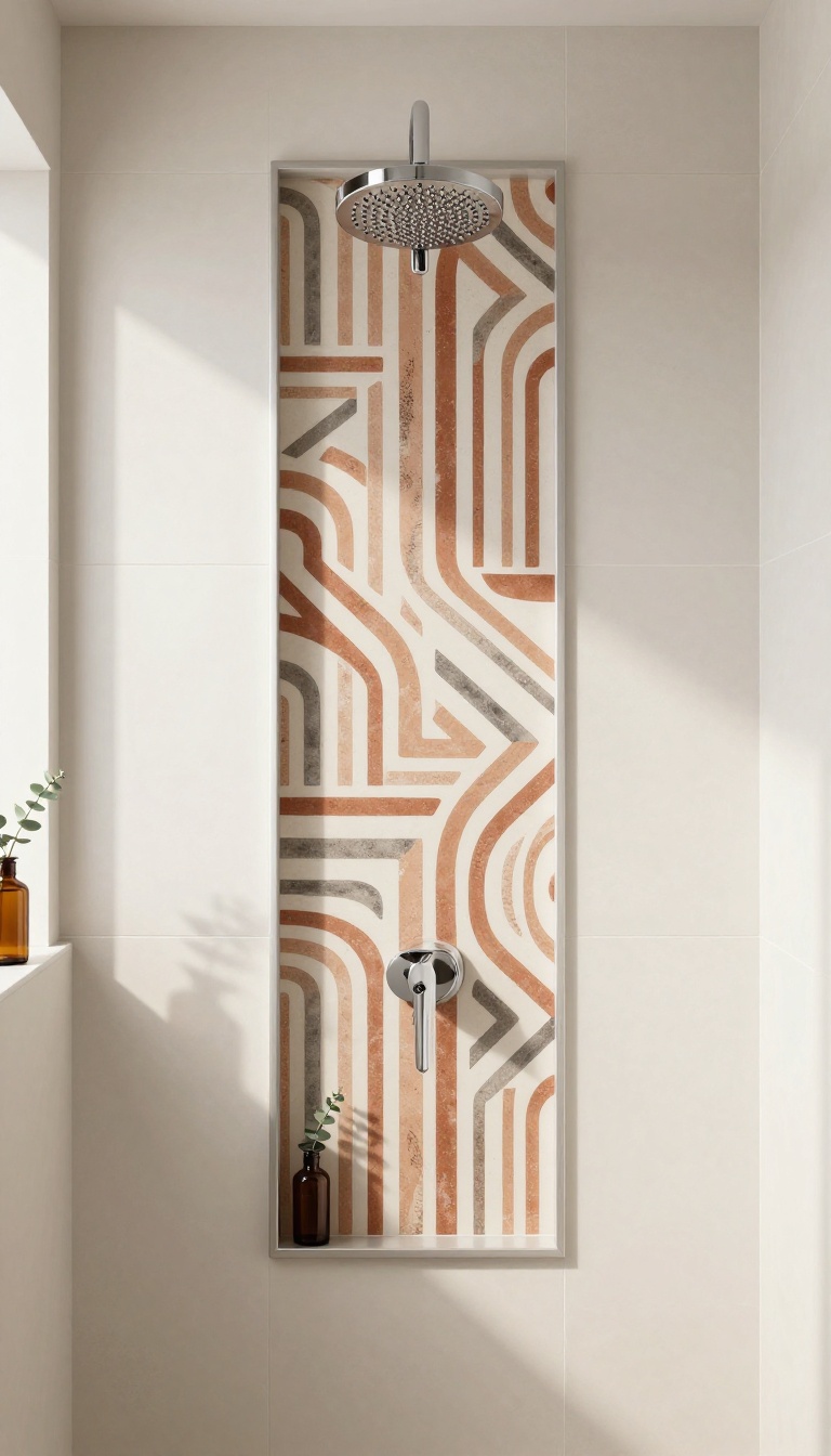
Cement tile brings a handcrafted, graphic punch that few other materials match. A single panel of it on one wall or inside a niche gives your shower a focal point without tiling the whole stall. It's a smart way to add color and pattern while keeping the rest of the space calm and budget-friendly.
Cement tile is made from a mix of cement, sand, and pigment, pressed into a mold and finished by hand. That process gives each piece slight variations in tone and edge, so the final wall feels organic rather than factory-perfect. The trade-off is that cement tile is porous and needs sealing, especially in a wet zone like a shower.
But when it's installed correctly and maintained, it holds up beautifully and becomes the star of the room.
Where To Place It
The most practical spot is a single vertical panel on the back wall, centered on the showerhead or running from floor to ceiling. This creates a column of pattern that draws the eye up and makes the ceiling feel higher. Another option is to tile just the inside of a niche, which turns a functional shelf into a jewel-box moment.
If you have a pony wall or a half-wall, cladding the outward-facing side in cement tile gives guests something interesting to look at from the rest of the bathroom.
Pairing With Other Tiles
Cement tile loves a simple companion. Large-format matte ceramic or porcelain in a solid color—think warm white, soft gray, or deep navy—lets the pattern breathe without competition. Keep the grout in the field tile close to its color so the accent panel pops.
For the cement tile itself, choose a grout that matches the darkest or lightest shade in the pattern to either sharpen or soften the look. Avoid pairing it with busy stone mosaics or heavily veined marble; the two patterns will fight.
Installation And Sealing Tips
Cement tile requires a little extra care during install. Use a white thinset mortar to prevent discoloration, and seal the tiles before grouting to keep grout from staining the surface. After grouting, apply a penetrating sealer annually to maintain water resistance.
In a shower, make sure the tile is installed over a proper waterproofing membrane, and consider using a epoxy grout for better stain protection. If you live in a hard-water area, wipe the tiles down after each shower to prevent mineral buildup.
Design Variations To Try
You don't have to stick to one pattern. Mix two or three cement tile designs in the same color family for a patchwork effect, or use a single pattern in a different colorway to create an ombré gradient. For a subtler look, choose a tone-on-tone pattern where the design is embossed rather than painted.
And if you want to dip a toe in, start with a small border strip at eye level or a single row inside the niche—you can always expand later.
15. Accent Tile Around the Shower Valve
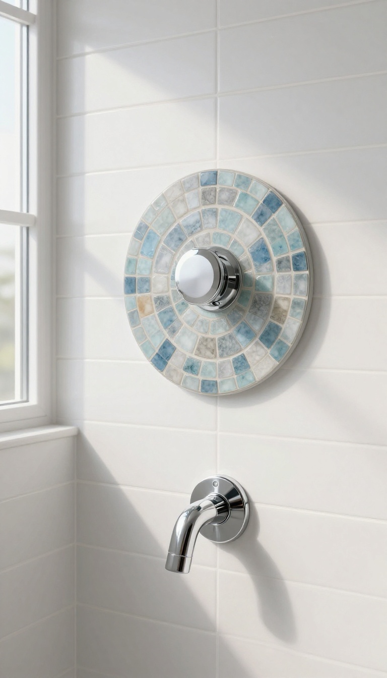
The shower valve is the one spot on your wall you touch every day, but it usually gets zero design attention. A ring of accent tile around it changes that in a hurry. You're not moving plumbing or adding square footage—just giving the fixture a frame that makes it look intentional.
Most valve trim plates are round or square and sit flat against the wall. That means you have a built-in shape to work with. You can outline it with a border, fill a larger square behind it with mosaic, or center a medallion so the valve becomes the bullseye.
The trick is keeping the accent big enough to read from the doorway but not so big it looks like a patch. A good rule: extend the accent at least six inches past the trim on every side, or go bold with a full-height panel that runs from the valve up to the showerhead. Either way, the valve stops being an afterthought and starts pulling its weight.
Pick A Shape That Matches The Trim
If your valve trim is round, a circular mosaic medallion feels natural. Square trim pairs well with a square or rectangular border. Mixing shapes can work, but it takes confidence—a round trim inside a square accent can look accidental if the spacing is off.
Trace the trim plate on paper, cut it out, and tape it to the wall to test proportions before you commit.
Use A Contrasting Material, Not Just A Contrasting Color
A different color of the same ceramic can look like a mistake. Switch materials instead: glass mosaic around a matte porcelain field, or honed stone against glossy subway tile. The texture change reads as deliberate even from across the room.
Just make sure the accent tile is rated for wet areas and won't stain from soap scum.
Keep The Grout Lines Working With You
If your field tile has tight grout lines, don't surround the valve with a mosaic that has thick, chunky joints—the mismatch will jump out. Match grout width where the two materials meet, or use a grout color that blends with both. A thin, epoxy grout in a neutral tone is your safest bet around plumbing fixtures because it resists staining and won't need sealing every year.
Plan The Layout Before The Plumber Sets The Valve
The valve body gets installed before the tile goes up, so you need to know your accent dimensions early. If you're centering a medallion on the valve, tell your plumber to center the valve on the wall studs accordingly. Otherwise you'll end up with an accent that's two inches off-center, and no amount of grout will hide that.
FAQ
What is the best accent tile for a shower?
There's no single best tile—it depends on your style and budget. Porcelain and ceramic are durable and affordable, while glass and natural stone offer a more upscale look. Just make sure the tile is rated for wet areas.
Where should I place accent tile in a shower?
Common spots include a vertical strip, a horizontal band, inside a niche, or on the shower floor. Choose a location that enhances the architecture and doesn't fight with your fixtures.
How much accent tile do I need?
Measure the area you plan to cover and add 10-15% for cuts and waste. For small accents like a niche or border, you may be able to use leftover tile from another project.
Can I mix accent tile with large-format tile?
Absolutely. Mixing scales adds visual interest. Just keep the color palette cohesive so the accent feels intentional, not random.
Is accent tile hard to maintain?
Not if you choose the right material. Porcelain and glass are easy to clean. Natural stone may need sealing, and small mosaics have more grout lines, which require a bit more scrubbing.
Conclusion
Accent tile works best when it solves a real problem instead of just filling space. Pick one idea that matches your layout and budget, then let it do its job without crowding the wall. A single band, a niche, or a shower floor does more than five competing patterns ever will.
Start with the spot that bugs you most, whether that is a blank wall or a slippery floor, and build from there. Live with it for a week before adding anything else. Get the accent right once, and the whole shower feels intentional.