13 Living Room Colour Ideas: Paint Colors for Cozy Style
Paint is the fastest way to change how a living room feels, and it costs less than a new sofa. The right shade can make a small space feel open, a cold room feel warm, or a plain room feel like it was designed on purpose.
The trick is picking a color that works with your light, your furniture, and how you actually use the room. Some shades calm things down, others add energy, and a few do both depending on the time of day.
Below are 13 living room color ideas, from warm greige to deep navy, with practical notes on what each one does well and where it tends to struggle.
1. Warm Greige: The New Neutral
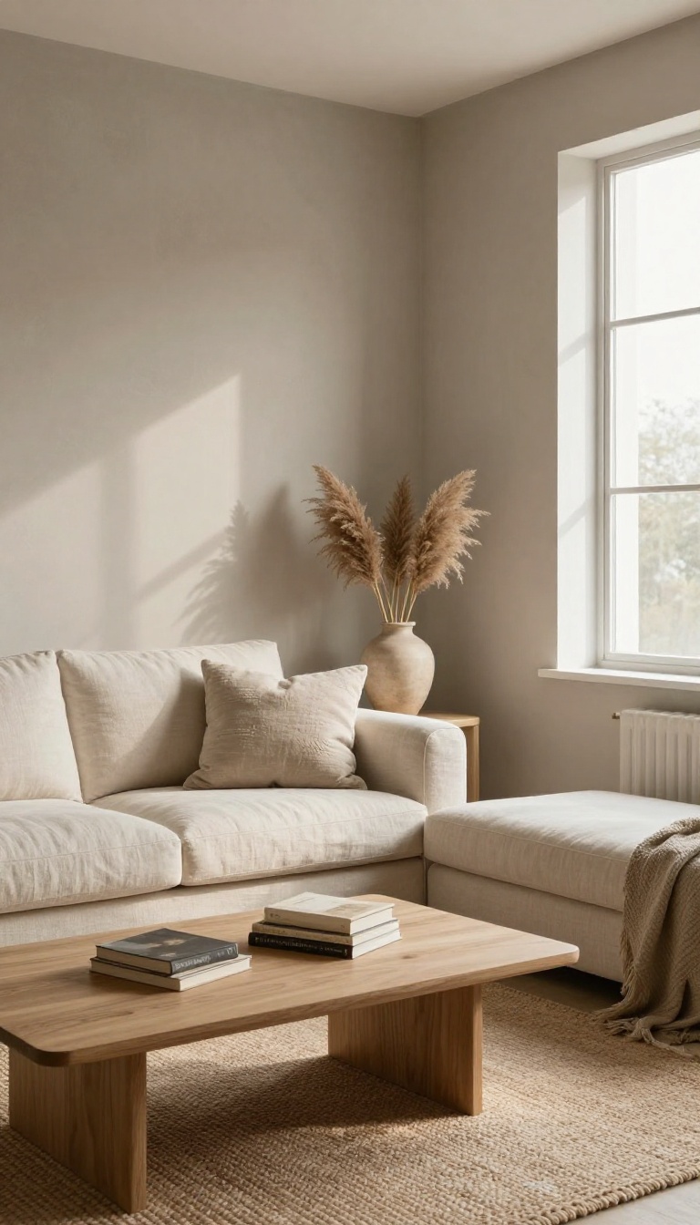
Greige sits right between gray and beige, and that middle ground is exactly why it works so well. It keeps the calm, grounded feel of gray without the chill, and borrows the softness of beige without turning yellow or muddy. In a living room, it reads as a quiet backdrop that lets your furniture and art do the talking.
It also plays nicely with almost any style, from modern to traditional. That flexibility is why designers keep coming back to it, and why it has quietly replaced cool gray as the go-to neutral in a lot of homes.
The best greige shades lean slightly warm, so they feel cozy instead of cold. Look for undertones of taupe, mushroom, or soft sand rather than anything with a blue or green cast. A warm greige on the walls makes a room feel settled and inviting, even on gray days.
Because it is so neutral, greige gives you room to layer in color through rugs, pillows, and throws. It also works as a whole-room color, on trim, or as a base for a two-tone wall. The shade you pick matters more than the label on the can, so always test it in your own light before committing.
Why It Works In Almost Any Room
Greige reflects light softly, so it brightens a space without glaring. In north-facing rooms it warms up the cool daylight, and in sunny rooms it stays calm instead of washing out. It also hides minor wall imperfections better than stark white or deep color.
Pairing It With Furniture And Wood Tones
Warm greige loves natural wood, especially oak, walnut, and weathered finishes. It also sits comfortably next to white, cream, and charcoal upholstery. For a little contrast, add black metal accents or a deep green plant to keep the palette from going flat.
Picking The Right Greige For Your Light
Test at least three greige samples on different walls and check them morning, afternoon, and night. North-facing rooms usually want a warmer, slightly pink or taupe greige. South-facing rooms can handle a cooler, grayer version without feeling cold.
2. Soft Sage Green: Nature's Calm
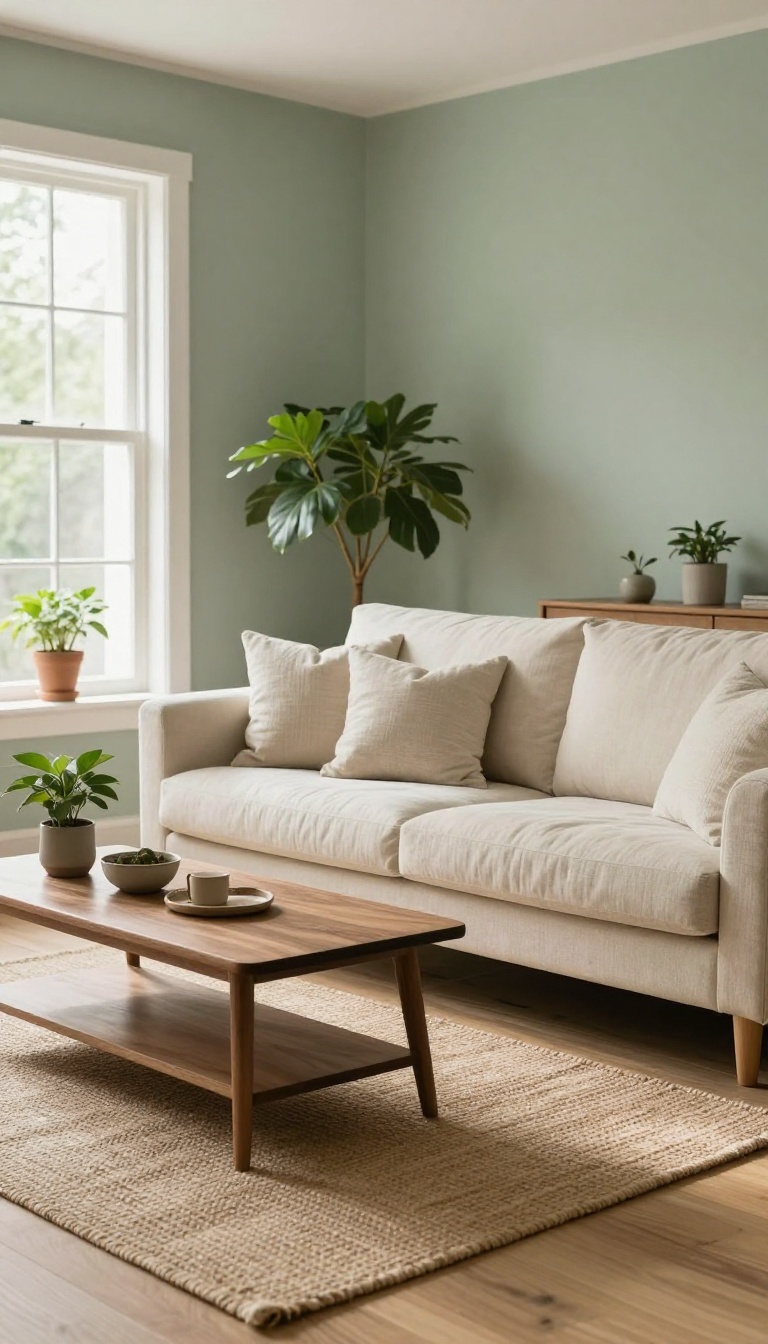
Sage green has a way of making a room exhale. It's muted, earthy, and just gray enough to feel sophisticated rather than sweet. That softness is why it works in living rooms that need to feel calm but not boring.
It also plays unusually well with wood. Oak, walnut, and even painted white furniture all look better against sage, which gives the color a natural, grounded feel. If your living room gets a lot of sunlight, sage can look almost silvery during the day and deeper at night.
Sage green sits in that sweet spot between green and gray, so it never feels loud. It brings the outside in without turning your living room into a jungle. The color has a slight dustiness that makes it feel lived-in, which is exactly what you want in a cozy space.
One of the best things about sage is how forgiving it is. It hides scuffs better than pale blue or bright white, and it doesn't show fingerprints the way darker greens can. That makes it a practical choice for families or anyone who actually uses their living room.
You can go lighter or darker depending on the mood you want. A pale sage feels airy and coastal, while a deeper, mossy sage adds warmth and a bit of drama. Either way, the color stays calm.
Why It Works With Wood
Wood tones and sage green share the same earthy undertones, so they naturally complement each other. A light oak floor or a walnut coffee table will look richer against sage because the green picks up the warm notes in the wood. If you have a lot of wood in the room, keep the sage on the lighter side so the space doesn't feel heavy.
If your furniture is mostly painted or upholstered, you can go darker with the green for contrast.
Best Pairings And Accents
Cream, warm white, and soft beige keep sage feeling fresh and open. Add a few black or brass accents for a little edge without breaking the calm. For texture, think natural materials: linen, wool, jute, and rattan.
They echo the earthy feel of the green and make the room feel cozier. A pop of terracotta or muted pink can warm things up if sage starts to feel too cool.
Lighting And Finish Tips
Sage changes a lot depending on your light. In north-facing rooms, it can lean gray and cool, so choose a version with more yellow or green undertones. In sunny rooms, it will look brighter and more vibrant.
Eggshell or satin finishes are usually best for living rooms because they're easy to clean and reflect a little light. Flat paint can look chalky with sage, which some people love and others don't.
3. Terracotta: Sun-Baked Warmth
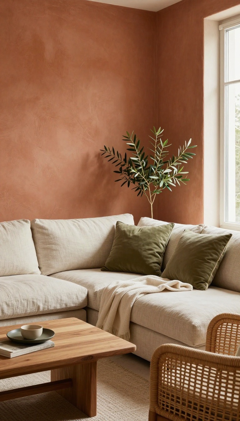
Terracotta brings the easy warmth of a Mediterranean afternoon straight into your living room. It's an earthy orange-brown that feels grounded and inviting, never flashy. The color works hard to soften hard edges and cool light, making even a basic rental feel like a getaway.
Terracotta sits in that sweet spot between orange and brown, so it carries heat without turning loud. It pairs beautifully with natural materials like wood, rattan, and linen. And because it's literally named after baked clay, it has a handmade quality that mass-produced colors can't fake.
Where It Works Best
Rooms with northern exposure or limited natural light benefit most from terracotta's glow. It bounces warm light around and keeps things from feeling dim. South-facing rooms can handle it too, but stick to lighter, more muted versions so the heat doesn't overwhelm.
Pairings That Sing
Cream, off-white, and soft olive green are terracotta's best friends. Add black metal accents or dark wood for contrast. Avoid cool grays and stark whites, which can make terracotta look muddy or dated.
How To Use It Without Going Overboard
Try an accent wall behind the sofa or a full room in a lighter clay tone. If you're nervous, start with a terracotta throw, curtains, or a large piece of art. You can always commit to paint later once you see how it feels.
4. Deep Navy: Moody but Cozy
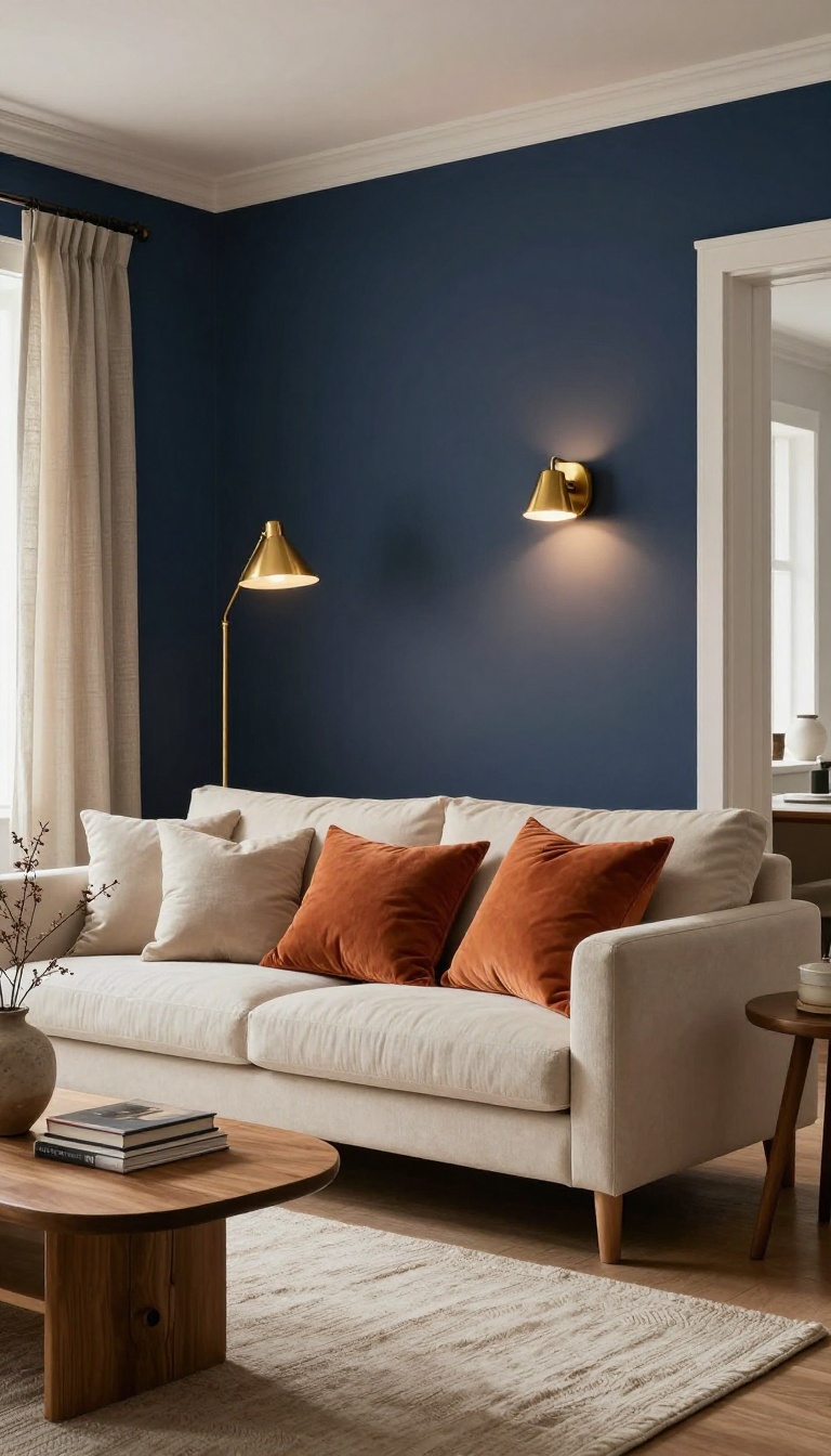
Deep navy doesn't shout for attention. It settles into the room, softens the edges, and makes everything around it look a little more expensive. At night, with a couple of lamps on, navy walls feel like a favorite sweater.
The color absorbs light instead of bouncing it, so the room gets quiet and wrapped-in rather than bright and busy.
Navy works best when you lean into the moody side instead of fighting it. A living room painted in deep navy becomes a place you want to sink into after a long day, especially if you get the lighting and contrast right. It's also more forgiving than people expect.
Navy plays well with warm woods, brass, cream, and even bold colors like rust or mustard. The trick is keeping the room from feeling like a cave, which comes down to a few practical moves.
Pick The Right Navy
Not all navies are the same. A navy with a hint of green or gray feels calm and classic, while one with strong purple undertones can look almost black in low light. Grab a few samples and paint big swatches on the wall.
Check them in the morning, at noon, and at night with lamps on. The shade that looks rich in daylight might go flat after dark, so test before you commit.
Balance The Darkness
Navy walls need contrast to stay cozy instead of heavy. Keep the ceiling light, add white or cream trim, and bring in a rug or curtains that aren't dark. Warm metals help a lot here.
Brass or gold light fixtures and hardware catch the light and keep the room from feeling cold. Wood tones with a little warmth do the same thing.
Layer The Lighting
One overhead light won't cut it in a navy room. Use two or three lamps at different heights so the light spreads across the walls instead of pooling in one spot. Warm bulbs around 2700K make navy feel inviting.
Cool white bulbs turn it cold and a little clinical, which is the opposite of what you want at night.
Watch The Room Size
Navy can make a small living room feel intimate, which is often a good thing. But if the room already feels tight, paint only one accent wall or use navy on the lower half with a lighter color above. Bigger rooms handle full navy walls easily.
Add a mirror or a light-colored piece of furniture to break up the dark expanse and keep the space from feeling closed in.
5. Creamy White: Bright and Soft
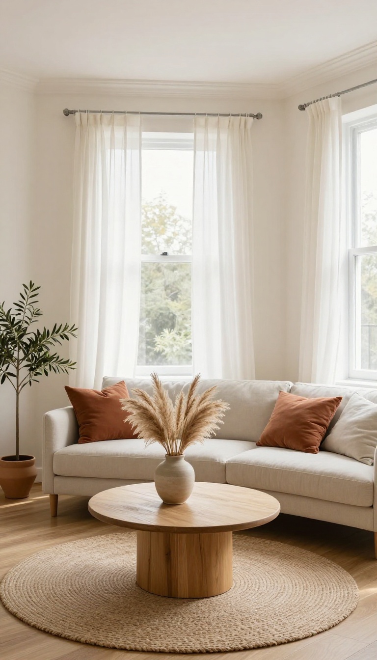
Creamy white is white with a hug. It bounces light around the room like a bright white, but it never turns cold or clinical. That tiny bit of warmth keeps things soft, so even a small living room feels open and inviting instead of stark.
It's a forgiving color, too. Creamy white plays nice with almost any furniture you already own, from dark wood to bright fabrics. You get the airy feel of white without the sterile vibe.
Creamy white works because it reflects light while holding onto a little warmth. In a small living room, that combination makes the walls feel like they're breathing. You get brightness without the glare, and coziness without the cave effect.
It's also one of the easiest colors to live with long-term. Trends come and go, but creamy white stays classic. You can swap out pillows, art, and throws without repainting, which saves you time and money down the road.
Why It Works In Small Rooms
Small rooms need light, but they also need warmth. Pure white can feel chilly, especially in north-facing rooms. Creamy white solves that by reflecting light while adding a soft yellow or beige undertone.
The result is a space that feels bigger and more welcoming. It also blurs the lines between walls and ceiling, which makes the room feel taller. If you paint the trim and ceiling in the same creamy white, the whole space opens up without any visual clutter.
Picking The Right Undertone
Creamy whites come in warm, neutral, and slightly cool versions. Warm ones lean yellow or peach, neutral ones sit closer to beige, and cool ones have a hint of gray. Test a few samples on your wall before you commit.
Look at them at different times of day. Morning light can make a creamy white look brighter, while evening lamplight can bring out the warmth. The right one will feel soft in both.
What To Pair With It
Creamy white loves natural textures. Think linen sofas, jute rugs, and wood tones like oak or walnut. These materials add depth without competing with the walls.
For contrast, bring in a few darker accents. A black metal floor lamp, a deep green plant, or charcoal throw pillows keep the room from feeling flat. Just don't overdo it—creamy white is the star here.
Where It Can Go Wrong
The biggest risk is picking a creamy white that's too yellow. In a sunny room, it can turn almost buttery, which might not be what you want. Similarly, a creamy white with too much gray can look dingy in low light.
Another trap is using it everywhere with no variation. If walls, trim, and ceiling are all the exact same shade, the room can feel like a blank box. Use a slightly brighter white on the trim to add subtle definition.
6. Muted Mustard: A Pop of Sunshine
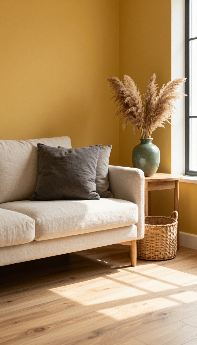
Mustard yellow gets a bad rap as a loud, retro color, but the muted versions are a different story. Think of a soft, earthy yellow with a little brown mixed in—like Dijon or goldenrod—rather than neon. It brings a cheerful, sunny energy to a living room without turning it into a circus tent.
The key is keeping it grounded. Pair muted mustard with warm neutrals, natural textures, and a few darker accents, and it feels cozy instead of chaotic. It works especially well in rooms that don't get a lot of natural light, because it mimics the glow of late-afternoon sun.
Mustard is one of those colors that instantly lifts a room's mood. It's optimistic without being aggressive, and it plays nicely with everything from wood tones to deep greens. The trick is choosing a shade with enough gray or brown in it so it reads as sophisticated, not sugary.
Use it on an accent wall, on built-ins, or even on the ceiling for a surprise. You don't need much—a single painted piece or a bold wall is enough to make the whole space feel warmer and more alive.
Where It Works Best
Muted mustard shines in north-facing rooms that feel a bit chilly, or in any space that needs a dose of warmth. It's also a great choice for a reading nook or a corner that gets used in the evening. Because it's a mid-tone color, it doesn't shrink a room the way dark colors can, but it still adds depth.
Pairings That Keep It Calm
Balance mustard with soft whites, warm grays, or creamy beiges to keep things airy. For contrast, add charcoal, navy, or forest green. Natural materials like rattan, leather, and linen help it feel grounded rather than gimmicky.
A few brass or gold accents echo its warmth without competing.
A Little Goes A Long Way
You don't have to commit to a full wall. Try painting the inside of a bookshelf, a single door, or a trim detail. Even a large canvas or a throw pillow in muted mustard can give you the same sunny effect with zero risk.
Start small and see how the light hits it throughout the day.
7. Dusty Rose: Gentle Romance
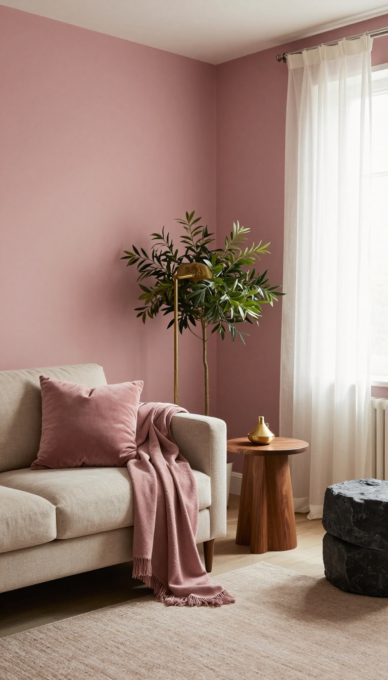
Dusty rose is the color of a vintage lipstick or a faded bouquet, softened with gray so it never feels too sweet. It brings a quiet romance to a living room without turning the space into a dollhouse. The shade works in modern and traditional homes alike because it sits somewhere between blush and mauve.
The trick with dusty rose is keeping it grounded. Pair it with warm neutrals like oatmeal or taupe, and it reads as sophisticated rather than sugary. Add a few darker accents, like charcoal or walnut, and the room gains depth.
This color also flatters skin tones, which makes it a great choice for a room where you host friends or spend long evenings.
Where It Works Best
Dusty rose shines in living rooms that get soft, indirect light. North-facing rooms can make it look a little gray, so test a sample on multiple walls. In bright, south-facing spaces, it warms up beautifully and feels almost sunbaked.
It's also a smart pick for small rooms because it doesn't overwhelm the eye.
Pairings That Keep It Grown-up
Skip the matchy-matchy pink-on-pink look. Instead, mix dusty rose with olive green, deep burgundy, or even a touch of black. Metallic accents in aged brass or bronze add a vintage feel without going full antique.
For a modern twist, use it as a single accent wall behind a neutral sofa.
Finishing Touches
Textiles do a lot of the heavy lifting here. Velvet in a similar tone adds richness, while linen keeps things breezy. A dusty rose throw or pair of curtains can test the waters before you commit to paint.
And don't forget the ceiling—a soft white or pale pink ceiling keeps the room feeling open and airy.
8. Charcoal Gray: Sophisticated Depth
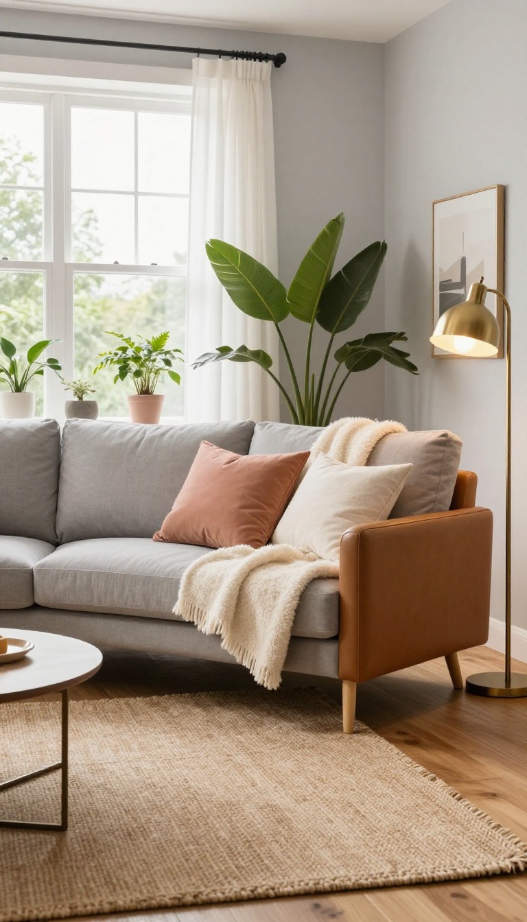
Charcoal gray sits at the deep end of the gray family, darker than slate and softer than true black. It gives a living room instant weight and polish without the harshness that can come from going fully dark. Pair it with the right light and accents, and it feels rich rather than gloomy.
Charcoal works because it absorbs light instead of bouncing it around. That makes a room feel grounded, almost like the walls are holding everything together. It also lets brighter colors and natural textures pop in a way pale walls never could.
The shade itself is flexible. A charcoal with a blue undertone reads cool and modern, while one with brown or green undertones feels warmer and more traditional. Test a few swatches on different walls before you commit, since charcoal shifts a lot depending on daylight and lamplight.
Where Charcoal Shines
Rooms with tall ceilings and big windows handle charcoal easily. It adds depth to open-plan spaces that would otherwise feel flat and unfinished. It also works beautifully as an accent wall behind a sofa or fireplace.
One dark wall gives you the drama without shrinking the whole room.
Making It Feel Cozy, Not Cave-like
Balance dark walls with warm light sources. Table lamps, floor lamps, and a dimmable overhead fixture keep charcoal from turning cold after sunset. Add texture through a wool throw, a leather chair, or a woven rug.
Soft materials soak up the seriousness and make the room feel lived-in.
Colors That Play Well With It
Charcoal loves bold accents. Mustard, blush pink, emerald, and brass all stand out against it without fighting for attention. For a calmer look, layer in cream, oatmeal, and warm wood tones.
The contrast stays gentle and the room feels quiet instead of heavy.
9. Olive Green: Earthy Elegance
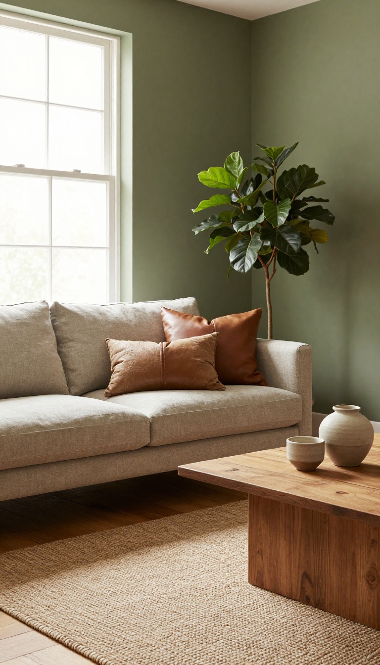
Olive green brings a quiet, grounded presence to a living room. It's not as flashy as emerald or as neutral as sage, but that's exactly what makes it work. This shade feels like a walk through a mossy forest—calm, organic, and effortlessly stylish.
Olive green is a chameleon. In a sunny room, it reads as a warm, almost golden green. In a north-facing space, it turns deeper and moodier, like the underside of a leaf.
That shift is part of its charm. It never feels static. Unlike brighter greens that can overwhelm, olive has a built-in softness.
It's muted with brown and gray, so it pairs easily with wood tones, leather, and natural fabrics. Think of it as a neutral that happens to be green. If you want a living room that feels cozy but not boring, olive green delivers.
It adds depth without darkening the mood, and it works with almost any style, from mid-century to modern farmhouse.
Why It Works
Olive green connects a room to nature, even if your only view is a brick wall. It's soothing without being sleepy, and it has enough pigment to make a statement while still playing well with others. It also flatters a wide range of skin tones, which matters if you spend a lot of time in the room.
And because it's earthy, it doesn't clash with the wood floors or furniture you already own.
Where to Use It
An accent wall behind the sofa is a safe bet. It anchors the seating area and gives the room a focal point without closing it in. For a bolder move, paint all four walls.
Olive has enough gray in it to keep the space from feeling like a cave, especially if you have good light. Trim in a soft white keeps things crisp. You can also use olive on built-ins, a fireplace surround, or even the ceiling for a cozy, enveloping effect.
Pairings That Work
Olive loves warm neutrals: cream, oatmeal, camel, and rust. Add black metal accents for a modern edge, or brass for a touch of glam. Natural materials like rattan, jute, and linen bring out its organic side.
For contrast, try deep burgundy or navy in small doses—they make the green pop without fighting it.
Light And Finish
In a bright room, olive can handle a matte finish. It'll look velvety and rich. In a darker room, choose an eggshell or satin finish to bounce light around.
Test the color on all four walls before committing. Olive shifts a lot depending on the time of day, and you want to make sure you love every version of it.
10. Blush Pink: Subtle Warmth
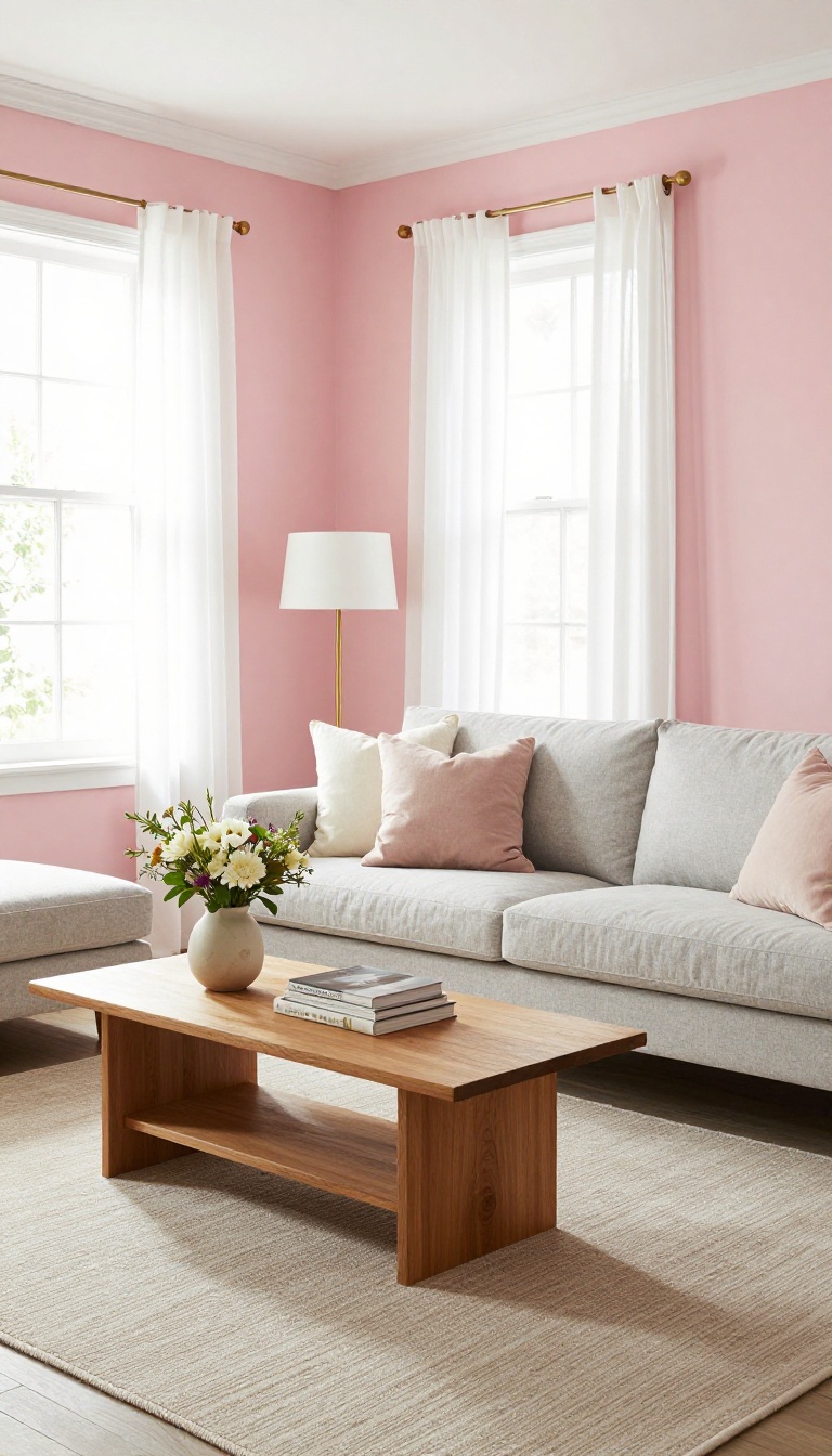
Blush pink has a reputation problem. People hear "pink" and picture a nursery or a Valentine's display, but blush is a different animal entirely. It's pink that's been quieted down with beige or gray, leaving just enough warmth to soften a room without turning it saccharine.
In a living room, blush works like a warm neutral with a pulse. It reflects light gently, flatters skin tones, and pairs with almost anything you already own. The key is choosing the right depth and knowing where to stop.
Blush sits in that sweet spot between beige and pink, which is why it plays so well with other colors. It has enough pigment to feel intentional but not so much that it dominates. Think of it as the friend who makes everyone else look good.
This shade shines in rooms that get indirect or northern light, where it reads as a soft, warm neutral. In bright southern exposure, it can turn slightly peachy, which is still lovely but worth testing first. Always paint a sample swatch and live with it for a day or two.
Blush also has a chameleon quality. Next to white trim, it looks crisp and modern. Against wood tones, it feels vintage and cozy.
With brass or gold accents, it leans glam without trying too hard.
Where Blush Works Best
Blush is a natural fit for rooms that need warmth without weight. It's ideal for small living rooms because it bounces light around and keeps things feeling open. It also works beautifully in bedrooms that double as lounges, where you want calm but not boredom.
If your furniture is mostly gray, white, or navy, blush adds life without clashing. It's also a smart choice for rental-friendly updates since it reads as neutral to most landlords.
Pairings That Keep It Grown-up
To avoid a room that feels too sweet, anchor blush with deeper tones. Navy, charcoal, or forest green give it backbone. Warm metals like brass and copper add richness, while natural textures like linen, rattan, and wool keep it grounded.
Avoid pairing blush with bright primary colors or too much white, which can push it into candy territory. Instead, layer in muted browns, taupes, or soft blacks for a look that feels collected, not themed.
Finishing Touches
Once the walls are blush, keep the rest of the room simple. Choose a rug in a neutral tone with a subtle pattern, and let artwork or throw pillows bring in contrast. A single bold element, like a black floor lamp or a deep green velvet sofa, is enough to keep the space from feeling one-note.
Lighting matters here. Warm bulbs (2700K) enhance blush's cozy side, while cool white light can make it look washed out. Dimmers help you adjust the mood from day to night.
11. Warm Taupe: Understated Chic
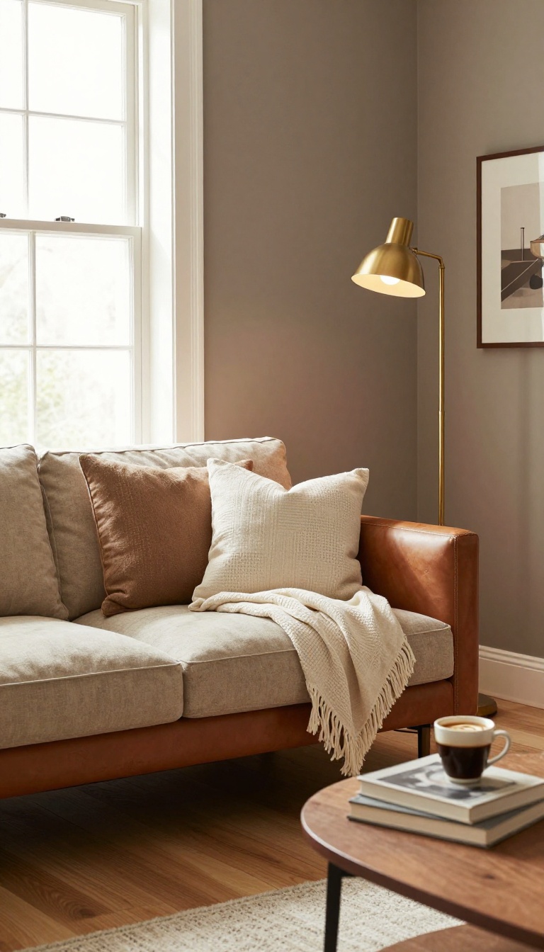
Warm taupe doesn't shout, but it doesn't disappear either. It's the color of a well-worn leather chair or a cup of coffee with too much cream—soft, brownish-gray, and quietly sophisticated. People often overlook taupe because it seems safe.
But the right warm taupe has depth. It shifts with the light, looking cozier at night and cleaner during the day. That flexibility makes it a smart choice for a living room you want to live in, not just look at.
It also plays well with almost everything. Wood tones, brass, linen, wool—taupe lets them all have their moment without competing.
Taupe is a chameleon. It borrows from brown, gray, and beige, so it never feels flat. In a north-facing room, a warm taupe can keep things from feeling chilly.
In a bright southern exposure, it stays calm instead of washing out. This is a color for people who want a room to feel collected, not decorated. It's the backdrop that makes your books, art, and throw pillows look intentional.
And because it's neutral, you can swap out accents with the seasons without repainting. One thing to watch: taupe can go muddy if the undertones clash with your flooring. Always test a sample against your floors and furniture before committing.
Why Warm Taupe Works
Warm taupe has a touch of red or yellow in it, which keeps it from feeling cold. That warmth makes a living room feel inviting without being overly sweet. It's also forgiving—scuffs and dust don't show the way they do on darker or brighter colors.
Unlike pure gray, taupe doesn't feel sterile. Unlike beige, it has more complexity. That balance is why designers return to it again and again.
Pairing Taupe With Other Colors
Taupe loves contrast. Cream trim and white ceilings make it look richer. Navy or charcoal accents add a tailored edge.
For a softer look, pair it with blush, sage, or muted blue. Metallics matter here. Brass and gold bring out taupe's warmth, while nickel and chrome can make it feel cooler.
Pick your hardware to match the mood you want.
Making Taupe Feel Cozy, Not Boring
Texture is your friend. Add a chunky knit throw, a woven rug, or velvet cushions. Layer in a mix of materials—wood, stone, glass—so the room has depth.
Lighting also plays a role. Warm bulbs (2700K–3000K) enhance taupe's coziness. A dimmer switch lets you adjust the mood from day to night.
Finally, don't be afraid to go slightly darker on the walls than you think. Taupe reads lighter once it's up, and a bit of depth makes the room feel enveloping.
12. Burnt Orange: Cozy Energy
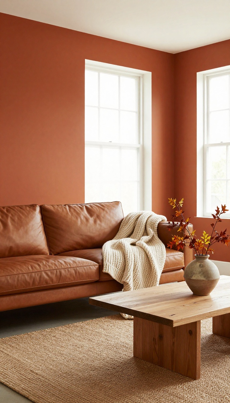
Burnt orange is the color of a crackling fire and autumn leaves, bringing a jolt of warmth that feels both energetic and comforting. It's bold enough to be the star of your living room, yet earthy enough to play well with others. Unlike brighter oranges, burnt orange has a depth that keeps it from feeling juvenile.
It pairs beautifully with natural textures like wood, leather, and linen, making it a natural fit for cozy, lived-in spaces. If you want a room that feels alive but still snug, this shade delivers.
Burnt orange sits in that sweet spot between red and yellow, but it's been muted with brown so it doesn't scream. The result is a color that feels warm, earthy, and a little bit retro in the best way. It's a great choice for a living room because it adds instant energy without being overwhelming.
And when you mix it with natural materials, it grounds the space and makes it feel inviting. Here's how to make it work in your home.
Why It Works
Burnt orange reflects warmth, so it makes a room feel cozy even on chilly days. It also has a richness that adds depth, especially in spaces with lots of natural light. Because it's a muted tone, it doesn't clash with other colors.
It actually plays nicely with a wide range of palettes, from neutrals to blues and greens.
Pairing With Natural Textures
This color loves texture. Think a chunky knit throw, a leather sofa, or a jute rug. The contrast between the smooth paint and the rough materials adds interest and keeps the room from feeling flat.
Wood tones, especially medium to dark woods, bring out the earthy side of burnt orange. Add some woven baskets or a rattan chair to complete the look.
Where to Use It
You don't have to paint all four walls. An accent wall behind the sofa or a fireplace makes a strong statement without overwhelming the space. If you're hesitant, start with burnt orange in smaller doses: a painted bookshelf, a trim detail, or even a large piece of art.
You can always go bigger later.
Lighting Matters
Burnt orange can look different depending on your light. In a north-facing room, it may appear more brown and subdued. In a sunny south-facing room, it will glow and feel more vibrant.
Test a sample patch on multiple walls and check it at different times of day. That way, you'll know exactly how it will behave in your space.
13. Soft Black: Bold and Intimate
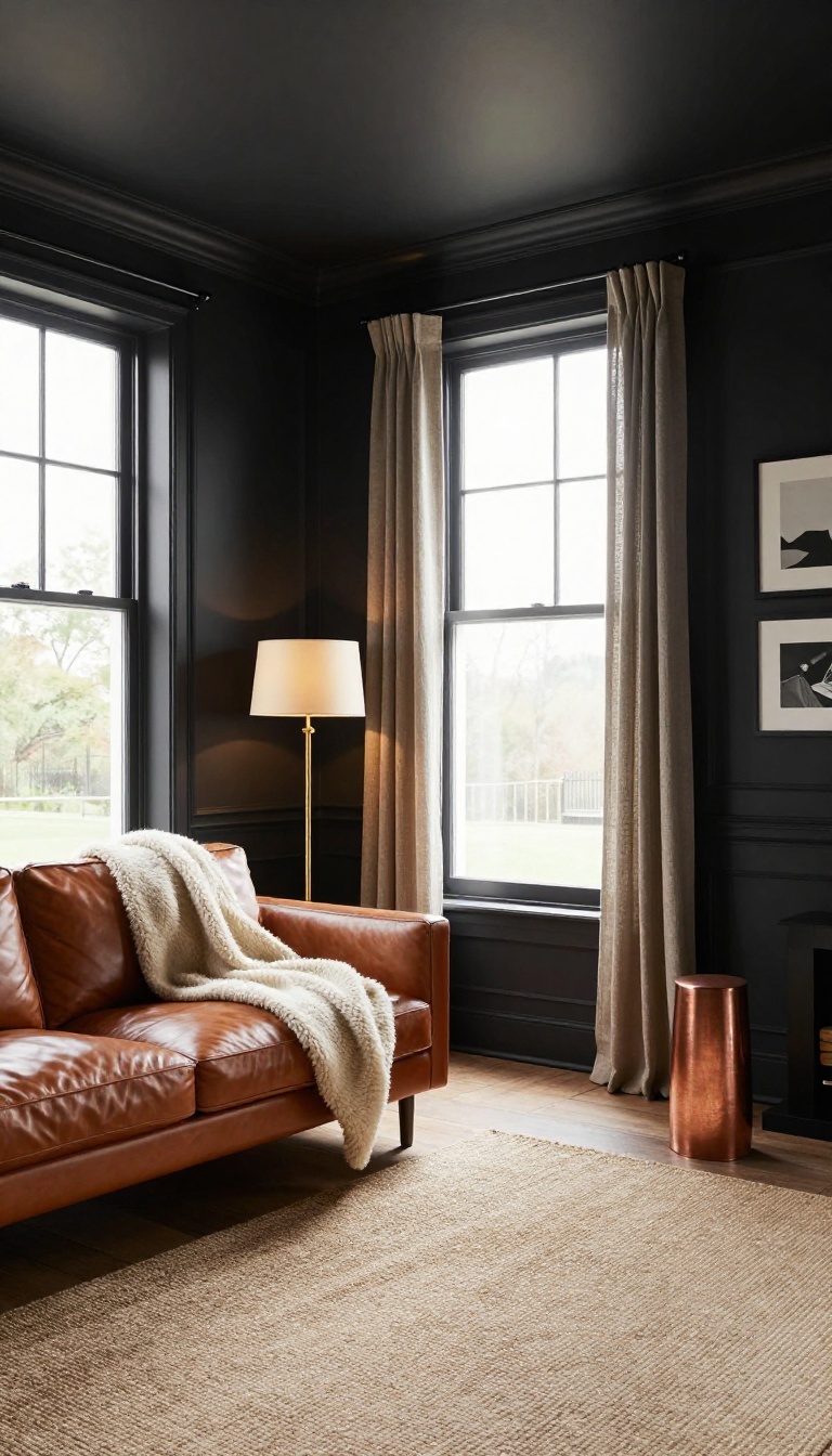
Soft black isn't the flat, inky black of a chalkboard. It's a black with a little warmth or gray mixed in, so it reads as deep charcoal or faded ink instead of a void. That tiny bit of softness is what makes it work on living room walls without turning the space into a cave.
Used well, it pulls everything in close and makes the room feel like a quiet retreat.
The biggest surprise with soft black is how much it changes after dark. During the day, it soaks up light and makes windows glow like little stages. At night, lamps and candles turn the walls into a warm backdrop that makes furniture and art pop.
It's a color that rewards you for staying in.
Where It Works Best
Rooms with lots of natural light handle soft black easily. North-facing rooms with big windows or skylights get a moody, gallery feel that's hard to fake with lighter colors. It also shines in small spaces you want to feel snug, like a reading nook or a den off the main living area.
If your room is dark and cramped already, use it on one accent wall instead of all four.
How To Keep It Cozy, Not Cold
Pair soft black with warm textures: a chunky wool throw, a leather sofa, a jute rug, or linen curtains. Add at least two sources of warm light, like a floor lamp and a table lamp with 2700K bulbs. Wood tones and brass or copper accents also keep the room from feeling like a bachelor pad.
The goal is contrast that feels layered, not stark.
Trim, Ceiling, And Accent Tricks
Painting the trim and ceiling the same soft black creates a seamless, cocooning effect that makes the room feel taller and more intentional. If that's too much, keep the ceiling white and paint the trim a shade lighter than the walls. For a bolder look, use soft black on the fireplace wall or built-ins and let the other walls stay light.
Either way, the black becomes the anchor.
FAQ
What is the best paint color for a cozy living room?
Warm neutrals like greige, soft sage, or creamy white are great for cozy living rooms because they create a soft, inviting atmosphere without feeling cold.
Should I paint my living room one color or use an accent wall?
Both can work. An accent wall adds interest, while painting all walls one color creates a cohesive, enveloping feel that many find cozier.
How do I choose a paint color that won't go out of style?
Stick with timeless shades like warm whites, greige, or muted greens. These colors have staying power and adapt well to changing decor.
Can dark colors make a living room feel cozy?
Yes, dark colors like navy, charcoal, or soft black can make a room feel intimate and cozy, especially when balanced with light accents and good lighting.
What finish should I use for living room walls?
Eggshell or satin finishes are popular for living rooms because they are easy to clean and have a subtle sheen that adds warmth.
Conclusion
Paint is the cheapest transformation a living room gets, and it works faster than new furniture ever will. Pick one color from this list that solves your biggest complaint, whether that is a room that feels cold, flat, or too small. Live with a swatch for a few days before you commit to the whole wall.
You do not need to repaint everything at once. Start with one wall or one alcove, see how the light treats it, then decide if the rest of the room wants to follow. Cozy rarely arrives in a single weekend, and that is fine.