13 Living Room Paint Color Ideas with Brown Furniture
Brown furniture gets a bad reputation it rarely deserves. The right wall color turns those warm wood and leather tones into the best thing in the room, not something you apologize for. Paint does the heavy lifting here, and it costs less than replacing a single sofa.
Some shades make brown read rich and intentional, while others leave it looking muddy and tired. The difference usually comes down to undertones and how much light your space actually gets.
Below are 13 living room paint colors that genuinely work with brown furniture, from soft sage to deep burgundy. Each one comes with practical notes on what it does well and where it tends to struggle.
1. Warm Sage Green
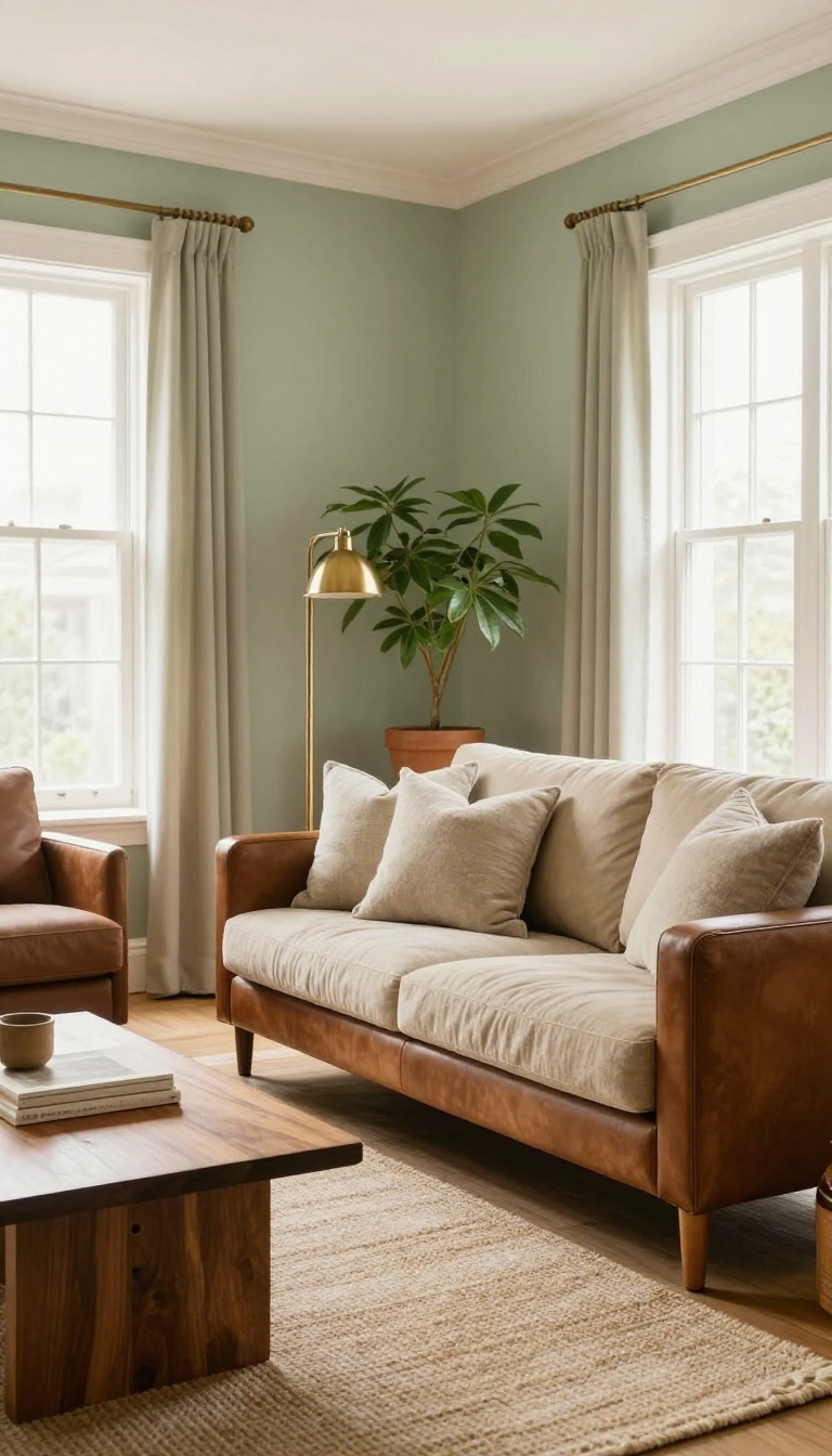
Sage green has a soft, earthy quality that makes brown furniture look intentional instead of dated. It sits right between gray and green, so it cools down warm wood tones without turning the room cold. That balance is why it works in both traditional and modern spaces.
The trick with sage is picking the right depth. A mid-tone sage with a hint of gray keeps things calm, while a lighter version opens up smaller rooms. Either way, it pairs beautifully with walnut, oak, and leather.
Why It Works With Brown
Brown and green are natural companions, like tree trunks and leaves. Sage picks up the subtle green undertones in some woods and softens the red in mahogany or cherry. It also makes leather look richer without competing with it.
Best Shades To Try
Look for sage with gray or blue undertones, like Sherwin-Williams Clary Sage or Benjamin Moore Misted Green. Avoid anything too yellow, which can make brown furniture look orange. Test a few samples on different walls to see how light changes them.
What To Pair It With
Cream trim and warm white ceilings keep sage from feeling heavy. Add brass or bronze accents to echo the brown tones. For textiles, linen, wool, and jute in oatmeal or taupe round out the earthy look.
2. Creamy Off-White
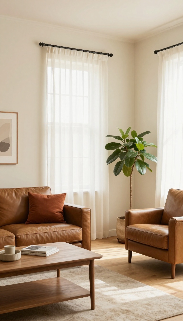
Creamy off-white doesn't shout, and that's exactly why it works with brown furniture. It bounces light around the room without turning cold or sterile, so dark wood and leather pieces feel deliberate rather than heavy. Think of it as the quiet friend who makes everyone else look good.
The trick is picking a cream with warm undertones. A stark white can make brown look orange or muddy, but a soft, buttery off-white keeps everything in the same cozy family. It's a safe bet that still feels stylish.
Creamy off-white is the chameleon of paint colors. It plays nicely with almost any brown shade, from espresso to honey oak, and it never fights for attention. That makes it a smart choice if you want your furniture to be the star.
It also gives you room to layer in other colors later. Add a rust throw pillow or a sage green plant, and the walls stay neutral enough to handle it. You won't have to repaint every time you switch up your accessories. ### Why It Works With Brown Brown furniture often has warm, reddish, or golden undertones.
A creamy off-white shares that warmth, so the two feel related instead of clashing. Cool whites, on the other hand, can make brown look dull or even dirty. This color also reflects light beautifully.
In a room with limited windows, it can make the space feel brighter and more open without feeling like a hospital. The slight yellow or beige tint keeps it inviting. ### Picking the Right Cream Not all off-whites are created equal. Look for names like ivory, alabaster, or antique white, and always test a sample on your wall.
The same cream can look completely different depending on your lighting and the direction your windows face. A good rule: if it looks slightly yellow or pink next to a pure white paint chip, it's probably warm enough. If it looks gray or blue, keep looking.
You want a cream that feels like a warm hug, not a cold shoulder. ### Making It Feel Intentional A room painted all cream can feel flat if you don't add texture. Mix in a woven rug, a linen sofa, or a chunky knit blanket to give the space depth. Brown furniture already brings weight, so balance it with soft fabrics and a few metallic accents.
Don't be afraid to use the same cream on trim and ceilings. It creates a seamless, cozy envelope that makes the room feel larger and more cohesive. Just make sure your finish is right: flat for walls, satin or semi-gloss for trim.
Why It Works With Brown
Brown furniture often has warm, reddish, or golden undertones. A creamy off-white shares that warmth, so the two feel related instead of clashing. Cool whites, on the other hand, can make brown look dull or even dirty.
This color also reflects light beautifully. In a room with limited windows, it can make the space feel brighter and more open without feeling like a hospital. The slight yellow or beige tint keeps it inviting.
Picking The Right Cream
Not all off-whites are created equal. Look for names like ivory, alabaster, or antique white, and always test a sample on your wall. The same cream can look completely different depending on your lighting and the direction your windows face.
A good rule: if it looks slightly yellow or pink next to a pure white paint chip, it's probably warm enough. If it looks gray or blue, keep looking. You want a cream that feels like a warm hug, not a cold shoulder.
Making It Feel Intentional
A room painted all cream can feel flat if you don't add texture. Mix in a woven rug, a linen sofa, or a chunky knit blanket to give the space depth. Brown furniture already brings weight, so balance it with soft fabrics and a few metallic accents.
Don't be afraid to use the same cream on trim and ceilings. It creates a seamless, cozy envelope that makes the room feel larger and more cohesive. Just make sure your finish is right: flat for walls, satin or semi-gloss for trim.
3. Soft Terracotta
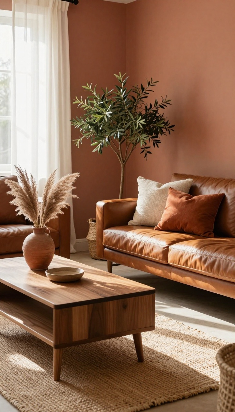
Terracotta brings a sun-baked warmth that feels right at home with brown furniture. This earthy orange-red picks up the warm undertones in wood, leather, and woven textures, turning them into a cohesive story instead of a mismatched collection. It adds energy without shouting, and a touch of Mediterranean charm that makes a living room feel traveled and collected.
Soft terracotta sits in that sweet spot between orange and clay, so it flatters brown rather than fighting it. The color works because it shares the same base notes as most brown furniture—reds, yellows, and a little black. When you put them together, the walls and the furniture amplify each other instead of competing.
This shade also handles natural light beautifully. In a sunny room, it glows like a Tuscan afternoon. In a darker space, it can turn moody and rich, which is a different look but still intentional.
The key is to test it on your walls before you commit, because terracotta shifts a lot depending on the light.
Why It Works With Brown Furniture
Brown furniture almost always has warm undertones, whether it's mahogany, walnut, or cognac leather. Terracotta echoes those undertones, so the two feel related rather than random. It's the same reason a brown belt works with brown shoes—the shared warmth ties everything together.
This color also adds a bit of life to rooms that lean too neutral. If your brown sofa or wood tables feel a little sleepy, terracotta wakes them up without making the space feel loud.
How To Get The Shade Right
Look for terracotta with a muted, dusty quality rather than a bright pumpkin orange. You want the color of an old clay pot, not a traffic cone. Brands often call it things like 'baked clay, ' 'antique terra, ' or 'spiced cider. ' Test at least three samples on different walls.
Terracotta can read pink, orange, or brown depending on the light, and you want to see all its moods before you buy a gallon.
What To Pair With It
Keep the rest of the room grounded. Cream trim, natural jute rugs, and a few dark green plants make terracotta feel balanced. If you want contrast, add a deep navy or charcoal accent—it sharpens the warmth without clashing.
Avoid pairing it with cool grays or stark whites, which can make terracotta look muddy. Stick with warm neutrals and earthy textures, and the whole room will feel like it was designed together.
4. Muted Navy Blue
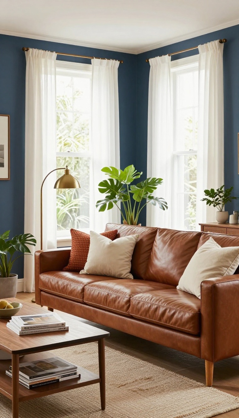
Navy blue and brown furniture are a classic pairing for a reason. The deep, cool tone makes warm wood and leather look richer, while the brown keeps navy from feeling too cold or formal. It's a balance that works in almost any living room, from traditional to modern.
Muted navy blue sits in that sweet spot between bold and livable. It's dark enough to create drama, but grayed out just enough that it doesn't overwhelm the space. When you put brown furniture against it, the contrast feels intentional and sophisticated.
This color also has a grounding effect. It anchors the room and makes it feel cozy, especially in the evening. And because navy is so versatile, it plays well with almost any accent color you already own.
Why It Works With Brown
Brown and navy are complementary in a way that feels natural. The cool blue tones balance the warmth of wood and leather, so neither one dominates. It's a pairing you'll see in everything from coastal cottages to city apartments.
Navy also has enough depth to handle dark browns without looking muddy. Even a heavy mahogany piece feels lighter against a muted navy wall.
Choosing The Right Shade
Not all navies are created equal. Look for shades with a hint of gray or green, like Benjamin Moore's Hale Navy or Sherwin-Williams' Naval. These read as sophisticated rather than primary.
Avoid navies with strong purple undertones if your furniture is reddish-brown. They can clash. A swatch test on the wall is always worth the effort.
Making It Feel Cozy
Navy can feel chilly if you don't balance it with texture. Add a wool throw, a jute rug, or linen curtains to soften the look. Warm metals like brass or copper also help.
Keep the trim and ceiling light—white or cream—to bounce light around. And don't forget a few warm bulbs in your lamps; they'll make the navy feel inviting after dark.
5. Pale Greige
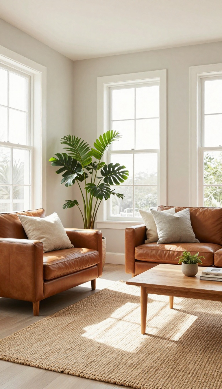
Pale greige sits right between gray and beige, and that in-between quality is what makes it so forgiving with brown furniture. It doesn't lean hard cool or hard warm, so it plays nicely with both espresso-toned wood and honey-colored pieces. Think of it as the neutral that actually earns its keep.
Unlike stark gray, which can make brown look orange by contrast, greige keeps things balanced. It reads soft and modern without feeling cold, and it gives brown furniture room to be the star. If you want a backdrop that never fights your furnishings, this is a strong contender.
Greige works because it borrows the best from both sides of the neutral family. The gray keeps it from turning yellow, while the beige stops it from feeling icy. That balance is exactly what brown furniture needs.
It's also one of the most versatile shades you can put on a wall. It shifts with the light, looking cooler in north-facing rooms and warmer in sunny spaces. Either way, it stays flattering. ### Why It Works with Both Cool and Warm Browns Warm browns, like cognac leather or oak, get a subtle lift from greige's cooler undertones.
The contrast is gentle, not jarring. Cool browns, like walnut or espresso, benefit from the beige side, which keeps them from looking flat. That flexibility means you don't have to overthink your existing pieces.
Greige meets them where they are. ### Picking the Right Undertone Not all greige is created equal. Some lean more gray, some more beige. Hold a swatch next to your furniture in natural light to see which way it pulls.
If your browns are reddish, a slightly cooler greige balances them. If they're more neutral or ashy, a warmer greige adds life. Trust your eye over the label. ### Making It Feel Intentional Greige can look bland if you stop at the walls.
Add texture through a woven rug, linen curtains, or a chunky throw. These layers keep the room from feeling like a beige box. Metal accents help too.
Brass warms it up, while black or pewter adds a crisp edge. Either way, the brown furniture stays the anchor.
Why It Works With Both Cool And Warm Browns
Warm browns, like cognac leather or oak, get a subtle lift from greige's cooler undertones. The contrast is gentle, not jarring. Cool browns, like walnut or espresso, benefit from the beige side, which keeps them from looking flat.
That flexibility means you don't have to overthink your existing pieces. Greige meets them where they are.
Picking The Right Undertone
Not all greige is created equal. Some lean more gray, some more beige. Hold a swatch next to your furniture in natural light to see which way it pulls.
If your browns are reddish, a slightly cooler greige balances them. If they're more neutral or ashy, a warmer greige adds life. Trust your eye over the label.
Making It Feel Intentional
Greige can look bland if you stop at the walls. Add texture through a woven rug, linen curtains, or a chunky throw. These layers keep the room from feeling like a beige box.
Metal accents help too. Brass warms it up, while black or pewter adds a crisp edge. Either way, the brown furniture stays the anchor.
6. Dusty Rose
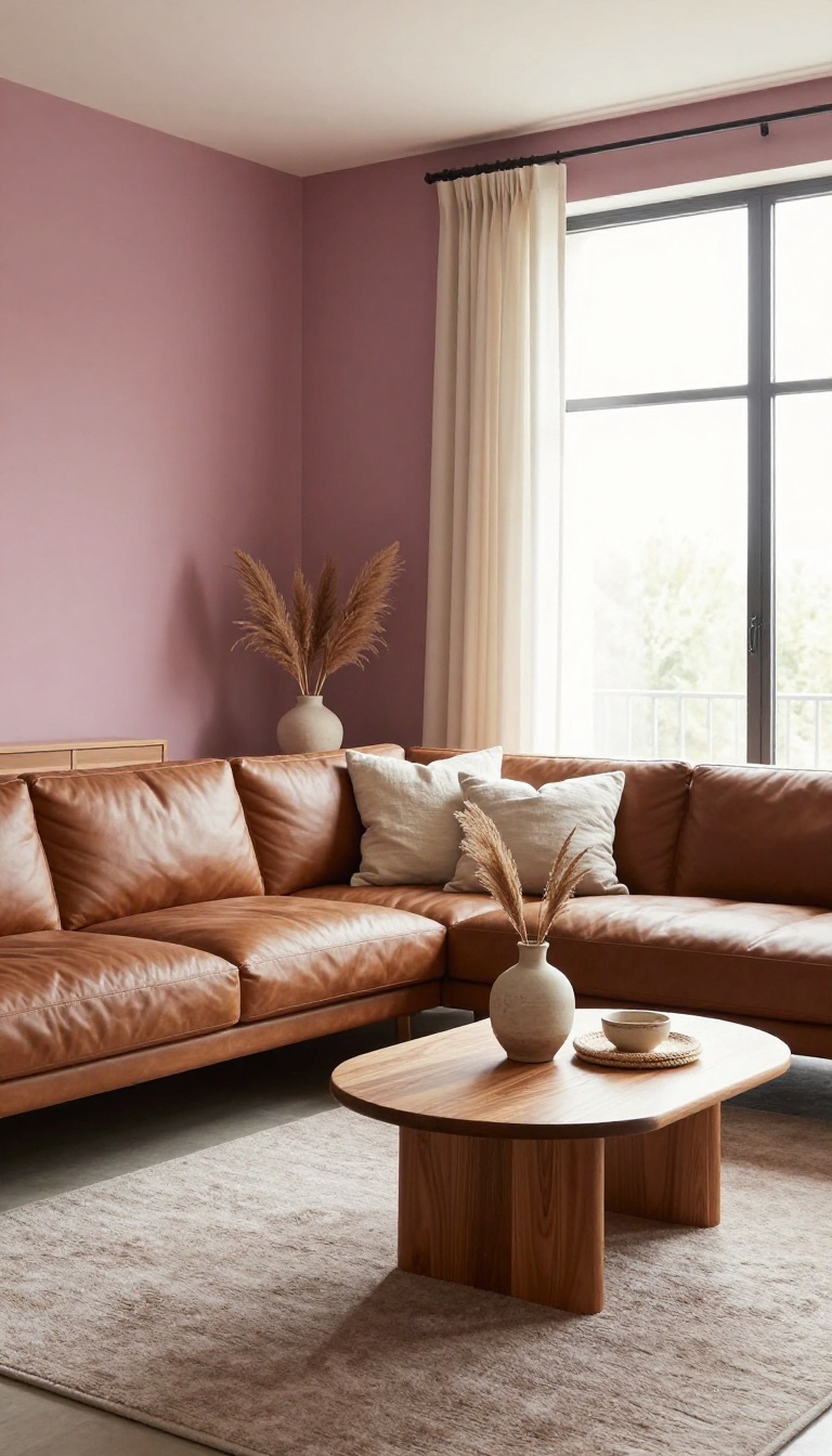
Dusty rose is the quiet rebel of this list. It's a soft pink with gray undertones, which keeps it from feeling sugary or nursery-like. Against brown furniture, it does something clever: it softens the heaviness without fighting it.
The result is a living room that feels romantic and a little unexpected, but still grounded.
Most people hear 'pink walls' and picture something bubblegum or overly sweet. Dusty rose is neither. The gray in it mutes the pink just enough, so it reads as a neutral with a wink.
That's why it works so well with brown wood, leather, and woven textures. It doesn't compete; it complements. Brown furniture can feel serious, especially in darker finishes like walnut or mahogany.
Dusty rose lightens the mood without making the room feel like a completely different space. It's a subtle shift that changes everything. You get warmth, softness, and a bit of personality all at once.
This color also plays nicely with different lighting. In a bright room, it looks almost like a warm blush. In a dim room, it deepens into a muted mauve.
Either way, it keeps brown furniture looking intentional rather than outdated. It's a forgiving shade, which is more than you can say for most pinks.
Why It Works With Brown
Dusty rose shares a similar warmth with brown furniture, so they feel related rather than clashing. The gray undertones keep it from turning too sweet, which means your wood pieces still look sophisticated. It's a balance of soft and sturdy that's hard to pull off with other pinks.
Best Brown Tones To Pair
Mid-tone woods like oak and teak look especially good with dusty rose because the contrast is gentle. Darker browns like espresso or mahogany get a nice lift from the pink's lightness. Leather in cognac or caramel also works beautifully, adding a rich, worn-in feel.
Where It Works Best
Dusty rose shines in living rooms that get decent natural light, but it can handle dimmer spaces too. It's a great choice if you want a romantic or vintage vibe without going full shabby chic. Pair it with brass accents, linen curtains, and a few green plants to keep it fresh.
What To Watch Out For
Too much dusty rose can start to feel flat, so break it up with white trim or a darker accent wall. Avoid pairing it with cool grays or stark whites, which can make it look muddy. And if your brown furniture is very red-based, test a sample first to make sure they don't fight.
7. Rich Charcoal
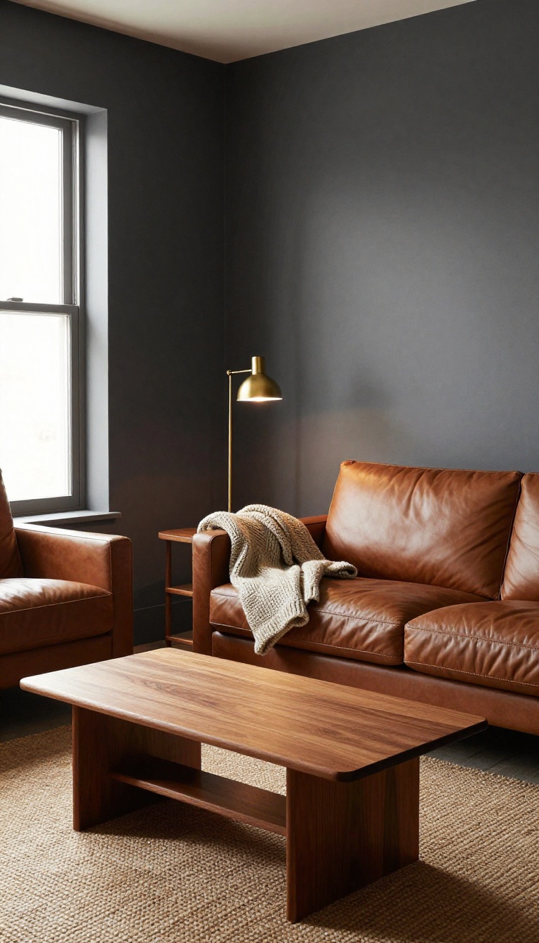
Charcoal is the color that makes brown furniture look like it was meant to be the star. The deep, smoky gray creates a backdrop that’s dramatic without being cold, so wood tones and leather feel richer by comparison. It’s a bold choice, but when it works, it really works.
Charcoal walls absorb light, which means your brown pieces stand out instead of blending in. That contrast is what gives the room its moody, sophisticated edge. It’s not about making the space dark—it’s about making everything in it feel more deliberate.
Why It Works
Brown and charcoal share a grounded, earthy quality, so they never clash. The difference in depth is what creates visual interest. Mid-tone woods like walnut or oak pop against charcoal, while darker espresso pieces get a subtle, tonal look.
Lighting Matters
Charcoal needs good lighting to avoid feeling cave-like. Layer in warm bulbs, table lamps, and maybe a floor lamp to keep things cozy. If your room gets lots of natural light, charcoal can handle it easily.
If not, go for a charcoal with a hint of blue or green to keep it from going flat.
Styling Tips
Add texture with a chunky knit throw or a woven rug to soften the intensity. Metallic accents like brass or copper add a little glam without competing with the brown. Keep the palette tight—charcoal, brown, and one or two neutrals is plenty.
8. Warm Mustard Yellow
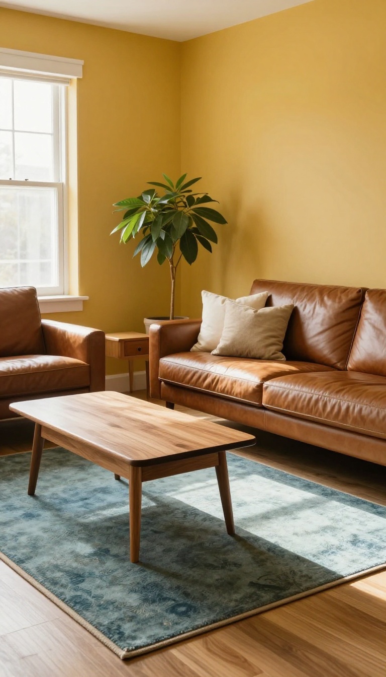
Mustard yellow wakes up a room without screaming for attention. It has enough earthiness to sit comfortably next to brown wood and leather, but enough brightness to keep the space from feeling heavy. Think of it as the color equivalent of a sunny afternoon in a mid-century den.
This shade works because it shares a warm base with most brown furniture. Oak, walnut, and cognac leather all have golden or reddish undertones, and mustard picks up on those without competing. The result is a cohesive, retro-inspired look that feels intentional rather than accidental.
Mustard also has a chameleon quality. In a north-facing room, it reads deeper and more golden. In a bright south-facing space, it turns lighter and more cheerful.
That flexibility makes it a solid choice for living rooms that get inconsistent light throughout the day.
Pick The Right Mustard
Not all mustards are created equal. Look for shades with a brown or orange base rather than a green one. A green-based mustard can clash with reddish woods like cherry or mahogany.
Swatches like Benjamin Moore's Golden Straw or Sherwin-Williams' Nugget tend to hit the sweet spot.
Balance The Boldness
Mustard is a statement, so give it room to breathe. Pair it with neutral textiles in cream, oatmeal, or soft gray. A brown leather sofa against mustard walls already provides contrast, so keep accessories simple.
If you want more depth, add a rug with muted blues or greens to cool things down.
Make It Feel Curated
Retro-inspired doesn't mean theme park. Choose furniture with clean lines and let the color do the talking. A vintage brass lamp or a woven basket adds texture without clutter.
The goal is cheerful and collected, not chaotic.
9. Soft Olive Green
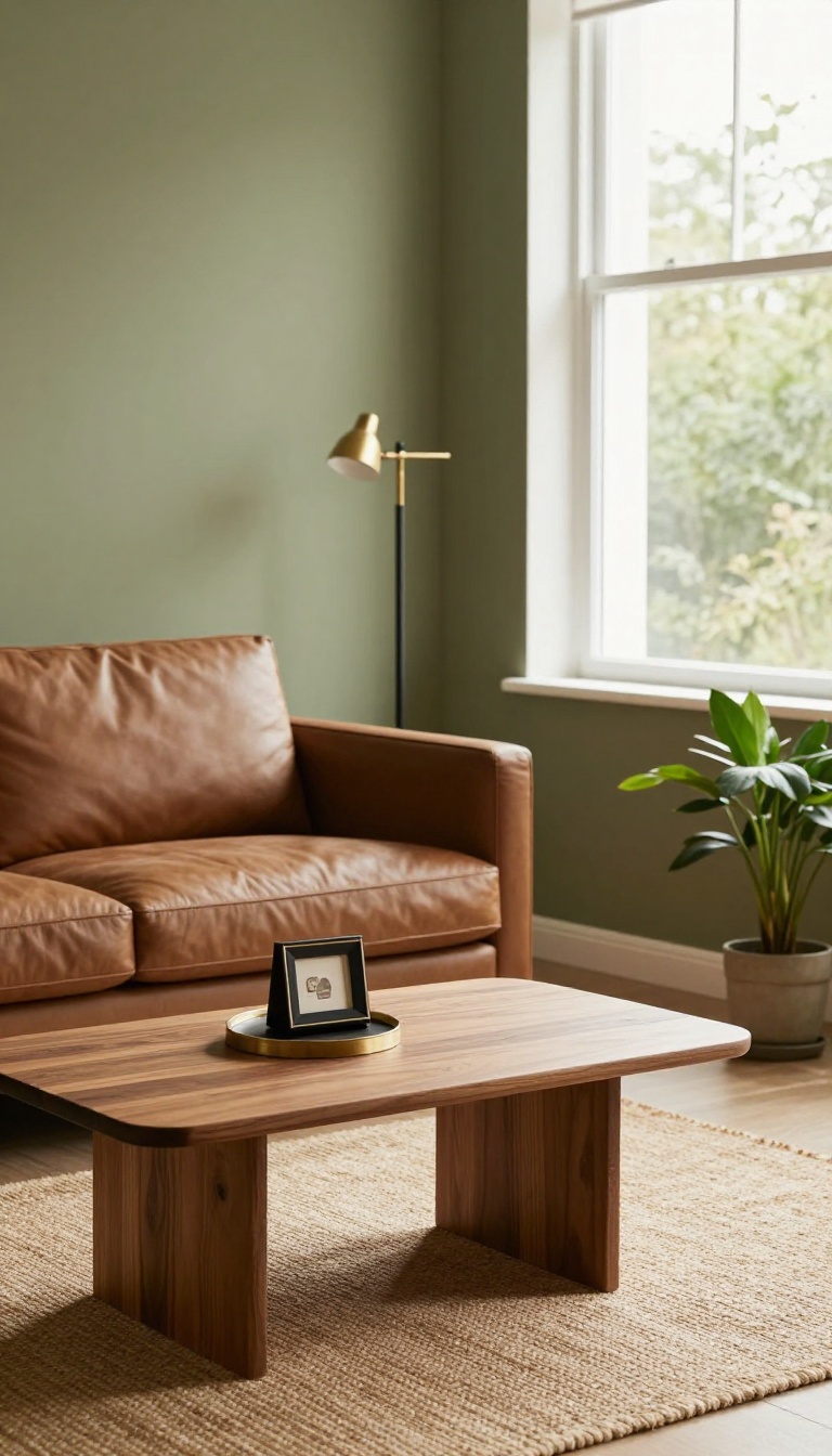
Soft olive green brings a bit of the outdoors in without going full forest. It sits in that sweet spot between earthy and refined, so brown wood and leather feel right at home. The color has enough gray in it to stay calm, but enough green to keep things interesting.
Olive works because it shares an undertone with brown. That common ground makes the pairing look intentional instead of accidental. It's also forgiving in rooms that don't get a ton of natural light, since it doesn't turn cold or washed out.
Why It Works With Brown
Brown furniture often has yellow or red undertones, and olive green carries a touch of yellow itself. That shared warmth keeps the combo from feeling flat. Unlike brighter greens, olive doesn't compete with wood grain—it lets it breathe.
Best Shades To Try
Look for olive with a gray base, like sage-tinged olive or muted army green. Avoid anything too neon or grassy, which can make brown look dated. Paint swatches next to your furniture in daylight before committing.
Where It Shines
Olive is a natural fit for rooms with leather sofas, walnut tables, or woven accents. It also plays well with brass and black metal, so you can mix finishes without overthinking it. If your space feels too neutral, olive adds depth without shouting.
10. Light Sky Blue
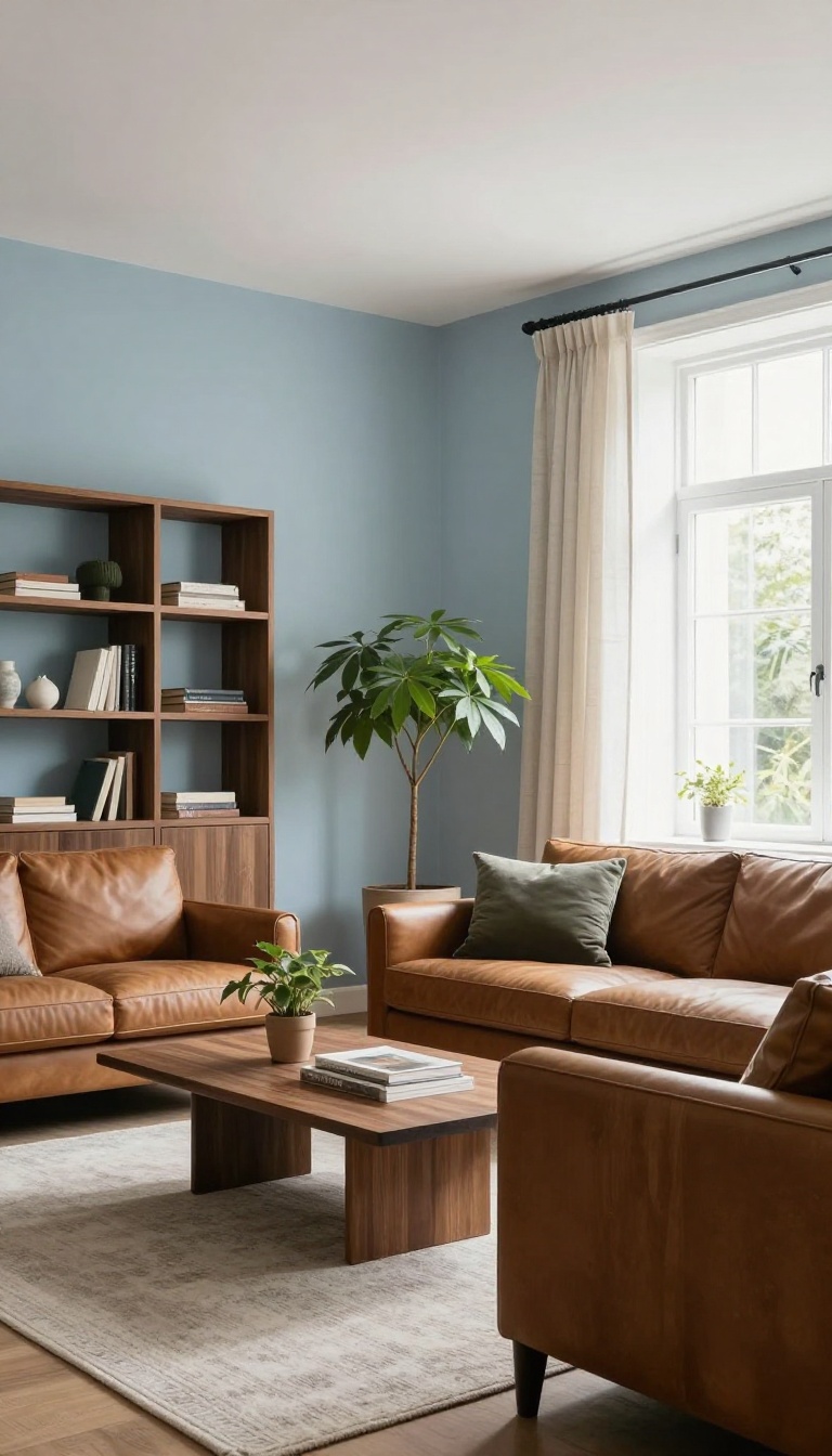
Light sky blue does something clever with brown furniture: it cools the room down without making it feel cold. Dark wood, leather, and espresso tones suddenly look lighter and more relaxed against that wash of soft blue. The trick is keeping the blue pale and slightly grayed rather than bright.
A saturated sky blue can turn cartoonish fast, while a muted version feels like an open window on a clear morning.
Brown furniture carries a lot of visual weight. Sky blue balances that weight by pulling the eye upward and outward, which makes even a small living room feel less packed. It also flatters the warm orange undertones in wood.
Warm brown and cool blue sit opposite each other on the color wheel, so they sharpen each other instead of blending into mush. That contrast is why a walnut coffee table can suddenly look intentional rather than heavy.
Why It Works With Brown
Blue and brown are a classic pairing for a reason. The coolness of the blue keeps warm wood from turning orange or muddy, and the brown keeps the blue from feeling sterile. This works best when the blue has a touch of gray or green in it.
Pure, bright blue can clash with reddish woods like cherry or mahogany. A softer sky blue plays nicely with almost any brown.
Picking The Right Shade
Look for names like powder blue, baby blue, or pale cerulean. Anything with 'dusty' or 'muted' in the name is usually a safe bet. Test the paint next to your largest brown piece before committing.
Wood tones shift a lot depending on the light, and a blue that looks perfect in the store can read icy on a north-facing wall.
Making It Feel Coastal, Not Cold
Add texture to warm the room back up. A woven jute rug, linen curtains, and a few cream or tan throw pillows keep the blue from feeling like a hospital waiting room. Warm metals help too.
Brass or aged bronze lamp bases and drawer pulls pick up the brown tones and tie the whole palette together.
Where It Works Best
Sky blue shines in living rooms that get decent natural light. In a dark room, it can turn gray and flat, so consider going a shade lighter or adding more lamps. It's also a great choice if you want to keep your brown furniture but lighten the overall mood.
You get a fresh look without replacing a single piece.
11. Deep Burgundy
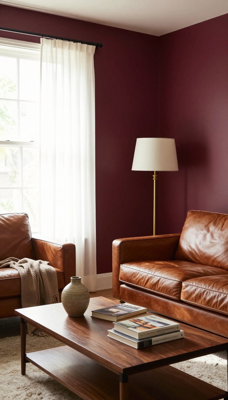
Deep burgundy doesn't whisper—it makes a statement. This rich, jewel-toned red leans slightly purple, which is exactly why it flatters brown wood and leather instead of fighting them. Think of it as the color of a well-aged wine or a velvet curtain in an old library.
It brings instant warmth and a touch of luxury, turning a plain living room into something that feels collected and intentional.
Burgundy works because it shares undertones with brown. Both have red and purple in their DNA, so they blend rather than clash. The result is a cozy, enveloping feel that makes brown furniture look expensive.
It's a bold choice, but it's also surprisingly easy to live with once you get the lighting right.
Why It Works With Brown
Brown furniture often has red or orange undertones, especially in woods like mahogany, cherry, and walnut. Burgundy picks up those undertones and amplifies them, making the wood look richer and more polished. Leather sofas in cognac or chocolate brown also pair beautifully, because the deep red adds a layer of sophistication without competing.
Even lighter browns, like oak or ash, get a boost from the contrast—they stand out against the dark wall instead of fading into it.
Getting The Shade Right
Not all burgundies are created equal. Look for ones with a hint of purple or brown, like oxblood, merlot, or Bordeaux. Avoid shades that lean too pink or too orange—they can make brown furniture look dated.
Test a few samples on your wall and check them at different times of day. Burgundy shifts dramatically depending on light: it can look almost black in dim corners and glowing red in direct sun. A satin or eggshell finish helps bounce light around and keeps the color from feeling flat.
Making It Feel Balanced
A full burgundy room can feel heavy, so balance is key. Break it up with lighter accents: cream trim, brass hardware, or a pale rug. Add a few metallic touches—gold or copper—to bring out the warmth.
If you want to keep the mood cozy but not cave-like, paint just one accent wall behind your main seating area. Pair it with neutral walls in a warm beige or greige, and let the burgundy do the talking. Plants with deep green leaves also add a nice contrast without stealing the show.
12. Soft Taupe
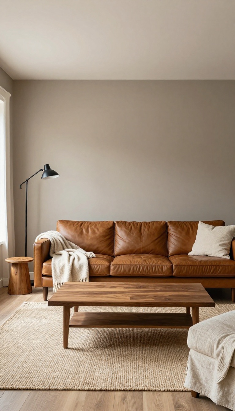
Taupe doesn't try to compete with brown furniture—it joins it. This gray-brown neutral sits right in the same family as wood and leather, so the whole room reads as one calm, cohesive space. It's the paint equivalent of a deep breath.
The trick with taupe is its undertone. A taupe with a hint of violet or pink warms up cool northern light, while a greige-leaning taupe keeps things crisp in sunnier rooms. Either way, it flatters brown instead of fighting it.
Why It Works With Brown
Taupe shares DNA with brown, so there's no jarring contrast—just a gentle shift in depth. Walnut, oak, and cognac leather all look richer against it because the walls echo their warmth rather than cancel it out. The result feels intentional, like you planned the whole palette at once.
Picking The Right Taupe
Test at least three samples on different walls before you commit. Look for one with a touch of mauve if your brown pieces lean reddish, or a greener taupe if they're more golden. Avoid taupes that pull too yellow—they can make honey oak look dated.
Making It Feel Layered, Not Flat
A monochromatic room can go sleepy fast. Add texture through a nubby throw, a woven rug, or a linen slipcover to keep things interesting. A single black metal lamp or dark wood frame gives the eye a place to land.
13. Bold Black
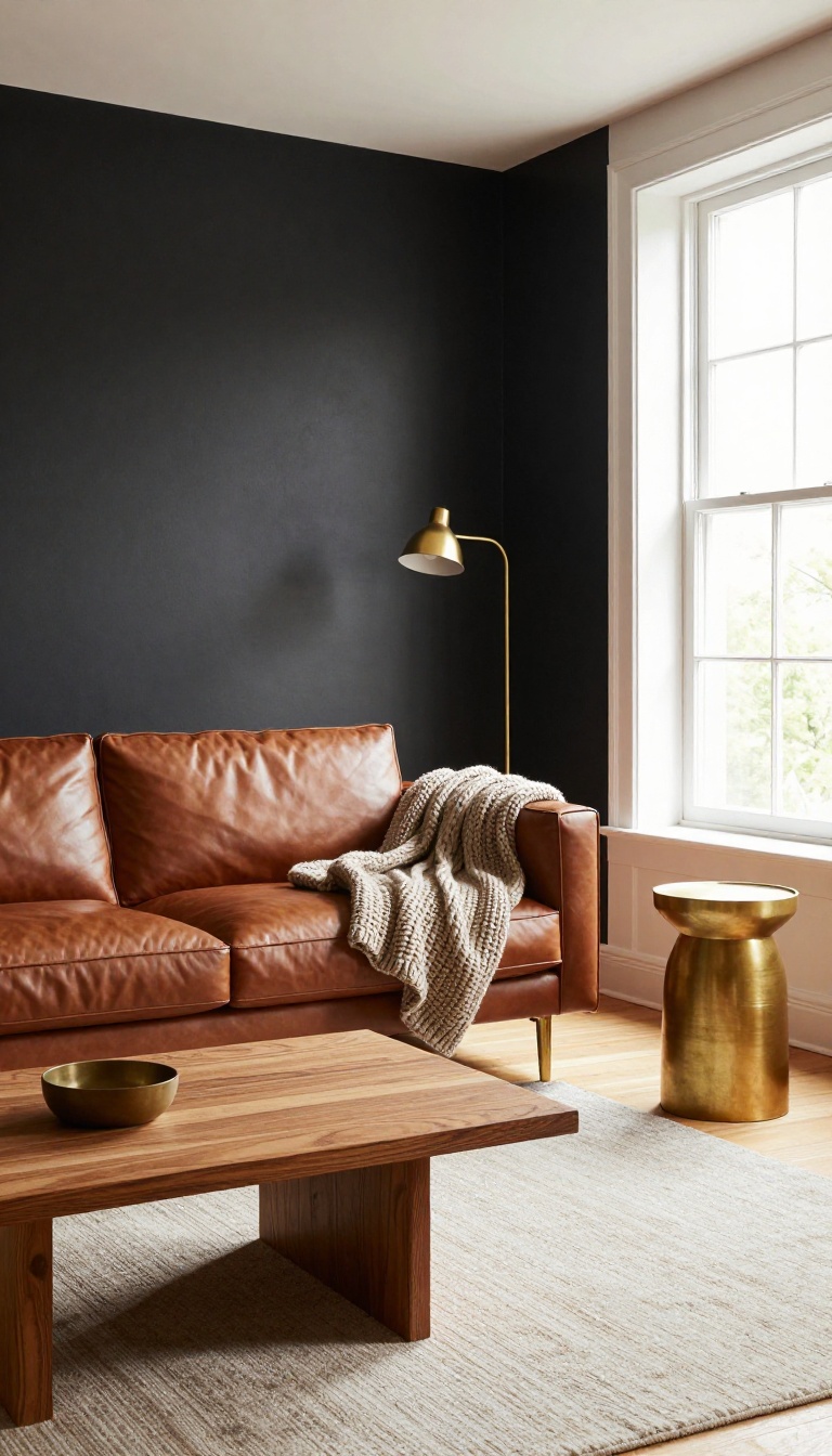
Black walls sound risky until you see them behind a brown leather sofa. Then it clicks. The dark background makes every wood grain, brass detail, and caramel cushion pop like it's under a spotlight.
Instead of competing with brown, black gives it a stage. This isn't about making your living room feel like a cave. It's about contrast, and brown furniture happens to be the perfect co-star.
The trick is managing light, finish, and texture so the room stays sharp instead of heavy.
Black paint has a reputation for being dramatic, and that's exactly why it works here. Brown furniture often gets lost against beige or gray walls. Against black, it becomes the focal point.
The warmth in wood and leather reads richer, and the whole room gains a sleek, modern edge that feels intentional rather than accidental. The catch is that black absorbs light, so you need to plan for it. A room with big windows and pale floors can handle a full black wall without breaking a sweat.
A darker, smaller space might need black on just one accent wall or a built-in bookcase. Either way, the result is the same: brown furniture suddenly looks expensive.
Pick The Right Black
Not all blacks are created equal. True black can feel flat and harsh, especially in rooms with cool northern light. Look for blacks with a hint of brown, green, or blue in the undertone.
A soft charcoal-black or an espresso black keeps things warm and pairs beautifully with medium and dark wood tones. Test a sample on the wall next to your furniture before you commit.
Balance With Texture And Light
Black walls need texture to keep from feeling like a void. Add a chunky knit throw, a jute rug, or linen curtains in a light neutral. Metallic accents—brass, copper, or aged bronze—catch the light and add warmth.
And don't forget lamps. Layered lighting is your best friend in a dark room. A floor lamp beside a brown armchair creates a cozy pool of light that makes the whole setup feel inviting.
Where Black Works Best
Full black walls shine in dining rooms and living rooms with high ceilings and lots of natural light. If your space is smaller, try black on a single wall behind a sofa or on a fireplace surround. Black built-ins are another winner—they frame brown furniture and make collections of books and objects look curated.
Just avoid black on every surface unless you have serious square footage and light to spare.
FAQ
What paint color makes brown furniture look less dated?
Cool or muted tones like sage green, navy, or greige modernize brown furniture by balancing its warmth. Avoid yellows and oranges that amplify the brown.
Can I use white paint with dark brown furniture?
Yes, but choose a warm white with yellow or beige undertones. Stark white can make dark brown look heavy and create too much contrast.
What colors go with brown leather sofas?
Olive green, navy, terracotta, and cream all work well. They complement the leather's richness without fighting it.
Should I paint my living room walls light or dark with brown furniture?
It depends on the mood. Light colors open up the space and reduce visual weight. Dark colors create drama and make brown furniture feel intentional.
How do I choose the right undertone for my brown furniture?
Check if your brown has red, yellow, or orange undertones. Pick a paint with a similar undertone for harmony, or a cool tone for contrast.
Conclusion
Brown furniture gives you a head start most rooms never get. Pick one paint color from this list that fixes your biggest complaint, whether that is a wall that feels flat, a corner that stays dark, or a room that never quite feels warm. Grab a sample, paint a square, and watch it for a few days.
You do not have to commit to the whole room at once. One wall, one alcove, one weekend. Let the color settle, then decide what comes next.